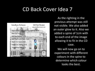
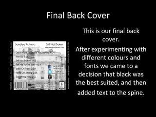
Drafting for the
CD Back Insert
 Anand, Trupti & Urvi
CD Back Cover – Record Company Logo
                       During the creation of the back
                   insert of the CD album we made an
                       initial version of a logo for our
                   record company ‘Emotion Records’.
                    It was a little too complex and did
                    not really look professional so we
                        decided to take it back to the
                   drawing board. The second and final
                      logo design was ready when we
                     finished creating the second and
                   final version of the back insert. This
                       new version was not pixelated,
                     simple and professional looking.
                    Using a name related to our music
Before     After       video would help reinforce the
                          meaning of our products.
CD Back Cover Idea 1


We designed a CD back cover which was inspired by an album back cover
 that we found online. In our plan for the CD back cover there are many
 typical conventions there which would instantly tell the audience what
ancillary text this is. Conventional back album inserts would contain a list
of songs, the artists name, the album name, the name of the records and
       the address, the logo of the record company and a barcode.
CD Back Cover Idea 2

              After developing the first version
              of the back insert for our album,
                it seemed there was plenty of
                    room for improvement –
                    changing of spine details
               (replacing the postcode with a
                  made up record label code),
               addition of websites and social
              network information, distribution
                information and track timings
                 including the redesign of our
                     record company logo.
CD Back Cover Idea 4
            Here we used the same
           image as the front cover
            and rotated it making it
           seem as if the building is
           wrapping around the CD
               cover. Also all the
             squares will be equal
            and so will give the CD
           cover a continuous feel.
CD Back Cover Idea 5
          Here we have taken the
         image and added a spine
            to conform to a CD’s
           dimensions . We also
          added track listings with
           timings as well as the
           record company logo.
CD Back Cover Idea 6
           In the previous attempt ,the
              text was very difficult to
           read therefore we increased
                the brightness of the
            background image allowing
            the text to stand out more.
            We also repositioned some
              text around making the
             information on the cover
                  more organised.
                 There are still some
            improvements to be made
           as the writing on the bottom
                  is still not visible.
CD Back Cover Idea 7
                As the righting in the
             previous attempt was still
             not visible. We also added
            an outer glow to it. Also we
            added a spine of 1cm with
             to each end of the image
             allowing it to fit in the CD
                         case.
                We will now go on to
             experiment with different
               colours in the spine to
              determine which colour
                   looks the best.
Final Back Cover
          This is our final back
                  cover.
       After experimenting with
         different colours and
          fonts we came to a
        decision that black was
       the best suited, and then
        added text to the spine.

Cd back cover ideas

  • 1.
    Drafting for the CDBack Insert Anand, Trupti & Urvi
  • 2.
    CD Back Cover– Record Company Logo During the creation of the back insert of the CD album we made an initial version of a logo for our record company ‘Emotion Records’. It was a little too complex and did not really look professional so we decided to take it back to the drawing board. The second and final logo design was ready when we finished creating the second and final version of the back insert. This new version was not pixelated, simple and professional looking. Using a name related to our music Before After video would help reinforce the meaning of our products.
  • 3.
    CD Back CoverIdea 1 We designed a CD back cover which was inspired by an album back cover that we found online. In our plan for the CD back cover there are many typical conventions there which would instantly tell the audience what ancillary text this is. Conventional back album inserts would contain a list of songs, the artists name, the album name, the name of the records and the address, the logo of the record company and a barcode.
  • 4.
    CD Back CoverIdea 2 After developing the first version of the back insert for our album, it seemed there was plenty of room for improvement – changing of spine details (replacing the postcode with a made up record label code), addition of websites and social network information, distribution information and track timings including the redesign of our record company logo.
  • 5.
    CD Back CoverIdea 4 Here we used the same image as the front cover and rotated it making it seem as if the building is wrapping around the CD cover. Also all the squares will be equal and so will give the CD cover a continuous feel.
  • 6.
    CD Back CoverIdea 5 Here we have taken the image and added a spine to conform to a CD’s dimensions . We also added track listings with timings as well as the record company logo.
  • 7.
    CD Back CoverIdea 6 In the previous attempt ,the text was very difficult to read therefore we increased the brightness of the background image allowing the text to stand out more. We also repositioned some text around making the information on the cover more organised. There are still some improvements to be made as the writing on the bottom is still not visible.
  • 8.
    CD Back CoverIdea 7 As the righting in the previous attempt was still not visible. We also added an outer glow to it. Also we added a spine of 1cm with to each end of the image allowing it to fit in the CD case. We will now go on to experiment with different colours in the spine to determine which colour looks the best.
  • 9.
    Final Back Cover This is our final back cover. After experimenting with different colours and fonts we came to a decision that black was the best suited, and then added text to the spine.