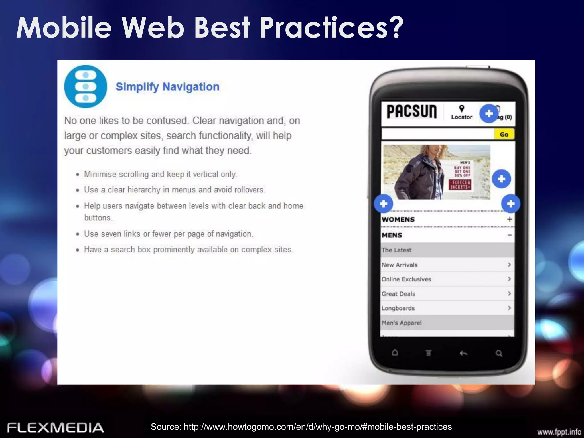
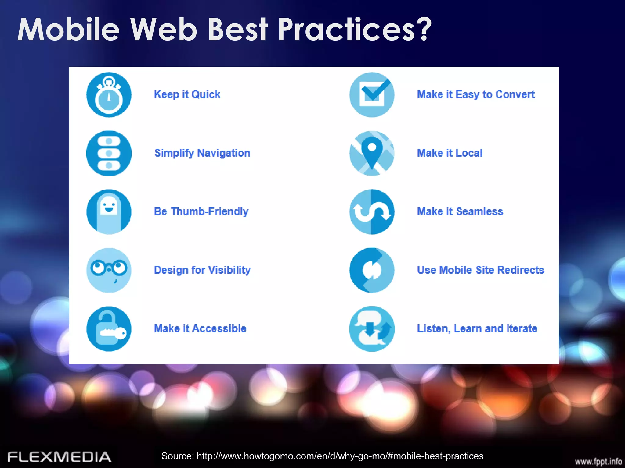
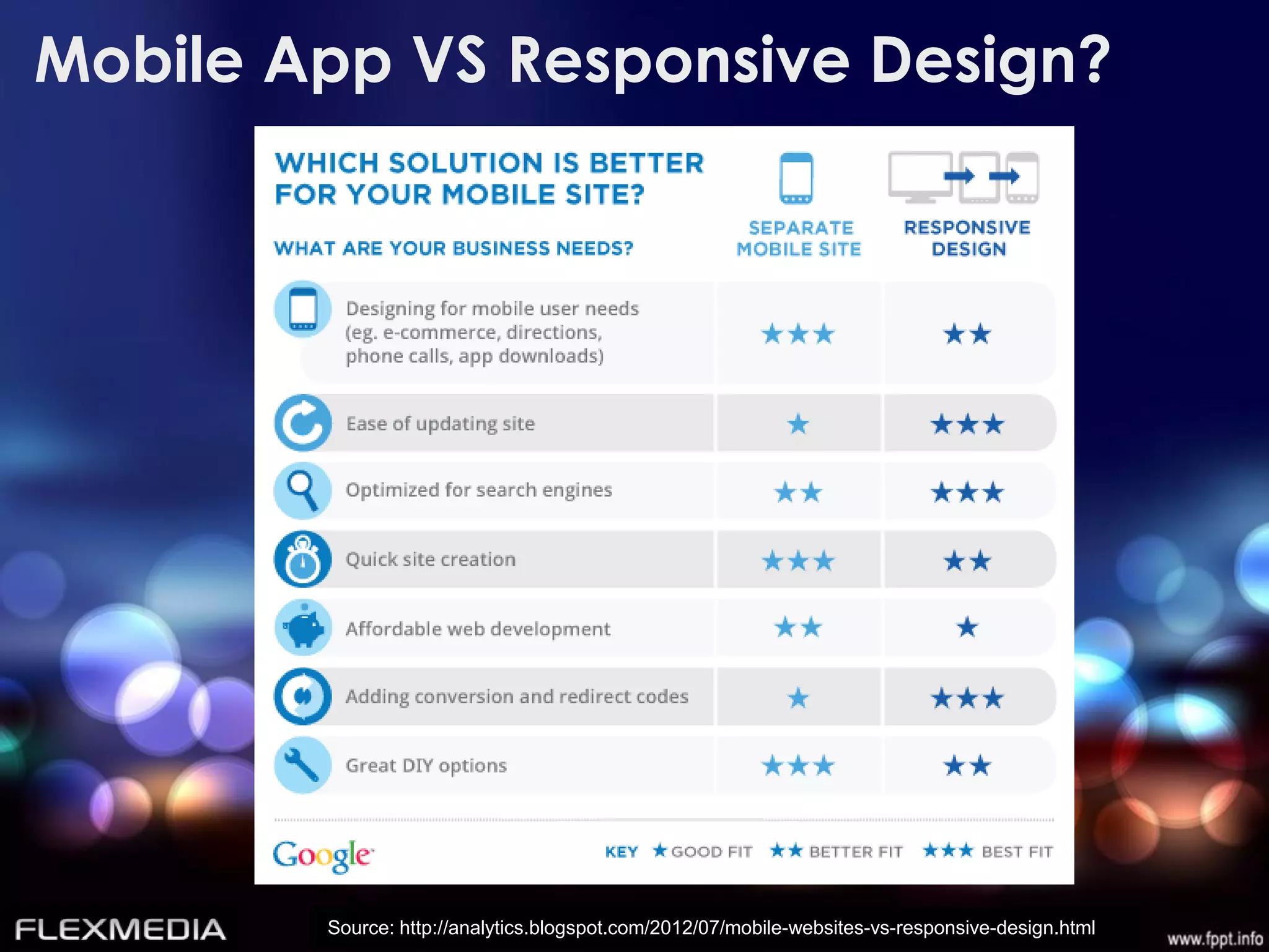
Responsive web design allows a single website to be accessed from any device but display content optimized for that device's screen size. It has become important as mobile internet usage grows significantly worldwide. Some key benefits of responsive design are supporting all screen sizes from a single code base, improving search engine optimization, and providing a better user experience for mobile users. Best practices for responsive design include keeping pages lightweight, using fluid grids and images, and prioritizing above-the-fold content. While separate mobile sites can also be effective, responsive design allows for centralized content management and tracking across devices.


![Responsive Web Design: Dirty Little Secrets [Presented by Yottaa]](https://cdn.slidesharecdn.com/ss_thumbnails/hnuzlt7krigmnwtzki7u-140520114602-phpapp01-thumbnail.jpg?width=640&height=640&fit=bounds)


