Download to read offline


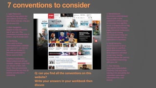


The document discusses website conventions for planning an effective website. It explains that during the pre-production phase, a draft website needs to be outlined and defined. Applying conventions can help ensure the plan is successful. The document then lists 7 common conventions to consider: 1) logo placement, 2) main navigation, 3) link styling, 4) button functionality, 5) standard icons, 6) visual hierarchy, and 7) clear naming. These conventions help communicate ideas to people involved in the website's development and create intuitive user experiences.