Download as PDF, PPTX


![#WebClinic
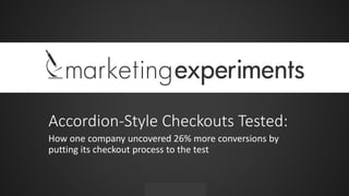
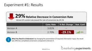
Experiment #1: Background
Background: National news publication selling subscriptions
Goal: To increase home delivery subscription rate
Research Question: Which treatment will generate the highest home delivery
subscription rate?
Test Design: A/B variable cluster test
Experiment ID: TP1666
Record Location: MECLABS Research Library
Research Partner: [Protected]](https://image.slidesharecdn.com/webclinicaccordioncartstestedv5bjp-130912085708-phpapp01/85/Do-Accordion-Style-Checkouts-Work-How-one-company-uncovered-26-more-conversions-by-putting-its-checkout-process-to-the-test-9-320.jpg)


![#WebClinic
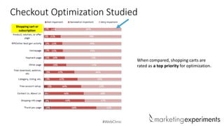
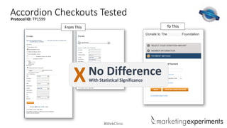
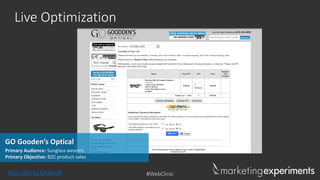
Experiment #2: Background
Background: National news publication selling subscriptions
Goal: To increase home delivery subscription rate
Research Question: Which treatment will generate the highest home delivery
subscription rate?
Test Design: A/B variable cluster test
Experiment ID: TP1740
Record Location: MECLABS Research Library
Research Partner: [Protected]](https://image.slidesharecdn.com/webclinicaccordioncartstestedv5bjp-130912085708-phpapp01/85/Do-Accordion-Style-Checkouts-Work-How-one-company-uncovered-26-more-conversions-by-putting-its-checkout-process-to-the-test-19-320.jpg)

![#WebClinic
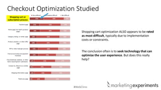
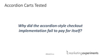
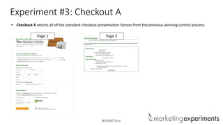
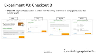
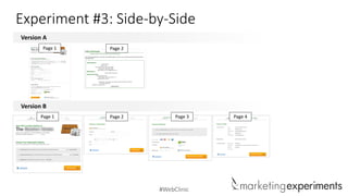
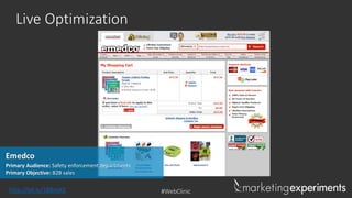
Experiment #3: Background
Background: National news publication selling subscriptions
Goal: To increase home delivery subscription rate
Research Question: Which treatment will generate the highest home delivery
subscription rate?
Test Design: A/B variable cluster test
Experiment ID: TP1789
Record Location: MECLABS Research Library
Research Partner: [Protected]](https://image.slidesharecdn.com/webclinicaccordioncartstestedv5bjp-130912085708-phpapp01/85/Do-Accordion-Style-Checkouts-Work-How-one-company-uncovered-26-more-conversions-by-putting-its-checkout-process-to-the-test-29-320.jpg)
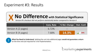
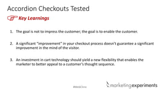


The document explores the effectiveness of accordion-style checkouts compared to traditional checkout processes through three experiments conducted for a national news publication selling subscriptions. The results indicated that changes in presentation significantly impacted conversion rates, with some experiments showing notable decreases in conversions when using accordion designs, while minor tweaks in layout improved rates. Key takeaways emphasize that optimizing the user experience should focus on enabling customers rather than merely impressing them.


