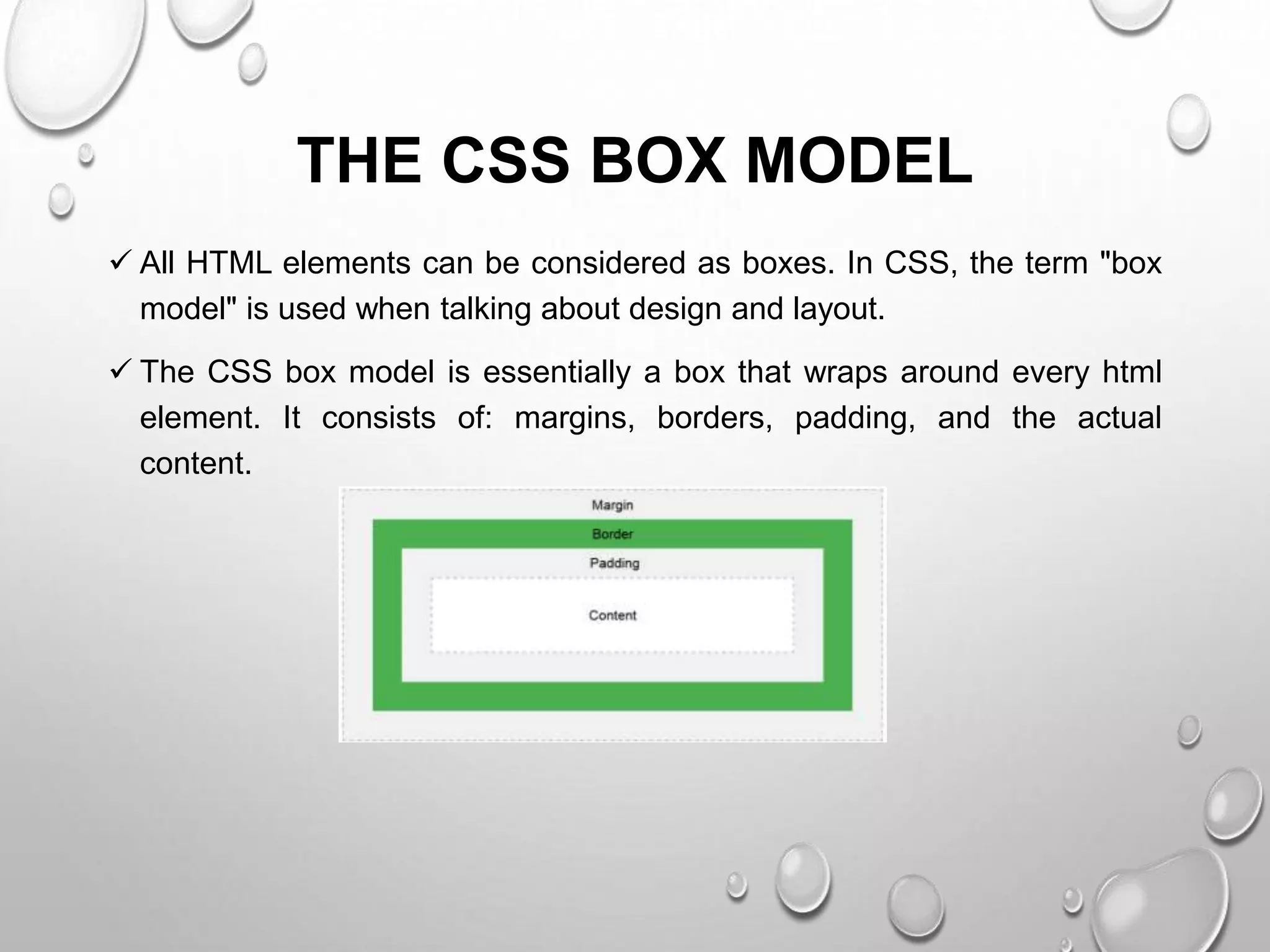
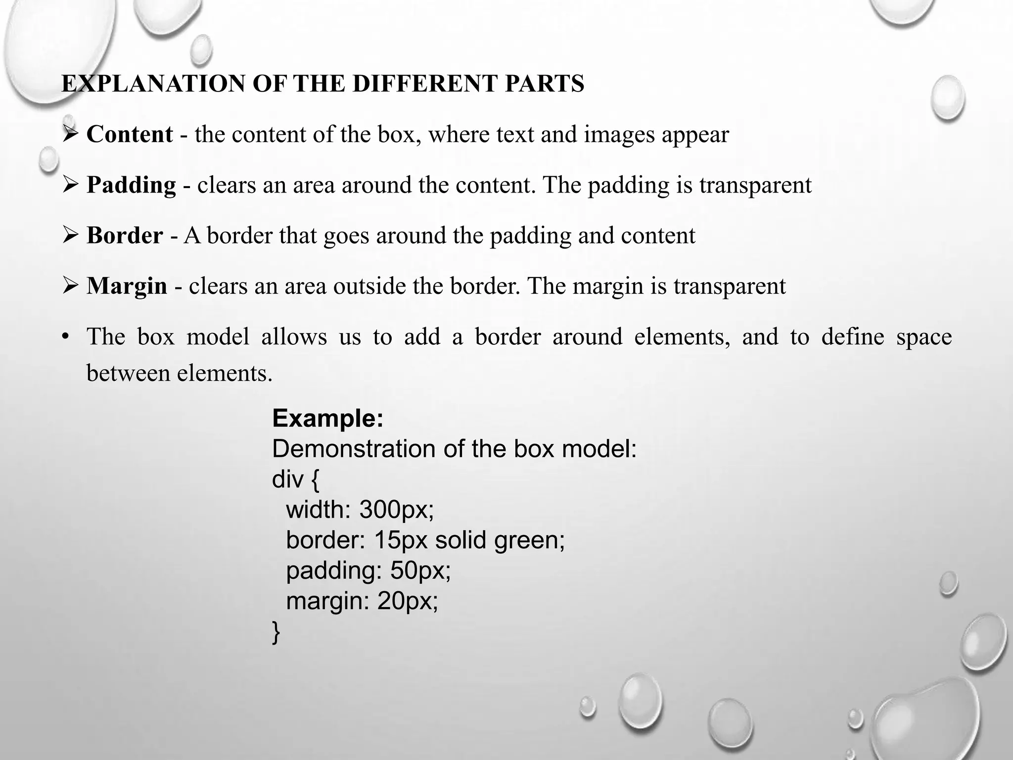
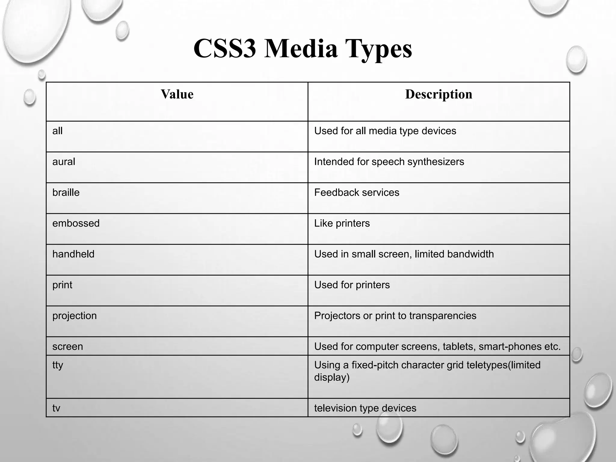
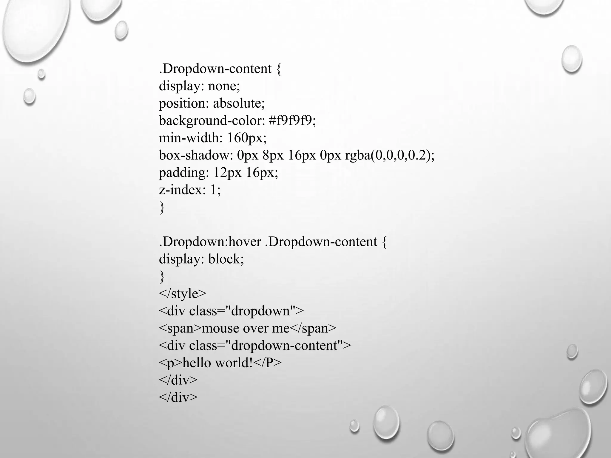
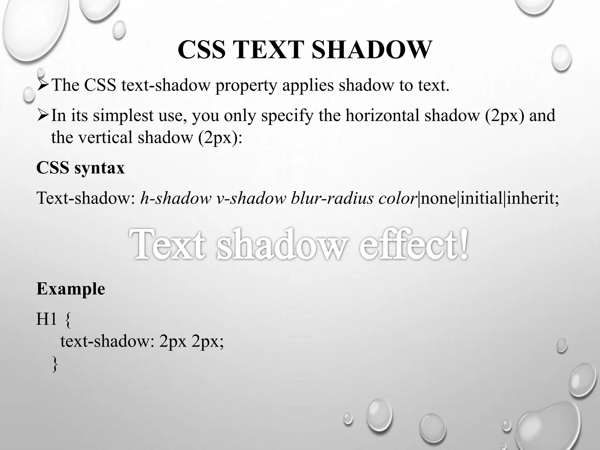
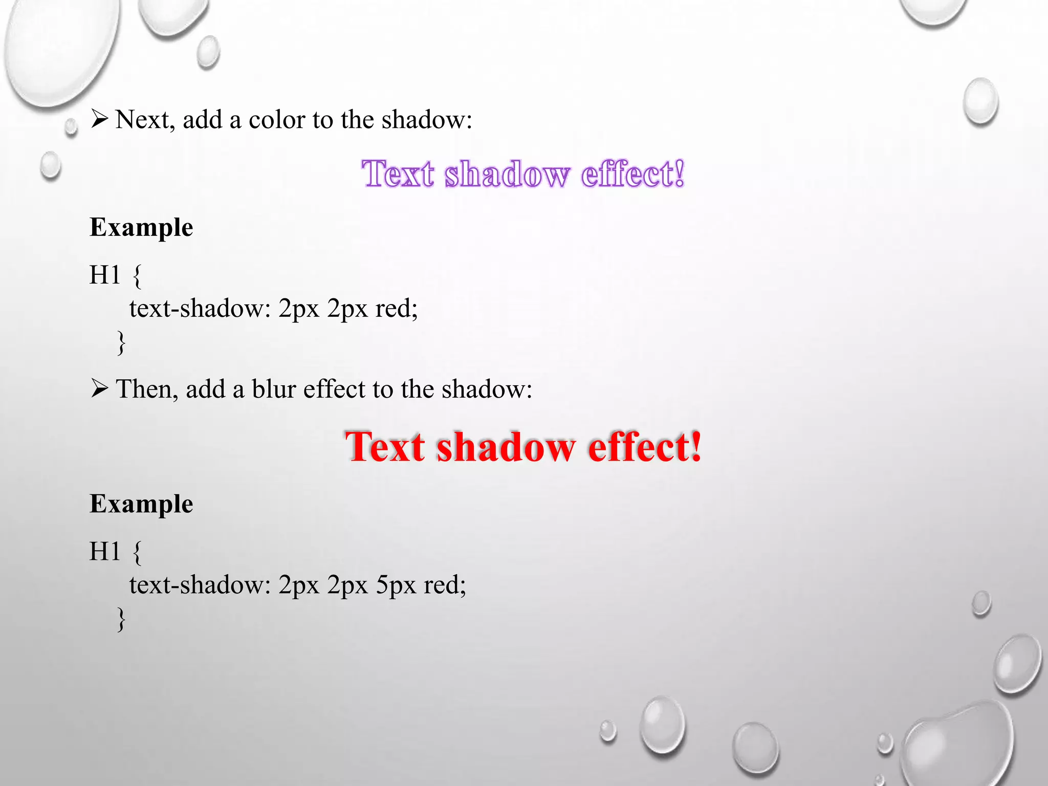
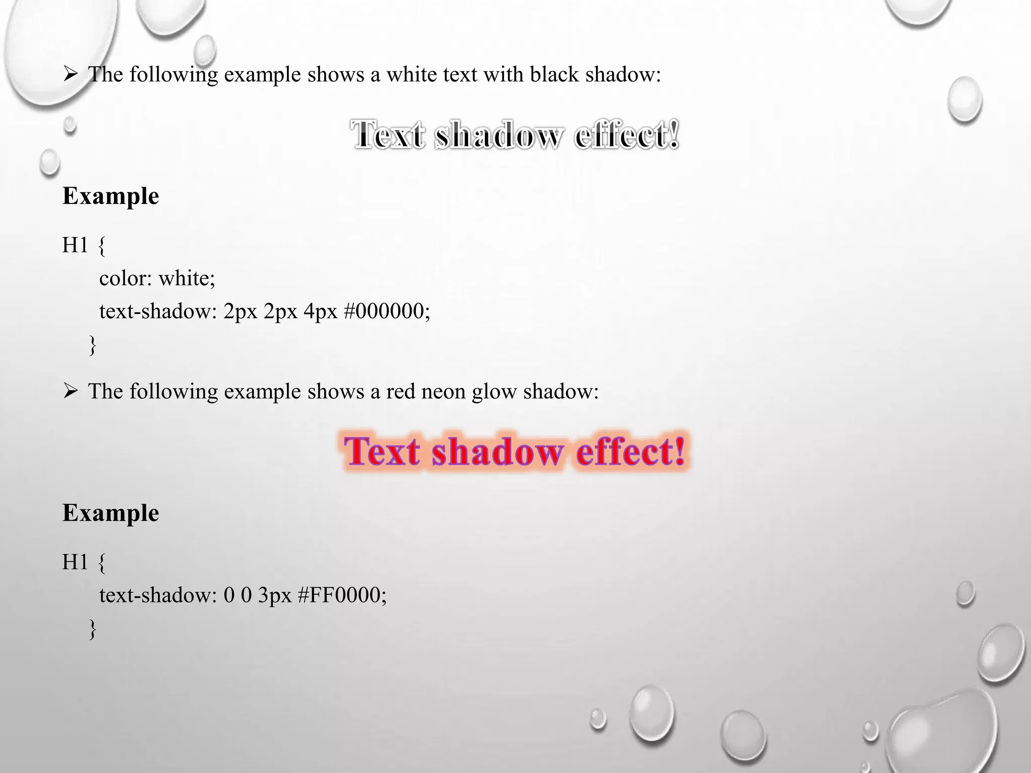
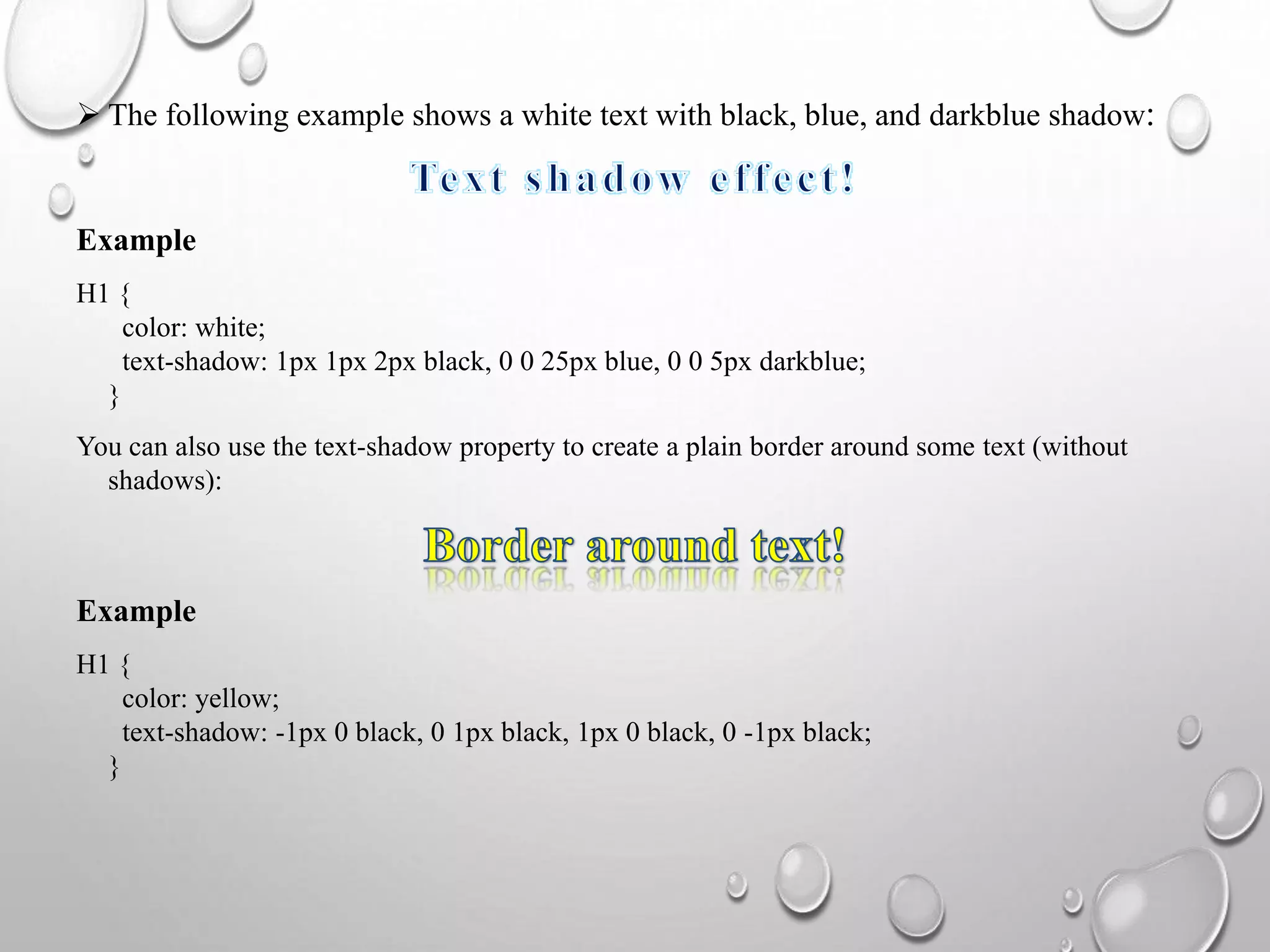
“
”
WEB PROGRAMMING
( Box model & Text flow, Media Types, Media Queries, Drop-Down
Menus, and Text Shadow)
Submittedby
Nagapandiyammal.N
M.Sccomputerscience
NADAR SARASWATHI COLLEGE OF ARTS & SCIENCE
CONTENT
BOX MODEL & TEXT FLOW
MEDIA TYPES
MEDIA QUERIES
DROP-DOWN MENUS
TEXT SHADOW
THE CSS BOX MODEL
 All HTML elements can be considered as boxes. In CSS, the term "box
model" is used when talking about design and layout.
 The CSS box model is essentially a box that wraps around every html
element. It consists of: margins, borders, padding, and the actual
content.
EXPLANATION OF THE DIFFERENT PARTS
 Content - the content of the box, where text and images appear
 Padding - clears an area around the content. The padding is transparent
 Border - A border that goes around the padding and content
 Margin - clears an area outside the border. The margin is transparent
• The box model allows us to add a border around elements, and to define space
between elements.
Example:
Demonstration of the box model:
div {
width: 300px;
border: 15px solid green;
padding: 50px;
margin: 20px;
}
TEXT-OVERFLOW
Definition and usage:
• The text-overflow property specifies how overflowed content that is not displayed
should be signaled to the user. It can be clipped, display an ellipsis (...), or display a
custom string.
• Both of the following properties are required for text-overflow:
• White-space: nowrap;
• Overflow: hidden;
Example
Use of the text-overflow property:
Div {
white-space: nowrap;
overflow: hidden;
text-overflow: ellipsis;
}
Syntax
text-overflow: clip|ellipsis|string|initial|inherit;
CSS2 INTRODUCED MEDIA TYPES
 The @media rule, introduced in CSS2, made it possible to define different style rules
for different media types.
 Examples: you could have one set of style rules for computer screens, one for
printers, one for handheld devices, one for television-type devices, and so on.
 Unfortunately these media types never got a lot of support by devices, other than the
print media type.
 You can also have different style sheets for different media:
 <Link rel="stylesheet" media="mediatype and|not|only (expressions)"
href="print.Css">
CSS3 Media Types
Value Description
all Used for all media type devices
aural Intended for speech synthesizers
braille Feedback services
embossed Like printers
handheld Used in small screen, limited bandwidth
print Used for printers
projection Projectors or print to transparencies
screen Used for computer screens, tablets, smart-phones etc.
tty Using a fixed-pitch character grid teletypes(limited
display)
tv television type devices
MEDIA QUERIES
Media queries in CSS3 extended the CSS2 media types idea: instead of looking
for a type of device, they look at the capability of the device.
Media queries can be used to check many things, such as:
Width and height of the viewport
Width and height of the device
Orientation (is the tablet/phone in landscape or portrait mode?)
Resolution
Using media queries are a popular technique for delivering a tailored style sheet
to desktops, laptops, tablets, and mobile phones (such as iPhone and android
phones).
Media query syntax:
 A media query consists of a media type and can contain one or more expressions, which resolve
to either true or false.
@Media not|only mediatype and (expressions)
{
css-code;
}
 The result of the query is true if the specified media type matches the type of device the
document is being displayed on and all expressions in the media query are true. When a media
query is true, the corresponding style sheet or style rules are applied, following the normal
cascading rules.
 Unless you use the not or only operators, the media type is optional and the all type will be
implied.
Media queries simple examples
One way to use media queries is to have an alternate CSS section right inside your
style sheet.
The following example changes the background-color to lightgreen if the viewport is
480 pixels wide or wider (if the viewport is less than 480 pixels, the background-
color will be pink):
Example
@Media screen and (min-width: 480px) {
body {
background-color: lightgreen;
}
}
DROP-DOWN MENUS
 Create a dropdown menu that allows the user to choose an option from a list:
Basic dropdown
• Create a dropdown box that appears when the user moves the mouse over an
element.
Example
<Style>
.Dropdown {
position: relative;
display: inline-block;
}
.Dropdown-content {
display: none;
position: absolute;
background-color: #f9f9f9;
min-width: 160px;
box-shadow: 0px 8px 16px 0px rgba(0,0,0,0.2);
padding: 12px 16px;
z-index: 1;
}
.Dropdown:hover .Dropdown-content {
display: block;
}
</style>
<div class="dropdown">
<span>mouse over me</span>
<div class="dropdown-content">
<p>hello world!</P>
</div>
</div>
Right-aligned dropdown content
 If you want the dropdown menu to go from right to left, instead of left to right, add
right: 0;
Example
.Dropdown-content {
right: 0;
}
Dropdown image
 How to add an image and other content inside the dropdown box.
 Hover over the image:
CSS TEXT SHADOW
The CSS text-shadow property applies shadow to text.
In its simplest use, you only specify the horizontal shadow (2px) and
the vertical shadow (2px):
CSS syntax
Text-shadow: h-shadow v-shadow blur-radius color|none|initial|inherit;
Example
H1 {
text-shadow: 2px 2px;
}
 Next, add a color to the shadow:
Example
H1 {
text-shadow: 2px 2px red;
}
 Then, add a blur effect to the shadow:
Text shadow effect!
Example
H1 {
text-shadow: 2px 2px 5px red;
}
 The following example shows a white text with black shadow:
Example
H1 {
color: white;
text-shadow: 2px 2px 4px #000000;
}
 The following example shows a red neon glow shadow:
Example
H1 {
text-shadow: 0 0 3px #FF0000;
}
 The following example shows a white text with black, blue, and darkblue shadow:
Example
H1 {
color: white;
text-shadow: 1px 1px 2px black, 0 0 25px blue, 0 0 5px darkblue;
}
You can also use the text-shadow property to create a plain border around some text (without
shadows):
Example
H1 {
color: yellow;
text-shadow: -1px 0 black, 0 1px black, 1px 0 black, 0 -1px black;
}
Web Programming

Web Programming

  • 1.
    “ ” WEB PROGRAMMING ( Boxmodel & Text flow, Media Types, Media Queries, Drop-Down Menus, and Text Shadow) Submittedby Nagapandiyammal.N M.Sccomputerscience NADAR SARASWATHI COLLEGE OF ARTS & SCIENCE
  • 2.
    CONTENT BOX MODEL &TEXT FLOW MEDIA TYPES MEDIA QUERIES DROP-DOWN MENUS TEXT SHADOW
  • 3.
    THE CSS BOXMODEL  All HTML elements can be considered as boxes. In CSS, the term "box model" is used when talking about design and layout.  The CSS box model is essentially a box that wraps around every html element. It consists of: margins, borders, padding, and the actual content.
  • 4.
    EXPLANATION OF THEDIFFERENT PARTS  Content - the content of the box, where text and images appear  Padding - clears an area around the content. The padding is transparent  Border - A border that goes around the padding and content  Margin - clears an area outside the border. The margin is transparent • The box model allows us to add a border around elements, and to define space between elements. Example: Demonstration of the box model: div { width: 300px; border: 15px solid green; padding: 50px; margin: 20px; }
  • 5.
    TEXT-OVERFLOW Definition and usage: •The text-overflow property specifies how overflowed content that is not displayed should be signaled to the user. It can be clipped, display an ellipsis (...), or display a custom string. • Both of the following properties are required for text-overflow: • White-space: nowrap; • Overflow: hidden;
  • 6.
    Example Use of thetext-overflow property: Div { white-space: nowrap; overflow: hidden; text-overflow: ellipsis; } Syntax text-overflow: clip|ellipsis|string|initial|inherit;
  • 7.
    CSS2 INTRODUCED MEDIATYPES  The @media rule, introduced in CSS2, made it possible to define different style rules for different media types.  Examples: you could have one set of style rules for computer screens, one for printers, one for handheld devices, one for television-type devices, and so on.  Unfortunately these media types never got a lot of support by devices, other than the print media type.  You can also have different style sheets for different media:  <Link rel="stylesheet" media="mediatype and|not|only (expressions)" href="print.Css">
  • 8.
    CSS3 Media Types ValueDescription all Used for all media type devices aural Intended for speech synthesizers braille Feedback services embossed Like printers handheld Used in small screen, limited bandwidth print Used for printers projection Projectors or print to transparencies screen Used for computer screens, tablets, smart-phones etc. tty Using a fixed-pitch character grid teletypes(limited display) tv television type devices
  • 9.
    MEDIA QUERIES Media queriesin CSS3 extended the CSS2 media types idea: instead of looking for a type of device, they look at the capability of the device. Media queries can be used to check many things, such as: Width and height of the viewport Width and height of the device Orientation (is the tablet/phone in landscape or portrait mode?) Resolution Using media queries are a popular technique for delivering a tailored style sheet to desktops, laptops, tablets, and mobile phones (such as iPhone and android phones).
  • 10.
    Media query syntax: A media query consists of a media type and can contain one or more expressions, which resolve to either true or false. @Media not|only mediatype and (expressions) { css-code; }  The result of the query is true if the specified media type matches the type of device the document is being displayed on and all expressions in the media query are true. When a media query is true, the corresponding style sheet or style rules are applied, following the normal cascading rules.  Unless you use the not or only operators, the media type is optional and the all type will be implied.
  • 11.
    Media queries simpleexamples One way to use media queries is to have an alternate CSS section right inside your style sheet. The following example changes the background-color to lightgreen if the viewport is 480 pixels wide or wider (if the viewport is less than 480 pixels, the background- color will be pink): Example @Media screen and (min-width: 480px) { body { background-color: lightgreen; } }
  • 12.
    DROP-DOWN MENUS  Createa dropdown menu that allows the user to choose an option from a list: Basic dropdown • Create a dropdown box that appears when the user moves the mouse over an element. Example <Style> .Dropdown { position: relative; display: inline-block; }
  • 13.
    .Dropdown-content { display: none; position:absolute; background-color: #f9f9f9; min-width: 160px; box-shadow: 0px 8px 16px 0px rgba(0,0,0,0.2); padding: 12px 16px; z-index: 1; } .Dropdown:hover .Dropdown-content { display: block; } </style> <div class="dropdown"> <span>mouse over me</span> <div class="dropdown-content"> <p>hello world!</P> </div> </div>
  • 14.
    Right-aligned dropdown content If you want the dropdown menu to go from right to left, instead of left to right, add right: 0; Example .Dropdown-content { right: 0; } Dropdown image  How to add an image and other content inside the dropdown box.  Hover over the image:
  • 15.
    CSS TEXT SHADOW TheCSS text-shadow property applies shadow to text. In its simplest use, you only specify the horizontal shadow (2px) and the vertical shadow (2px): CSS syntax Text-shadow: h-shadow v-shadow blur-radius color|none|initial|inherit; Example H1 { text-shadow: 2px 2px; }
  • 16.
     Next, adda color to the shadow: Example H1 { text-shadow: 2px 2px red; }  Then, add a blur effect to the shadow: Text shadow effect! Example H1 { text-shadow: 2px 2px 5px red; }
  • 17.
     The followingexample shows a white text with black shadow: Example H1 { color: white; text-shadow: 2px 2px 4px #000000; }  The following example shows a red neon glow shadow: Example H1 { text-shadow: 0 0 3px #FF0000; }
  • 18.
     The followingexample shows a white text with black, blue, and darkblue shadow: Example H1 { color: white; text-shadow: 1px 1px 2px black, 0 0 25px blue, 0 0 5px darkblue; } You can also use the text-shadow property to create a plain border around some text (without shadows): Example H1 { color: yellow; text-shadow: -1px 0 black, 0 1px black, 1px 0 black, 0 -1px black; }