Download as PDF, PPTX


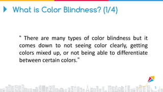

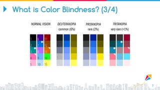


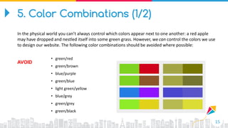
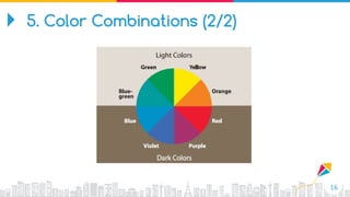


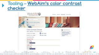
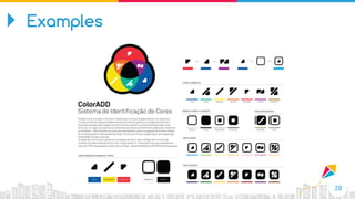
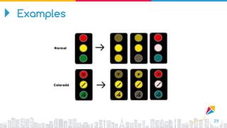
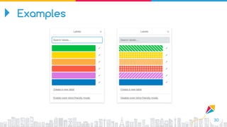


The document provides guidelines for designing user-friendly interfaces for colorblind individuals, detailing the various types of color blindness and their prevalence. It offers ten practical tips such as ensuring text readability, appropriate color combinations, and the use of icons to enhance link recognition. Additionally, it highlights the importance of accessibility tools and best practices in web design to accommodate colorblind users.


![Bootcamp[1] to enhane the ui and ux of the student](https://cdn.slidesharecdn.com/ss_thumbnails/bootcamp1-251226060255-d61c5940-thumbnail.jpg?width=640&height=640&fit=bounds)


