CMN Flooring Inc. is a professional flooring installer in the Omaha, NE area.
As part of an Advanced Graphic Design course, we were prompted to choose a company that we wanted to rebrand. I chose CMN Flooring and here is the process book that describes the journey I had with the company and my process in rebranding it.
2. Table of Contents
The
December 2020
CMN Flooring
Process Book.
Inspiration
Mood Board
Logotype
Style Guide
Stationary
Web Design
pg. 4
pg. 5
pg. 8
pg. 12
pg. 14
pg. 18
By: Brady Netzel
3. The initial brand proposal was inspired by color psychology,
especially the color psychology with businesses. I wanted to
create a color palette that represented the ideals that matched my
chosen brand. The colors I narrowed it down to was blue, purple,
brown, black and grey. Narrowing it down further to just blue,
brown and grey. Blue for integrity, confidence and dependability;
Brown for the authenticity, reliability, and validity; Grey for its
timelessness, familiarity, and accuracy. Having these three colors
as the core color palette help to distinguish who CMN Flooring is.
Since this was the first mood board I had ever done, I wanted to
research and determine what kind of mood board appealed to me
and was best for my brand. After googling several different types, I
was most inspired by Professor Jackson’s mood board example she
showed us in class. Before constructing the entire mood board, I
wanted to gather several images and develop a color palette. I also
went through several type fonts and determine what type font was
best for my primary and secondary text.
Inspiration Mood Board Idea
4 5
4. Mood Board explanation
Actual Mood Board
Familiarity Authority
Dependability Experience
Authenticity
The CMN Flooring Mood Board was constructed based off my chosen type fonts, the
selected color palette and several images that relate to the brand. The layout helps create
a structed image that utilizes gestalt. The colors are balanced in a hierarchy. The grey, dark
brown and lighter brown all represent the primary colors while the blue and middle brown
are the secondary colors. The chosen words help to showcase what the brand represents.
Dependability, authenticity and experience are the key words chosen from the color
psychology and the brands image. These three words are the primary brand representation
terms, which are featured in the primary brand type font. The other words, familiarity and
authority, are also a part of the brands representation but act as the secondary terms as
they are in the secondary type font.
The images are also placed in the sizes that represent their importance. The largest image
in the top right shows the quality of work CMN Flooring produces. It’s important to CMN
Flooring to have work that is the highest quality and looks the way the customer wants it.
The images below help showcase the secondary keywords. Familiarity is demonstrated in
the child playing on the hard wood floor, demonstrating a sense of security and a familiar
home feeling. Authority is showcased with the individual displaying knowledge of the job.
Having the proper tools at the ready and a stance that represents the proper authority
for the job. The last couple images are just for general displays of the accuracy and job
performance CMN Flooring provides. Always having the proper tools as well as experience
for the job.
6 7
5. After conducting research with CMN Flooring, the logotype
thumbnails were able to be created. Using the research gathered,
it was clear that CMN Flooring has a wide range of flooring
installations they can install. There is also a set of tools that are
used primarily. With this information in mind, the general theme
for the logo type features either tools or types of flooring. More
research was conducted on the general shape of the logo. It was
determined that a square logo shape helps to convey strength,
courage and discipline. In terms of branding regarding industry
business, squares also produce a customer loyalty. The square
shape also creates a masculine image for industry or service-
based businesses. After the research was conducted, the first 20
thumbnails were created. Then it was narrowed down to the best 10
out of the 20.
Logotype Ideas Logotype Thumbs
8 9
6. Flooring
CMN
Flooring
CMN
Flooring
CMN
Flooring
CMN
Flooring
CMN
Out of the 10 best thumbnails, it was then narrowed down further
to the best 2. The best two were very similar in design except for
one critical element, the shape. The first design consisted of a
diamond shape incorporate the tools featured within the logotype.
The second design consisted of a square shape the incorporate the
tools featured within the logotype. During this process, the logo
was colorized and given more of a personality as the primary and
second colors were used in the colorization. The logotype also uses
both the primary and the secondary type font.
The final logotype was chosen after feedback given by the
instructor. The square shape was the best fit in creating a more
cohesive logo type. The CMN Flooring name now sits even with
the logo and creates a gestalt look. Creating the combination
mark that presents the business. As part of developing the logo
further, the logo was generated in both a white version and a
black version to create options and to be able to see the logotype
in different settings.
Logotype Design Logotype Final
10
11
7. White
ABCDEFGHIJKLMNOPQRSTUVWXYZ
abcdefghijklmnopqrstuvwxyz
1234567890
?!@#$%&*_-~=+;:`’”,./<>^{[}]|()
ABCDEFGHIJKLMNOPQRSTUVWXYZ
abcdefghijklmnopqrstuvwxyz
1234567890
?!@#$%&*_-~=+;:`’”,./<>^{[}]|()
Secondary Type: Transat Text Medium
CMN Flooring Brand Style Guides
P#: P102-5 C
#6978BA
C: 69%
M: 53%
Y: 0%
K: 0%
R: 105
G: 120
B: 186
P#: P179-9 C
#808285
C: 0%
M: 0%
Y: 0%
K: 60%
R: 128
G: 130
B: 133
P#: P23-16 C
#56483A
C: 36%
M: 44%
Y: 56%
K: 60%
R: 86
G: 72
B: 58
P#: P23-9 C
#9F856F
C: 36%
M: 44%
Y: 56%
K: 8%
R: 159
G: 133
B: 111
P#: P23-6 C
#B89F8A
C: 30%
M: 36%
Y: 46%
K: 0%
R: 184
G: 159
B: 138
Color Swatches
Logo Type (full color)
Primary Type: Ironstrike Stencil Semibold
Black
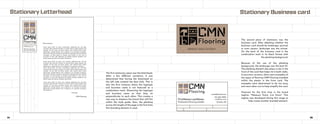
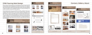
The CMN Flooring style guide is the
piece that encompasses all of the
brand’s styles and specifics. Displaying
the logo type in full color, in white
and in black. The style guide also
features the primary and secondary
type showcased in each letter both
uppercase and lowercase, as well as
numbers and symbols. What is also
prominent in the style guide is the color
swatches that represent CMN Flooring.
The color swatches also contain each
RGB, CMYK, and pantone numbers of
that specific color.
The style guide acts as the final say
when it comes to branding regarding
CMN Flooring. The type font and color
swatches are to remain true to the style
guide in order to properly represent
CMN Flooring. A subtle feature of the
style guide is the grid layout within the
background of the information. The low
opacity grid layout is a foreshadowing
brand style that is later showcased in
the stationary of CMN Flooring.
CMN Flooring Brand Style Guide
12 13
White
ABCDEFGHIJKLMNOPQRSTUVWXYZ
abcdefghijklmnopqrstuvwxyz
1234567890
?!@#$%&*_-~=+;:`’”,./<>^{[}]|()
ABCDEFGHIJKLMNOPQRSTUVWXYZ
abcdefghijklmnopqrstuvwxyz
1234567890
?!@#$%&*_-~=+;:`’”,./<>^{[}]|()
Secondary Type: Transat Text Medium
P#: P102-5 C
#6978BA
C: 69%
M: 53%
Y: 0%
K: 0%
R: 105
G: 120
B: 186
P#: P179-9 C
#808285
C: 0%
M: 0%
Y: 0%
K: 60%
R: 128
G: 130
B: 133
P#: P23-16 C
#56483A
C: 36%
M: 44%
Y: 56%
K: 60%
R: 86
G: 72
B: 58
P#: P23-9 C
#9F856F
C: 36%
M: 44%
Y: 56%
K: 8%
R: 159
G: 133
B: 111
P#: P23-6 C
#B89F8A
C: 30%
M: 36%
Y: 46%
K: 0%
R: 184
G: 159
B: 138
Color Swatches
Primary Type: Ironstrike Stencil Semibold
Black
8. CMN 123.456.7890
email@email.com
cmnfloor.com
FirstName LastName
Professional Flooring Installer Omaha, NE
The first stationary piece was the letterhead.
After a few different variations, it was
determined that having the letterhead on
the left side created the best look. This is
also the first instance where the logotype
and business name is not featured as a
combination mark. Dissecting the logotype
and business name so that they sit
perpendicular to each other. This creates a
new way to displace the brand that still fits
within the style guide. Also, the planking
across the length of the page is the first time
this branding element is used.
The second piece of stationary was the
business card. After debating whether the
business card should be landscape, portrait
or even square, landscape was the winner.
On the back of the business card is the
combination mark in its black format with
the planking background.
Because of the use of the planking
background, the landscape was the best fit.
The planking element also plays a role in the
front of the card that helps tie in both sides.
In previous versions, there were examples of
the types of flooring CMN Flooring installed
within the planks in the front card. The
examples were determined to be too busy
and were taken out to help simplify the card.
Featured for the first time is the brand
tagline: “Measure Twice, Cut Once”. This
tagline was developed during this stage to
help create another branded element.
800 University Drive,
Maryville, MO 64468
CMNflooring.com Lorem ipsum dolor sit amet, consectetuer adipiscing elit, sed diam
nonummy nibh euismod tincidunt ut laoreet dolore magna aliquam erat
volutpat. Ut wisi enim ad minim veniam, quis nostrud exerci tation
ullamcorper suscipit lobortis nisl ut aliquip ex ea commodo consequat.
Duis autem vel eum iriure dolor in hendrerit in vulputate velit esse molestie
consequat, vel illum dolore eu feugiat nulla facilisis at vero eros et
accumsan et iusto odio dignissim qui blandit praesent luptatum zzril
delenit augue duis dolore te feugait nulla facilisi.
Lorem ipsum dolor sit amet, cons ectetuer adipiscing elit, sed dia
nonummy nibh euismod tincidunt ut laoreet dolore magna aliquam erat
volutpat. Ut wisi enim ad minim veniam, quis nostrud exerci tation
ullamcorper suscipit lobortis nisl ut aliquip ex ea commodo consequat.
Lorem ipsum dolor sit amet, consectetuer adipiscing elit, sed diam
nonummy nibh euismod tincidunt ut laoreet dolore magna aliquam erat
volutpat. Ut wisi enim ad minim veniam, quis nostrud exerci tation
ullamcorper suscipit lobortis nisl ut aliquip ex ea commodo consequat.
Duis autem vel eum iriure dolor in hendrerit in vulputate velit esse molestie
consequat, vel illum dolore eu feugiat nulla facilisis at vero eros et
accumsan et iusto odio dignissim qui blandit praesent luptatum zzril
delenit augue duis dolore te feugait nulla facilisi.
Lorem ipsum dolor sit amet, cons ectetuer adipiscing elit, sed diam
nonummy nibh euismod tincidunt ut laoreet dolore magna aliquam erat
volutpat. Ut wisi enim ad minim veniam, quis nostrud exerci tation
ullamcorper suscipit lobortis nisl ut aliquip ex ea commodo consequat.
Ullamcorper suscipit lobortis nisl ut aliquip ex ea commodo consequat.
Duis autem vel
Dear Someone,
Sincerely,
CMN Flooring
Stationary Letterhead Stationary Business card
14 15
9. Measure Twice,
Cut Once.
Stationary Social Media post Stationary Mockup
16 17
The third piece of stationary was the social media post. The social media post
was to consist of the combination mark and a tag line and another element
that connected the brand. I decided to tag the same combination mark from
the letter head and incorporate it into the post. I then copied the tagline from
the business card and implemented it onto the post as well. I finalized the
post with the planking element as the entire background. To give a better
sense of what the social media post looks like, I created an Instagram mockup
that features what the post looks like.
After developing all of the
stationary pieces, it was time
to create one inclusive mockup.
The mockup consisted of the
developed letterhead, business
cards, and the social media
post. I decided to put the social
media post into a phone as well
as on a tablet to help balance
out the mockup. I then used
the planking element for the
background as well, but with a
twist. Instead of the horizontal
planking, I decided to go with
the diagonal planking to create
a more dynamic look.
10. CMN Flooring Web Design Contact, Gallery, About
18 19
The last and most intensive element in the rebranding process was the design of the CMN
Flooring webpage. Instead of building the actual website with coding a such, all that was
required was the design. The CMN Flooring web page is broken down into four different
pages. The home page, the gallery page, the about page, and the contact page. Designing
a website from blank up is very intimidating, but after wire framing and building it out
through a rough draft, it became much easier after that.
The home page describes what services CMN Flooring offers, a slideshow of their recent
installs and what king of installations they carry out. The gallery page is simply blown
up images of their work that users can view. The about page gives a small history of who
CMN Flooring is. Lastly, the contact page is where users could contact CMN Flooring via
their email, phone number, social media platforms and with the traditional contact form.
The main struggle with developing the webpage was starting from scratch. Designing
a website from blank up is very intimidating, but after wire framing and building it out
through a rough draft, it became much easier after that. The snippet featured below is
the “above the fold” image. Otherwise known as the first thing someone sees when they
entire the website.
11. Authors Note
Measure Twice,
Cut Once
The CMN Flooring web design was the last part of the rebranding process during this semester. We went through
nearly every basic step in the rebranding process. Beginning with the mood/concept board. Determining what color
palette and type fonts best describe the company. Then going on to design the logotype and combination of the
company. Then once a logo was developed and a color palette was chosen, a graphics style guide was needing to
be created. Following the style guide was the creation of stationary. Thanks to the rules following the style guide, it
was easy to develop the stationary based off of the style guide. After the development of a letterhead, a business
card, and a social media post, all 3 elements needed to be turned into a mockup. The mockup was the last step of the
stationary process, which was a great transition into the web design. The designing of the company’s website from
scratch was the most intense part as there was a lot of work to do. But the work was very doable, and the website was
created. All that was left after the web design was the process book, describing the journey that was taken in order
to develop the company.
Overall, this was a great process to understand advance graphic design material as well as gain knowledge on what
it means to have a brand, establish a brand, and rebrand. Taking a company that is already existing and optimizing
it’s brand by redesign it completely was a very intriguing and entertaining project. It was a great way to really see the
intricacies that make a brand special and it gave for a great chance to let the creative juices flow.
My favorite part in the rebranding process was developing the stationary. I think making business cards is very
fun and being able to create the business card that I did really made me proud of the work. Also once I developed
the planking on both the business card and social media post, I knew it had to be a company element, which I have
continued to use for the rest of the process.
Flooring
CMN