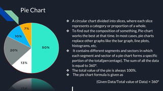
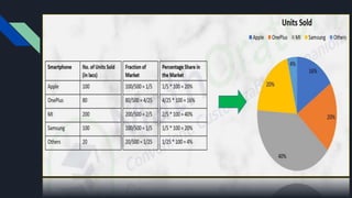
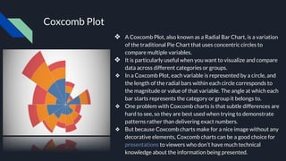
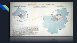
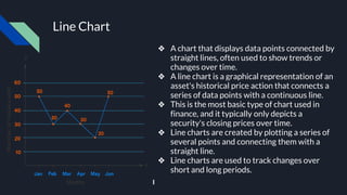
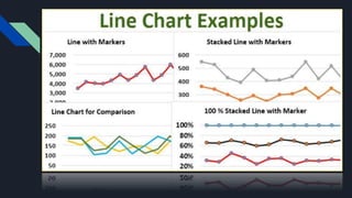
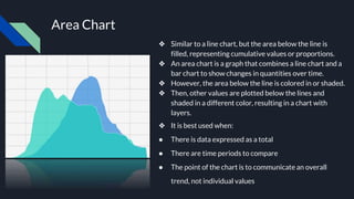
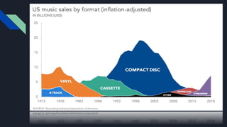
Visualization idioms helps in making our work more presentable by adding graphs and charts to it. These helps in expressing our views and also helps the viewers to understand the text more easily.
3. Data Visualization
❖ Data visualization is defined as a graphical representation that contains the
information and the data.
❖ By using visual elements like charts, graphs, and maps, data visualization
techniques provide an accessible way to see and understand trends, outliers,
and patterns in data.
❖ Data visualization provides an important suite of tools for identifying a
qualitative understanding. This can be helpful when we try to explore the
dataset and extract some information to know about a dataset and can help
with identifying patterns, corrupt data, outliers, and much more.
❖ In the world of Big Data, Data Visualization tools, and technologies are
crucial to analyze massive amounts of information and make data-driven
decisions.
❖ All at last, Data Visualization is another technique of visual art that grabs our
interest and keeps our main focus on the message captured with the help of
eyes.
5. Visualization Idioms
❖ Visualization idioms, also known as visualization techniques or design patterns, refer
to common approaches or strategies used to represent and communicate data
visually. These idioms provide a structured and intuitive way to create visualizations
that effectively convey information.
❖ These idioms provide standardized ways of encoding and presenting data to
effectively communicate insights and patterns to viewers.
❖ They are often based on well-established visual perception principles and best
practices in data visualization.
❖ Idioms provide a foundation for creating effective visualizations and can be
implemented using various libraries or tools, such as D3.js, matplotlib, Tableau, or
ggplot2.
❖ By understanding and applying these visualization idioms, data analysts and designers
can create clear and informative visual representations of data.
6. Some of the visualization idioms include: -
❖ Pie Chart
❖ Coxcomb Plot
❖ Line Chart
❖ Area Chart and many more
7. Pie Chart
❖ A circular chart divided into slices, where each slice
represents a category or proportion of a whole.
❖ To find out the composition of something, Pie-chart
works the best at that time. In most cases, pie charts
replace other graphs like the bar graph, line plots,
histograms, etc.
❖ It contains different segments and sectors in which
each segment and sector of a pie chart forms a specific
portion of the total(percentage). The sum of all the data
is equal to 360°.
❖ The total value of the pie is always 100%.
❖ The pie chart formula is given as
(Given Data/Total value of Data) × 360°
8.
9. Coxcomb Plot
❖ A Coxcomb Plot, also known as a Radial Bar Chart, is a variation
of the traditional Pie Chart that uses concentric circles to
compare multiple variables.
❖ It is particularly useful when you want to visualize and compare
data across different categories or groups.
❖ In a Coxcomb Plot, each variable is represented by a circle, and
the length of the radial bars within each circle corresponds to
the magnitude or value of that variable. The angle at which each
bar starts represents the category or group it belongs to.
❖ One problem with Coxcomb charts is that subtle differences are
hard to see, so they are best used when trying to demonstrate
patterns rather than delivering exact numbers.
❖ But because Coxcomb charts make for a nice image without any
decorative elements, Coxcomb charts can be a good choice for
presentations to viewers who don’t have much technical
knowledge about the information being presented.
10.
11. Line Chart
❖ A chart that displays data points connected by
straight lines, often used to show trends or
changes over time.
❖ A line chart is a graphical representation of an
asset's historical price action that connects a
series of data points with a continuous line.
❖ This is the most basic type of chart used in
finance, and it typically only depicts a
security's closing prices over time.
❖ Line charts are created by plotting a series of
several points and connecting them with a
straight line.
❖ Line charts are used to track changes over
short and long periods.
12.
13. Area Chart
❖ Similar to a line chart, but the area below the line is
filled, representing cumulative values or proportions.
❖ An area chart is a graph that combines a line chart and a
bar chart to show changes in quantities over time.
❖ However, the area below the line is colored in or shaded.
❖ Then, other values are plotted below the lines and
shaded in a different color, resulting in a chart with
layers.
❖ It is best used when:
● There is data expressed as a total
● There are time periods to compare
● The point of the chart is to communicate an overall
trend, not individual values