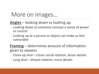
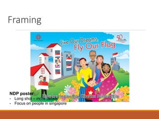
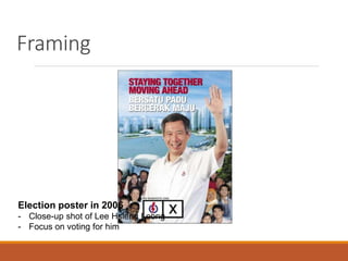
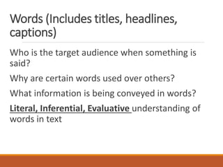
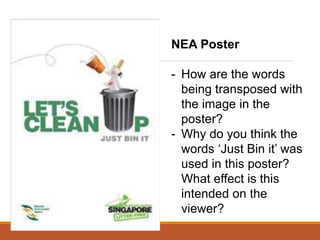
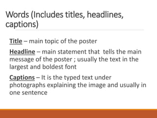
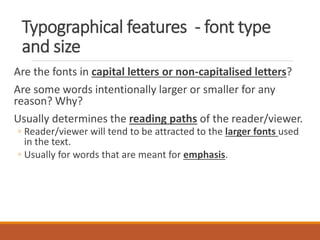
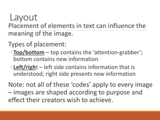
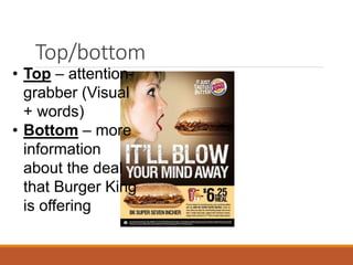
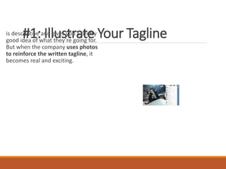
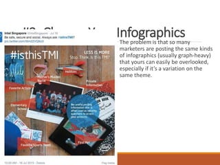
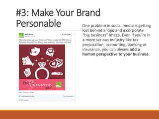
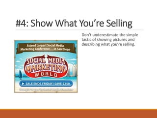
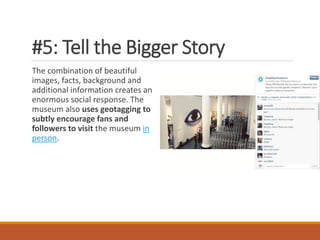
Understanding Visual
Texts
Visual texts
Texts that are created using still or moving
images
May or may not contain words
Television, film, radio, advertising, billboards,
the Internet, computer games and programs, art
works such as paintings, drawings, sculptures,
architecture, book covers, illustrations
Visual Text Comprehension
Understanding images & words in the context it is being
used
◦ Bring life experiences & background knowledge to what is
being read/viewed
All visual texts are influenced by the cultures, values,
ideologies and world views in and through which they
are created & consumed.
◦ Eg. Family photo in your home vs. A family potrait in a magazine
or
◦ Artists’ impression vs. housing agent’s view of a HDB estate
How to interpret visual texts?
We need to first identify the different elements that
make up the text.
These include:
◦ Images
◦ (Colour)
◦ words – includes title, headlines, captions
◦ Typographical features - type of font, font size
◦ Layout – spatial arrangement of different elements in a text
Images…
Images are mental représentations, pictures of objects,
people or animals or any diagram that provides visual
information.
Images in a visual text may contain:
◦ People, animals or object participating in an action
◦ Flow charts, maps or labelled images showing a concept or an
idea
◦ Symbols or icons
What does this
image show?
- Concept/idea
- Desire to
show unity
between
young & old
- Unity between
different races
also
What does this
image show?
- An action – ex –
offender trying to
remove the label
from his back
- Stereotype –
tattooed people are
offenders
More on images…
Angles – looking down vs looking up
◦ Looking down at someone conveys a sense of power
or control
◦ Looking up at a person or object can make us feel
vulnerable
Framing – determines amount of information
given to viewers
◦ Close-up shot – closer social relation, lesser details
◦ Long shot – distant relation, more details
Framing
NDP poster
- Long shot – more details
- Focus on people in singapore
Framing
Election poster in 2006
- Close-up shot of Lee Hsieng Leong
- Focus on voting for him
Words (Includes titles, headlines,
captions)
Who is the target audience when something is
said?
Why are certain words used over others?
What information is being conveyed in words?
Literal, Inferential, Evaluative understanding of
words in text
NEA Poster
- How are the words
being transposed with
the image in the
poster?
- Why do you think the
words ‘Just Bin it’ was
used in this poster?
What effect is this
intended on the
viewer?
Words (Includes titles, headlines,
captions)
Title – main topic of the poster
Headline – main statement that tells the main
message of the poster ; usually the text in the
largest and boldest font
Captions – It is the typed text under
photographs explaining the image and usually in
one sentence
Typographical features - font type
and size
Are the fonts in capital letters or non-capitalised letters?
Are some words intentionally larger or smaller for any
reason? Why?
Usually determines the reading paths of the reader/viewer.
◦ Reader/viewer will tend to be attracted to the larger fonts used
in the text.
◦ Usually for words that are meant for emphasis.
- What are the words
that are meant to
capture viewer’s
attention first?
- What is the next
thing that captures
your attention?
- With regards to the
typographical
features, why do you
think the poster is
created as such?
Layout
Placement of elements in text can influence the
meaning of the image.
Types of placement:
◦ Top/bottom – top contains the ‘attention-grabber’;
bottom contains new information
◦ Left/right – left side contains information that is
understood; right side presents new information
Note: not all of these ‘codes’ apply to every image
– images are shaped according to purpose and
effect their creators wish to achieve.
Top/bottom
• Top – attention-
grabber (Visual
+ words)
• Bottom – more
information
about the deal
that Burger King
is offering
Left side –
reported
natural
disasters in
the country
Right side –
information
about the
services they
are providing
Remembe
r this?
Advertorial by Watsons
Study the placement of
the image with the
products that Watson’s is
trying to sell. Notice that
the testimonies of the
experts are placed before
the products they are
selling.
Why do you think the
layout is as such?
How to Combine Text and Visual
Content for Better Social
Engagement
#1: Illustrate Your Tagline
is descriptive and gives you a pretty
good idea of what they’re going for.
But when the company uses photos
to reinforce the written tagline, it
becomes real and exciting.
#2: Change Your Infographics
The problem is that so many
marketers are posting the same kinds
of infographics (usually graph-heavy)
that yours can easily be overlooked,
especially if it’s a variation on the
same theme.
#3: Make Your Brand
Personable One problem in social media is getting
lost behind a logo and a corporate
“big business” image. Even if you’re in
a more serious industry like tax
preparation, accounting, banking or
insurance, you can always add a
human perspective to your business.
#4: Show What You’re Selling
Don’t underestimate the simple
tactic of showing pictures and
describing what you’re selling.
#5: Tell the Bigger Story
The combination of beautiful
images, facts, background and
additional information creates an
enormous social response. The
museum also uses geotagging to
subtly encourage fans and
followers to visit the museum in
person.
#6: Create Text Overlays
Think about what gets your customers
excited about your product and come up
with short phrases that convey that
feeling.
Pair the phrases with an
image that reinforces both your product
and your customers’ sentiment for a
winning engagement combination.
#7: Ask for Fan Stories
It’s an easy way to encourage
more audience participation while
pointing the spotlight at those
fans—and it highlights your
products being used by happy
customers.
Recap…
Different elements of visual texts:
◦ Images
◦ (Colour)
◦ words – includes title, headlines, captions
◦ Typographical features - type of font, font size
◦ Layout – spatial arrangement of different elements in a text
Task
Kingsway Unit 3 Paper 2

visual textcomprehension MIL 12.ppt

  • 1.
  • 2.
    Visual texts Texts thatare created using still or moving images May or may not contain words Television, film, radio, advertising, billboards, the Internet, computer games and programs, art works such as paintings, drawings, sculptures, architecture, book covers, illustrations
  • 3.
    Visual Text Comprehension Understandingimages & words in the context it is being used ◦ Bring life experiences & background knowledge to what is being read/viewed All visual texts are influenced by the cultures, values, ideologies and world views in and through which they are created & consumed. ◦ Eg. Family photo in your home vs. A family potrait in a magazine or ◦ Artists’ impression vs. housing agent’s view of a HDB estate
  • 4.
    How to interpretvisual texts? We need to first identify the different elements that make up the text. These include: ◦ Images ◦ (Colour) ◦ words – includes title, headlines, captions ◦ Typographical features - type of font, font size ◦ Layout – spatial arrangement of different elements in a text
  • 5.
    Images… Images are mentalreprésentations, pictures of objects, people or animals or any diagram that provides visual information. Images in a visual text may contain: ◦ People, animals or object participating in an action ◦ Flow charts, maps or labelled images showing a concept or an idea ◦ Symbols or icons
  • 6.
    What does this imageshow? - Concept/idea - Desire to show unity between young & old - Unity between different races also
  • 7.
    What does this imageshow? - An action – ex – offender trying to remove the label from his back - Stereotype – tattooed people are offenders
  • 8.
    More on images… Angles– looking down vs looking up ◦ Looking down at someone conveys a sense of power or control ◦ Looking up at a person or object can make us feel vulnerable Framing – determines amount of information given to viewers ◦ Close-up shot – closer social relation, lesser details ◦ Long shot – distant relation, more details
  • 9.
    Framing NDP poster - Longshot – more details - Focus on people in singapore
  • 10.
    Framing Election poster in2006 - Close-up shot of Lee Hsieng Leong - Focus on voting for him
  • 11.
    Words (Includes titles,headlines, captions) Who is the target audience when something is said? Why are certain words used over others? What information is being conveyed in words? Literal, Inferential, Evaluative understanding of words in text
  • 12.
    NEA Poster - Howare the words being transposed with the image in the poster? - Why do you think the words ‘Just Bin it’ was used in this poster? What effect is this intended on the viewer?
  • 13.
    Words (Includes titles,headlines, captions) Title – main topic of the poster Headline – main statement that tells the main message of the poster ; usually the text in the largest and boldest font Captions – It is the typed text under photographs explaining the image and usually in one sentence
  • 14.
    Typographical features -font type and size Are the fonts in capital letters or non-capitalised letters? Are some words intentionally larger or smaller for any reason? Why? Usually determines the reading paths of the reader/viewer. ◦ Reader/viewer will tend to be attracted to the larger fonts used in the text. ◦ Usually for words that are meant for emphasis.
  • 15.
    - What arethe words that are meant to capture viewer’s attention first? - What is the next thing that captures your attention? - With regards to the typographical features, why do you think the poster is created as such?
  • 16.
    Layout Placement of elementsin text can influence the meaning of the image. Types of placement: ◦ Top/bottom – top contains the ‘attention-grabber’; bottom contains new information ◦ Left/right – left side contains information that is understood; right side presents new information Note: not all of these ‘codes’ apply to every image – images are shaped according to purpose and effect their creators wish to achieve.
  • 17.
    Top/bottom • Top –attention- grabber (Visual + words) • Bottom – more information about the deal that Burger King is offering
  • 18.
    Left side – reported natural disastersin the country Right side – information about the services they are providing
  • 19.
    Remembe r this? Advertorial byWatsons Study the placement of the image with the products that Watson’s is trying to sell. Notice that the testimonies of the experts are placed before the products they are selling. Why do you think the layout is as such?
  • 20.
    How to CombineText and Visual Content for Better Social Engagement
  • 22.
    #1: Illustrate YourTagline is descriptive and gives you a pretty good idea of what they’re going for. But when the company uses photos to reinforce the written tagline, it becomes real and exciting.
  • 23.
    #2: Change YourInfographics The problem is that so many marketers are posting the same kinds of infographics (usually graph-heavy) that yours can easily be overlooked, especially if it’s a variation on the same theme.
  • 24.
    #3: Make YourBrand Personable One problem in social media is getting lost behind a logo and a corporate “big business” image. Even if you’re in a more serious industry like tax preparation, accounting, banking or insurance, you can always add a human perspective to your business.
  • 25.
    #4: Show WhatYou’re Selling Don’t underestimate the simple tactic of showing pictures and describing what you’re selling.
  • 26.
    #5: Tell theBigger Story The combination of beautiful images, facts, background and additional information creates an enormous social response. The museum also uses geotagging to subtly encourage fans and followers to visit the museum in person.
  • 27.
    #6: Create TextOverlays Think about what gets your customers excited about your product and come up with short phrases that convey that feeling. Pair the phrases with an image that reinforces both your product and your customers’ sentiment for a winning engagement combination.
  • 28.
    #7: Ask forFan Stories It’s an easy way to encourage more audience participation while pointing the spotlight at those fans—and it highlights your products being used by happy customers.
  • 29.
    Recap… Different elements ofvisual texts: ◦ Images ◦ (Colour) ◦ words – includes title, headlines, captions ◦ Typographical features - type of font, font size ◦ Layout – spatial arrangement of different elements in a text
  • 30.

Editor's Notes

  • #14 Letter u is replaced with a rubbish bin – to show how ‘cleaning up’ can be done Just bin it – inspired by nike slogan. Creation of sense of familiarity with the audience to encourage them to throw rubbish in it respecti
  • #17 Clearance sale – big fonts/colours used 70% Emphasis on the clearance sale which has up to 70% discount
  • #21 Testimonies by experts given first so that audience will have the impression that Watson’s has expert knowledge of hair Image of girl with great hair put alongside product to influence the audience to buy those products – i.e. if you buy these, you will have such greatlooking hair.