Download to read offline
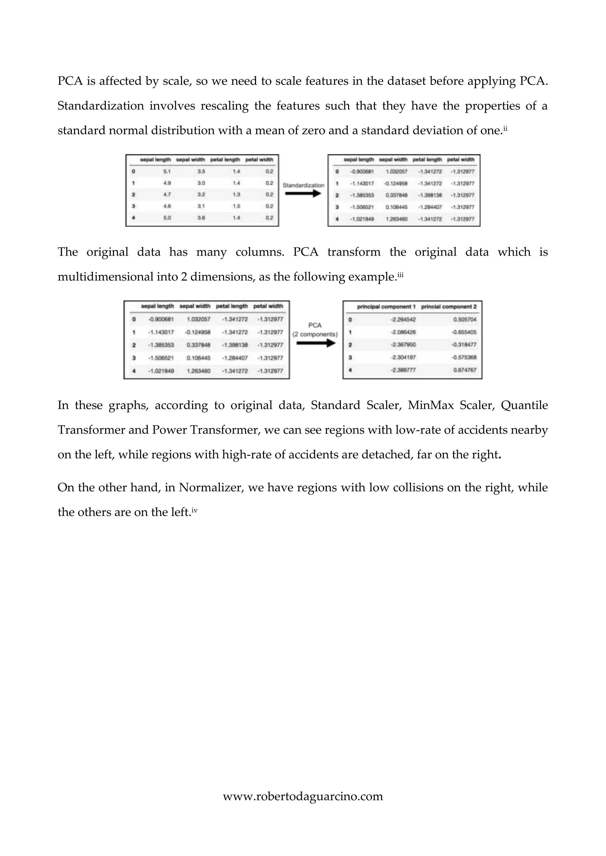
![www.robertodaguarcino.com
Figure 3: MinMaxScaler rescales the data set such that all feature values are in the range [0, 1].
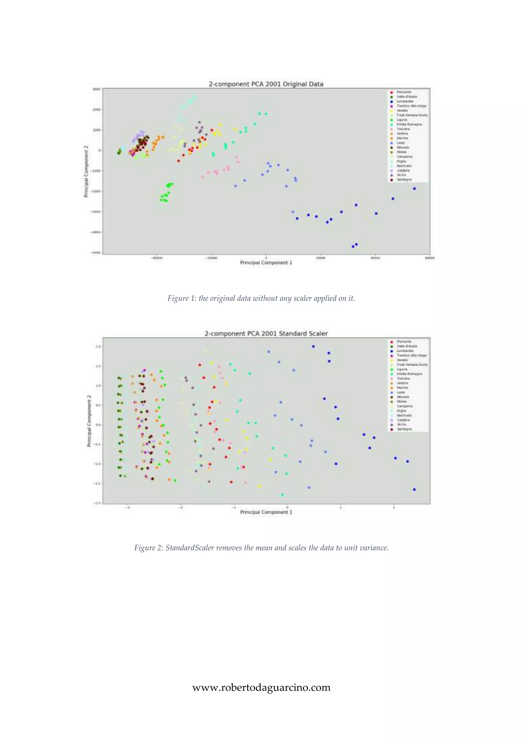
Figure 4: The Normalizer rescales the vector for each sample to have unit norm, independently of the distribution of the samples.](https://image.slidesharecdn.com/visualanalyticsreport-190117150216/75/Visual-Analytics-Traffic-Collisions-in-Italy-6-2048.jpg)
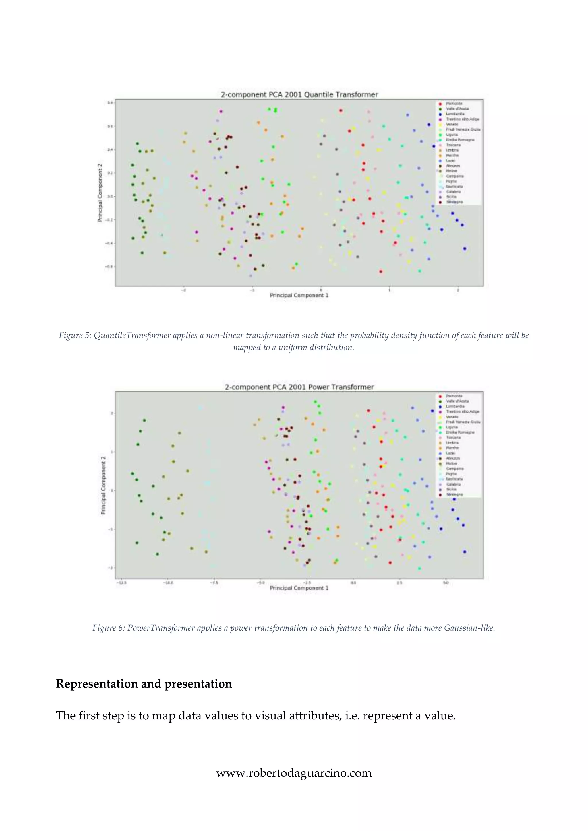
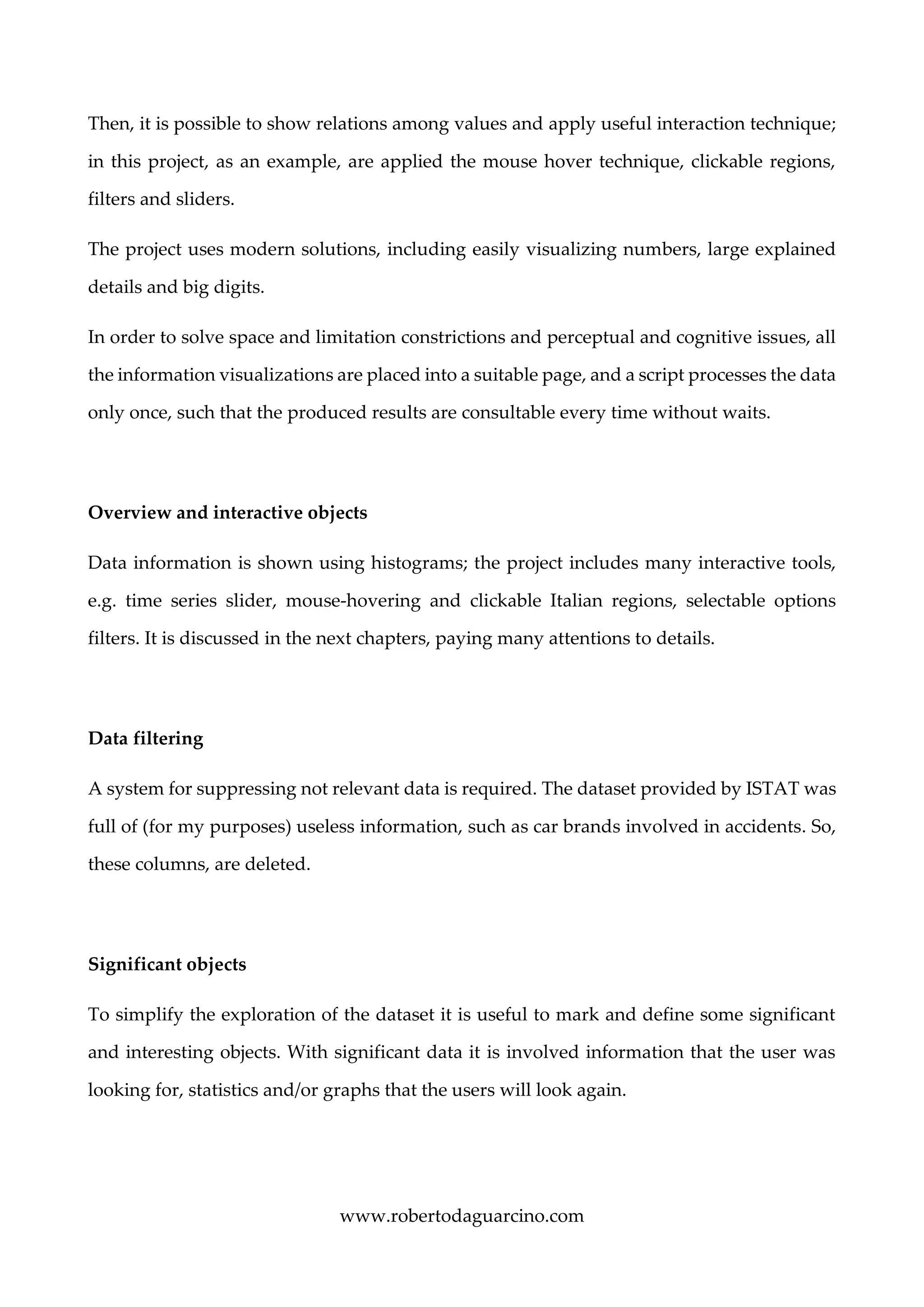


The document describes a visual analytics project analyzing traffic collision statistics in Italy. It uses an interactive dashboard with an Italy map, histograms, and sliders to filter data by year, region, and other factors. Principal component analysis is applied to reduce the dataset dimensions before representation. The dashboard allows users to gain insights through interactive exploration of quantitative relationships between variables like accident rates in different regions.