Download as PDF, PPTX
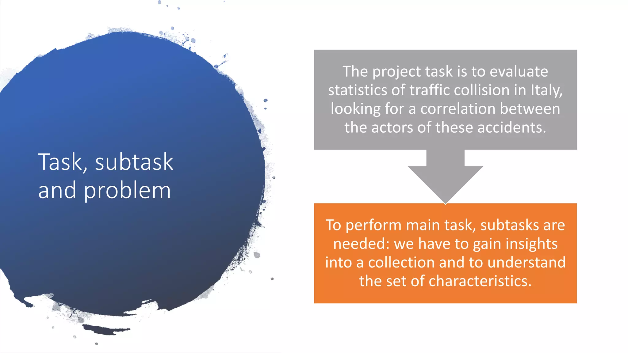
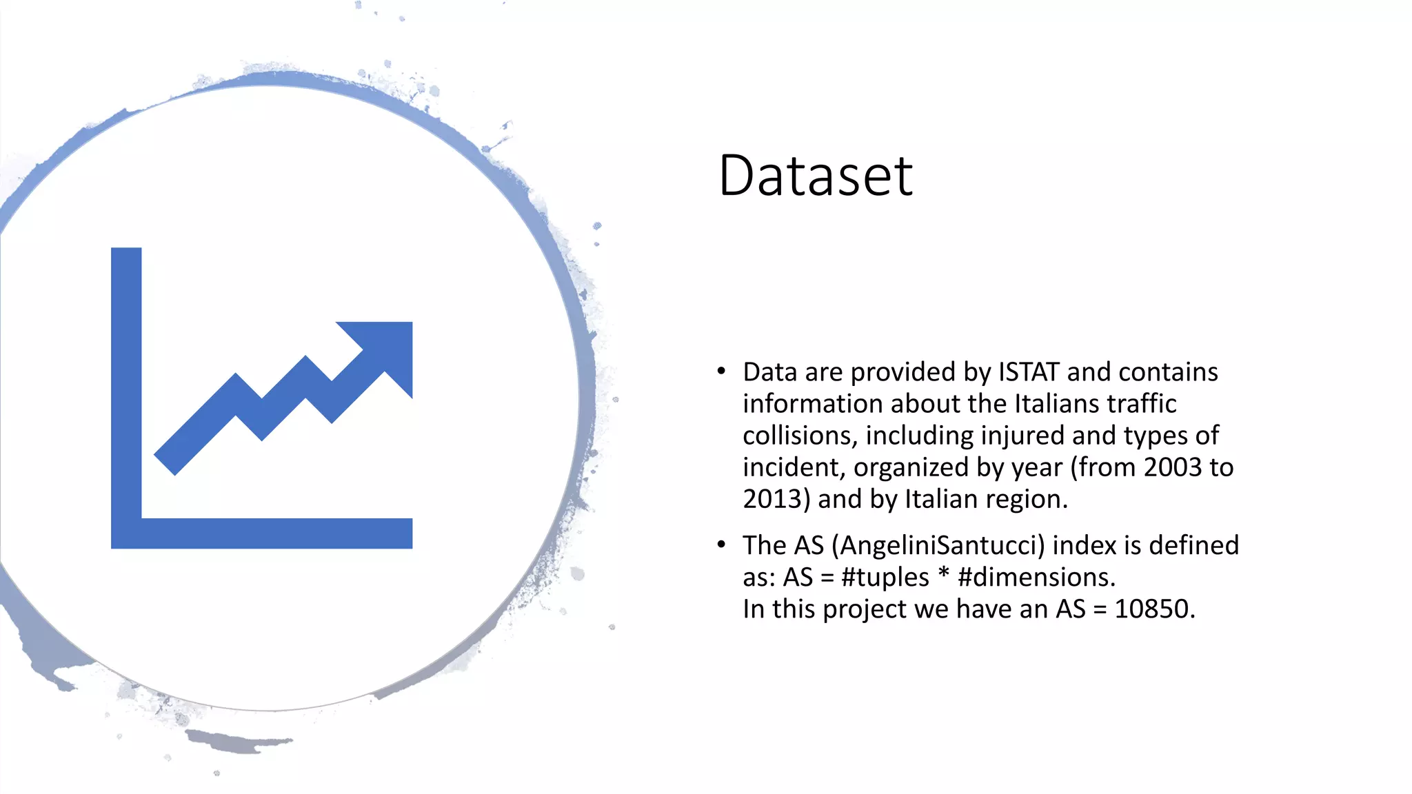
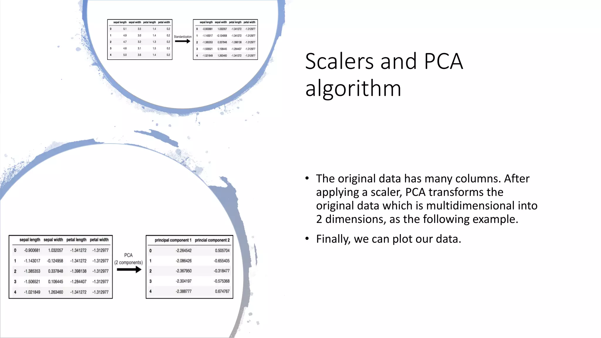
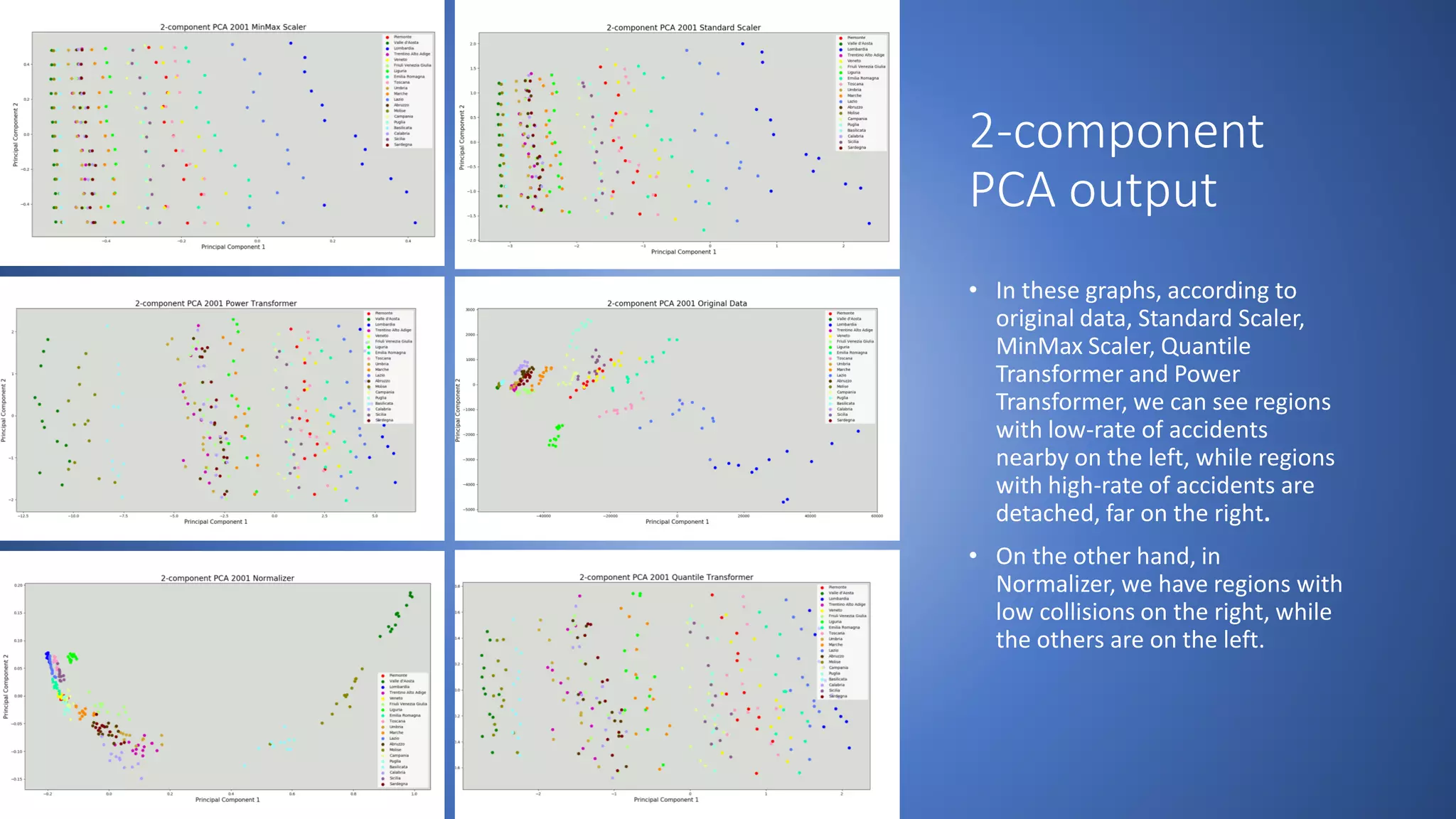
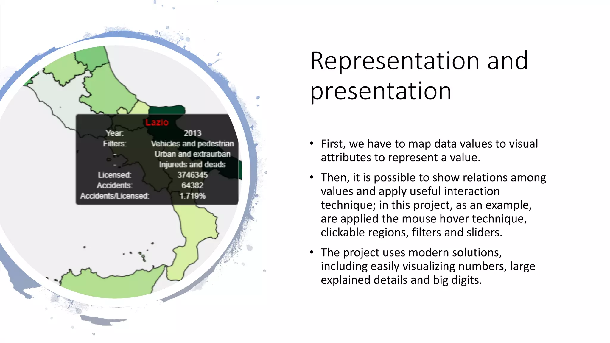
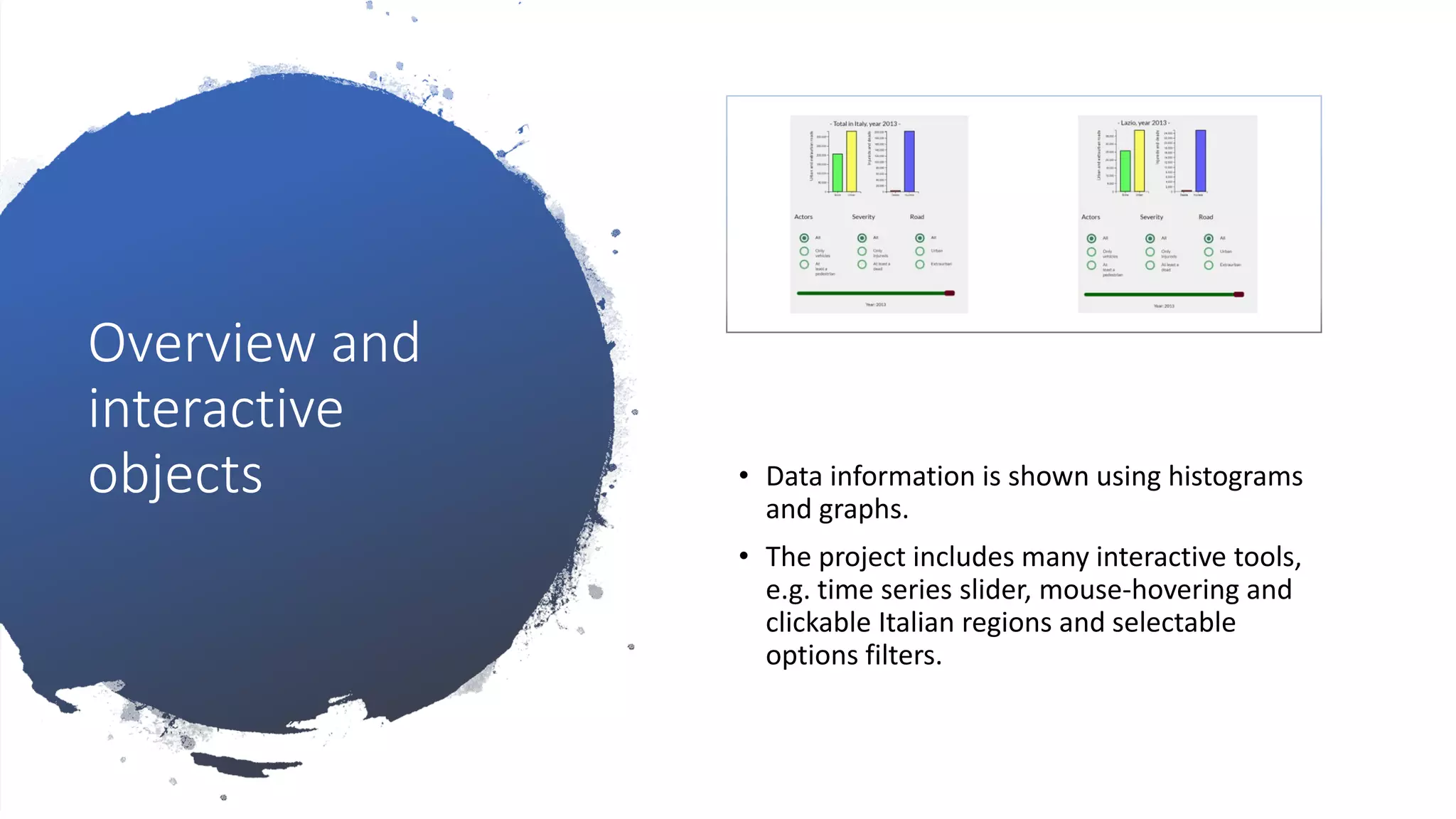
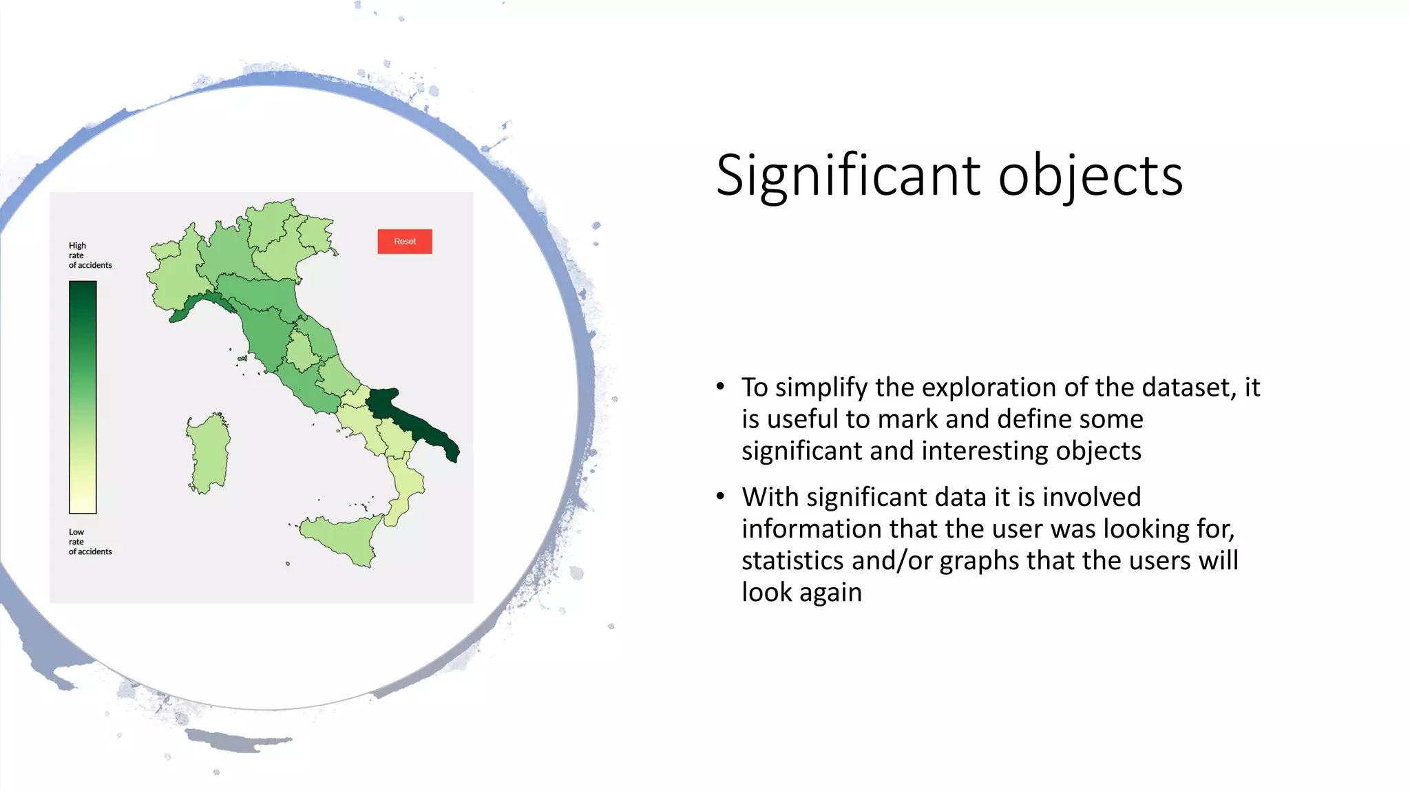
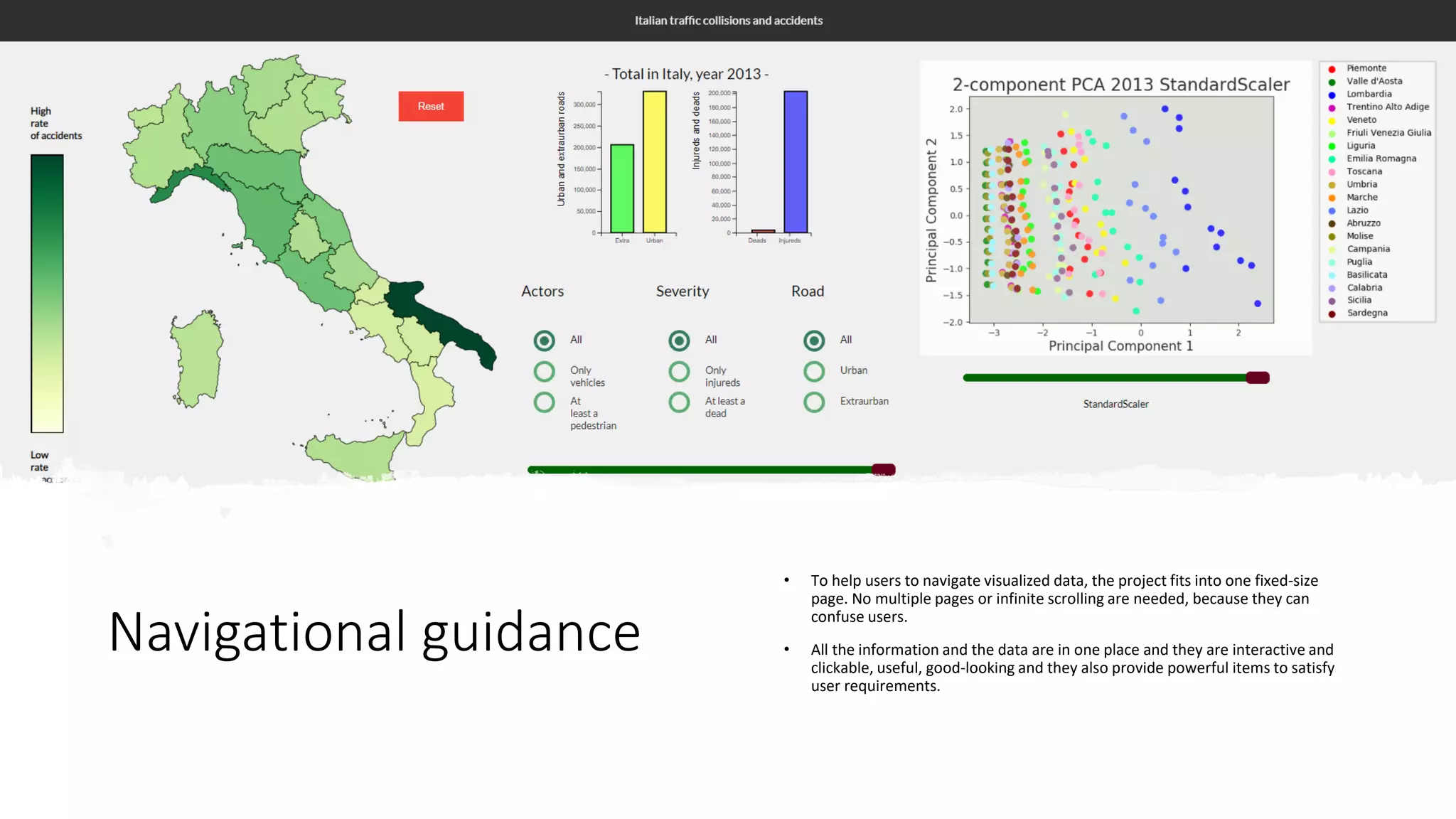
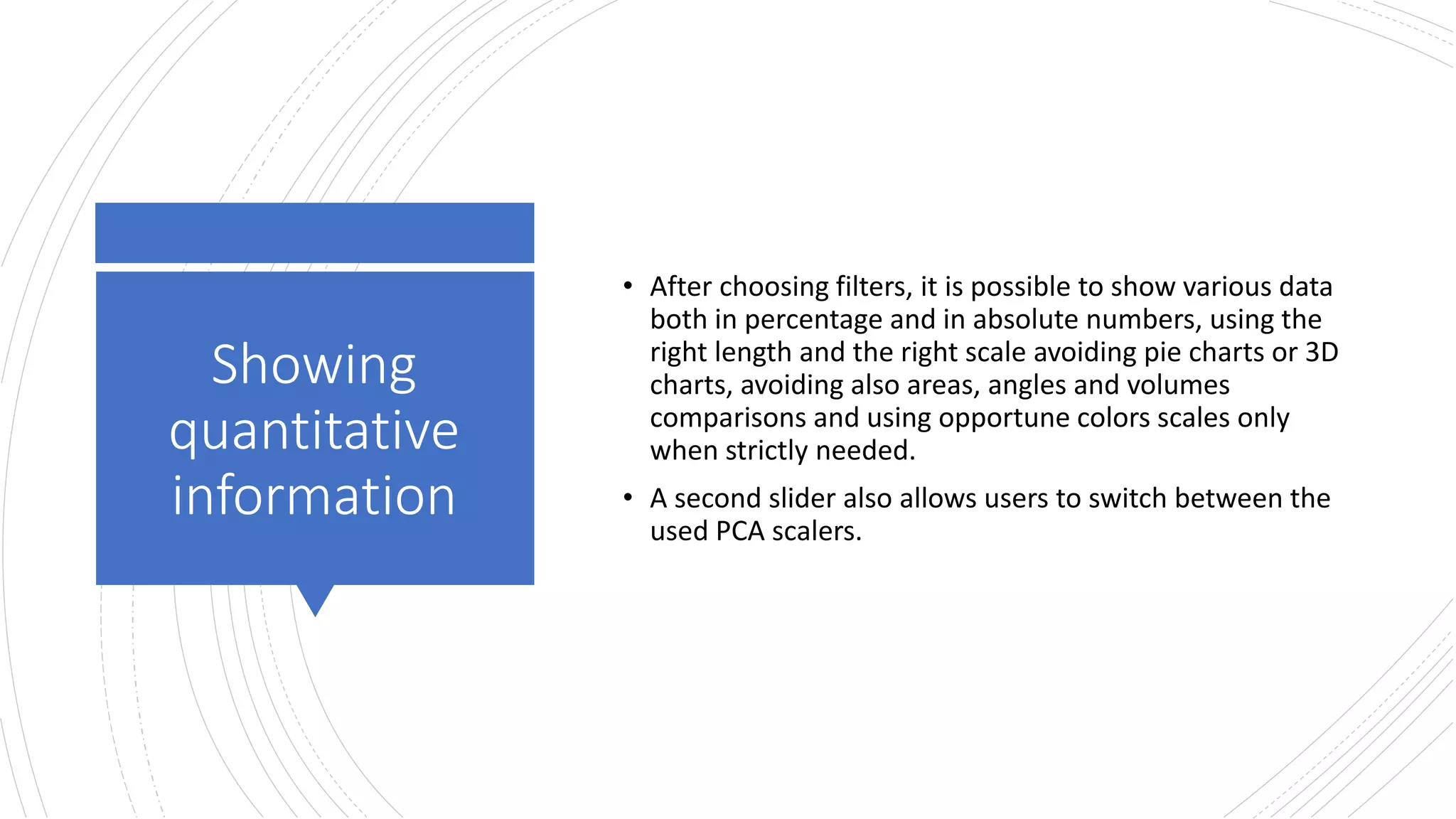
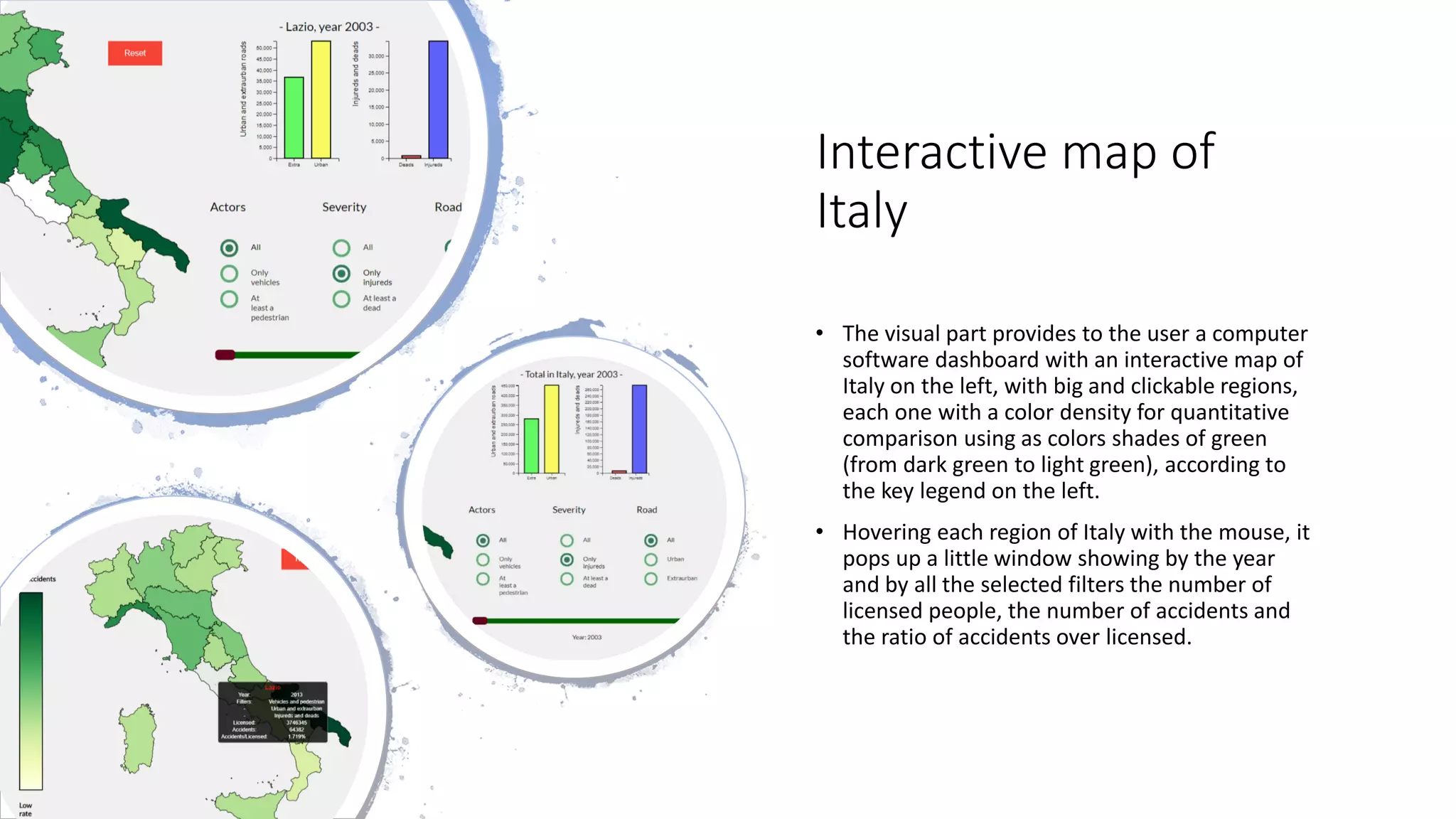
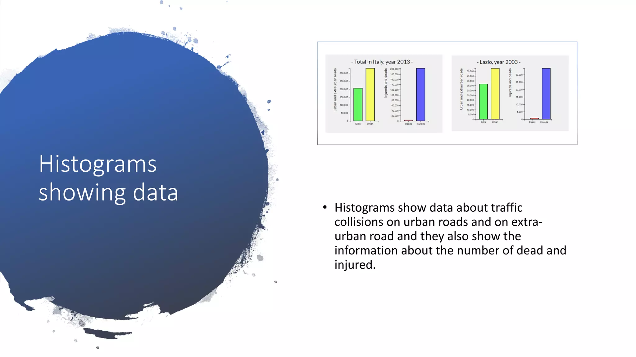
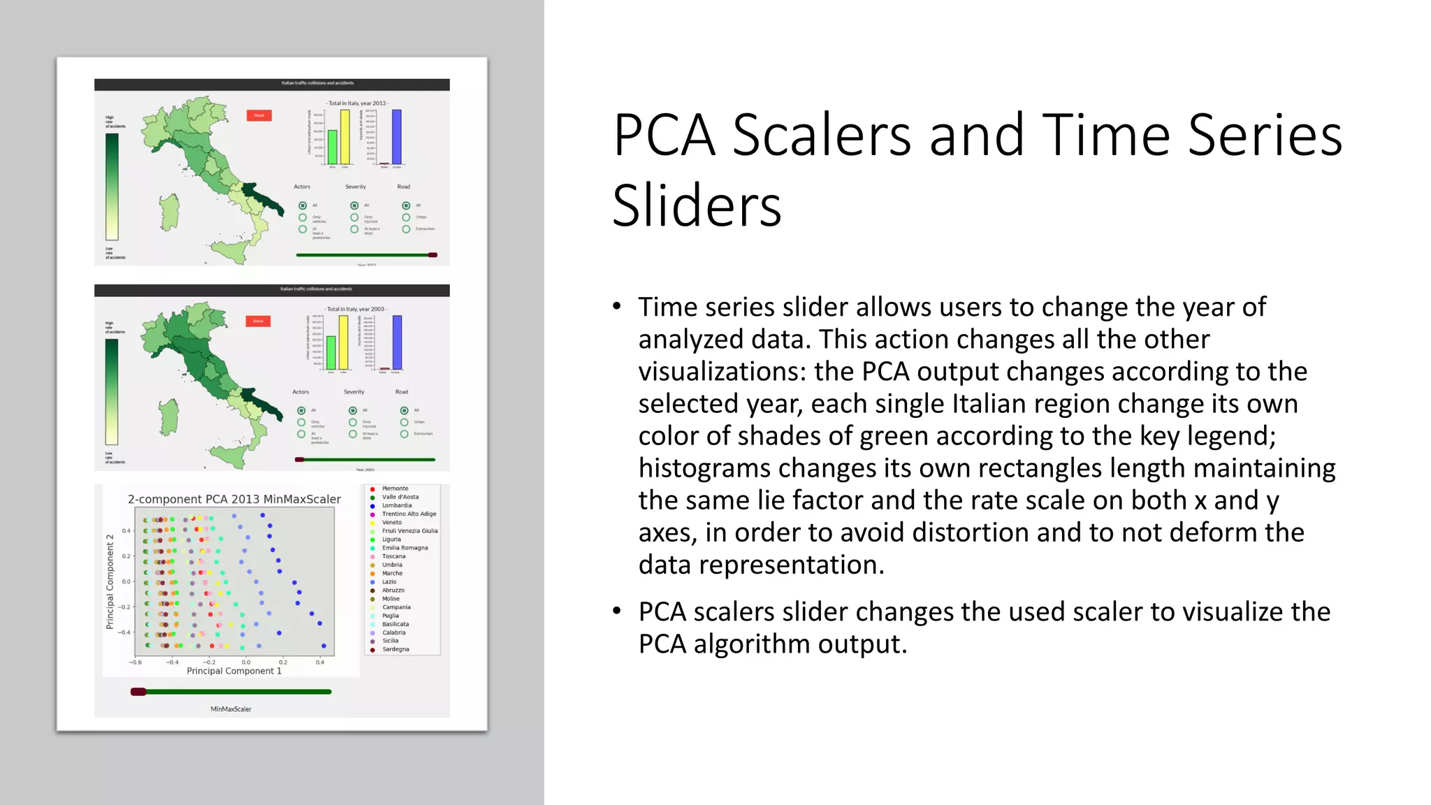


This document describes a visual analytics project analyzing traffic collision data in Italy from 2003 to 2013. It discusses the tasks, dataset, data preprocessing with PCA, and various visualizations and interactive elements in the dashboard, including an interactive map of Italy, histograms, and slider filters for year and PCA scaler. The project aims to provide insights into traffic collisions and identify relationships between different factors.