United States Fatal Road Collisions, 2000-2014
Karan Kashyap & Ekta Ahuja
University of Maryland
ABSTRACT
The purpose of the project is to visualize how motor vehicle
collisions have occurred in the United States in the past fourteen
years from 2000-2014 using tableau. We have primarily focused on
casualties that have occurred state-wise and visualize trends in
collisions across the day of the week and specific time slots.
Furthermore, we have made use of infographic elements to make the
dashboard intuitive and user-friendly.
Keywords: Visualization, collision, casualties, infographic,
Tableau
INTRODUCTION
Motor vehicle deaths have been a great cause of concern in the
United States. In the year 2012 on an average 92 people were killed
every day due to road accidents, a total of 30,800 fatal crashes
occurred during that year. However, in the last few decades, this
number has been on the decline, but still holds a lot of importance
from an analysis point of view. Furthermore, we also wanted to
compare these road mishaps with each state in the US. The dataset
downloaded from NHTSA (National Highway Traffic Safety
Administrations) offers a statistical overview of the road accidents
that involved passengers, pedestrians, passengers, pedal cyclist and
other interesting variables. Very often we have seen that just
conducting statistical analysis is not enough. Therefore, in this
project, we strive to create an interactive dashboard, which will be
understood by everyone and depicts all the necessary information,
which we want to convey.
1. RELATED WORK
Visualizing road accidents can be a bit tricky as it involves a lot
of factors like over speeding, driver age, vehicle category, date &
time and location, DUI etc. and thus, requires a lot of understanding
of which factors to take into consideration to effectively display the
data.
Identifying interesting variables and the correlation, which exists
between them, is a key aspect of visualizing data. For example
conducting a spatial analysis by the hour of the day and depicting
each collision as a data point (Linhua Li, Li Zhu & Daniel Z. Sui,
2007). This paper visualizes temporal data using a 3D technique,
which makes it difficult to view the variations at different levels in
the visualization. In our project, we aim to follow a different
approach and use a more subtle and simpler visualization technique.
Similarly (John D. Lee, 2007) talks about the various technology
distractions that lead to accidents of young drivers.
 Karan Kashyap is a Master of Information management Student in
University of Maryland, College Park. E-mail: karan26@umd.edu.
 Ekta Ahuja is a Master of Information management Student in
University of Maryland, College Park. E-mail: emahuja@umd.edu
However, it does not talk about other factors like alcohol influence,
texting while driving, over speeding etc. that we will try to visualize
in our dashboard
Data visualizations can become tricky if the visualization created
is not intuitive. Complex visualizations defeat the very purpose of
visualizing data. One of the most popular methods of visualization
is the map visualization. It effectively displays data across a large
area and can be easily understood. In our project, we aim to visualize
all the collision data we have across the various states of the US. A
similar visualization was created by BBC (Audrey Watters, 2011),
in this visualization; the collisions that happened in the UK between
1999 and 2010 are mapped on the map of UK. Collisions are
depicted through light point, where brighter the light, more the
number of collisions in that particular region. Another way of
visualizing this information can be in the form of a heat map
(Damon Lavrinc, 2013);(Brian N Hilton, 2012). This article talks
about visualizing collisions using different color schemes on a heat
map.
It is very often considered that most of the motor vehicle
casualties consist of a large number of male drivers. (Heidi Worley,
2006), further backs this claim by stating a number of statistics
describing how mainly it is the males who dies in a road accident
which accounts for 73 percent of the total deaths, which leads to a
lot of economic hardships due to the loss of a breadwinner especially
in a developing country. This article mainly talks about road
accidents worldwide and is specifically aimed at developing
countries however our project is only focused on road accidents in
the United States.
Our dataset consists of a rich variety of variables like date and
time of collision, weather condition, type of vehicle, collisions
across each month, and collision due to DUI etc. which we aim to
visualize in order to find some interesting trends. A similar
visualization approach has been used earlier by Maps data based in
the UK, wherein they have mapped all the collisions on the map
along with important details like, area, date and time, the police
force in charge etc. (Mapping Car crashes in the UK). However, our
end product varies in a way that along with an interactive map we
also want to take into consideration other interesting factors like
gender, age, type of casualty etc.
Similarly, another interesting factor that can be taken into
consideration is the type of road user, e.g. cyclist, pedestrian,
motorcyclist etc. (Katie Leach-Kemon, 2014). This article visualizes
death due to diseases caused by motor emissions and categorizes
road accident casualties by type of road user, which can be a good
addition for our project. A unique way of visualizing temporal
collision data can be in the form of a calendar (Randy, 2012), which
visualizes the trends of fatal crashes. However, it is more of an
infographic and less of an interactive visualization. Another form of
calendar visualization can be a calendar heat map, which uses a
color scheme to signify the number of collisions taking place during
that period (Nathan Yau, 2013)
A wide variety of visualization software is being used to
effectively unearth the mystery behind data. The Virginia
department of Transportation has taken the power of visualization
to a whole new level. Since 2013 they have been using tableau for
creating interactive maps to find specific locations and roads, which
are more prone to accidents (Lalita Clozel, 2014). For our project,
we do not have specific location data but we do have collision data
by states, which can be visualized on a map to make the visualization
more intuitive.
What we want to visualize will be closest to what (Every Death
on Every U.S. road 2004-2013, 2015) visualized. It has an
interactive map visualization displaying all collision death across
each location in the United States. While this focusses more on
location, our visualization will build on it and take into
consideration other factors like over speeding, alcohol influence,
weather condition etc. and provide a complete visualization that is
intuitive. Thus, we have reviewed all the work that has been done
on road accidents in the US as well as worldwide and hope to
successfully use this information to create a unique visualization.
The following sections will provide an overview of the steps we
undertook for the completion of our dashboard right from the design
phase to the final product.
2. IMPLEMENTATION
In order to create this dashboard, we downloaded the dataset from
NHTSA (National Highway Traffic Safety Administration). We
have focused on the year range 2000-2014. The creation of our final
dashboard is divided into four phases: design phase which helped us
decide the visual elements we wanted to include, the alpha release
helped us create a basic visualization using our dataset, the beta
release was our final release prototype and our final release includes
few modifications we incorporated from our beta release.
2.1. DESIGN
For the design phase, we wanted to sketch out a couple of
visualizations to see how our dataset can be used for creating them.
We thought of two designs out of which we were able to
successfully incorporate the map visualization. The calendar heat
map was not supported by our dataset and was not included in the
later stages of our process.
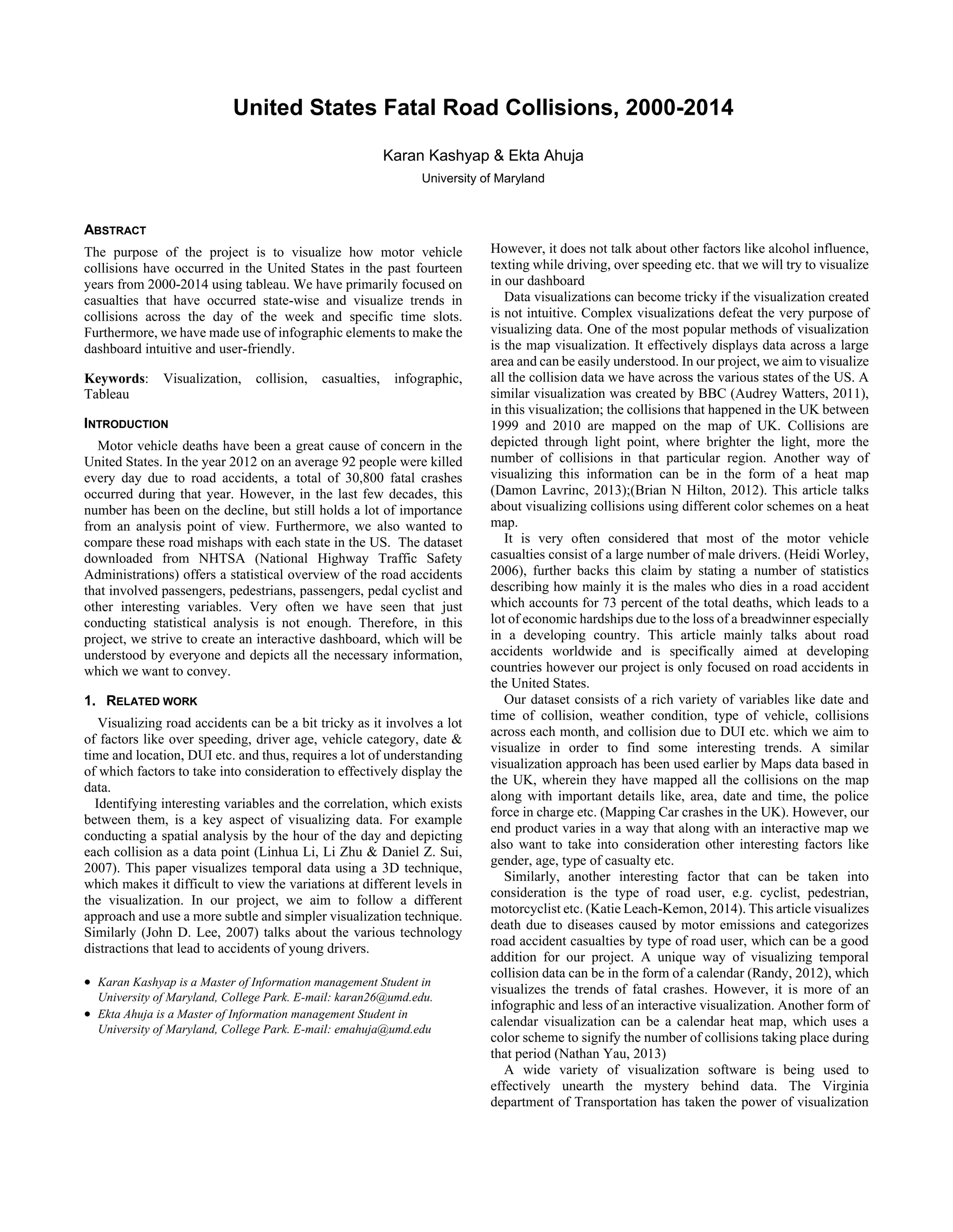
Map visualization:
This visualization focuses on the different states of US depicting
every fatal collision that occurred in the past ten years from 2004-
2014. We have tried to depict the crashes using the red marker;
denser the marker more the number of collision in that particular
region. Thus, as per our map visualization the number of collisions
is the greatest in New York, Boston, Miami, San Francisco and
Phoenix. Furthermore, we have incorporated a zoomed-in version;
in which if the user will hover over a particular location, a table will
be displayed stating all the statistics in that region related to car
collisions. There is a drop-down button due to which the user can
select the year in which he is interested.
Figure 1
Calendar heat map
The second visualization that we created was that of a year wide heat
map depicting fatal crashes. Darker is the shading more is the
number of collisions on that day of the week and month. As per our
heat map, the collisions are highest on New Year’s and the trend
continues to show more crashes on weekends. Also, the crashes are
less during winters as people generally stay indoors and prefer not
to travel.
2.2. ALPHA RELEASE
After initial design process was clear, we decided to use Tableau as
the tool for creating our visualizations. For our alpha release, we
first wanted to observe how our visualization works for a subset of
our data and thus used only the year 2014 for our analysis. We
decided on creating a dashboard with all the visualizations in one
place making it more user-friendly. Our main focus for the alpha
release was to get acquainted with tableau and the different
functionalities we can leverage from it for the creation of our final
dashboard.
The alpha release can be divided as follows
Data Cleaning
One of the most important activities conducted during the alpha
release was structuring the data in the way that would be appropriate
to create the visualizations we had in mind. The data was only
available one year at a time, therefore, we had to merge all the
discrete data sets of all the years to have a consolidated view.
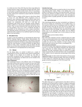
State-wise map visualization
We zeroed on using a map visualization technique as it gives a good
overview of your data with different techniques like filtering and
color coding that can further enhance the visual appeal of the
dashboard. The map visualization which we created for our alpha
release was just for the year 2014 and shows state wise distribution
of the number of drivers, pedestrians and passengers killed during
that year.
Stacked Bar Graph: In order to find certain patterns in the age group
of drivers we created a stacked bar graph, which shows the number
of fatal crashes for a particular age group in all states. The age
groups covered by this graph are 21-24, 25-34, and 35-44.
Figure 2
2.3. BETA RELEASE
The alpha release gave us a good overview of our data as well as a
good grip over the functionalities of tableau. It helped us understand
our data better and decide upon which visualizations to include
towards our final dashboard. The alpha release also helped us
identify some of our key variables as well as some of the limitations
of our data. For our beta release, we have focused on the map
visualization and finding patterns in accidents occurring at specific
time and days of the week. Since the data we had was in the range
2000-2014 we also thought of visualizing it using a time series
navigation bar. The time series navigation bar was the closest we
could get to the calendar heat map, proposed during the initial design
process. Furthermore, we have tried to incorporate a few infographic
elements to enhance the visual appeal of our dashboard. The
dashboard, which we created for the beta release, can be divided into
4 different visualizations.
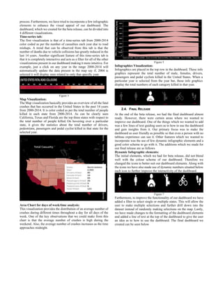
Time-series tab:
The first visualization is that of a time-series tab from 2000-2014
color coded as per the number of casualties each year due to road
mishaps. A trend that can be observed from this tab is that the
number of deaths due to vehicle collisions has greatly reduced in the
last 14 years. Another significant feature of this time-series tab is
that it is completely interactive and acts as a filter for all of the other
visualizations present in our dashboard making it more intuitive. For
example, just a click on any year in the range 2000-2014 will
automatically update the data present in the map say if, 2004 is
selected it will display stats related to only that specific year.
Figure 3
Map Visualization:
The Map visualization basically provides an overview of all the fatal
crashes that has occurred in the United States in the past 14 years
from 2000-2014. It is color coded as per the total number of people
killed in each state from 2000-2014. As can be clearly seen
California, Texas and Florida are the top three states with respect to
the total number of people killed. On hovering over a particular
state, it gives the statistics about the total number of drivers,
pedestrians, passengers and pedal cyclist killed in that state for the
selected year.
Area Chart for days of week/time analysis:
This visualization provides the distribution of an average number of
crashes during different times throughout a day for all days of the
week. One of the key observations that we could make from this
chart is that the average number of crashes is high during the
weekend. Also, the average number of crashes increases as the time
approaches midnight.
Figure 5
Infographics Visualization:
Infographics are placed in the top row in the dashboard. These info
graphics represent the total number of male, females, drivers,
passengers and pedal cyclists killed in the United States. When a
particular year is selected from the year bar, these info graphics
display the total numbers of each category killed in that year.
2.4. FINAL RELEASE
At the end of the beta release, we had the final dashboard almost
ready. However, there were certain areas where we wanted to
improve our dashboard. One of the things which we wanted to add
was a few lines of text guiding users as to how to use the dashboard
and gain insights from it. Our primary focus was to make the
dashboard as user friendly as possible so that even a person with no
tableau experience can use it. Other features which we wanted to
incorporate was the use of few dynamic infographic elements and a
good color scheme to go with it. The additions which we made for
our final release are as follows
Dynamic Infographic elements:
The initial elements, which we had for beta release, did not blend
well with the colour scheme of our dashboard. Therefore we
changed the icons to better suit our dashboard elements. Along with
the icons we have also made use of dynamic numbers situated below
each icon to further improve the interactivity of the dashboard.
Figure 7
Furthermore, to improve the functionality of our dashboard we have
added a filter to select single or multiple states. This will allow the
user to make multiple selections and further drill down into the
dataset instead of randomly making selections on the map. Lastly,
we have made changes to the formatting of the dashboard elements
and added a line of text at the top of the dashboard to give the user
an idea as to how to use the dashboard. The final dashboard we
created can be seen below
Figure 8
3. RESULTS
The key patterns, which we could find using, this data from the year
2000-2014 are as follows:
1. The states of California, Texas and Florida has the
maximum number of road casualties in the past fourteen
years.
2. The total road casualty has declined gradually from
41,941 in the year 2000 to 32,688 in the year 2014.
3. The average number of fatal crashes is higher during the
days Friday, Saturday and Sunday and gradually peaks as
one approaches midnight.
4. The District of Columbia has the least number of traffic
casualties with just 618 cases in the last fourteen years.
4. CONCLUSION
Based on our results and findings we conclude that even though
the number of fatal road crashes has been declining over the past
few years, the number of crashes currently taking place is still too
large. As can be seen from our results District of Columbia has only
618 traffic casualties in the last fourteen years which is a testimony
to the fact that stringent laws and regular inspection of drivers can
help to curb accidents. As a future scope of our current work we aim
to gather data of each location where a collision has occurred. This
will help us to find patterns in road accidents at a particular location
and can help to curb further accidents at that location. Furthermore,
we can focus on other variables like weather conditions DUI and age
group of drivers.
ACKNOWLEDGEMENTS
We wish to thank Dr. Niklas Elmqvist, director HCI, University of
Maryland for his constant support and guidance for the successful
completion of this project.
REFERENCES
[1] Li, L., Zhu, L., & Sui, D. Z. (2007). A GIS-based Bayesian approach
for analyzing spatial–temporal patterns of intra-city motor vehicle
crashes. Journal of Transport Geography, 15(4), 274-285.
doi:10.1016/j.jtrangeo.2006.08.005
[2] Lee, J. D. (2007). Technology and teen drivers. Journal of Safety
Research, 38(2), 203-213. doi:10.1016/j.jsr.2007.02.008
[3] Erdogan, S., Yilmaz, I., Baybura, T., & Gullu, M. (2008). Geographical
information systems aided traffic accident analysis system case study:
City of Afyonkarahisar. Accident Analysis & Prevention, 40(1), 174-
181. doi:10.1016/j.aap.2007.05.004
[4] Watters, A. (2011, December 16). Visualization of the Week: Mapping
traffic casualties. Retrieved October 13, 2016, from
http://radar.oreilly.com/2011/12/visualization-uk-traffic-
accidents.html
[5] Lavrinc, D. (2013, August 2). Visualizing New York’s Road Accidents
With the Interactive ‘Crashmapper’. Retrieved October 13, 2016, from
https://www.wired.com/2013/08/crashmapper-nyc/Lee, J. D. (2007).
Technology and teen drivers. Journal of Safety Research, 38(2), 203-
213. doi:10.1016/j.jsr.2007.02.008
[6] Worley, H. (2006). Road Traffic Accidents Increase Dramatically
Worldwide. Retrieved October 13, 2016, from
http://www.prb.org/Publications/Articles/2006/RoadTrafficAccidents
IncreaseDramaticallyWorldwide.aspx Lee, J. D. (2007). Technology
and teen drivers. Journal of Safety Research, 38(2), 203-213.
doi:10.1016/j.jsr.2007.02.008
[7] Mapping car Crashes in the UK. (2013). Retrieved October 13, 2016,
from http://www.mapsdata.co.uk/portfolio-items/traffic-accidents-
uk/
[8] Leach Kemon, K. (2014, April 04). Visualizing the global burden of
traffic deaths. Retrieved October 13, 2016, from
http://www.humanosphere.org/global-health/2014/04/visualizing-
traffic-deaths/
[9] R (2012, January 11). Calendar Visualization of Fatal Car Crashes -
Blog About Infographics and Data Visualization - Cool Infographics.
Retrieved October 13, 2016, from
http://www.coolinfographics.com/blog/2012/1/11/calendar-
visualization-of-fatal-car-crashes.html
[10] Clozel, L. (2012, January 11). Calendar Visualization of Fatal Car
Crashes - Blog About Infographics and Data Visualization - Cool
Infographics. Retrieved October 13, 2016, from
http://www.coolinfographics.com/blog/2012/1/11/calendar-
visualization-of-fatal-car-crashes.html
[11] Yau, N. (2013, January 08). Five years of traffic fatalities. Retrieved
October 13, 2016, from https://flowingdata.com/2013/01/08/five-
years-of-traffic-fatalities/
[12] Hilton, B. N. (2012). ArcUser. Retrieved October 13, 2016, from
http://www.esri.com/news/arcuser/0612/mapping-roadway-
fatalities.html
[13] Administration, N. H. (n.d.). Retrieved December 06, 2016, from
http://www-fars.nhtsa.dot.gov/Main/index.aspx

Inst 760_Data_Visualization_Final_paper

  • 1.
    United States FatalRoad Collisions, 2000-2014 Karan Kashyap & Ekta Ahuja University of Maryland ABSTRACT The purpose of the project is to visualize how motor vehicle collisions have occurred in the United States in the past fourteen years from 2000-2014 using tableau. We have primarily focused on casualties that have occurred state-wise and visualize trends in collisions across the day of the week and specific time slots. Furthermore, we have made use of infographic elements to make the dashboard intuitive and user-friendly. Keywords: Visualization, collision, casualties, infographic, Tableau INTRODUCTION Motor vehicle deaths have been a great cause of concern in the United States. In the year 2012 on an average 92 people were killed every day due to road accidents, a total of 30,800 fatal crashes occurred during that year. However, in the last few decades, this number has been on the decline, but still holds a lot of importance from an analysis point of view. Furthermore, we also wanted to compare these road mishaps with each state in the US. The dataset downloaded from NHTSA (National Highway Traffic Safety Administrations) offers a statistical overview of the road accidents that involved passengers, pedestrians, passengers, pedal cyclist and other interesting variables. Very often we have seen that just conducting statistical analysis is not enough. Therefore, in this project, we strive to create an interactive dashboard, which will be understood by everyone and depicts all the necessary information, which we want to convey. 1. RELATED WORK Visualizing road accidents can be a bit tricky as it involves a lot of factors like over speeding, driver age, vehicle category, date & time and location, DUI etc. and thus, requires a lot of understanding of which factors to take into consideration to effectively display the data. Identifying interesting variables and the correlation, which exists between them, is a key aspect of visualizing data. For example conducting a spatial analysis by the hour of the day and depicting each collision as a data point (Linhua Li, Li Zhu & Daniel Z. Sui, 2007). This paper visualizes temporal data using a 3D technique, which makes it difficult to view the variations at different levels in the visualization. In our project, we aim to follow a different approach and use a more subtle and simpler visualization technique. Similarly (John D. Lee, 2007) talks about the various technology distractions that lead to accidents of young drivers.  Karan Kashyap is a Master of Information management Student in University of Maryland, College Park. E-mail: karan26@umd.edu.  Ekta Ahuja is a Master of Information management Student in University of Maryland, College Park. E-mail: emahuja@umd.edu However, it does not talk about other factors like alcohol influence, texting while driving, over speeding etc. that we will try to visualize in our dashboard Data visualizations can become tricky if the visualization created is not intuitive. Complex visualizations defeat the very purpose of visualizing data. One of the most popular methods of visualization is the map visualization. It effectively displays data across a large area and can be easily understood. In our project, we aim to visualize all the collision data we have across the various states of the US. A similar visualization was created by BBC (Audrey Watters, 2011), in this visualization; the collisions that happened in the UK between 1999 and 2010 are mapped on the map of UK. Collisions are depicted through light point, where brighter the light, more the number of collisions in that particular region. Another way of visualizing this information can be in the form of a heat map (Damon Lavrinc, 2013);(Brian N Hilton, 2012). This article talks about visualizing collisions using different color schemes on a heat map. It is very often considered that most of the motor vehicle casualties consist of a large number of male drivers. (Heidi Worley, 2006), further backs this claim by stating a number of statistics describing how mainly it is the males who dies in a road accident which accounts for 73 percent of the total deaths, which leads to a lot of economic hardships due to the loss of a breadwinner especially in a developing country. This article mainly talks about road accidents worldwide and is specifically aimed at developing countries however our project is only focused on road accidents in the United States. Our dataset consists of a rich variety of variables like date and time of collision, weather condition, type of vehicle, collisions across each month, and collision due to DUI etc. which we aim to visualize in order to find some interesting trends. A similar visualization approach has been used earlier by Maps data based in the UK, wherein they have mapped all the collisions on the map along with important details like, area, date and time, the police force in charge etc. (Mapping Car crashes in the UK). However, our end product varies in a way that along with an interactive map we also want to take into consideration other interesting factors like gender, age, type of casualty etc. Similarly, another interesting factor that can be taken into consideration is the type of road user, e.g. cyclist, pedestrian, motorcyclist etc. (Katie Leach-Kemon, 2014). This article visualizes death due to diseases caused by motor emissions and categorizes road accident casualties by type of road user, which can be a good addition for our project. A unique way of visualizing temporal collision data can be in the form of a calendar (Randy, 2012), which visualizes the trends of fatal crashes. However, it is more of an infographic and less of an interactive visualization. Another form of calendar visualization can be a calendar heat map, which uses a color scheme to signify the number of collisions taking place during that period (Nathan Yau, 2013) A wide variety of visualization software is being used to effectively unearth the mystery behind data. The Virginia department of Transportation has taken the power of visualization
  • 2.
    to a wholenew level. Since 2013 they have been using tableau for creating interactive maps to find specific locations and roads, which are more prone to accidents (Lalita Clozel, 2014). For our project, we do not have specific location data but we do have collision data by states, which can be visualized on a map to make the visualization more intuitive. What we want to visualize will be closest to what (Every Death on Every U.S. road 2004-2013, 2015) visualized. It has an interactive map visualization displaying all collision death across each location in the United States. While this focusses more on location, our visualization will build on it and take into consideration other factors like over speeding, alcohol influence, weather condition etc. and provide a complete visualization that is intuitive. Thus, we have reviewed all the work that has been done on road accidents in the US as well as worldwide and hope to successfully use this information to create a unique visualization. The following sections will provide an overview of the steps we undertook for the completion of our dashboard right from the design phase to the final product. 2. IMPLEMENTATION In order to create this dashboard, we downloaded the dataset from NHTSA (National Highway Traffic Safety Administration). We have focused on the year range 2000-2014. The creation of our final dashboard is divided into four phases: design phase which helped us decide the visual elements we wanted to include, the alpha release helped us create a basic visualization using our dataset, the beta release was our final release prototype and our final release includes few modifications we incorporated from our beta release. 2.1. DESIGN For the design phase, we wanted to sketch out a couple of visualizations to see how our dataset can be used for creating them. We thought of two designs out of which we were able to successfully incorporate the map visualization. The calendar heat map was not supported by our dataset and was not included in the later stages of our process. Map visualization: This visualization focuses on the different states of US depicting every fatal collision that occurred in the past ten years from 2004- 2014. We have tried to depict the crashes using the red marker; denser the marker more the number of collision in that particular region. Thus, as per our map visualization the number of collisions is the greatest in New York, Boston, Miami, San Francisco and Phoenix. Furthermore, we have incorporated a zoomed-in version; in which if the user will hover over a particular location, a table will be displayed stating all the statistics in that region related to car collisions. There is a drop-down button due to which the user can select the year in which he is interested. Figure 1 Calendar heat map The second visualization that we created was that of a year wide heat map depicting fatal crashes. Darker is the shading more is the number of collisions on that day of the week and month. As per our heat map, the collisions are highest on New Year’s and the trend continues to show more crashes on weekends. Also, the crashes are less during winters as people generally stay indoors and prefer not to travel. 2.2. ALPHA RELEASE After initial design process was clear, we decided to use Tableau as the tool for creating our visualizations. For our alpha release, we first wanted to observe how our visualization works for a subset of our data and thus used only the year 2014 for our analysis. We decided on creating a dashboard with all the visualizations in one place making it more user-friendly. Our main focus for the alpha release was to get acquainted with tableau and the different functionalities we can leverage from it for the creation of our final dashboard. The alpha release can be divided as follows Data Cleaning One of the most important activities conducted during the alpha release was structuring the data in the way that would be appropriate to create the visualizations we had in mind. The data was only available one year at a time, therefore, we had to merge all the discrete data sets of all the years to have a consolidated view. State-wise map visualization We zeroed on using a map visualization technique as it gives a good overview of your data with different techniques like filtering and color coding that can further enhance the visual appeal of the dashboard. The map visualization which we created for our alpha release was just for the year 2014 and shows state wise distribution of the number of drivers, pedestrians and passengers killed during that year. Stacked Bar Graph: In order to find certain patterns in the age group of drivers we created a stacked bar graph, which shows the number of fatal crashes for a particular age group in all states. The age groups covered by this graph are 21-24, 25-34, and 35-44. Figure 2 2.3. BETA RELEASE The alpha release gave us a good overview of our data as well as a good grip over the functionalities of tableau. It helped us understand our data better and decide upon which visualizations to include towards our final dashboard. The alpha release also helped us identify some of our key variables as well as some of the limitations of our data. For our beta release, we have focused on the map visualization and finding patterns in accidents occurring at specific time and days of the week. Since the data we had was in the range 2000-2014 we also thought of visualizing it using a time series navigation bar. The time series navigation bar was the closest we could get to the calendar heat map, proposed during the initial design
  • 3.
    process. Furthermore, wehave tried to incorporate a few infographic elements to enhance the visual appeal of our dashboard. The dashboard, which we created for the beta release, can be divided into 4 different visualizations. Time-series tab: The first visualization is that of a time-series tab from 2000-2014 color coded as per the number of casualties each year due to road mishaps. A trend that can be observed from this tab is that the number of deaths due to vehicle collisions has greatly reduced in the last 14 years. Another significant feature of this time-series tab is that it is completely interactive and acts as a filter for all of the other visualizations present in our dashboard making it more intuitive. For example, just a click on any year in the range 2000-2014 will automatically update the data present in the map say if, 2004 is selected it will display stats related to only that specific year. Figure 3 Map Visualization: The Map visualization basically provides an overview of all the fatal crashes that has occurred in the United States in the past 14 years from 2000-2014. It is color coded as per the total number of people killed in each state from 2000-2014. As can be clearly seen California, Texas and Florida are the top three states with respect to the total number of people killed. On hovering over a particular state, it gives the statistics about the total number of drivers, pedestrians, passengers and pedal cyclist killed in that state for the selected year. Area Chart for days of week/time analysis: This visualization provides the distribution of an average number of crashes during different times throughout a day for all days of the week. One of the key observations that we could make from this chart is that the average number of crashes is high during the weekend. Also, the average number of crashes increases as the time approaches midnight. Figure 5 Infographics Visualization: Infographics are placed in the top row in the dashboard. These info graphics represent the total number of male, females, drivers, passengers and pedal cyclists killed in the United States. When a particular year is selected from the year bar, these info graphics display the total numbers of each category killed in that year. 2.4. FINAL RELEASE At the end of the beta release, we had the final dashboard almost ready. However, there were certain areas where we wanted to improve our dashboard. One of the things which we wanted to add was a few lines of text guiding users as to how to use the dashboard and gain insights from it. Our primary focus was to make the dashboard as user friendly as possible so that even a person with no tableau experience can use it. Other features which we wanted to incorporate was the use of few dynamic infographic elements and a good color scheme to go with it. The additions which we made for our final release are as follows Dynamic Infographic elements: The initial elements, which we had for beta release, did not blend well with the colour scheme of our dashboard. Therefore we changed the icons to better suit our dashboard elements. Along with the icons we have also made use of dynamic numbers situated below each icon to further improve the interactivity of the dashboard. Figure 7 Furthermore, to improve the functionality of our dashboard we have added a filter to select single or multiple states. This will allow the user to make multiple selections and further drill down into the dataset instead of randomly making selections on the map. Lastly, we have made changes to the formatting of the dashboard elements and added a line of text at the top of the dashboard to give the user an idea as to how to use the dashboard. The final dashboard we created can be seen below
  • 4.
    Figure 8 3. RESULTS Thekey patterns, which we could find using, this data from the year 2000-2014 are as follows: 1. The states of California, Texas and Florida has the maximum number of road casualties in the past fourteen years. 2. The total road casualty has declined gradually from 41,941 in the year 2000 to 32,688 in the year 2014. 3. The average number of fatal crashes is higher during the days Friday, Saturday and Sunday and gradually peaks as one approaches midnight. 4. The District of Columbia has the least number of traffic casualties with just 618 cases in the last fourteen years. 4. CONCLUSION Based on our results and findings we conclude that even though the number of fatal road crashes has been declining over the past few years, the number of crashes currently taking place is still too large. As can be seen from our results District of Columbia has only 618 traffic casualties in the last fourteen years which is a testimony to the fact that stringent laws and regular inspection of drivers can help to curb accidents. As a future scope of our current work we aim to gather data of each location where a collision has occurred. This will help us to find patterns in road accidents at a particular location and can help to curb further accidents at that location. Furthermore, we can focus on other variables like weather conditions DUI and age group of drivers. ACKNOWLEDGEMENTS We wish to thank Dr. Niklas Elmqvist, director HCI, University of Maryland for his constant support and guidance for the successful completion of this project. REFERENCES [1] Li, L., Zhu, L., & Sui, D. Z. (2007). A GIS-based Bayesian approach for analyzing spatial–temporal patterns of intra-city motor vehicle crashes. Journal of Transport Geography, 15(4), 274-285. doi:10.1016/j.jtrangeo.2006.08.005 [2] Lee, J. D. (2007). Technology and teen drivers. Journal of Safety Research, 38(2), 203-213. doi:10.1016/j.jsr.2007.02.008 [3] Erdogan, S., Yilmaz, I., Baybura, T., & Gullu, M. (2008). Geographical information systems aided traffic accident analysis system case study: City of Afyonkarahisar. Accident Analysis & Prevention, 40(1), 174- 181. doi:10.1016/j.aap.2007.05.004 [4] Watters, A. (2011, December 16). Visualization of the Week: Mapping traffic casualties. Retrieved October 13, 2016, from http://radar.oreilly.com/2011/12/visualization-uk-traffic- accidents.html [5] Lavrinc, D. (2013, August 2). Visualizing New York’s Road Accidents With the Interactive ‘Crashmapper’. Retrieved October 13, 2016, from https://www.wired.com/2013/08/crashmapper-nyc/Lee, J. D. (2007). Technology and teen drivers. Journal of Safety Research, 38(2), 203- 213. doi:10.1016/j.jsr.2007.02.008 [6] Worley, H. (2006). Road Traffic Accidents Increase Dramatically Worldwide. Retrieved October 13, 2016, from http://www.prb.org/Publications/Articles/2006/RoadTrafficAccidents IncreaseDramaticallyWorldwide.aspx Lee, J. D. (2007). Technology and teen drivers. Journal of Safety Research, 38(2), 203-213. doi:10.1016/j.jsr.2007.02.008 [7] Mapping car Crashes in the UK. (2013). Retrieved October 13, 2016, from http://www.mapsdata.co.uk/portfolio-items/traffic-accidents- uk/ [8] Leach Kemon, K. (2014, April 04). Visualizing the global burden of traffic deaths. Retrieved October 13, 2016, from http://www.humanosphere.org/global-health/2014/04/visualizing- traffic-deaths/ [9] R (2012, January 11). Calendar Visualization of Fatal Car Crashes - Blog About Infographics and Data Visualization - Cool Infographics. Retrieved October 13, 2016, from http://www.coolinfographics.com/blog/2012/1/11/calendar- visualization-of-fatal-car-crashes.html [10] Clozel, L. (2012, January 11). Calendar Visualization of Fatal Car Crashes - Blog About Infographics and Data Visualization - Cool Infographics. Retrieved October 13, 2016, from http://www.coolinfographics.com/blog/2012/1/11/calendar- visualization-of-fatal-car-crashes.html [11] Yau, N. (2013, January 08). Five years of traffic fatalities. Retrieved October 13, 2016, from https://flowingdata.com/2013/01/08/five- years-of-traffic-fatalities/ [12] Hilton, B. N. (2012). ArcUser. Retrieved October 13, 2016, from http://www.esri.com/news/arcuser/0612/mapping-roadway- fatalities.html [13] Administration, N. H. (n.d.). Retrieved December 06, 2016, from http://www-fars.nhtsa.dot.gov/Main/index.aspx