The document describes the 6 steps taken to create a magazine front cover using Microsoft Publisher:
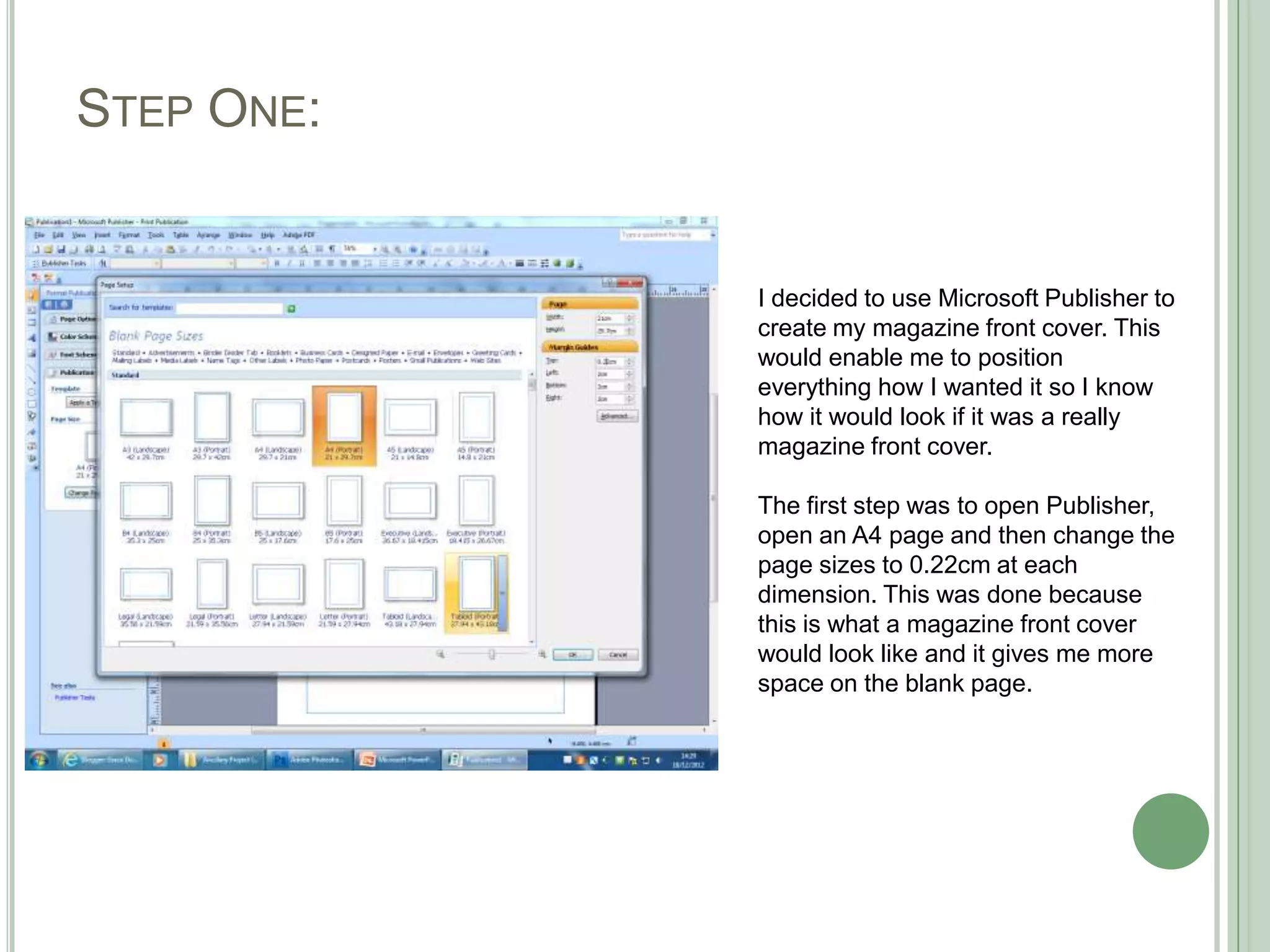
1. Open Publisher and set the page size to match a magazine cover.
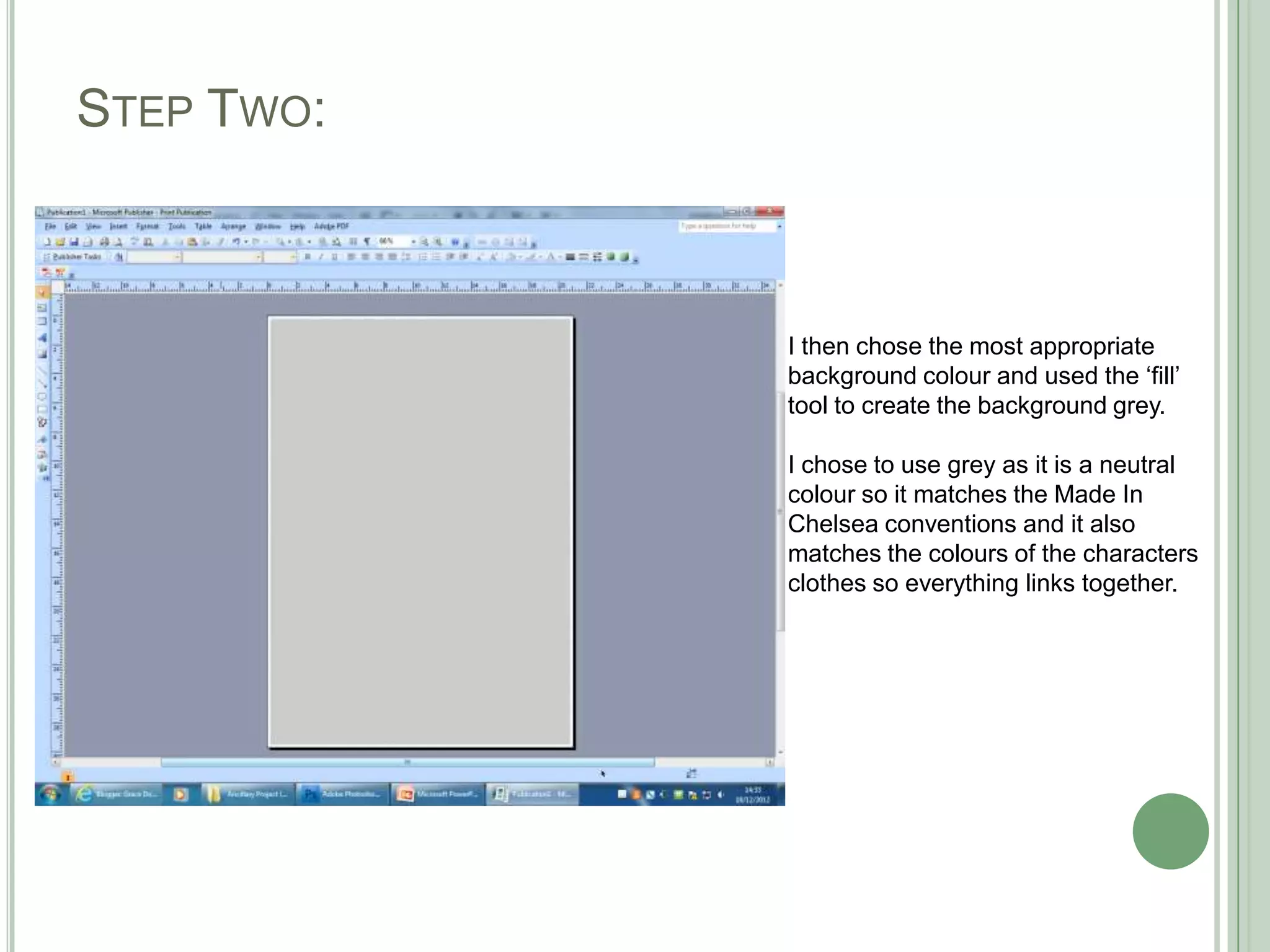
2. Choose a neutral gray background color to match the TV show's style.
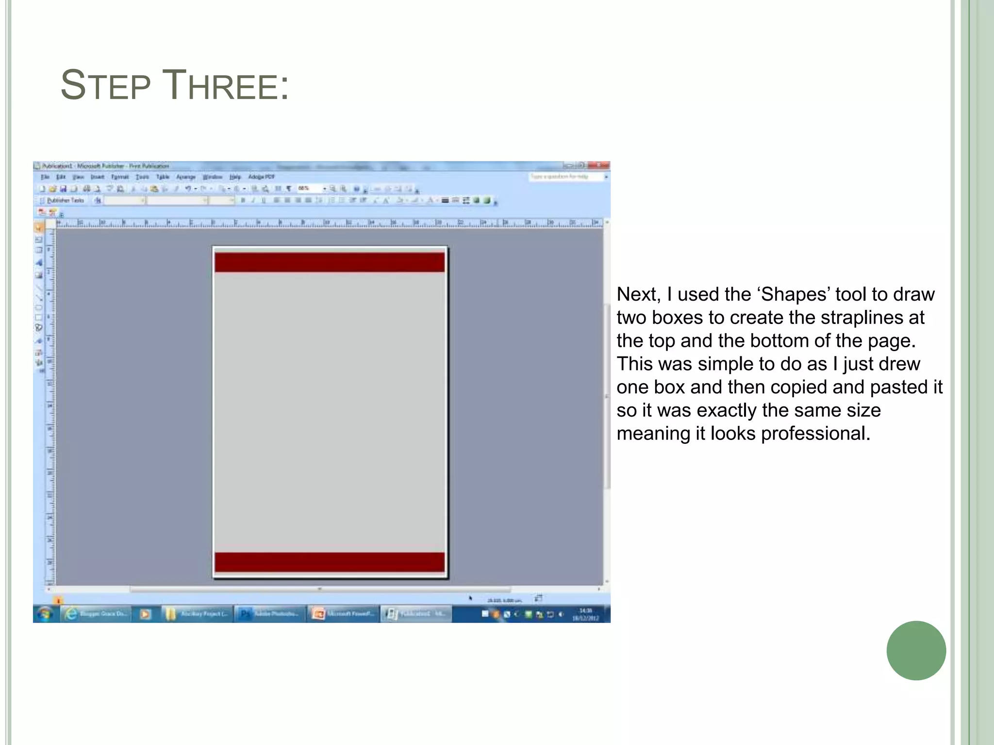
3. Use shapes to create matching straplines at the top and bottom.
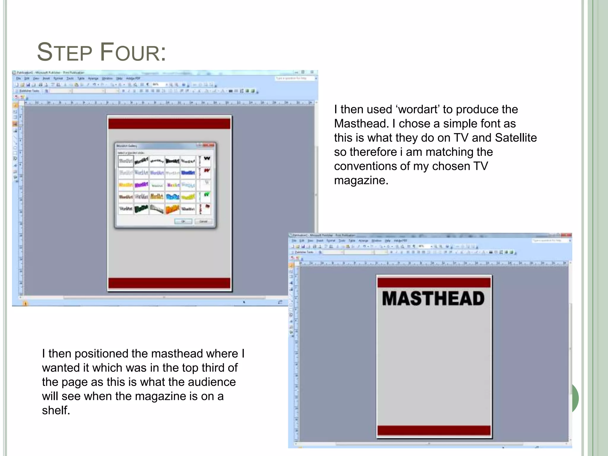
4. Add the masthead in a simple font matching TV conventions.
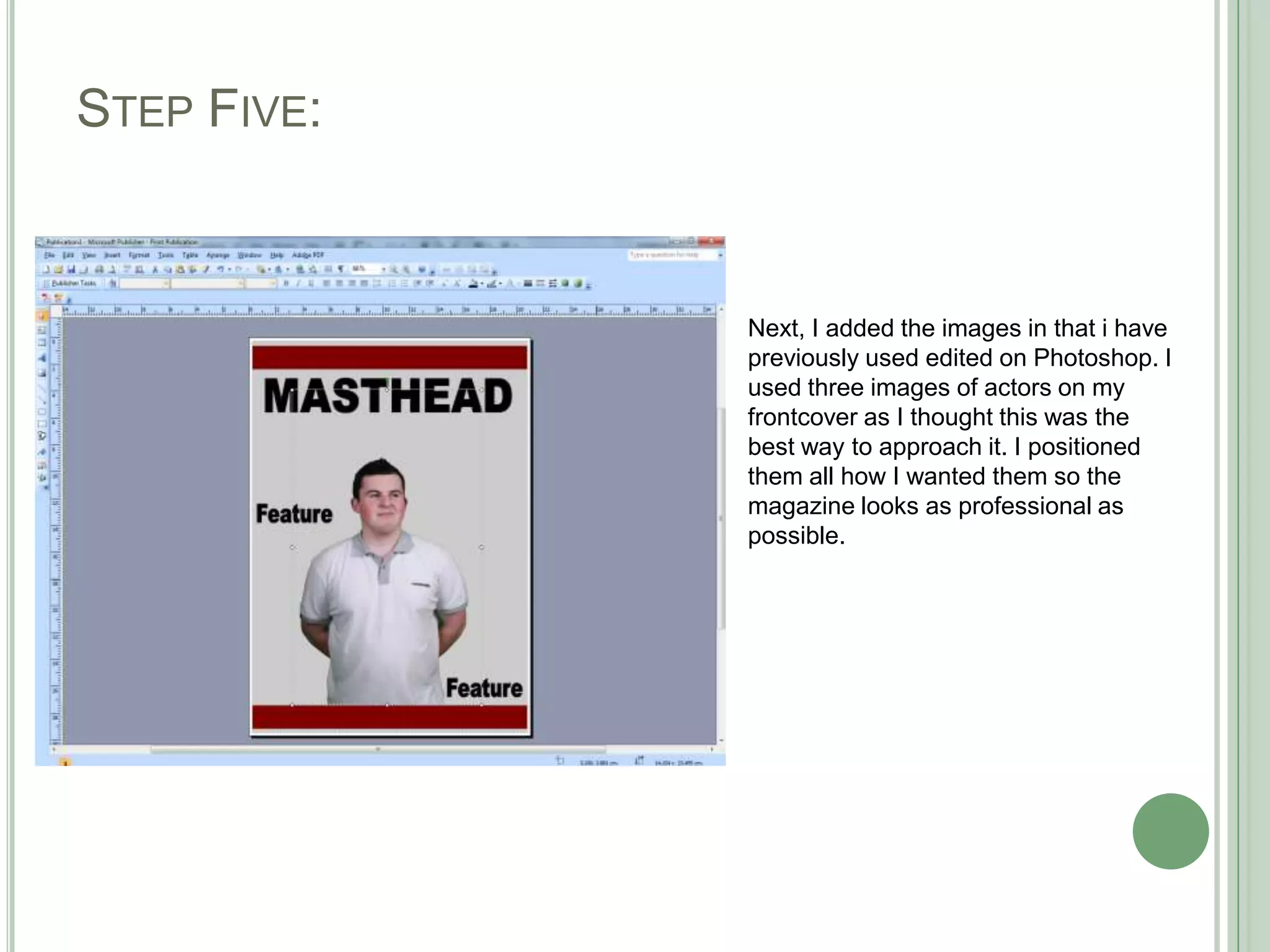
5. Position 3 actor images and other elements professionally.
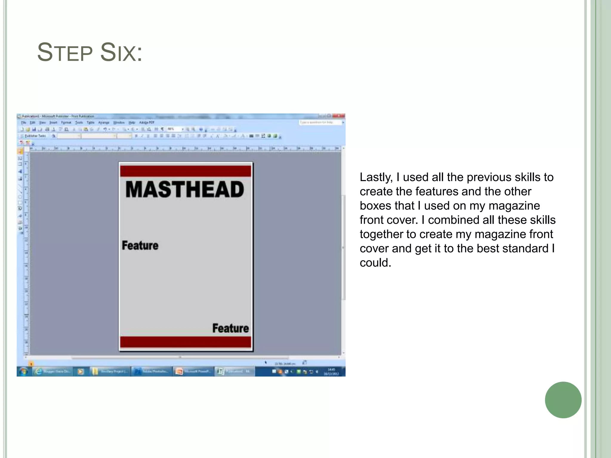
6. Combine all skills to finish the front cover to the best standard.