This document contains information about GPS stations in Greenland, including photos of stations NNVN, HJOR, and PLPK. It also includes images showing Helheim Glacier, including its elevation change between 1995-2012 and the elevation change of an adjacent GPS receiver from 2000-2011. Maps are also included showing the melting day anomaly in Greenland and uplift anomalies at GPS stations in 2010.
Improving scientific graphics of climate (change) dataZachary Labe
Creating visuals of data is a critical part of our jobs as scientists. We use figures for journal publications, presentations, posters, and science communication. This week we'll discuss a framework for making better figures, particularly in the climate sciences. I will also give examples of what not to do, and how we can improve these figures moving forward. e
Improving science (communication) through data visualizationZachary Labe
Creating visuals of data is an important part of our jobs as scientists. We use figures for journal publications, presentations, posters, lab group meetings, science communication, and more. In this workshop, we'll use examples from climate science to discuss a framework and network of resources available for making accessible figures. I will also share examples of what not to do and how to improve these figures moving forward.
Historical and Contemporary Trends in the Size, Drift, and Color of Jupiterʼs...Sérgio Sacani
Observations of Jupiter’s Great Red Spot (GRS) span more than 150 years. This allows for careful measurements
of its size and drift rate. High spatial resolution spacecraft data also allow tracking of its spectral characteristics and
internal dynamics and structure. The GRS continues to shrink in longitudinal length at an approximately linear rate
of 0°.194 yr−1 and in latitudinal width at 0°.048 yr−1. Its westward drift rate (relative to System III W. longitude)
has increased from ∼0°.26/day in the 1980s to ∼0°.36/day currently. Since 2014, the GRS’s short wavelength
(<650 nm) reflectance has continued to decrease, while it has become brighter at 890 nm, indicating a change in
clouds/haze at high altitudes. In addition, its north–south color asymmetry has decreased, and the dark core has
become smaller. Internal velocities have increased on its east and west edges, and decreased on the north and south,
resulting in decreased relative vorticity and circulation. The GRS’s color changes from 2014 to 2017 may be
explained by changes in stretching vorticity or divergence acting to balance the decrease in relative vorticity.
Ability of the GIS to incorporate the spatially varying data of ground elevation, soil properties, slope, etc. in the engineering analysis of the slope stability.
gis
Spherical projection technology at Oregon Museum of Science & Industry. Developed at NOAA, this PPT reviews spherical projection for WhereCamp Portland, October, 2009
Communicating Arctic climate change through data-driven storiesZachary Labe
Arctic Science Summit Week 2021 (Session 2: “The 4 Essential Cs - Coordination, Communication, Community, and Collaboration”):
In this presentation, I will discuss the power of sharing Arctic climate change information through accessible and engaging data visualizations. In particular, I will focus on using social media (Twitter) as one tool for communicating science to broad audiences.
Satellite Image Based Mapping of Wetland Tundra Landscapes Using ILWIS GISUniversität Salzburg
Presentation shows an application of ILWIS GIS for RS data processing with a case study of detecting land cover changes during 20-year period (1988-2011) in Yamal Peninsula, Arctic. Research goals: Distribution of different types of landscapes in the wetland tundra of the Yamal Peninsula; Monitoring changes in the landscapes of tundra; Analysis of the landscape dynamics for 2 decades (1988-2011). Data include 2 satellite images: Landsat TM for 1988 and 2011. Methods include clustering, segmentation and classification. Technical approach: Landsat TM data processing by ILWIS GIS. Methods: Supervised classification of Landsat TM images. Results demonstrated changes in selected land cover types. Study area: tundra landscapes in the wetlands of the Yamal Peninsula in the Far North of Russia. Statistical results of calculations of types of vegetation cover were obtained in a semi-automatic mode in ILWIS GIS. In 1988 ’willow shrubs’ type covered 412,292 pixels from the total part of the AOI, and ’high willow’ class is 823,430 pixels. 2011: willow increased to 651427 pixels, (’willow shrubs’), and 893092 pixels (’high willows’). Both combined classes of willows, typical for AOI with a high water content, cover total 1544519 pixels, which is 40.27 %. Area of grasses decreased compared to shrub and willow. Max area covered by class ’heather and dry grass’ is 933798 pixels
Geovisualisation of flows: New approaches to map an interdependent worldBenjamin Hennig
Postgraduate Presentation by Benjamin D Hennig at the Department of Geography, University of Sheffield, 26th May 2009 - more at http://www.viewsoftheworld.net/?p=2777
The aim of this work is to produce an avalanche hazard map with ArcGIS and to compare it with the map of possible avalanche location (CLPV, Carta di Localizzazione Probabile delle Valanghe), which is based on past events.
The map will be based mainly on morphological characteristics and on their link with the possibility of avalanche generation. The avalanche evolution and movement are not considered, as well as the risk (probability of harm or economic loss with respect to people).
Presentació per part de Hermann Haeusler (Departament de Geociències Ambientals, Universitat de Viena, Àustria) en el marc de l’acte de clausura del projecte europeu CIRCLE 2 MOUNTain co-organitzat per l'Oficina Catalana del Canvi Climàtic durant els dies 26 i 27 de setembre de 2013.
A large impact crater beneath Hiawatha Glacier in northwest GreenlandSérgio Sacani
We report the discovery of a large impact crater beneath Hiawatha Glacier in northwest Greenland. From airborne radar surveys, we identify a 31-kilometer-wide, circular bedrock depression beneath up to a kilometer of ice. This depression has an elevated rim that cross-cuts tributary subglacial channels and a subdued central uplift that appears to be actively eroding. From ground investigations of the deglaciated foreland, we identify overprinted structures within Precambrian bedrock along the ice margin that strike tangent to the subglacial rim. Glaciofluvial sediment from the largest river draining the crater contains shocked quartz and other impact- related grains. Geochemical analysis of this sediment indicates that the impactor was a fractionated iron aster- oid, which must have been more than a kilometer wide to produce the identified crater. Radiostratigraphy of the ice in the crater shows that the Holocene ice is continuous and conformable, but all deeper and older ice appears to be debris rich or heavily disturbed. The age of this impact crater is presently unknown, but from our geological and geophysical evidence, we conclude that it is unlikely to predate the Pleistocene inception of the Greenland Ice Sheet.
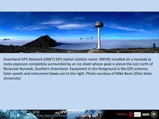
1. Greenland GPS Network (GNET) GPS station (station name: NNVN) installed on a nunatak (a
rocky exposure completely surrounded by an ice sheet whose peak is above the ice) north of
Niviarsiat Nunatak, Southern Greenland. Equipment in the foreground is the GPS antenna.
Solar panels and instrument boxes are to the right. Photo courtesy of Mike Bevis (Ohio State
University)
2. GNET GPS station (name: HJOR) in SE
Greenland. GPS antenna is visible in the photo.
Site was constructed in 2007. Photo by Dana
Caccamise, Ohio State University.
3. GNET GPS station (name: PLPK) on Pilgupik
Island, SE Greenland. The glacier visible across
the water is Laube Glacier. Photo by Michael
Willis, Cornell University.
4. Landsat image of Helheim Glacier, 2006. The bright, reflective surface on the right side of the
image is called an ice melange—a composite of sea ice and icebergs.
5. Left: Digital elevation model (DEM) of Helheim Glacier, 2006. Red star represents study
location for ice elevation data. Brown represents the eleavation of the land surface.
Blue represents elevation of the ice and ocean (Stearns and Hamilton, 2007.)
Right: Vertical displacement (thinning) of the surface of Helheim Glacier from 1995-
2012 derived from repeat satellite and airborne altimetry. Notice that elevation changes
(Csatho et al., 2014).
6. Vertical displacement of GPS receiver located on bedrock adjacent to Helheim Glacier from
2000-2011 (after Bevis et al., 2012).
7. Elevation of the surface of Helheim Glacier from 2000-2012 derived from repeat satellite and
airborne altimetry (Csatho et al., 2014).
8. This work is supported by the National Science Foundation’s Transforming Undergraduate Education in STEM program within the
Directorate for Education and Human Resources (DUE-1245025).
9. Left: 2010 melting day anomaly map for Greenland. The shading on the map illustrates the number of extra days of melting in 2010 relative to the average number of
melting days considering the 1979-2009 data. Students will be focusing on SE Greenland in Unit 4. NASA Earth Observatory image by Robert Simmon, based on data from
Marco Tedesco, City College of New York.
Right: 2010 uplift anomaly and melting day map for selected Greenland GPS stations. The green arrows illustrate uplift in 2010 relative to the trend from site installation
date (~2000 for most sites). The shading on the map illustrates the number of extra days of melting in 2010 relative to the average number of melting days considering the
1979-2009 data. Students will be focusing on SE Greenland in Unit 4. From Bevis et al., 2012.
Editor's Notes
Greenland GPS Network (GNET) GPS station (station name: NNVN) installed on a nunatak (a rocky exposure completely surrounded by an ice sheet whose peak is above the ice) north of Niviarsiat Nunatak, Southern Greenland. Equipment in the foreground is the GPS antenna. Solar panels and instrument boxes are to the right. Photo courtesy of Mike Bevis (Ohio State University)
GNET GPS station (name: HJOR) in SE Greenland. GPS antenna is visible in the photo. Site was constructed in 2007. Photo by Dana Caccamise, Ohio State University.
GNET GPS station (name: PLPK) on Pilgupik Island, SE Greenland. The glacier visible across the water is Laube Glacier. Photo by Michael Willis, Cornell University.
Landsat image of Helheim Glacier, 2006. The bright, reflective surface on the right side of the image is called an ice melange—a composite of sea ice and icebergs.
Left: Digital elevation model (DEM) of Helheim Glacier, 2006. Red star represents study location for ice elevation data. Brown represents the elevation of the land surface. Blue represents elevation of the ice and ocean (Stearns and Hamilton, 2007.) Right: Vertical displacement (thinning) of the surface of Helheim Glacier from 1995-2012 derived from repeat satellite and airborne altimetry. Notice that elevation changes (Csatho et al., 2014).
Csatho, Beata M., Anton F. Schenk, Cornelis J. van der Veen, Gregory Babonis, Kyle Duncan, Soroush Rezvanbehbahani, Michiel R. van den Broeke, Sebastian B. Simonsen, Sudhagar Nagarajan, and Jan H. van Angelen. 2014. Laser altimetry reveals complex pattern of Greenland Ice Sheet dynamics. PNAS 2014 111 (52) 18478-18483, doi:10.1073/pnas.1411680112
Stearns, Leigh, and Gordon S. Hamilton. 2007. Rapid volume loss from two East Greenland outlet glaciers quantified using repeat stereo satellite imagery. Geophysical Research Letters. Vol. 34, L05503, doi:10.1029/2006GL028982.
PNAS (Proceedings of the National Academy of Science) allows reuse of published figures for non-commercial and educational uses. (http://www.pnas.org/site/aboutpnas/authorfaq.xhtml). Geophysical Research Letters allows reuse of a single figure from an article for non-commercial and education uses.
Vertical displacement of GPS receiver located on bedrock adjacent to Helheim Glacier from 2000-2011 (after Bevis et al., 2012).
Bevis, Michael, John Wahr, Shfaqat A. Khan, Finn Bo Madsen, Abel Brown, Michael Willis, Eric Kendrick, Per Knudsen, Jason E. Box, Tonie van Dam, Dana J. Caccamise II, Bjorn Johns, Thomas Nylen, Robin Abbott, Seth White, Jeremy Miner, Rene Forsberg, Hao Zhou, Jian Wang, Terry Wilson, David Bromwich, and Olivier Francis. 2012. Bedrock displacements in Greenland manifest ice mass variations, climate cycles and climate change. PNAS 2012 109 (30) 11944-11948, 2012, doi:10.1073/pnas.1204664109
PNAS (Proceedings of the National Academy of Science) allows reuse of published figures for non-commercial and educational uses. (http://www.pnas.org/site/aboutpnas/authorfaq.xhtml).
Elevation of the surface of Helheim Glacier from 2000-2012 derived from repeat satellite and airborne altimetry (Csatho et al., 2014).
Csatho, Beata M., Anton F. Schenk, Cornelis J. van der Veen, Gregory Babonis, Kyle Duncan, Soroush Rezvanbehbahani, Michiel R. van den Broeke, Sebastian B. Simonsen, Sudhagar Nagarajan, and Jan H. van Angelen. 2014. Laser altimetry reveals complex pattern of Greenland Ice Sheet dynamics. PNAS 2014 111 (52) 18478-18483, doi:10.1073/pnas.1411680112
PNAS (Proceedings of the National Academy of Science) allows reuse of published figures for non-commercial and educational uses. (http://www.pnas.org/site/aboutpnas/authorfaq.xhtml).
Students use this figure to plot sea level change in SE Greenland from 2000-2011 due to ice discharge from Helheim and bedrock rebound from removal of ice.
Left: 2010 melting day anomaly map for Greenland. The shading on the map illustrates the number of extra days of melting in 2010 relative to the average number of melting days considering the 1979-2009 data. Students will be focusing on SE Greenland in Unit 4. NASA Earth Observatory image by Robert Simmon, based on data from Marco Tedesco, City College of New York.
Right: 2010 uplift anomaly and melting day map for selected Greenland GPS stations. The green arrows illustrate uplift in 2010 relative to the trend from site installation date (~2000 for most sites). The shading on the map illustrates the number of extra days of melting in 2010 relative to the average number of melting days considering the 1979-2009 data. Students will be focusing on SE Greenland in Unit 4 (Bevis et al., 2012).
PNAS (Proceedings of the National Academy of Science) allows reuse of published figures for non-commercial and educational uses. (http://www.pnas.org/site/aboutpnas/authorfaq.xhtml).