Download as PDF, PPTX
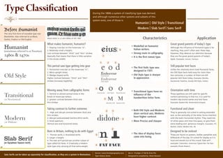

1. The document discusses the classification of different typefaces throughout history based on their characteristics and usage. 2. It identifies the major categories as Humanist, Old Style, Transitional, Modern, Slab Serif, and Sans Serif and provides examples for each. 3. Within each category, it describes distinguishing features like stress, contrast, serifs and explains how each type evolved over time from early forms like blackletter to more recent designs.