Download as PDF, PPTX

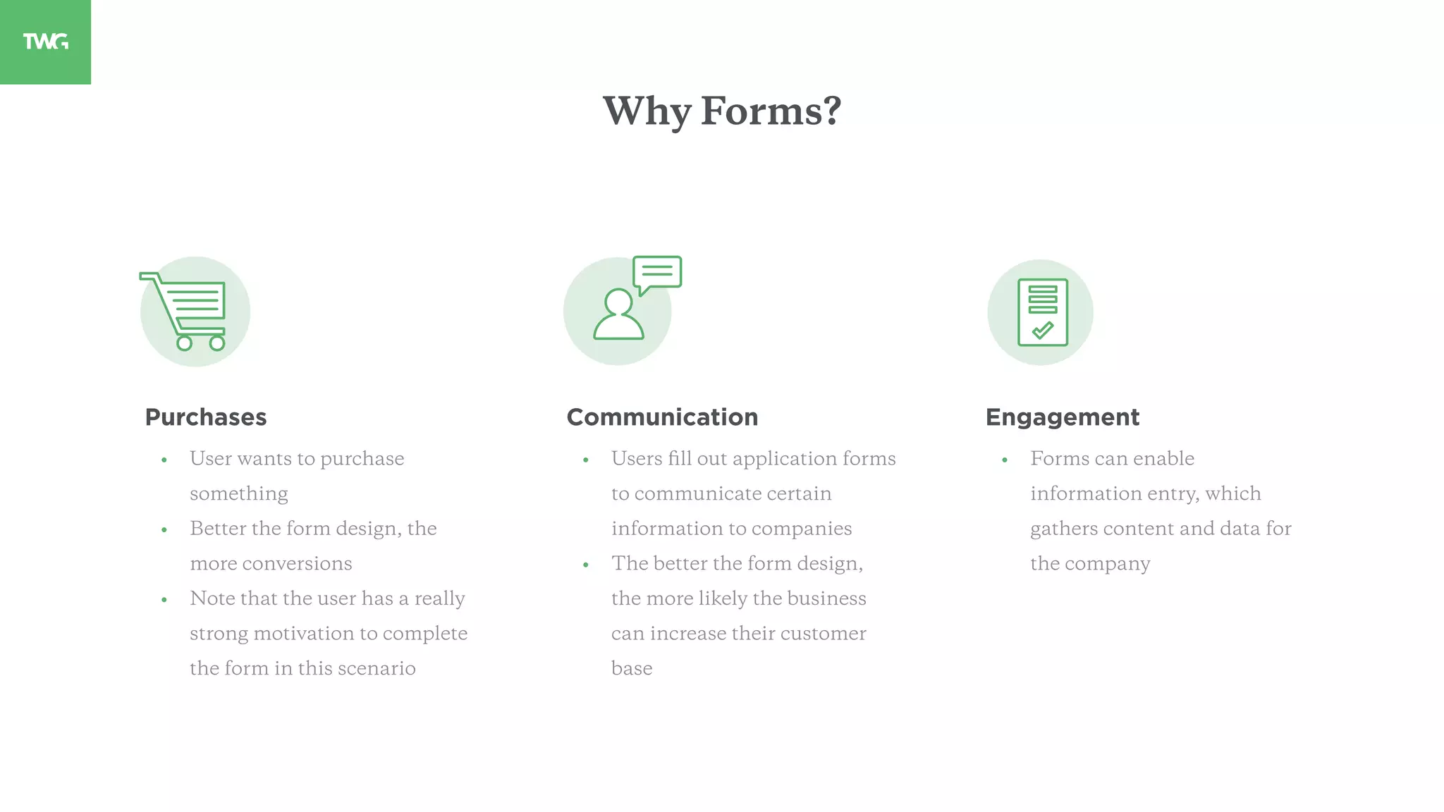
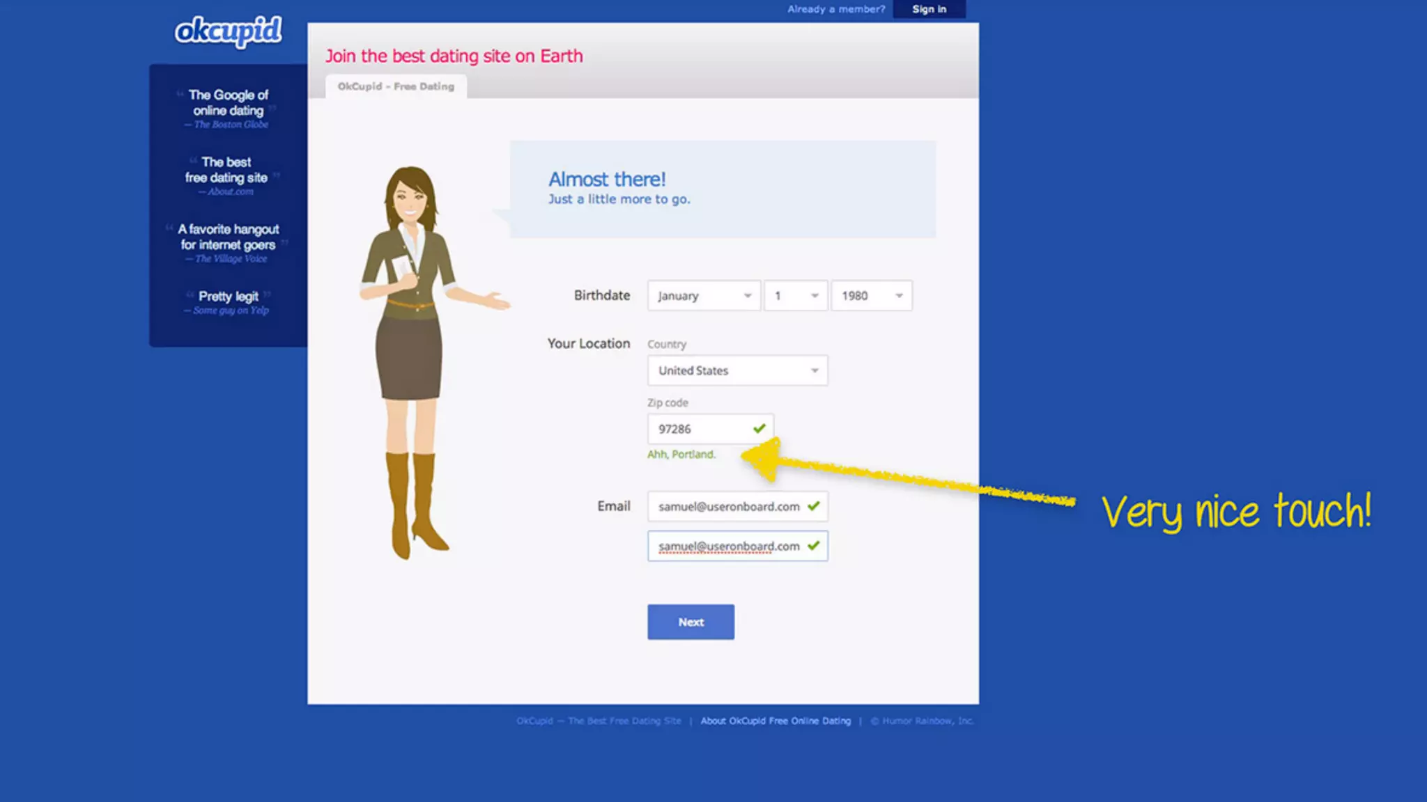

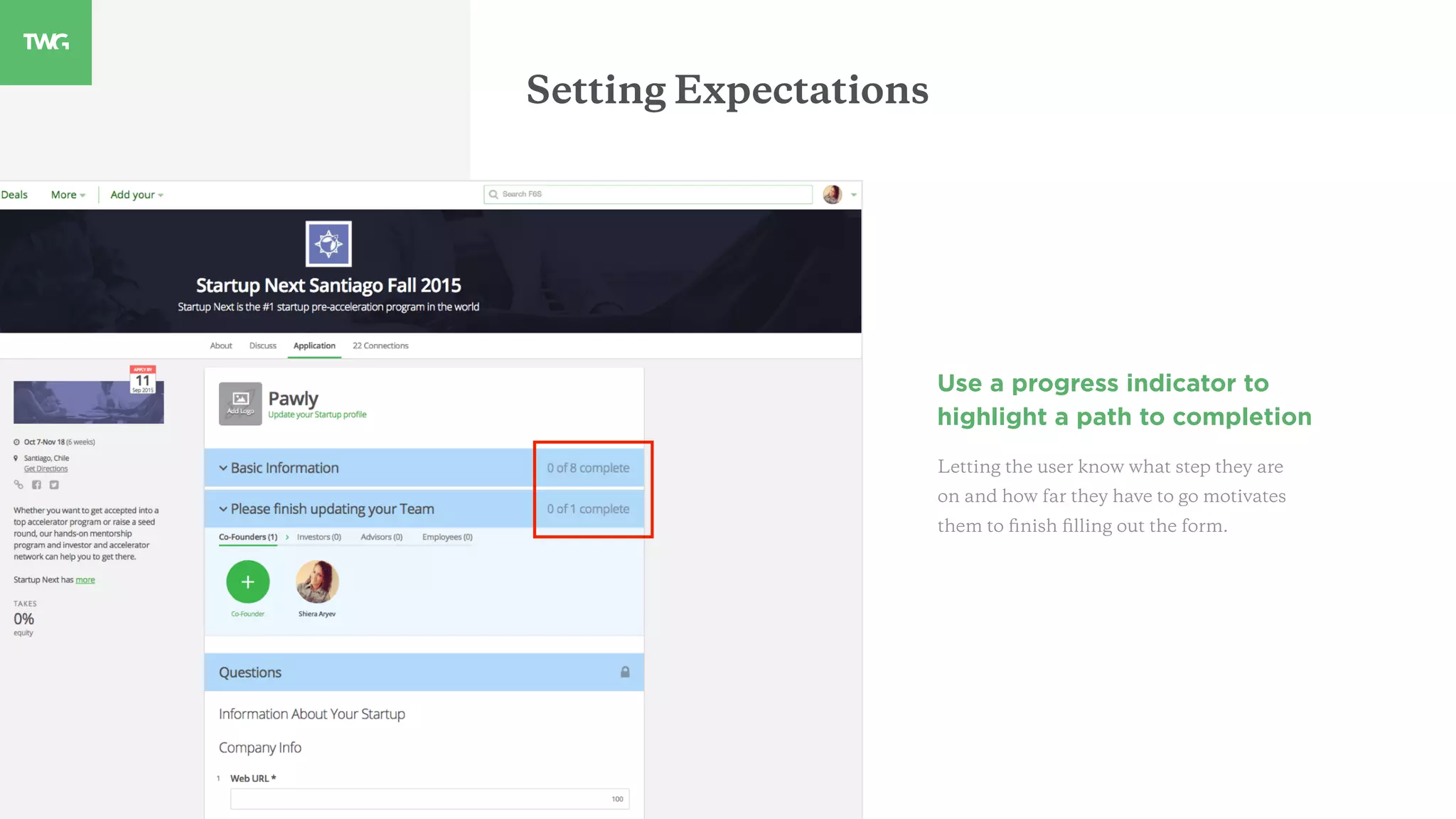


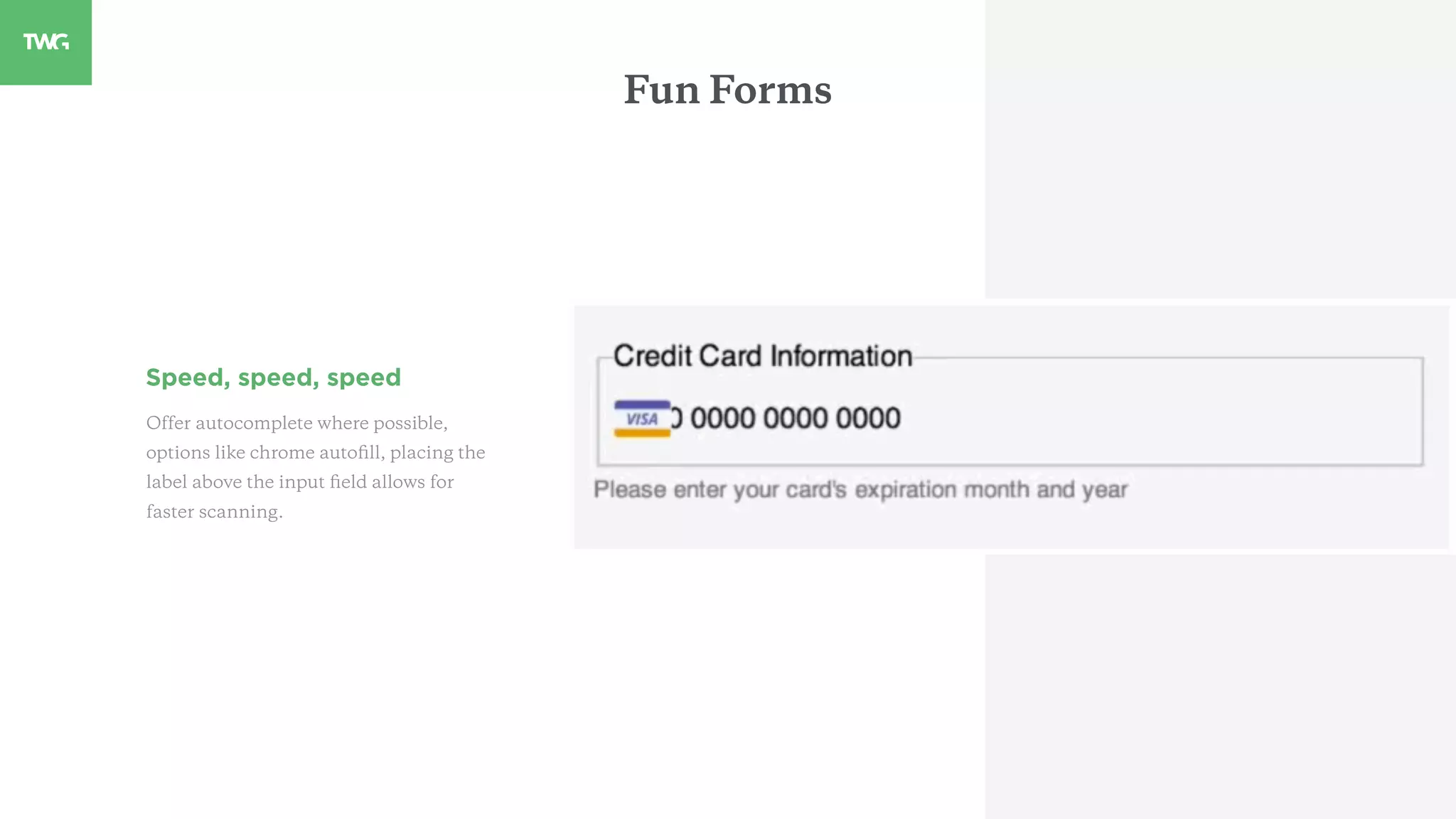
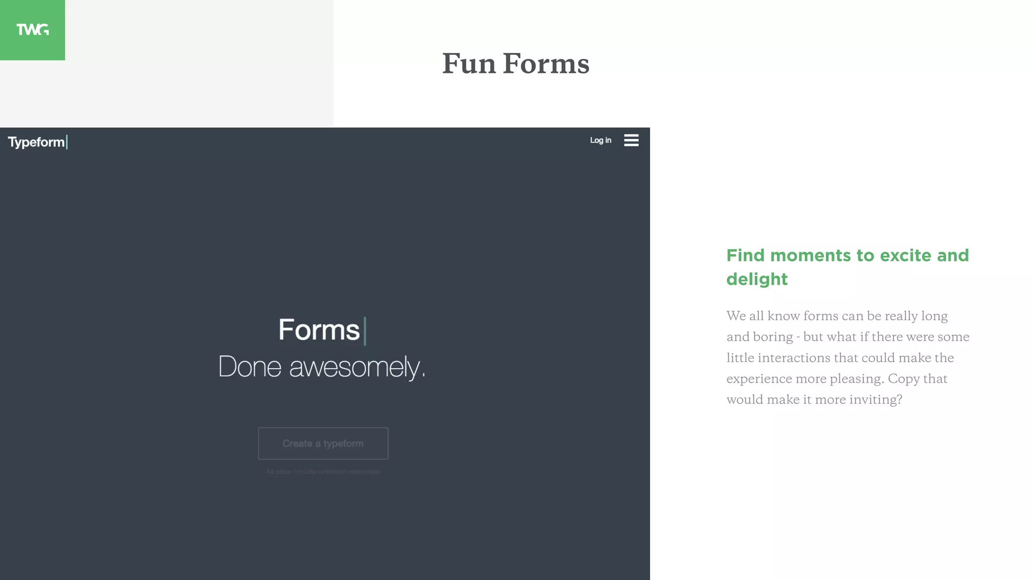
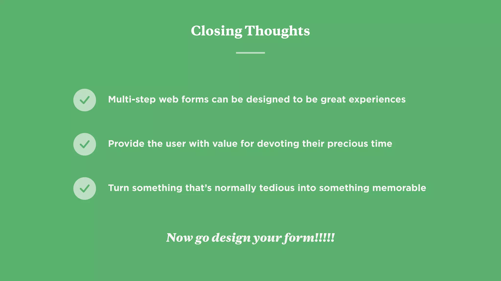


This guide offers best practices for designing long-format forms to enhance user experiences and maximize conversions. Key recommendations include setting expectations through progress indicators, avoiding errors with smart defaults, and organizing information logically. The document emphasizes creating engaging forms by using motivating language and including delightful interactions to make the process memorable.


![[BROCHURE] Italy Tour Project | @SlideON](https://cdn.slidesharecdn.com/ss_thumbnails/brochure8-251215152319-2805af68-thumbnail.jpg?width=640&height=640&fit=bounds)
