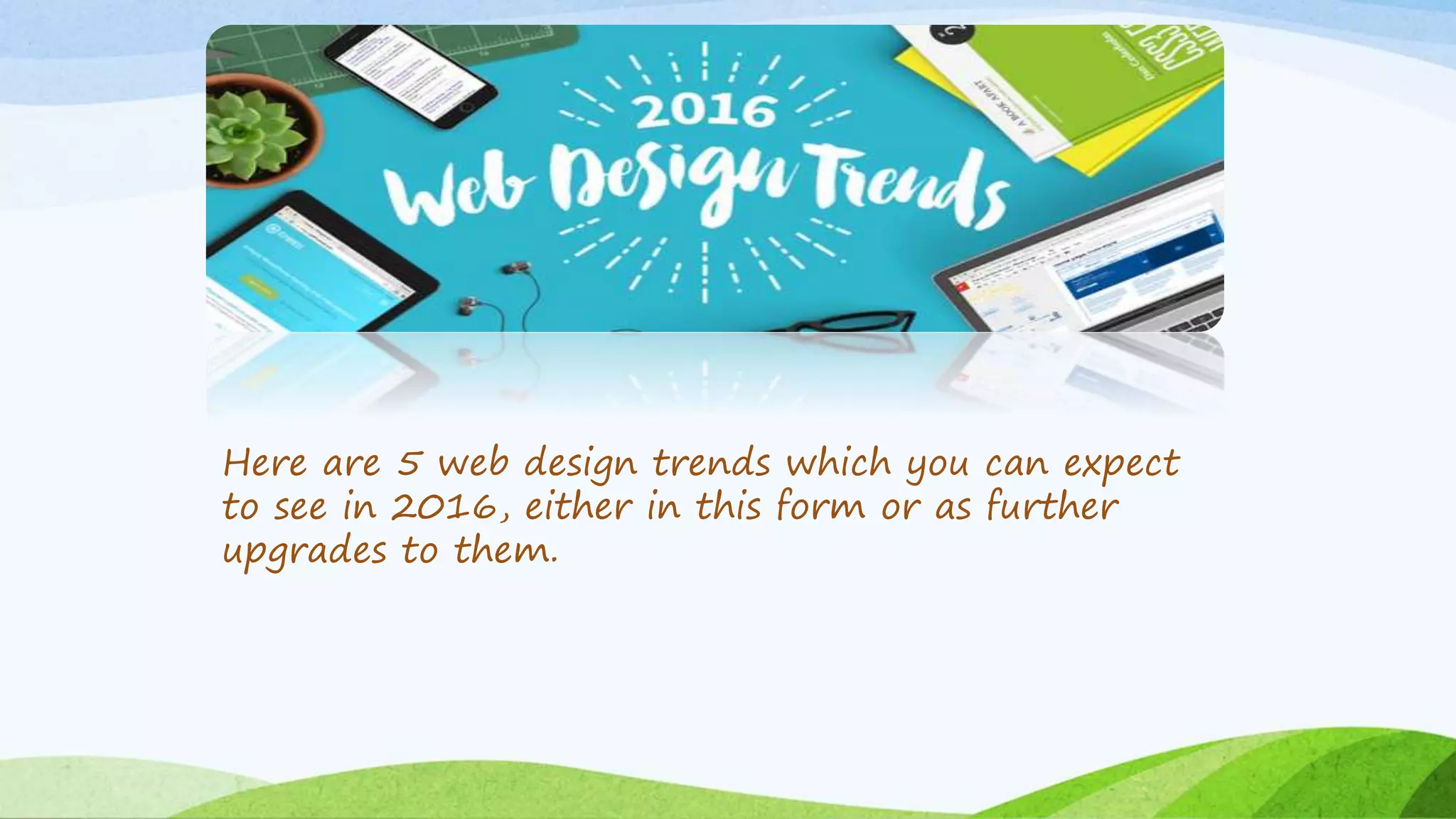
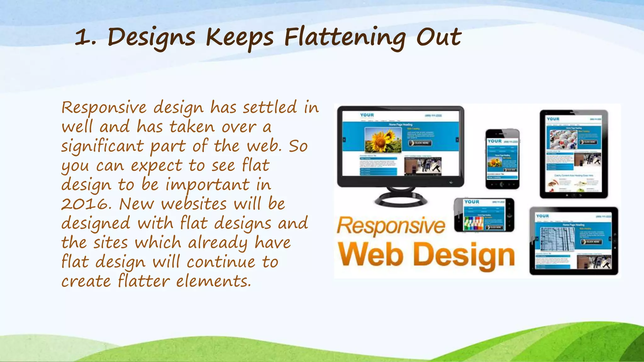
Top 5 Website Design
Trends You Can
Expect in 2016
Many years ago web design trends would change rapidly, and
move onto something entirely different. But in the last few
years, the switch has become more gradual, as there is a focus
on more user-friendliness and stability. Even if new websites
seems to be different (and unique) from what were designed a
few months ago, the underlying change is an upgrade on the
existing trends rather than a ‘skip’ to something new. But new
trends are also making their way, many times creeping in
without making much buzz. Many of these new web design
trends are driven by technology improvements.
Here are 5 web design trends which you can expect
to see in 2016, either in this form or as further
upgrades to them.
1. Designs Keeps Flattening Out
Responsive design has settled in
well and has taken over a
significant part of the web. So
you can expect to see flat
design to be important in
2016. New websites will be
designed with flat designs and
the sites which already have
flat design will continue to
create flatter elements.
• Google’s updated logo is a good example. The design has
become flatter and the font has changed. Due to this
the logo file’s size has also been reduced by more than
50%. The new flatter logo is also easier to view on
devices with smaller screens. Flatter design includes
changes to much more than logos. It includes changes to
all web design elements that weren’t’ flattened earlier.
• Flatter design will mean websites will be quicker and
load faster than before. They will be less bulky and will
take the content to users more efficiently and
effectively.
2. More Focus on Site Functions than Looks
Visitors now care more about the
functions of a site than its
aesthetics. They are becoming
more and more particular of
when something they need to do
doesn’t work properly on a site.
Such users are more likely to
leave a site. So it will no longer
be about sites looking good, it will
also be about ensuring that they
function effectively and offer
precisely what is needed by the
visitors.
3. Vertical Patterns
There is a growing focus towards mobile. Mobile traffic is tipped to
grow as big as desktop traffic in 2016. Thus, a new trend in web
designing is towards vertical scroll. Some time ago there was a
debate that the scroll could take the backseat in web designing,
but that is not happening this year. Vertical scroll seems to be the
only way for designers to facilitate user flow, especially for small-
screen users.
4. Expect Tiny Animations
Animations or more likely “moving elements” have been seen
throughout 2015. In 2016, their popularity is expected to grow,
but in smaller sizes. Tiny animation UI elements are seen as fun-
way for engaging users. They also carry an element of surprise
that keeps them intrigued and interested.
5. Responsive Design & Larger Screens
Until now responsive design was mostly
discussed in terms of optimizing the website
keeping in mind the small mobile and tablet
screens. The desktop screen was already
there and was not the focus. But in 2016,
responsive design will also focused on larger
screen devices. Although it will continue to
have smartphones and tablets within its
scope, there will be a new focus towards
high-resolution devices such as televisions.
More people are browsing the web and even
shopping on their TV.
http://www.aguaweb.ca/

Top 5 website design trends you can expect in 2016

  • 1.
    Top 5 WebsiteDesign Trends You Can Expect in 2016
  • 2.
    Many years agoweb design trends would change rapidly, and move onto something entirely different. But in the last few years, the switch has become more gradual, as there is a focus on more user-friendliness and stability. Even if new websites seems to be different (and unique) from what were designed a few months ago, the underlying change is an upgrade on the existing trends rather than a ‘skip’ to something new. But new trends are also making their way, many times creeping in without making much buzz. Many of these new web design trends are driven by technology improvements.
  • 3.
    Here are 5web design trends which you can expect to see in 2016, either in this form or as further upgrades to them.
  • 4.
    1. Designs KeepsFlattening Out Responsive design has settled in well and has taken over a significant part of the web. So you can expect to see flat design to be important in 2016. New websites will be designed with flat designs and the sites which already have flat design will continue to create flatter elements.
  • 5.
    • Google’s updatedlogo is a good example. The design has become flatter and the font has changed. Due to this the logo file’s size has also been reduced by more than 50%. The new flatter logo is also easier to view on devices with smaller screens. Flatter design includes changes to much more than logos. It includes changes to all web design elements that weren’t’ flattened earlier. • Flatter design will mean websites will be quicker and load faster than before. They will be less bulky and will take the content to users more efficiently and effectively.
  • 6.
    2. More Focuson Site Functions than Looks Visitors now care more about the functions of a site than its aesthetics. They are becoming more and more particular of when something they need to do doesn’t work properly on a site. Such users are more likely to leave a site. So it will no longer be about sites looking good, it will also be about ensuring that they function effectively and offer precisely what is needed by the visitors.
  • 7.
    3. Vertical Patterns Thereis a growing focus towards mobile. Mobile traffic is tipped to grow as big as desktop traffic in 2016. Thus, a new trend in web designing is towards vertical scroll. Some time ago there was a debate that the scroll could take the backseat in web designing, but that is not happening this year. Vertical scroll seems to be the only way for designers to facilitate user flow, especially for small- screen users.
  • 8.
    4. Expect TinyAnimations Animations or more likely “moving elements” have been seen throughout 2015. In 2016, their popularity is expected to grow, but in smaller sizes. Tiny animation UI elements are seen as fun- way for engaging users. They also carry an element of surprise that keeps them intrigued and interested.
  • 9.
    5. Responsive Design& Larger Screens Until now responsive design was mostly discussed in terms of optimizing the website keeping in mind the small mobile and tablet screens. The desktop screen was already there and was not the focus. But in 2016, responsive design will also focused on larger screen devices. Although it will continue to have smartphones and tablets within its scope, there will be a new focus towards high-resolution devices such as televisions. More people are browsing the web and even shopping on their TV. http://www.aguaweb.ca/