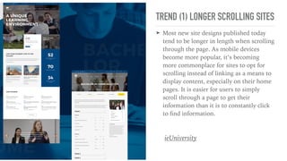
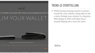
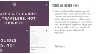
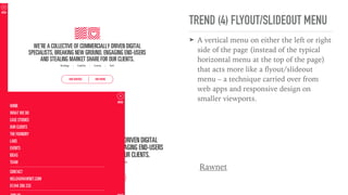
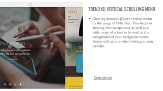
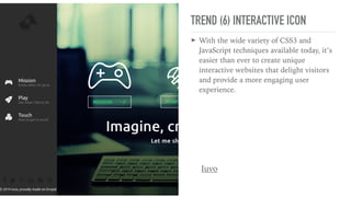
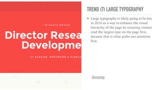
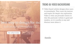
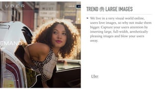
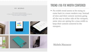
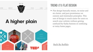
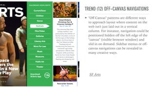
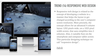
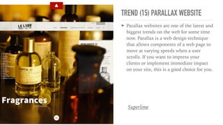
WEBSITE DESIGN TREND
by IT-Werks Pte Ltd
TREND (1) LONGER SCROLLING SITES
➤ Most new site designs published today
tend to be longer in length when scrolling
through the page. As mobile devices
become more popular, it’s becoming
more commonplace for sites to opt for
scrolling instead of linking as a means to
display content, especially on their home
pages. It is easier for users to simply
scroll through a page to get their
information than it is to constantly click
to find information.
ieUniversity
TREND (2) STORYTELLING
➤ While having amazing content is always
crucial for your website, being able to tell
a story through your content is a big plus.
Web design in 2016 will likely focus
around helping tell a story for users.
Bellroy
TREND (3) HIDDEN MENU
➤ More sites hiding their main menus all
together when visitors first visit the site.
These hidden menus will only become
visible when the visitor is ready to move
on and clicks the appropriate icon. This is
also a technique of responsive design that
is starting to be carried over into all of a
site’s design instead of just small
viewports.
Triplagent
TREND (4) FLYOUT/SLIDEOUT MENU
➤ A vertical menu on either the left or right
side of the page (instead of the typical
horizontal menu at the top of the page)
that acts more like a flyout/slideout
menu – a technique carried over from
web apps and responsive design on
smaller viewports.
Rawnet
TREND (5) VERTICAL SCROLLING MENU
➤ Creating dynamic jQuery vertical menu
by the usage of PNG files. This helps in
creating the transparency as well as a
wide range of colors to be used at the
background of your navigation menu.
People will admire when looking at your
website.
Zensorium
TREND (6) INTERACTIVE ICON
➤ With the wide variety of CSS3 and
JavaScript techniques available today, it’s
easier than ever to create unique
interactive websites that delight visitors
and provide a more engaging user
experience.
Iuvo
TREND (7) LARGE TYPOGRAPHY
➤ Large typography is likely going to be key
in 2016 as a way to enhance the visual
hierarchy of the page by ensuring visitors
read the largest type on the page first,
because that is what grabs our attention
first.
ilovemy
TREND (8) VIDEO BACKGROUND
➤ Video-based website designs draw users
in immediately. They rouse the interest
and inspire for deeper site exploration.
Video is what can persuade visitors in
that this particular website is good and
modern, so it is worthy to stay and
discover more about it.
Standin
TREND (9) LARGE IMAGES
➤ We live in a very visual world online,
users love images, so why not make them
bigger. Capture your users attention by
inserting large, full-width, aesthetically
pleasing images and blow your users
away.
Uber
TREND (10) FIX WIDTH CENTERED
➤ Fix-width trend seems to be trying to
come back in a more modern way. Instead
of sites and their content sections going
all the way to either side of the viewport,
some sites are opting for a max-width to
keep their content centered in the
viewport.
Michele Mazzucco
TREND (11) FLAT DESIGN
➤ Flat design basically means, no noise and
no clutter, and puts prominence on
content and minimalist principles. This
sort of design is much easier for users to
search your website without getting
confused by flashy buttons or confusing
or noisy home pages.
Built By Buffalo
TREND (12) OFF-CANVAS NAVIGATIONS
➤ "Off Canvas" patterns are different ways
to approach layout where content on the
web isn't just laid out in a vertical
column. For instance, navigation could be
positioned hidden off the left edge of the
"canvas" (visible browser window) and
slid in on demand. Sidebar menus or off-
canvas navigations can be revealed in
many creative ways.
SF Arts
TREND (14) RESPONSIVE WEB DESIGN
➤ Responsive web design is related to the
concept of developing a website in a
manner that helps the layout to get
changed according to the user’s computer
screen resolution. More precisely, the
concept allows for an advanced 4 column
layout 1292 pixels wide, on a 1025 pixel
width screen, that auto-simplifies into 2
columns. Also, it suitably fixes on the
smartphone and computer tablet screen.
This particular designing technique we
call “responsive design”.
Fabrik
TREND (15) PARALLAX WEBSITE
➤ Parallax websites are one of the latest and
biggest trends on the web for some time
now. Parallax is a web design technique
that allows components of a web page to
move at varying speeds when a user
scrolls. If you want to impress your
clients or implement immediate impact
on your site, this is a good choice for you.
Superlime
THANKS YOU

Website Design Trend 2016

  • 1.
    WEBSITE DESIGN TREND byIT-Werks Pte Ltd
  • 2.
    TREND (1) LONGERSCROLLING SITES ➤ Most new site designs published today tend to be longer in length when scrolling through the page. As mobile devices become more popular, it’s becoming more commonplace for sites to opt for scrolling instead of linking as a means to display content, especially on their home pages. It is easier for users to simply scroll through a page to get their information than it is to constantly click to find information. ieUniversity
  • 3.
    TREND (2) STORYTELLING ➤While having amazing content is always crucial for your website, being able to tell a story through your content is a big plus. Web design in 2016 will likely focus around helping tell a story for users. Bellroy
  • 4.
    TREND (3) HIDDENMENU ➤ More sites hiding their main menus all together when visitors first visit the site. These hidden menus will only become visible when the visitor is ready to move on and clicks the appropriate icon. This is also a technique of responsive design that is starting to be carried over into all of a site’s design instead of just small viewports. Triplagent
  • 5.
    TREND (4) FLYOUT/SLIDEOUTMENU ➤ A vertical menu on either the left or right side of the page (instead of the typical horizontal menu at the top of the page) that acts more like a flyout/slideout menu – a technique carried over from web apps and responsive design on smaller viewports. Rawnet
  • 6.
    TREND (5) VERTICALSCROLLING MENU ➤ Creating dynamic jQuery vertical menu by the usage of PNG files. This helps in creating the transparency as well as a wide range of colors to be used at the background of your navigation menu. People will admire when looking at your website. Zensorium
  • 7.
    TREND (6) INTERACTIVEICON ➤ With the wide variety of CSS3 and JavaScript techniques available today, it’s easier than ever to create unique interactive websites that delight visitors and provide a more engaging user experience. Iuvo
  • 8.
    TREND (7) LARGETYPOGRAPHY ➤ Large typography is likely going to be key in 2016 as a way to enhance the visual hierarchy of the page by ensuring visitors read the largest type on the page first, because that is what grabs our attention first. ilovemy
  • 9.
    TREND (8) VIDEOBACKGROUND ➤ Video-based website designs draw users in immediately. They rouse the interest and inspire for deeper site exploration. Video is what can persuade visitors in that this particular website is good and modern, so it is worthy to stay and discover more about it. Standin
  • 10.
    TREND (9) LARGEIMAGES ➤ We live in a very visual world online, users love images, so why not make them bigger. Capture your users attention by inserting large, full-width, aesthetically pleasing images and blow your users away. Uber
  • 11.
    TREND (10) FIXWIDTH CENTERED ➤ Fix-width trend seems to be trying to come back in a more modern way. Instead of sites and their content sections going all the way to either side of the viewport, some sites are opting for a max-width to keep their content centered in the viewport. Michele Mazzucco
  • 12.
    TREND (11) FLATDESIGN ➤ Flat design basically means, no noise and no clutter, and puts prominence on content and minimalist principles. This sort of design is much easier for users to search your website without getting confused by flashy buttons or confusing or noisy home pages. Built By Buffalo
  • 13.
    TREND (12) OFF-CANVASNAVIGATIONS ➤ "Off Canvas" patterns are different ways to approach layout where content on the web isn't just laid out in a vertical column. For instance, navigation could be positioned hidden off the left edge of the "canvas" (visible browser window) and slid in on demand. Sidebar menus or off- canvas navigations can be revealed in many creative ways. SF Arts
  • 14.
    TREND (14) RESPONSIVEWEB DESIGN ➤ Responsive web design is related to the concept of developing a website in a manner that helps the layout to get changed according to the user’s computer screen resolution. More precisely, the concept allows for an advanced 4 column layout 1292 pixels wide, on a 1025 pixel width screen, that auto-simplifies into 2 columns. Also, it suitably fixes on the smartphone and computer tablet screen. This particular designing technique we call “responsive design”. Fabrik
  • 15.
    TREND (15) PARALLAXWEBSITE ➤ Parallax websites are one of the latest and biggest trends on the web for some time now. Parallax is a web design technique that allows components of a web page to move at varying speeds when a user scrolls. If you want to impress your clients or implement immediate impact on your site, this is a good choice for you. Superlime
  • 16.