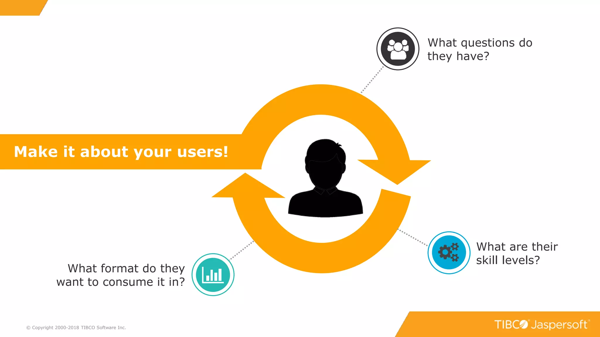
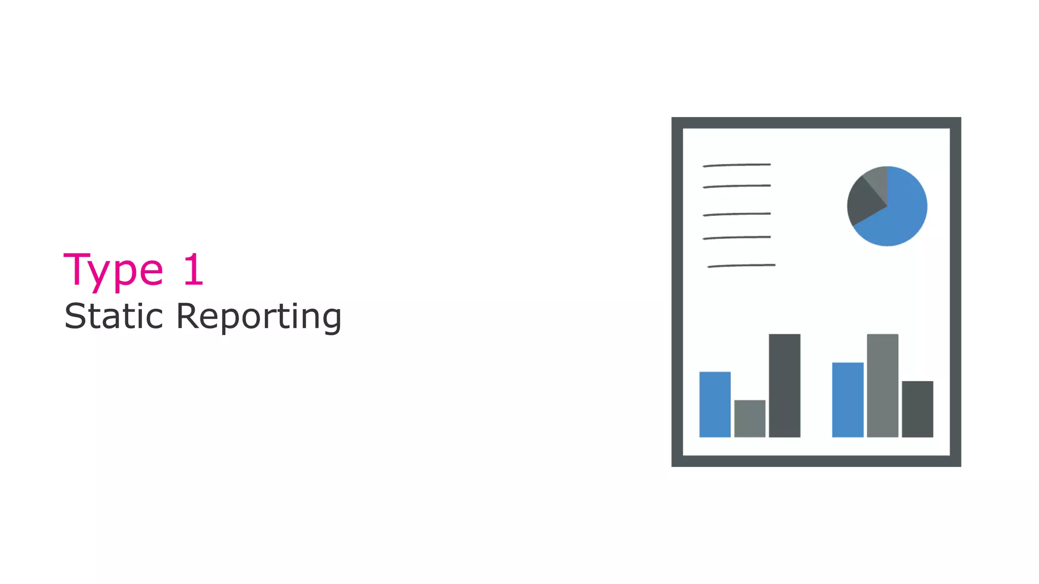
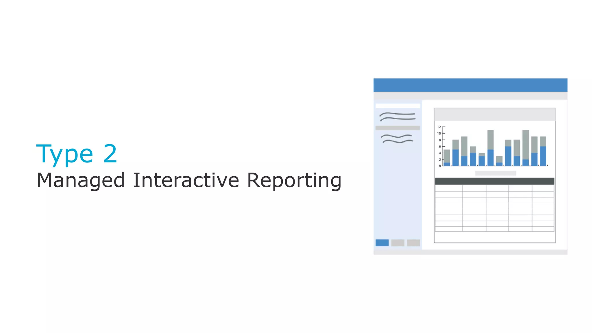
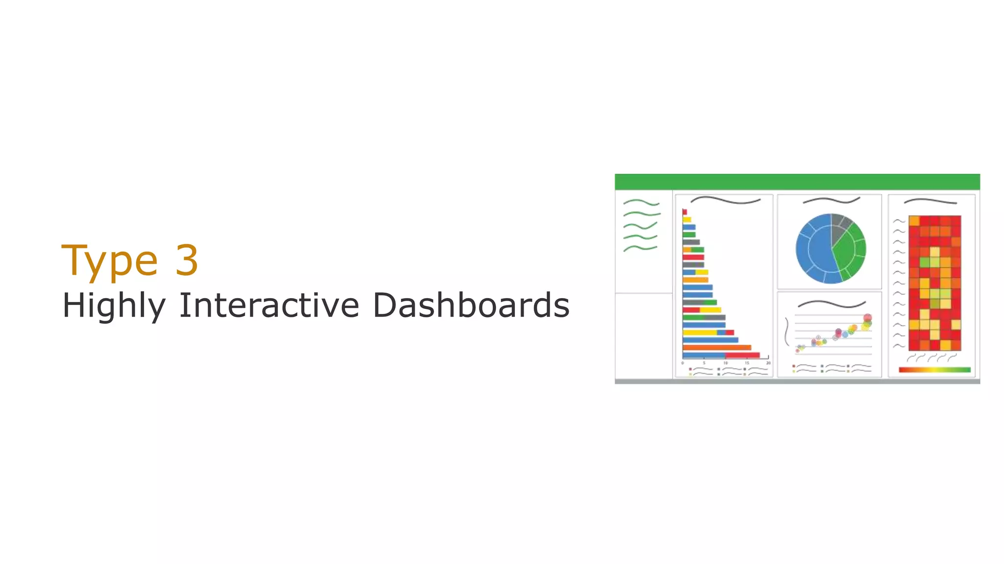
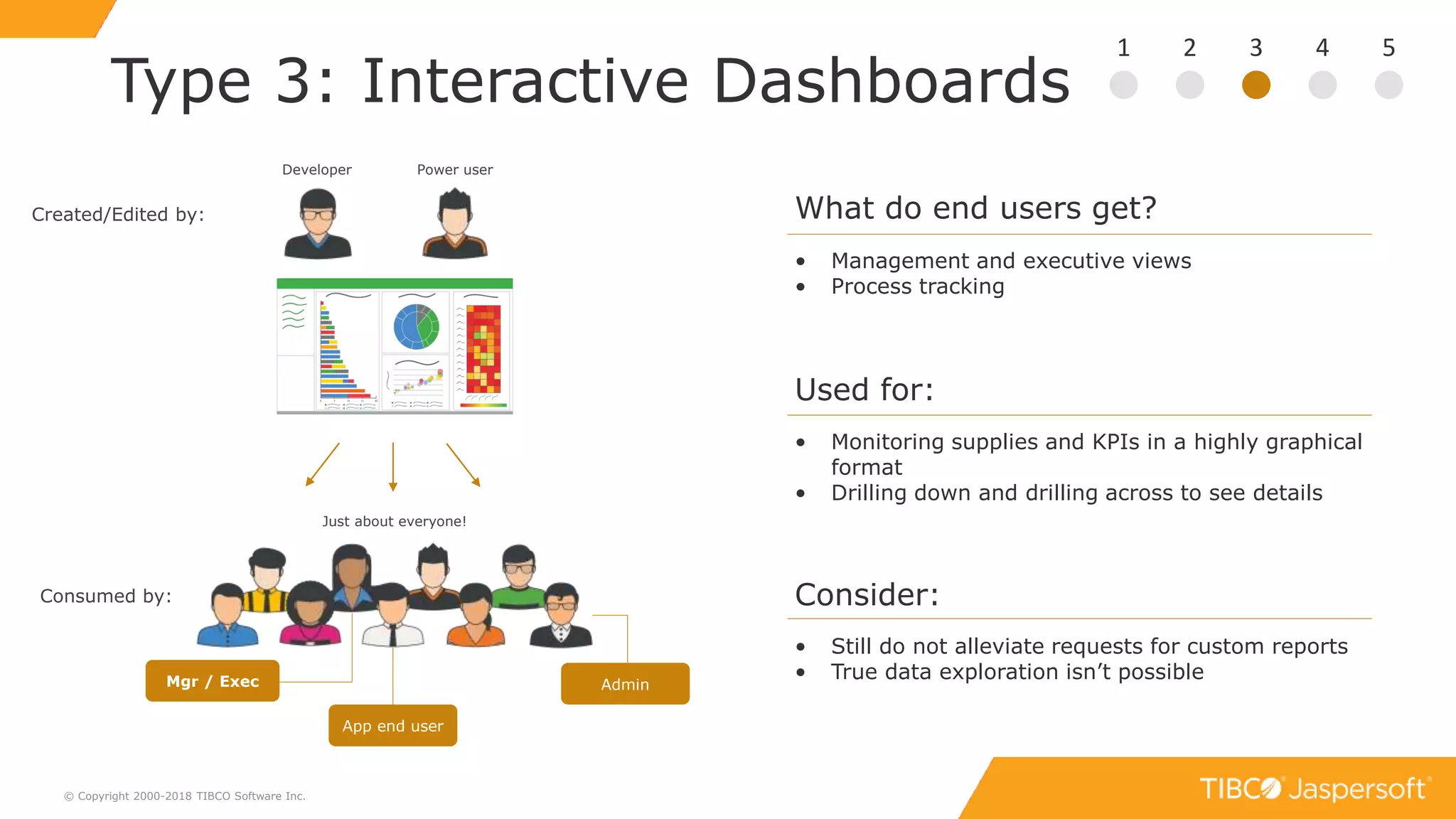
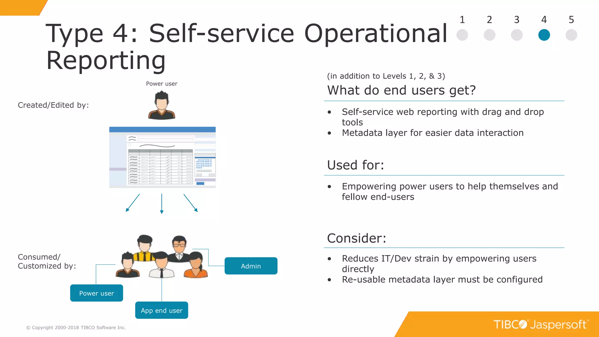
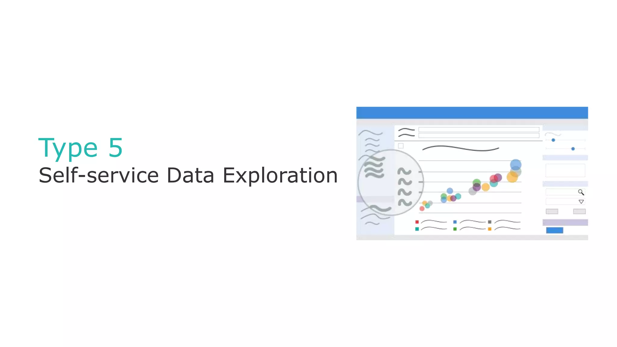
From Static Reports to Self-Service Analytics
Top 5 Types of Analytics
Data as a feature
Winter
Helping Users Reach
Goals with Data
Spring
Embedded BI:
All Things Considered
Summer
Modern Reporting
At Scale
Fall
Building Data as a Feature
Applications
3
Data for everyone
© Copyright 2000-2018 TIBCO Software Inc.
I need my sales numbers
for last week in Excel
I got the data I need but I
want to change a filter
I need to know WHY this
number is lower
I want to see a top level
view of our performance
We’re all interested in data but not
all interested in learning new tools!
We all have data questions but
we want to ask them in
different ways!
? ? ? ?
4
How to choose the right analytics?
© Copyright 2000-2018 TIBCO Software Inc.
Reports?
Dashboards?
Self-service?
5© Copyright 2000-2018 TIBCO Software Inc.
What are their
skill levels?
What format do they
want to consume it in?
Make it about your users!
What questions do
they have?
6
Process: Getting Started
© Copyright 2000-2018 TIBCO Software Inc.
Data
Connect
Relational, Big Data, NoSQL
ETL, data virtualization, direct
Metadata layer, in-memory engine
Platform
Install
Cloud or on-premises
Open web development platform
Clustering, built-in multi-tenancy
Delivery
Embed
Javascript API
Extensive REST APIs
Mobile apps & SDKs
Author
Create
Pixel Perfect and
complex designs via IDE
Self-Service via browser
7
Five Types of Analytics
© Copyright 2000-2018 TIBCO Software Inc.
Type 1
Static Reporting
Type 2
Managed Interactive
Reporting
Type 3
Highly Interactive
Dashboards
Type 4
Self-service Operational
Reporting
Type 5
Self-service Data Exploration
for Deeper Insight
Type 1
Static Reporting
9
Type 1: Static Reporting
© Copyright 2000-2018 TIBCO Software Inc.
1 2 3 4 5
What do end users get?
• Canned reports presented within the application
UI
• User receives a PDF/Excel with data periodically
or on-demand
Used for:
• Reports where there is a pre-determined layout:
• Invoices
• Statements
• Periodical updates
Consider:
• Every report created/edited by IT/Dev
• Limited timeframe of information
• Satisfies many users’ basic data needs
Created/Edited by:
Developer
Consumed by:
Just about everyone!
Mgr / Exec Admin
App end user
Type 2
Managed Interactive Reporting
11
Type 2: Managed Interactive
Reporting
© Copyright 2000-2018 TIBCO Software Inc.
1 2 3 4 5
What do end users get?
• End user controls chart types, filters, adds
formatting, and can save own version
Used for:
• Dynamic lists
• Filtering results, conditional highlighting
Consider:
• Cuts down static reporting needs
• Customized reports
• Generally displayed via front end (not a static
export)
Created by:
Developer
Consumed/
Customized by:
Just about everyone!
Mgr / Exec Admin
App end user
Type 3
Highly Interactive Dashboards
13
Type 3: Interactive Dashboards
© Copyright 2000-2018 TIBCO Software Inc.
1 2 3 4 5
What do end users get?
• Management and executive views
• Process tracking
Used for:
• Monitoring supplies and KPIs in a highly graphical
format
• Drilling down and drilling across to see details
Consider:
• Still do not alleviate requests for custom reports
• True data exploration isn’t possible
Created/Edited by:
Consumed by:
Just about everyone!
Mgr / Exec Admin
App end user
Developer Power user
Demo
Types 1, 2, & 3
Type 4
Self-service Reporting
16
Type 4: Self-service Operational
Reporting
© Copyright 2000-2018 TIBCO Software Inc.
1 2 3 4 5
Used for:
• Empowering power users to help themselves and
fellow end-users
Consider:
• Reduces IT/Dev strain by empowering users
directly
• Re-usable metadata layer must be configured
• Self-service web reporting with drag and drop
tools
• Metadata layer for easier data interaction
What do end users get?
(in addition to Levels 1, 2, & 3)
Created/Edited by:
Power user
Consumed/
Customized by: Admin
App end user
Power user
Type 5
Self-service Data Exploration
18
Type 5: Self-service Data
Exploration
© Copyright 2000-2018 TIBCO Software Inc.
1 2 3 4 5
• Answering questions to ad hoc queries
• Live data exploration requires fast back-ends
• Reusable metadata layer must be configured by
IT/Dev first
• Beware: Self-service opens the door for users to
come to wrong conclusions
• Live graphical data exploration
• Metadata layer for easier data interaction
Created/Edited by:
Power user
Consumed/
Customized by: Admin
App end user
Power user
Data Analyst
What do end users get?
(in addition to Levels 1, 2, & 3)
Used for:
Consider:
Demo
Types 4 & 5
20
But wait… there’s more!
Pixel-perfect, print-ready reports for
distributing information to the
masses
Self-service analytics with built-in data
wrangling, interactive visualizations, and
advanced analytics
Real-time analysis of data in motion and
at the edge
Embeddable, interactive reports and
dashboards designed for software
builders
Machine learning, predictive
analytics and prescriptive analytics
Single source of reliable information to control
and manage data across the organization
Enterprise Reporting
ERe
EBI
VAn
DS
SAn
MDM
Embedded BI
Smart Visual Analytics
Data Science
Streaming Analytics
Master Data Management
Spotfire
Statistica
Alpine
Streambase
TIBCO MDM
21
Application Integration Levels
© Copyright 2000-2018 TIBCO Software Inc.
1 2 3 4 5
Static Reports Managed Interactive
Reporting
Highly Interactive
Dashboards
Self-service Reporting Self-service Data
Exploration
Step 1: Determine Analytics Type
the ”what”
Step 2: Determine Application Integration Level
the ”how”
0 1 2 3
Not Integrated
(separate portal)
RESTful API iFrame Integration Visualize.js
(seamless)
22
Q & A
© Copyright 2000-2017 TIBCO Software Inc.
23
What next?
© Copyright 2000-2018 TIBCO Software Inc.
See How to Get Started
http://www.jaspersoft.com/getting-started
Try Jaspersoft Free for 60 Days
http://www.jaspersoft.com/download
O’Reilly Book: Data as a Feature
www.jaspersoft.com > Resources
Get your question(s) answered by an expert
Send questions to: emea-jaspersoftdemo@tibco.com
Next webinar:
The Four Application Integration Levels

Top 5 Type of Analytics

  • 1.
    From Static Reportsto Self-Service Analytics Top 5 Types of Analytics
  • 2.
    Data as afeature Winter Helping Users Reach Goals with Data Spring Embedded BI: All Things Considered Summer Modern Reporting At Scale Fall Building Data as a Feature Applications
  • 3.
    3 Data for everyone ©Copyright 2000-2018 TIBCO Software Inc. I need my sales numbers for last week in Excel I got the data I need but I want to change a filter I need to know WHY this number is lower I want to see a top level view of our performance We’re all interested in data but not all interested in learning new tools! We all have data questions but we want to ask them in different ways! ? ? ? ?
  • 4.
    4 How to choosethe right analytics? © Copyright 2000-2018 TIBCO Software Inc. Reports? Dashboards? Self-service?
  • 5.
    5© Copyright 2000-2018TIBCO Software Inc. What are their skill levels? What format do they want to consume it in? Make it about your users! What questions do they have?
  • 6.
    6 Process: Getting Started ©Copyright 2000-2018 TIBCO Software Inc. Data Connect Relational, Big Data, NoSQL ETL, data virtualization, direct Metadata layer, in-memory engine Platform Install Cloud or on-premises Open web development platform Clustering, built-in multi-tenancy Delivery Embed Javascript API Extensive REST APIs Mobile apps & SDKs Author Create Pixel Perfect and complex designs via IDE Self-Service via browser
  • 7.
    7 Five Types ofAnalytics © Copyright 2000-2018 TIBCO Software Inc. Type 1 Static Reporting Type 2 Managed Interactive Reporting Type 3 Highly Interactive Dashboards Type 4 Self-service Operational Reporting Type 5 Self-service Data Exploration for Deeper Insight
  • 8.
  • 9.
    9 Type 1: StaticReporting © Copyright 2000-2018 TIBCO Software Inc. 1 2 3 4 5 What do end users get? • Canned reports presented within the application UI • User receives a PDF/Excel with data periodically or on-demand Used for: • Reports where there is a pre-determined layout: • Invoices • Statements • Periodical updates Consider: • Every report created/edited by IT/Dev • Limited timeframe of information • Satisfies many users’ basic data needs Created/Edited by: Developer Consumed by: Just about everyone! Mgr / Exec Admin App end user
  • 10.
  • 11.
    11 Type 2: ManagedInteractive Reporting © Copyright 2000-2018 TIBCO Software Inc. 1 2 3 4 5 What do end users get? • End user controls chart types, filters, adds formatting, and can save own version Used for: • Dynamic lists • Filtering results, conditional highlighting Consider: • Cuts down static reporting needs • Customized reports • Generally displayed via front end (not a static export) Created by: Developer Consumed/ Customized by: Just about everyone! Mgr / Exec Admin App end user
  • 12.
  • 13.
    13 Type 3: InteractiveDashboards © Copyright 2000-2018 TIBCO Software Inc. 1 2 3 4 5 What do end users get? • Management and executive views • Process tracking Used for: • Monitoring supplies and KPIs in a highly graphical format • Drilling down and drilling across to see details Consider: • Still do not alleviate requests for custom reports • True data exploration isn’t possible Created/Edited by: Consumed by: Just about everyone! Mgr / Exec Admin App end user Developer Power user
  • 14.
  • 15.
  • 16.
    16 Type 4: Self-serviceOperational Reporting © Copyright 2000-2018 TIBCO Software Inc. 1 2 3 4 5 Used for: • Empowering power users to help themselves and fellow end-users Consider: • Reduces IT/Dev strain by empowering users directly • Re-usable metadata layer must be configured • Self-service web reporting with drag and drop tools • Metadata layer for easier data interaction What do end users get? (in addition to Levels 1, 2, & 3) Created/Edited by: Power user Consumed/ Customized by: Admin App end user Power user
  • 17.
  • 18.
    18 Type 5: Self-serviceData Exploration © Copyright 2000-2018 TIBCO Software Inc. 1 2 3 4 5 • Answering questions to ad hoc queries • Live data exploration requires fast back-ends • Reusable metadata layer must be configured by IT/Dev first • Beware: Self-service opens the door for users to come to wrong conclusions • Live graphical data exploration • Metadata layer for easier data interaction Created/Edited by: Power user Consumed/ Customized by: Admin App end user Power user Data Analyst What do end users get? (in addition to Levels 1, 2, & 3) Used for: Consider:
  • 19.
  • 20.
    20 But wait… there’smore! Pixel-perfect, print-ready reports for distributing information to the masses Self-service analytics with built-in data wrangling, interactive visualizations, and advanced analytics Real-time analysis of data in motion and at the edge Embeddable, interactive reports and dashboards designed for software builders Machine learning, predictive analytics and prescriptive analytics Single source of reliable information to control and manage data across the organization Enterprise Reporting ERe EBI VAn DS SAn MDM Embedded BI Smart Visual Analytics Data Science Streaming Analytics Master Data Management Spotfire Statistica Alpine Streambase TIBCO MDM
  • 21.
    21 Application Integration Levels ©Copyright 2000-2018 TIBCO Software Inc. 1 2 3 4 5 Static Reports Managed Interactive Reporting Highly Interactive Dashboards Self-service Reporting Self-service Data Exploration Step 1: Determine Analytics Type the ”what” Step 2: Determine Application Integration Level the ”how” 0 1 2 3 Not Integrated (separate portal) RESTful API iFrame Integration Visualize.js (seamless)
  • 22.
    22 Q & A ©Copyright 2000-2017 TIBCO Software Inc.
  • 23.
    23 What next? © Copyright2000-2018 TIBCO Software Inc. See How to Get Started http://www.jaspersoft.com/getting-started Try Jaspersoft Free for 60 Days http://www.jaspersoft.com/download O’Reilly Book: Data as a Feature www.jaspersoft.com > Resources Get your question(s) answered by an expert Send questions to: emea-jaspersoftdemo@tibco.com Next webinar: The Four Application Integration Levels

Editor's Notes

  • #2 Webinar will expose audience to top 5 types of analytics. Or the 5 “most common”. Many options exist for analytics. How do you know which type or category of analytics to pick? There are number of factors and criteria to consider. This webinar will walk you the most important for each type. You’ll also see each type through live demonstration. Goal of this webinar is to help audience decide which type or types make the most sense for them and their users.
  • #3 This webinar is part of the Spring theme, Embedded BI: All Things Considered. There is a lot to evaluate when looking to embed BI into your applications. Throughout the course of this theme, we explore all of the major considerations. Analytics does not need to Each of the 4 themes throughout the year are sub-themes of a concept called Data as a feature. Data is a feature is about making data work for you, your application, and your users. It is the act and process of treating data as a core feature of a software product in a way that delivers value to its users.
  • #4 Everyone wants data but not everyone wants it in the same way. One person might just want to see sales numbers for last week in a spreadsheet, another might have the data they need but wants to be able to filter it and interact with it, yet another might want to actually ask questions of the data, to drill in and know why a particular number is lower. Finally, there are people who just want to see high-level performance metrics for their business. The point is that we all have data questions but we want to ask them in different ways. Another way of saying that is that we’re all interested in data—we all appreciate its value—but we’re not all interested in learning new tools. And that’s really what this webinar is about. It’s about understanding the goals and requirements of your end users and matching those with the BI or Analytics type that is right for them.
  • #5 What options do you have? There are many types of analytic categories ranging from reports, dashboards, self-service capabilities, and more. Each of these has subsets and we’ll explore many of those subsets today.
  • #6 The secret to choosing the right analytics is to make it about your users. It’s important to understand: what questions they have? what are their skill levels with regard to data and analytics? what format do they want to consume their analytics in? (e.g. report, dashboard, embedded)
  • #7 To frame today’s presentation with regard to the Embedded BI: All Things Considered Theme, we are going to primarily look at creating and authoring various types of analytics. You’ll see what types of analytics can be created, who is creating them, who is consuming them, and what each are best at.
  • #8 With that said, let’s go ahead and move on to the core of webinar. These are the five types of analytics we will be covering—starting at the bottom with Static reporting and moving all the way through Self-Service data exploration. The plan is to cover levels 1, 2, & 3, we’ll break for the first demo. After that, we’ll cover levels 4 & 5, we’ll do a second demo and finish with Q & A. I do want to make one thing clear before we start. No level here is necessarily better than the other. The only thing that the levels indicate is the degree of sophistication in the analytic experience. What’s really important is what your users want. The purpose of the presentation is to help you identify which level or levels make the most sense for your users and the type of BI experience you should deliver within your application.
  • #9 The first type is Static Reporting using a Reporting Library
  • #10 Static Reporting is really part of the first generation of BI & Analytics and is one that has been around for many, many years. The first thing you should know about Static Reports is that they’re created by a technical, developer-type individual. For Jaspersoft, static reports are created in our desktop report designer called Jaspersoft Studio. And once they’re created they are generally embedded and distributed to a wide audience—everyone from a CEO down to your low-level application user reads static reports. So what do end users get? Well, they receive static or “canned” reports within the context of their application UI. This is great for when users just want to view data from their operational application. These reports are generally formatted as PDFs and are ready for print or they are made available to download as an Excel worksheet. Common examples of these types of reports are documents like invoices, statements, and periodical updates. The biggest downside to static reports is that they are only providing a snapshot of information across a specific timeframe meaning the reports aren’t able to show trends. With that said, static reports are still used extensively and are great if you need to retain complete control over the information that’s being communicated to your audience. There’s no room for interpretation of the information in this type of report.
  • #11 The next level is interactive reporting with a reporting server.
  • #12 With interactive reporting, end users are now able to start manipulating and viewing their report in different ways. You’ll see some similarities to level 1 in that the report is still created by IT or a developer, but the difference is that after the report is created, it is pushed to Jaspersoft’s reporting server so that end users can access it. Once it’s there, they can make adjustments to chart types and formatting, drill-down into the data, and even save their customized version for later viewing. So there’s this additional layer of engagement that is now possible with Level 2. Once the report is customized to the user’s liking, it can be scheduled, secured in our repository, and you can also distribute them via email directly from the application UI. So if I’m an end-user, what this means is that I can take a report, tailor it to show the information or answers that I need to convey, and then easily share that custom report with my colleagues from directly within my application. It provides users with a degree of power they don’t have with static reporting—and your developers are probably going to have less static report requests because end-users can start to find some of the information or views that they were requesting, on their own.
  • #13 The next level is Highly Interactive Dashboards.
  • #14 Dashboards are very good at giving users a visual of all the data that is in an application. They are actually just a compilation of small reports (known as dashlets) that are brought together in a single interactive canvas that can be fully embedded in your application. Like levels 1 & 2, they are consumed by just about everyone, but I will mention that they are particularly popular among executive and manager-level data consumers because they do a great job at displaying a high-level view of company performance. They can be used for monitoring metrics like supplies and KPIs. And the fact that they are mashable means that they can feed from several different application sources to give you an even more holistic view of your business. Users can drill down to look at data vertically or drill across to see data from a variety of reports and data sources. A few considerations for dashboards. First, you’re not going to entirely alleviate requests for custom reports. And this is because users are still limited by the parameters that are built into the initial dashboard. For the same reason, your users aren’t going to be able to truly explore the data. So you might think of dashboards at being great for inspiring new questions, but they aren’t always the ideal method for answering them.
  • #16 With Levels 4 & 5 we’re going to move beyond interactive reporting and dashboarding and start exploring self-service BI capabilities.
  • #17 The primary premise of self-service BI is that report creation is now possible without the intervention of IT/Dev. Generally this creation process is done by a power user, someone who has the basic skills and interest level in building reports. You’ll notice that the group of individuals who consume this is smaller and that’s because the report generally contains a more specific information that applies to a smaller audience. Usually the need for self-service comes when the power user needs a report that contains measures and parameters different than what the reports created by IT/Dev have, so he/she creates a report that will satisfy that need, and then shares it with other individuals who it also pertains to. With level 4, end users get a simple drag and drop interface that makes it easy for them to build and customize reports on their own, and to do it on-demand. They also get a metadata layer called “domains” which presents non-technical users with a user-friendly interface to access the data they need to build reports. You’ll get a chance to see this in more detail during Scott’s next demo. Again, this is used for equipping power users with a tool to help themselves and other end users get at information not available in existing reports and dashboards. A few notable considerations for Level #4 are: 1. we’re reducing the strain on IT/Dev by giving end users the ability to generate reports themselves (which we mentioned earlier) 2. The metadata layer I just mentioned. Although it’s designed for and used by non-technical data consumers, it needs to be configured by IT/Dev before that’s possible
  • #18 The final stage is Level 5. Here we’re talking about self-service data exploration
  • #19 We’ve talked about previous levels being really good at raising and inspiring questions from data. The part that was lacking, however, was the ability for the user to actually explore data further in order to find answers to those questions. And even to find answers to unknown questions. That is what Level 5 is all about. The creators for level 5 are power users and data analysts. Again, the audience here is a smaller subset of levels 1, 2, and 3 because the results often apply to a more specific group of individuals. Ends users get live graphical data exploration that is typically run against a data warehouse or data mart. Contrary to self-service web reporting which allows users to create their own tabular reports, self-service data exploration allows aggregations across multiple dimensions. For example, if you are a product line manager and you want to see average sales by product, region, and time period. This is done with data exploration and allows for easy comparative and time-based analysis (so we’re talking about drill-downs, slicing-and-dicing, pivoting, and filtering of data). Two considerations to raise: #1) Live data exploration requires fast backends. For that last example with the product line manager, let’s say that in order to see that average sales number you have to run analysis against a few million records of data, that can be a resource intensive task. For this, Jaspersoft has a great in-memory engine that is available to you, but the preferred method is generally using push-down aggregations for performance and analytic processing. It's a very intelligent system. #2) The second consideration… and this pertains to that “BEWARE” bullet at the bottom, Self-service BI is an incredibly powerful and useful tool when used by the right audience. But, by giving users unadulterated access to data, you’re opening the door for them to come to the wrong conclusions—which generally causes more harm than good. The takeaway here is to make sure you have an understanding of your audience and that you’re only providing it to them as it makes sense to do so.
  • #20 The final stage is Level 5. Here we’re talking about self-service data exploration
  • #22 RECAP In this webinar, we looked at the top 5 types of analytics and gave you advice on how to determine the right analytics for you and your users. Once you’ve decided on the right analytics, one of the ways to enable your users to get the most of your analytics is to embed it into the applications they already use. As a follow-up to today’s webinar, we will run a second webinar to help you determine the right application integration level.