Download to read offline


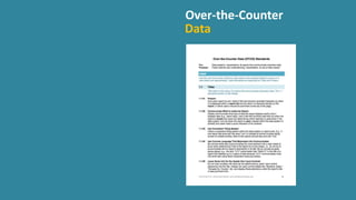
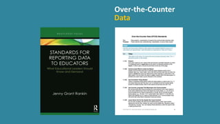
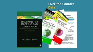
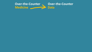
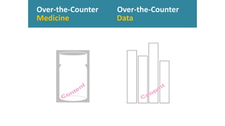
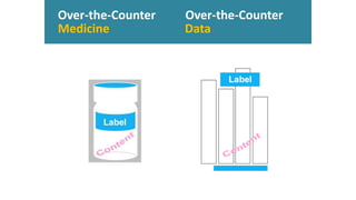
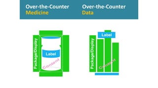
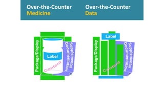
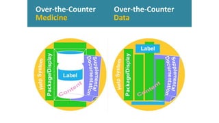
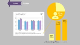
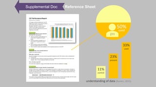
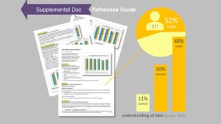
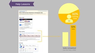


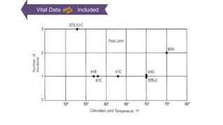
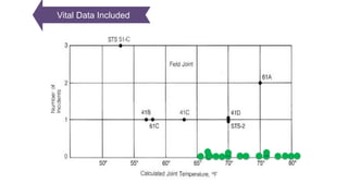


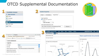
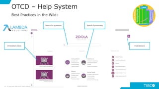
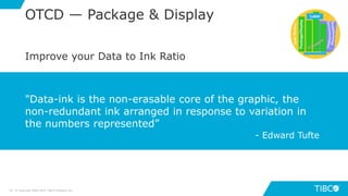
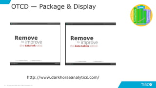


This document discusses standards for effective data visualization known as "Over-the-Counter Data Standards" or OTCD. It outlines objectives to understand OTCD, research showing people have difficulty interpreting data, and how to design reports according to OTCD. This includes using clear labels, supplemental documentation, help systems, effective packaging and displays, and focusing content for audiences. Tips for applying OTCD in Jaspersoft like composite elements and highcharts are provided.


