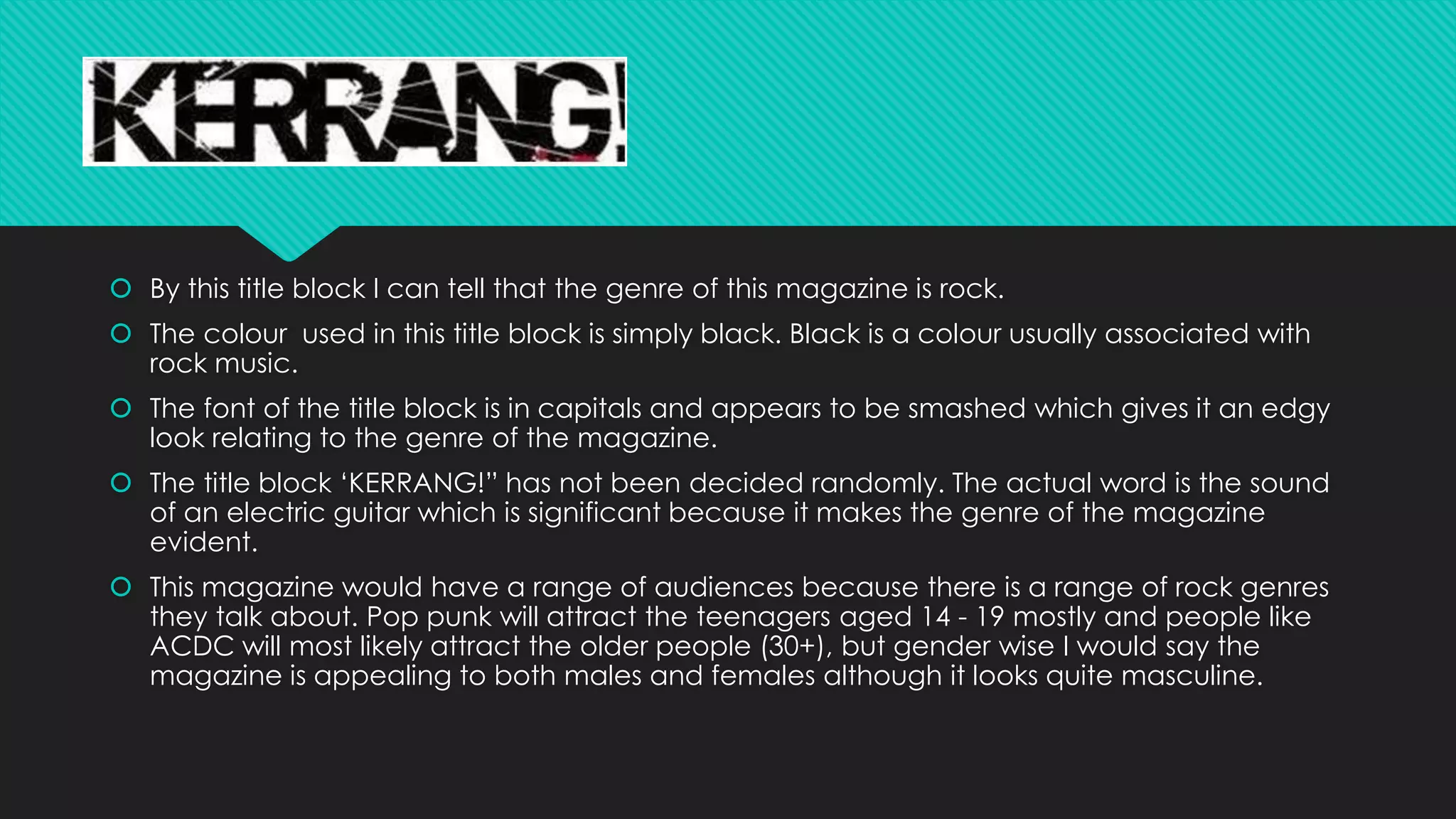
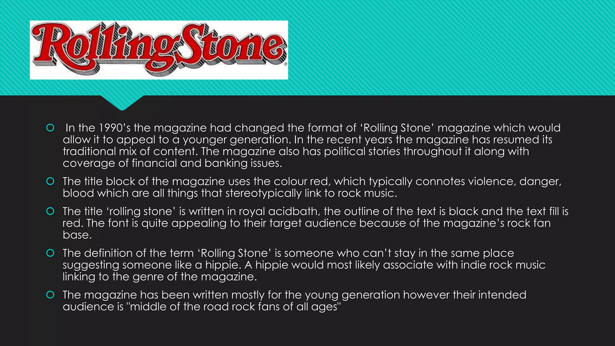
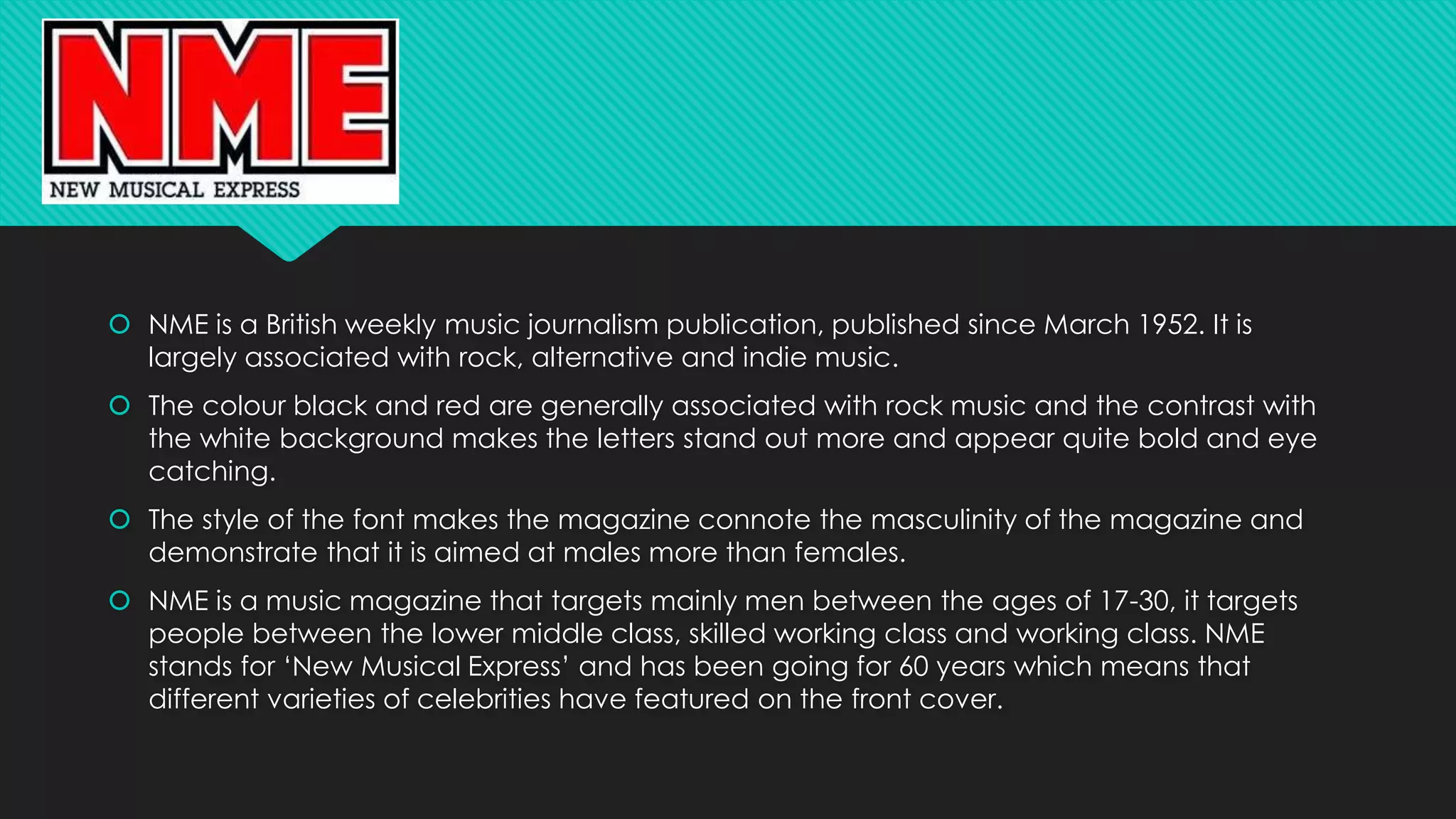
2. By this title block I can tell that the genre of this magazine is rock.
The colour used in this title block is simply black. Black is a colour usually associated with
rock music.
The font of the title block is in capitals and appears to be smashed which gives it an edgy
look relating to the genre of the magazine.
The title block ‘KERRANG!” has not been decided randomly. The actual word is the sound
of an electric guitar which is significant because it makes the genre of the magazine
evident.
This magazine would have a range of audiences because there is a range of rock genres
they talk about. Pop punk will attract the teenagers aged 14 - 19 mostly and people like
ACDC will most likely attract the older people (30+), but gender wise I would say the
magazine is appealing to both males and females although it looks quite masculine.
3. In the 1990’s the magazine had changed the format of ‘Rolling Stone’ magazine which would
allow it to appeal to a younger generation. In the recent years the magazine has resumed its
traditional mix of content. The magazine also has political stories throughout it along with
coverage of financial and banking issues.
The title block of the magazine uses the colour red, which typically connotes violence, danger,
blood which are all things that stereotypically link to rock music.
The title ‘rolling stone’ is written in royal acidbath, the outline of the text is black and the text fill is
red. The font is quite appealing to their target audience because of the magazine’s rock fan
base.
The definition of the term ‘Rolling Stone’ is someone who can’t stay in the same place
suggesting someone like a hippie. A hippie would most likely associate with indie rock music
linking to the genre of the magazine.
The magazine has been written mostly for the young generation however their intended
audience is "middle of the road rock fans of all ages"
4. NME is a British weekly music journalism publication, published since March 1952. It is
largely associated with rock, alternative and indie music.
The colour black and red are generally associated with rock music and the contrast with
the white background makes the letters stand out more and appear quite bold and eye
catching.
The style of the font makes the magazine connote the masculinity of the magazine and
demonstrate that it is aimed at males more than females.
NME is a music magazine that targets mainly men between the ages of 17-30, it targets
people between the lower middle class, skilled working class and working class. NME
stands for ‘New Musical Express’ and has been going for 60 years which means that
different varieties of celebrities have featured on the front cover.