Download as PDF, PPTX
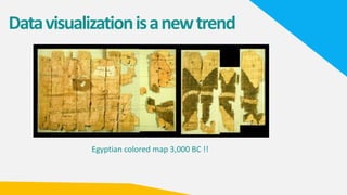
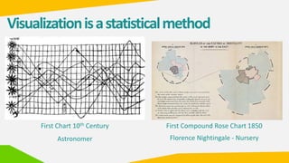


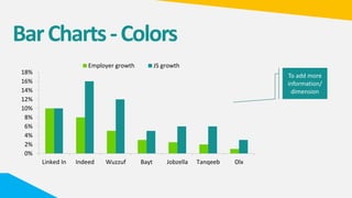
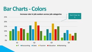
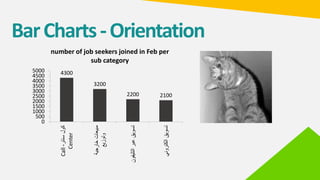
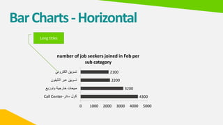


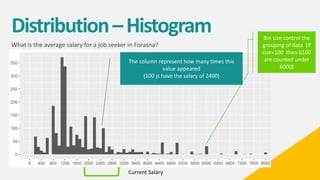
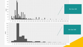
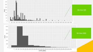

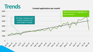
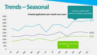
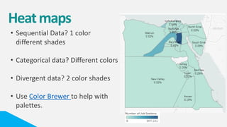
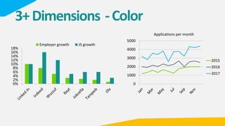
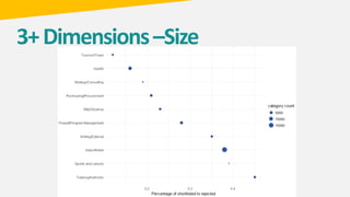


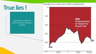
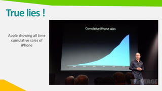
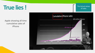
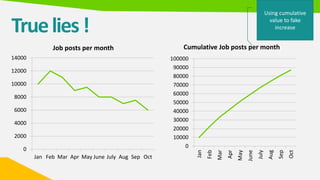


The document provides an extensive overview of data visualization, tracing its history from ancient times to modern practices, and highlighting the importance of visuals in communication and learning. It includes various data visualization techniques and tools, their strengths and constraints, along with ethical considerations in presenting data. Additionally, the document discusses common pitfalls in visualization, urging accuracy and clarity to maintain audience trust.


![[DSC Europe 25] Borko Kozomora - Optimizing business workflows with advances ...](https://cdn.slidesharecdn.com/ss_thumbnails/hbgekyb0txw0xpo4yfml-borko-kozomora-leading-ai-transformation-260122103838-cc29ee38-thumbnail.jpg?width=640&height=640&fit=bounds)


![[DSC Europe 25] Milos Belcevic - Product Professional's Journey to Full-Stack...](https://cdn.slidesharecdn.com/ss_thumbnails/1zovd6fgsycdg4wvgvls-milos-belcevic-product-professionals-journey-to-full-stack-product-developer-260123083019-d993120d-thumbnail.jpg?width=640&height=640&fit=bounds)
