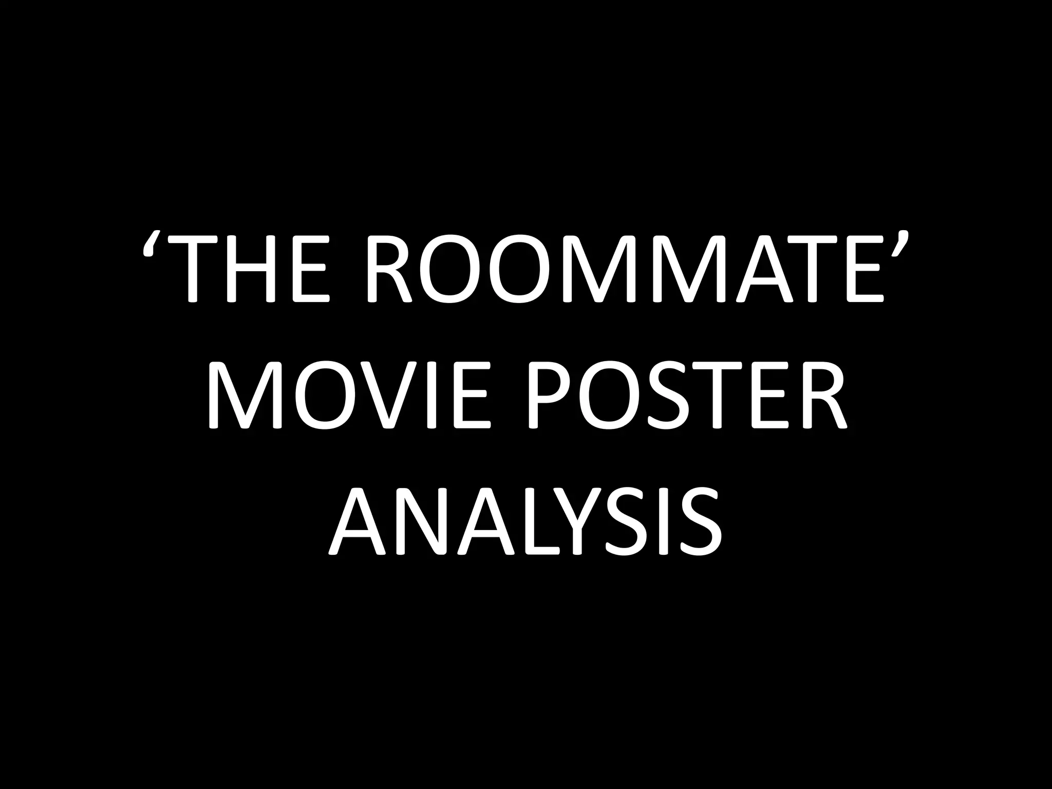
‘THE ROOMMATE’
MOVIE POSTER
ANALYSIS
PURPOSE:
The purpose of the poster is to entice
the reader into watching the film. The
aim is to make the reader think of the
narrative of the film and to think she is
an ordinary girl. This is in contrast to
reality as she is a psychopath
antagonist. The deep and direct eye-
contact to the reader is threatening
and powering making her appear to be
a superior character and also helps to
suggest the genre of the movie.
LAYOUT:
The layout of the poster follows a
conventional method of using the grid.
This is where the image is placed
directly into the middle of the page,
then around the edges text is used to
frame the image.
The background of the poster is
effective as at the top of the page it is
dark and gloomy , whereas where the
image is, is clear and brighter
representing her characteristics
making her seem mysterious.
IMAGE:
The image of the psychopath named
Rebecca is a faded mid shot with the
main focus on her face. The direct eye-
contact makes the model look
powerful and threatening. Her clothing
makes her appear like an ordinary girl
when in reality she is the antagonist.
The way in which she is faded from
shoulders down directs the readers
focus to her face making her appear
more empowering.
COLOUR SCHEME:
The colour scheme on the poster
involves red and white for the colour
of text. This is effective as the red
connotes danger, death and
deadliness. This adds emphasis to the
idea that she holds power and is
superior in comparison to the
protagonist being her roommate. The
font used within the cover line is
effective as it looks slightly broken
alike shattered glass suggesting that
the antagonist is fragile as well as
dangerous.

'The roommate’ movie poster analysis

  • 1.
  • 2.
    PURPOSE: The purpose ofthe poster is to entice the reader into watching the film. The aim is to make the reader think of the narrative of the film and to think she is an ordinary girl. This is in contrast to reality as she is a psychopath antagonist. The deep and direct eye- contact to the reader is threatening and powering making her appear to be a superior character and also helps to suggest the genre of the movie. LAYOUT: The layout of the poster follows a conventional method of using the grid. This is where the image is placed directly into the middle of the page, then around the edges text is used to frame the image. The background of the poster is effective as at the top of the page it is dark and gloomy , whereas where the image is, is clear and brighter representing her characteristics making her seem mysterious. IMAGE: The image of the psychopath named Rebecca is a faded mid shot with the main focus on her face. The direct eye- contact makes the model look powerful and threatening. Her clothing makes her appear like an ordinary girl when in reality she is the antagonist. The way in which she is faded from shoulders down directs the readers focus to her face making her appear more empowering. COLOUR SCHEME: The colour scheme on the poster involves red and white for the colour of text. This is effective as the red connotes danger, death and deadliness. This adds emphasis to the idea that she holds power and is superior in comparison to the protagonist being her roommate. The font used within the cover line is effective as it looks slightly broken alike shattered glass suggesting that the antagonist is fragile as well as dangerous.