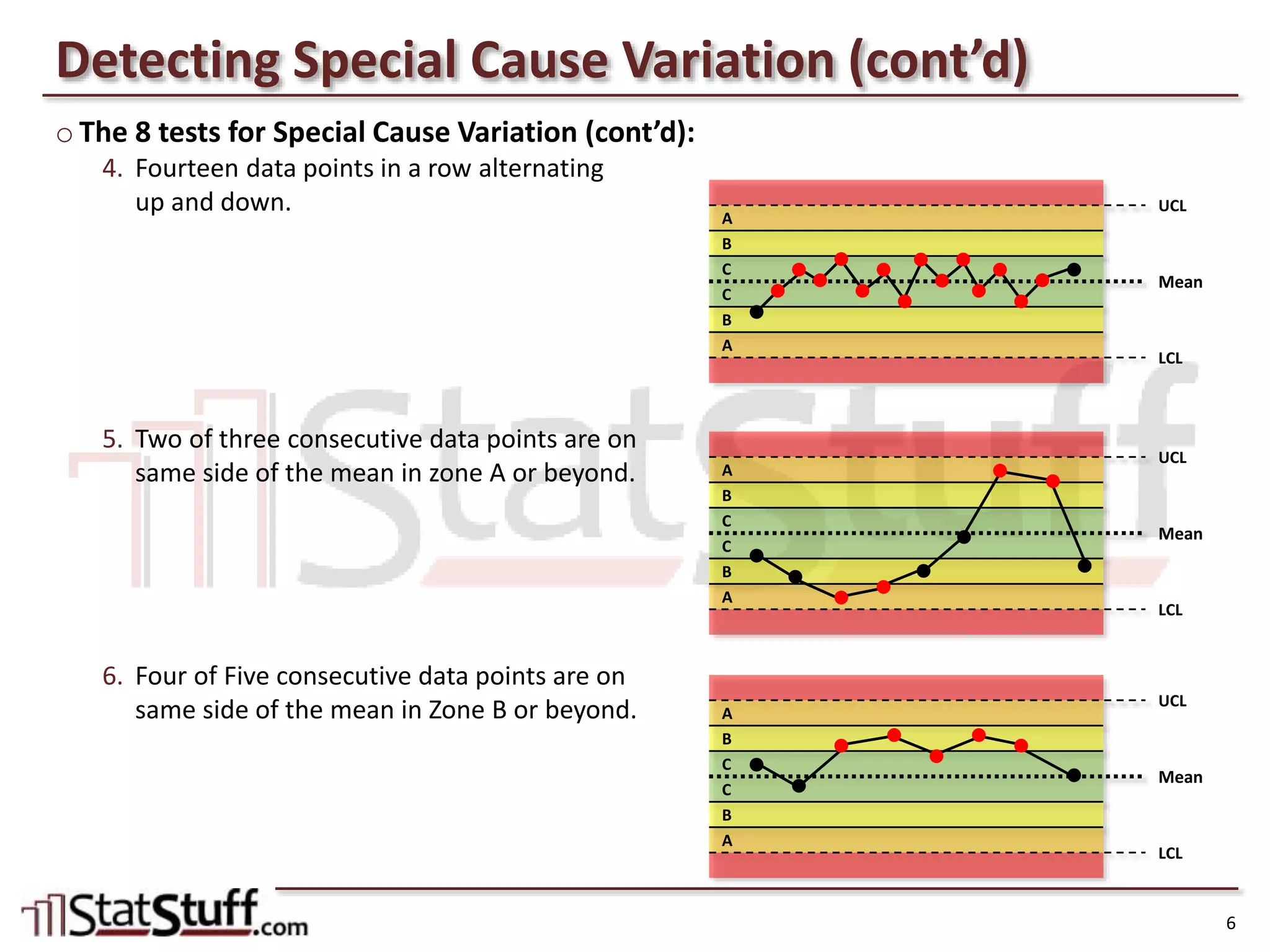
3. o How do you read a control chart?
• Control charts plot the data points (continuous data) over time and define the following:
Observations – the data points from the dataset that should be pre-sorted in date/time order.
Mean – the average for all data points.
LCL – Lower Control Limit defined as 3σ below the mean.
UCL – Upper Control Limit defined as 3σ above the mean.
Special Cause Tests – Any of 8 rules can be tested on the data to highlight potential special causes.
– We’ll review later what these tests are and how to modify them.
• Below is an example of a control chart and its various components:
• Control limits (LCL/UCL) are not the same as Specification limits (LSL/USL).
Spec limits are tied to the VOC; a process can be “in control” but not meet customer req’ts & vice versa.
Control Charts Defined
3
Mean (average)
of the dataset
Upper Control Limit set
at 3σ above the mean
Lower Control Limit set
at 3σ below the mean
Indicates 20 observations
(data points) in time order
191715131197531
57.5
55.0
52.5
50.0
47.5
45.0
42.5
40.0
Observation
IndividualValue
_
X=48.85
UCL=56.55
LCL=41.15
1
I Chart of Data
Observation #7 failed the test for
data points outside LCL/UCL.
Expected
variation region
(common cause)
Unexpected
variation region
(special cause)
4. o How do you detect special cause variation in a control chart?
• Special cause variation may exist in a process that appears to be “in control” (within LCL/UCL).
It may also be reflected in trends or behavior that appear non-normal.
• There are 8 tests (general rules) for finding potential special cause variation.
Some tests divide the “control region” of the chart into 3 zones (usually 1σ apart from each other).
4
Outside Control (usually >3σ above mean)
UCL
Zone A (usually 3σ above mean)
Zone B (usually 2σ above mean)
Zone C (usually 1σ above mean)
Mean
Zone C (usually 1σ below mean)
Zone B (usually 2σ below mean)
Zone A (usually 3σ below mean)
LCL
Outside Control (usually >3σ below mean)
Detecting Special Cause Variation
5. o The 8 tests for Special Cause Variation:
1. One data point falls outside the control limits.
2. Nine data points in a row are on the same
side of the mean.
3. Six data points in a row are all increasing
or decreasing.
UCL
A
B
C
Mean
C
B
A
LCL
UCL
A
B
C
Mean
C
B
A
LCL
Detecting Special Cause Variation (cont’d)
5
UCL
A
B
C
Mean
C
B
A
LCL
6. o The 8 tests for Special Cause Variation (cont’d):
4. Fourteen data points in a row alternating
up and down.
5. Two of three consecutive data points are on
same side of the mean in zone A or beyond.
6. Four of Five consecutive data points are on
same side of the mean in Zone B or beyond.
UCL
A
B
C
Mean
C
B
A
LCL
UCL
A
B
C
Mean
C
B
A
LCL
Detecting Special Cause Variation (cont’d)
6
UCL
A
B
C
Mean
C
B
A
LCL
7. o The 8 tests for Special Cause Variation (cont’d):
7. Fifteen consecutive data points within
Zone C on either side of the mean.
8. Eight consecutive data points outside of
Zone C on either side of the mean.
UCL
A
B
C
Mean
C
B
A
LCL
Detecting Special Cause Variation (cont’d)
7
UCL
A
B
C
Mean
C
B
A
LCL
8. o How do I setup these special cause variation tests in Minitab?
• In any of the control chart dialog boxes, select the “Chart Options…” button, then “Tests” tab.
• By default, the first test is applied for all control charts; check any others you want to run.
• The “K” column allows you to modify the tests to be more or less restrictive than the standard.
• When a test fails, the chart’s data points will be red with a # referencing which test failed.
Minitab’s session window will also display which test failed and reference which observation(s) failed.
8
Finding the Special Cause Tests in Minitab