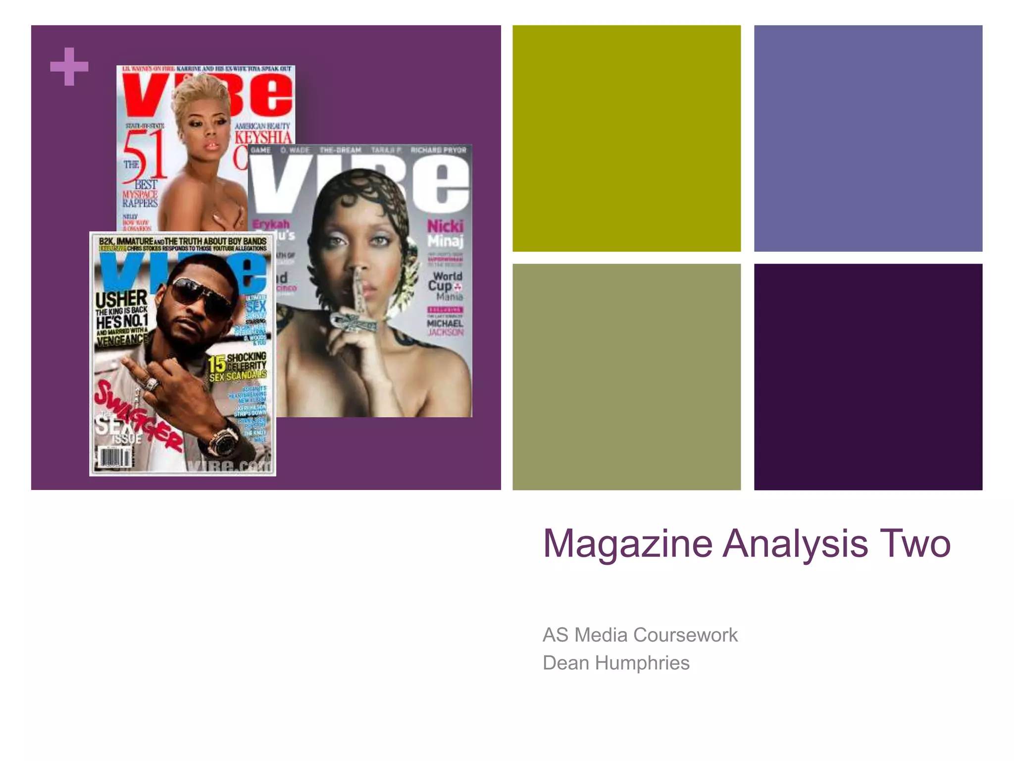
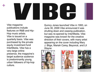
+


    Magazine Analysis Two

    AS Media Coursework
    Dean Humphries
+


    Vibe magazine                Quincy Jones launched Vibe in 1993, on
    publications include         June 30, 2009 Vibe announced it was
    features on R&B and Hip-     shutting down and ceasing publication,
    Hop music artists.           but was re-opened by InterMedia. Vibe
    Vibe is issued on a          magazine was known for the creative
    quarterly basis. Vibe was    direction of their covers, with many artist
    purchased by the private     appearing on the cover including Mary
    equity investment fund       J. Blige, Mariah Carey, Beyoncé, and Lil
    InterMedia. Vibe has a       Wayne
    very large online
    presence, the magazine’s
    target audience audience
    is predominantly young,
    urban followers of hip-hop
    culture.
+
Masthead: The
masthead of Vibe is
extremely bold, in
each issue the color
changes, but the style
stays the same. The
‘VIB’ is in capital          Cover Lines: The cover
letters but the ‘e’ is in    lines on ‘Vibe’ are all in
lower case letters; to       yellow and white. They
convey a stylish             give insight into the
representation. ‘VIBe’       magazine and also
is the most dominating       include pull out quotes
text on the page so          from the artist in the main
the audience can             image.
recognize it through         Main Image: The main
all of the other many        image ‘Vibe’ has used is
magazines.                   someone instantly
                             recognisable to the
Header: A list of            audience that would read
artist featured in           ‘Vibe’ this would attract
the magazine. Gets           their target audience, and
the reader in the            keep inline of their
know of who they             convention of target
are going to read            audience.
about in this
particular issue.
                   Barcode
+   It is easily identifiable that this is
    the contents of ‘Vibe’
    magazine, with the big ‘V’
    watermark behind the main
    image of Kanye West. The word
    ‘contents’ is split onto 3 lines to
    add a stylish effect, and create
    the image of an urban magazine
    feel. ‘Contents’ is in bold, and is
    written in all capitals to attract
    the readers attention. The main
    image of Kanye West is also
    instantly recognisable to the
    readers, and is the reason why it
    is subject to the contents page.
    Only featured articles are written
    in the contents page. It is very
    difficult to establish a house style
    for ‘Vibe’ as every contents and
    front cover are different; except
    the text ‘Vibe’. All color schemes
    change and very between
    issues, as this one has a
    gradient color scheme with a
    lack of color, which emphasises
    the urban culture to which it
    appeals too.
+


This is a double page spread taken from a ‘Vibe’ magazine. The right A4 page is taken up by the main
image of Alexandra Burke modeling in a chic ‘seductive’ way to lure and entice the readers to read the
article. There is one more image of Alexandra on the left A4 page, in the same ‘sexy’ attire which gives
emphasis to the culture of the RnB magazine and to show that the article is obviously about her. There is a
quote pulled out of the article pink in color, which lets the reader jump to it to read it if they want some more
information about the article. The text is simple and clear in lines of columns influences by newspapers to
let the reader easily follow the continuous prose. Overall the design is simple yet elegant and
modern, enticing that modern and elegant reader to pick it up and take a read.

Analysis Two: Vibe

  • 1.
    + Magazine Analysis Two AS Media Coursework Dean Humphries
  • 2.
    + Vibe magazine Quincy Jones launched Vibe in 1993, on publications include June 30, 2009 Vibe announced it was features on R&B and Hip- shutting down and ceasing publication, Hop music artists. but was re-opened by InterMedia. Vibe Vibe is issued on a magazine was known for the creative quarterly basis. Vibe was direction of their covers, with many artist purchased by the private appearing on the cover including Mary equity investment fund J. Blige, Mariah Carey, Beyoncé, and Lil InterMedia. Vibe has a Wayne very large online presence, the magazine’s target audience audience is predominantly young, urban followers of hip-hop culture.
  • 3.
    + Masthead: The masthead ofVibe is extremely bold, in each issue the color changes, but the style stays the same. The ‘VIB’ is in capital Cover Lines: The cover letters but the ‘e’ is in lines on ‘Vibe’ are all in lower case letters; to yellow and white. They convey a stylish give insight into the representation. ‘VIBe’ magazine and also is the most dominating include pull out quotes text on the page so from the artist in the main the audience can image. recognize it through Main Image: The main all of the other many image ‘Vibe’ has used is magazines. someone instantly recognisable to the Header: A list of audience that would read artist featured in ‘Vibe’ this would attract the magazine. Gets their target audience, and the reader in the keep inline of their know of who they convention of target are going to read audience. about in this particular issue. Barcode
  • 4.
    + It is easily identifiable that this is the contents of ‘Vibe’ magazine, with the big ‘V’ watermark behind the main image of Kanye West. The word ‘contents’ is split onto 3 lines to add a stylish effect, and create the image of an urban magazine feel. ‘Contents’ is in bold, and is written in all capitals to attract the readers attention. The main image of Kanye West is also instantly recognisable to the readers, and is the reason why it is subject to the contents page. Only featured articles are written in the contents page. It is very difficult to establish a house style for ‘Vibe’ as every contents and front cover are different; except the text ‘Vibe’. All color schemes change and very between issues, as this one has a gradient color scheme with a lack of color, which emphasises the urban culture to which it appeals too.
  • 5.
    + This is adouble page spread taken from a ‘Vibe’ magazine. The right A4 page is taken up by the main image of Alexandra Burke modeling in a chic ‘seductive’ way to lure and entice the readers to read the article. There is one more image of Alexandra on the left A4 page, in the same ‘sexy’ attire which gives emphasis to the culture of the RnB magazine and to show that the article is obviously about her. There is a quote pulled out of the article pink in color, which lets the reader jump to it to read it if they want some more information about the article. The text is simple and clear in lines of columns influences by newspapers to let the reader easily follow the continuous prose. Overall the design is simple yet elegant and modern, enticing that modern and elegant reader to pick it up and take a read.