Shout Magazine is a pop music magazine published in the UK since 1993 targeted at teenage girls aged 12-16. The magazine uses a feminine pink masthead font and pink/blue color palette. The language, hashtags, and use of pronouns like "you" and "your" aim to relate directly to and engage teenage readers. The central image on the cover is the popular boyband One Direction, appealing to their large fanbase to boost sales. Puffs advertise a competition to win shopping vouchers, enticing readers interested in fashion. Cover lines promote fashion and boyfriend-focused content relevant to young girls.
You could be a professional graphic designer and still make mistakes. There is always the possibility of human error. On the other hand if you’re not a designer, the chances of making some common graphic design mistakes are even higher. Because you don’t know what you don’t know. That’s where this blog comes in. To make your job easier and help you create better designs, we have put together a list of common graphic design mistakes that you need to avoid.
Book Formatting: Quality Control Checks for DesignersConfidence Ago
This presentation was made to help designers who work in publishing houses or format books for printing ensure quality.
Quality control is vital to every industry. This is why every department in a company need create a method they use in ensuring quality. This, perhaps, will not only improve the quality of products and bring errors to the barest minimum, but take it to a near perfect finish.
It is beyond a moot point that a good book will somewhat be judged by its cover, but the content of the book remains king. No matter how beautiful the cover, if the quality of writing or presentation is off, that will be a reason for readers not to come back to the book or recommend it.
So, this presentation points designers to some important things that may be missed by an editor that they could eventually discover and call the attention of the editor.
Top 5 Indian Style Modular Kitchen DesignsFinzo Kitchens
Get the perfect modular kitchen in Gurgaon at Finzo! We offer high-quality, custom-designed kitchens at the best prices. Wardrobes and home & office furniture are also available. Free consultation! Best Quality Luxury Modular kitchen in Gurgaon available at best price. All types of Modular Kitchens are available U Shaped Modular kitchens, L Shaped Modular Kitchen, G Shaped Modular Kitchens, Inline Modular Kitchens and Italian Modular Kitchen.
Can AI do good? at 'offtheCanvas' India HCI preludeAlan Dix
Invited talk at 'offtheCanvas' IndiaHCI prelude, 29th June 2024.
https://www.alandix.com/academic/talks/offtheCanvas-IndiaHCI2024/
The world is being changed fundamentally by AI and we are constantly faced with newspaper headlines about its harmful effects. However, there is also the potential to both ameliorate theses harms and use the new abilities of AI to transform society for the good. Can you make the difference?
2. Institution
Music genre: pop music
Who published the magazine: D.C Thomson & Co. Ltd
They have been publishing the magazine since 1993.
Target audience: the target audience for this
magazine would be teenage girls ranging from 12-16
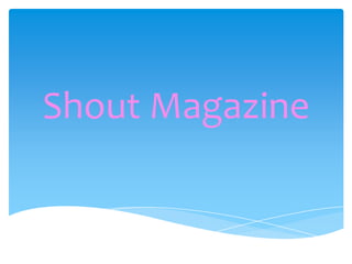
3. The second magazine cover I have chosen to analyse is from the brand Shout. This
magazine is also a perfect example of my chosen subgenre, pop music.
Masthead - the masthead used is bold and eye
catching. The colour used is a muted baby
pink, which is perfect for the target audience
and their expected interests. Perhaps the use
of colour contradicts the masthead itself.
'Shout' connotes boldness and loudness. The
font is rounded and friendly.
4. Colour palette - again, as I have
mentioned the colour palette used is
typical of a pre-teen pop magazine. The
two main colours used are pink and
blue. Although perhaps blue is seen to
be a male colour, in this context it most
definitely compliments the pink and
connotes femininity.
5. Mode of Address - the mode of address used is relatable
to teenagers today, abbreviations are used as a way of
seeming up to date and 'cool'. The use of the twitter
hash tag 'trending' represents the idea that this
magazine is up to date with the latest technology, this
will relate well with teenagers. Many personal pronouns
are found within the front cover, "you" and "your are
often mentioned. For example, "your date with the
biggest boyband on the planet" the use of this engages
the reader and leads them to feel that the magazine is
talking directly to them, it makes them feel involved.
6. Images - the central image of the magazine is of young
modern pop boyband One Direction. The use of having
such a widely known, famous pop group as the central
image is that it appeals to a mainstream audience, a lot
more people are likely to buy the magazine once they see
them. Pop magazines often use images to entice a
mainstream audience rather than a niche audience as this
brings in more money to fund the magazine.
Interestingly, One Direction are the only people on the
front cover, there are no other celebrities or images of
people - this is clever because it tells the reader that there
will be a lot of content including One Direction and
again, as One Direction have millions of fans it
subsequently means more people will buy it.
7. Puffs - the puffs on this front cover are found at
the top of the magazine, highlighted by a big bold
'WIN!' image. This encourages more people to buy
the magazine because young teenagers perhaps
do not have money of their own, or not a lot of it
and the idea of a chance to win £250 worth of
shopping vouchers will entice girls who enjoy
fashion and shopping.
8. Cover-lines - the cover-lines used are obviously
aimed at girls, as they are fashion and boyfriend
orientated. This shows the audience the content
of the magazine and will appeal to a lot of
young girls.
Fonts - fonts used are big, bold and very
feminine.
9. Shot-type – the shot type used is a long shot (LS)
because it shows the whole of the bands body.
House style – the house style for Shout magazine is
definitely feminine and girly. The colour palette connotes
femininity and also the language that has been used is
typical of a pop magazine, it is young, fresh and relatable
to the younger generation.
Brand identity – the magazine uses bright colours which
connote youthfulness and energy, they are fresh and
bold which contributes to the brand identity of Shout
magazine.