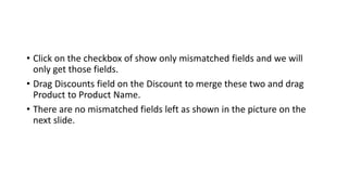
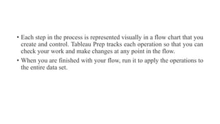
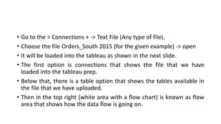
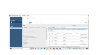
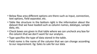
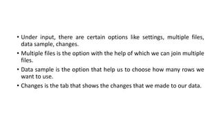
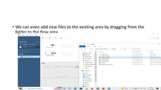
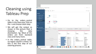
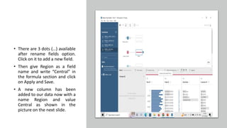
Tableau Prep is a tool for preparing data for analysis in Tableau. It allows users to connect to various data sources, combine and clean the data through a visual flow process. Key features include connecting to multiple data sources, using steps to filter, pivot, join and clean data, tracking changes, and applying operations to entire datasets. The document provides examples of using Tableau Prep to clean data from multiple files by adding/removing fields, standardizing date formats, handling missing values, and merging datasets.


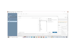
![• Add a formula [Ship Mode]='first class’ into the window and click on
apply.
• We can also remove/edit the filter applied to our data by right clicking](https://image.slidesharecdn.com/tableauprep-230329145426-2278ce87/85/Tableau-Prep-pptx-10-320.jpg)
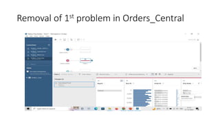
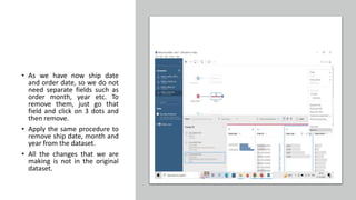
![• Second issue with the orders_central is missing order date and ship
date column. For this again we will add a new calculated field.
• Enter the details as Order Date as a field name and formula as
MAKEDATE([Order Year],[Order Month],[Order Day]) and click on
apply and save.
• New field with a name Order Date has been added into the data as
shown in the picture on the next slide.
• Similarly add a new field ship date with a formula MAKEDATE([Ship
Year],[Ship Month],[Ship Day]).](https://image.slidesharecdn.com/tableauprep-230329145426-2278ce87/85/Tableau-Prep-pptx-18-320.jpg)