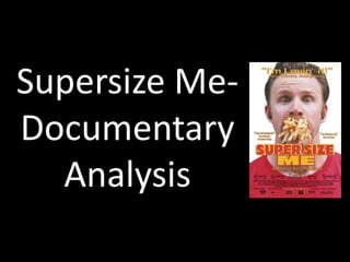
Supersize Me- 
Documentary 
Analysis
Directed by Morgan 
Spurlock
Themes 
• There where six main themes that I spotted 
throughout the documentary.
Narrative Structure 
Linear 
This documentary is linear as it is in chronological order, 
sticks to one time period rather than jumping between 
tenses. 
Open V closed 
There was a closed structure as we seen Morgan finish 
the 30 day experiment and learnt what the consequences 
where of eating fast food. 
On the other hand it had an open structure as we were 
not informed on what McDonalds decided to do after 
watching the documentary and what actions where taken 
to reduce the obesity across America.
Camera 
Zoom out Two shot 
Low angle shot Close-up
Wide shot Zoom in 
Mid shot 
The camera shots where used 
throughout many times. using the right 
shot when relevant. For example, a wide 
shot was used when the mise-en-scene 
needed to be shown to understand the 
point being made.
Mise-en-scene 
Doctors Home 
McDonalds Work
In his car
Sound 
Throughout the documentary songs related to 
‘supersize me’, ‘fat’ and ‘McDonalds’ are 
played so it keeps to the themes that the 
documentary is based on. However, there is a 
juxtaposition of non-diegetic music during 
surgery as operatic music is played which 
highlights the difference. Then there is digetic 
sounds such as the unwrapping of food which 
makes it more realistic to the viewer.
Editing 
There is not a complex use of editing techniques used as that is 
not what the documentary needs to get across its point. 
However as there are videos edited into it of people eating 
food and fat people walking the streets its used to send a 
message that your not in control of your body as much as you 
think. Also, there are cartoon animations which are used to 
show the viewers what they are really buying. There are many 
jump-cuts so that it is a clean watch through without it 
jumping from place to place, images are inserted to make 
sure the theme is kept the same for that topic of 
conversation. Clips also, fade in and fade out.
Archive material 
There is archive material throughout the documentary. It is mainly used so there are 
not so many jumpstarts throughout. It can be placed between two scenes, for 
example an image of a fat person walking the street so the material is something to 
do with the topic allowing the two scenes to flow through. The archive material is 
also used to be inspiring to those who watch as there are clips of speech's, one 
being from Jared Fogle who tried to inspire Americans. A piece of archive material 
that was also inspiring was a clip of a man holding his old pair of pants after loosing 
a large mass of weight.
Graphics 
Graphics are used throughout. Most subtitles are written in Sans 
Serif making it clear for the viewer to understand what has been 
said. The use of days, states, time and maps are used through the 
documentary emphasising the chronological order to the 
documentary. Below there are two maps, one showing the rate of 
obesity in 1985 and the other in 2002, showing the public that 
obesity is a new and popular thing in the U.S, hoping to scare the 
viewer into realising that things need to change.
The use of off putting propaganda 
is used throughout the 
documentary, imitating different 
famous paintings such as ‘The Last 
Supper’ showing how McDonalds 
manipulate the population into 
buying the food they serve to the 
public.

Supersize me documentary analysis

  • 1.
  • 2.
  • 4.
    Themes • Therewhere six main themes that I spotted throughout the documentary.
  • 5.
    Narrative Structure Linear This documentary is linear as it is in chronological order, sticks to one time period rather than jumping between tenses. Open V closed There was a closed structure as we seen Morgan finish the 30 day experiment and learnt what the consequences where of eating fast food. On the other hand it had an open structure as we were not informed on what McDonalds decided to do after watching the documentary and what actions where taken to reduce the obesity across America.
  • 6.
    Camera Zoom outTwo shot Low angle shot Close-up
  • 7.
    Wide shot Zoomin Mid shot The camera shots where used throughout many times. using the right shot when relevant. For example, a wide shot was used when the mise-en-scene needed to be shown to understand the point being made.
  • 8.
  • 9.
  • 10.
    Sound Throughout thedocumentary songs related to ‘supersize me’, ‘fat’ and ‘McDonalds’ are played so it keeps to the themes that the documentary is based on. However, there is a juxtaposition of non-diegetic music during surgery as operatic music is played which highlights the difference. Then there is digetic sounds such as the unwrapping of food which makes it more realistic to the viewer.
  • 11.
    Editing There isnot a complex use of editing techniques used as that is not what the documentary needs to get across its point. However as there are videos edited into it of people eating food and fat people walking the streets its used to send a message that your not in control of your body as much as you think. Also, there are cartoon animations which are used to show the viewers what they are really buying. There are many jump-cuts so that it is a clean watch through without it jumping from place to place, images are inserted to make sure the theme is kept the same for that topic of conversation. Clips also, fade in and fade out.
  • 12.
    Archive material Thereis archive material throughout the documentary. It is mainly used so there are not so many jumpstarts throughout. It can be placed between two scenes, for example an image of a fat person walking the street so the material is something to do with the topic allowing the two scenes to flow through. The archive material is also used to be inspiring to those who watch as there are clips of speech's, one being from Jared Fogle who tried to inspire Americans. A piece of archive material that was also inspiring was a clip of a man holding his old pair of pants after loosing a large mass of weight.
  • 13.
    Graphics Graphics areused throughout. Most subtitles are written in Sans Serif making it clear for the viewer to understand what has been said. The use of days, states, time and maps are used through the documentary emphasising the chronological order to the documentary. Below there are two maps, one showing the rate of obesity in 1985 and the other in 2002, showing the public that obesity is a new and popular thing in the U.S, hoping to scare the viewer into realising that things need to change.
  • 14.
    The use ofoff putting propaganda is used throughout the documentary, imitating different famous paintings such as ‘The Last Supper’ showing how McDonalds manipulate the population into buying the food they serve to the public.