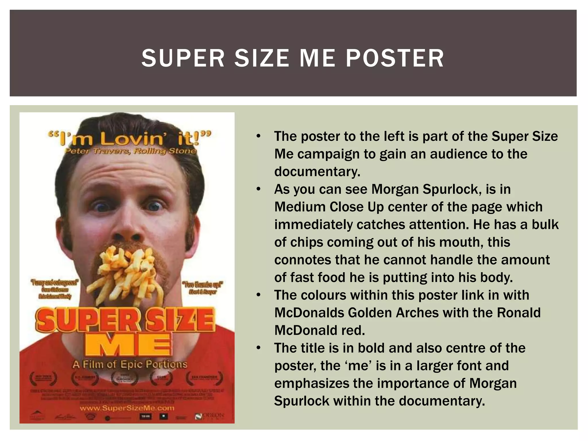
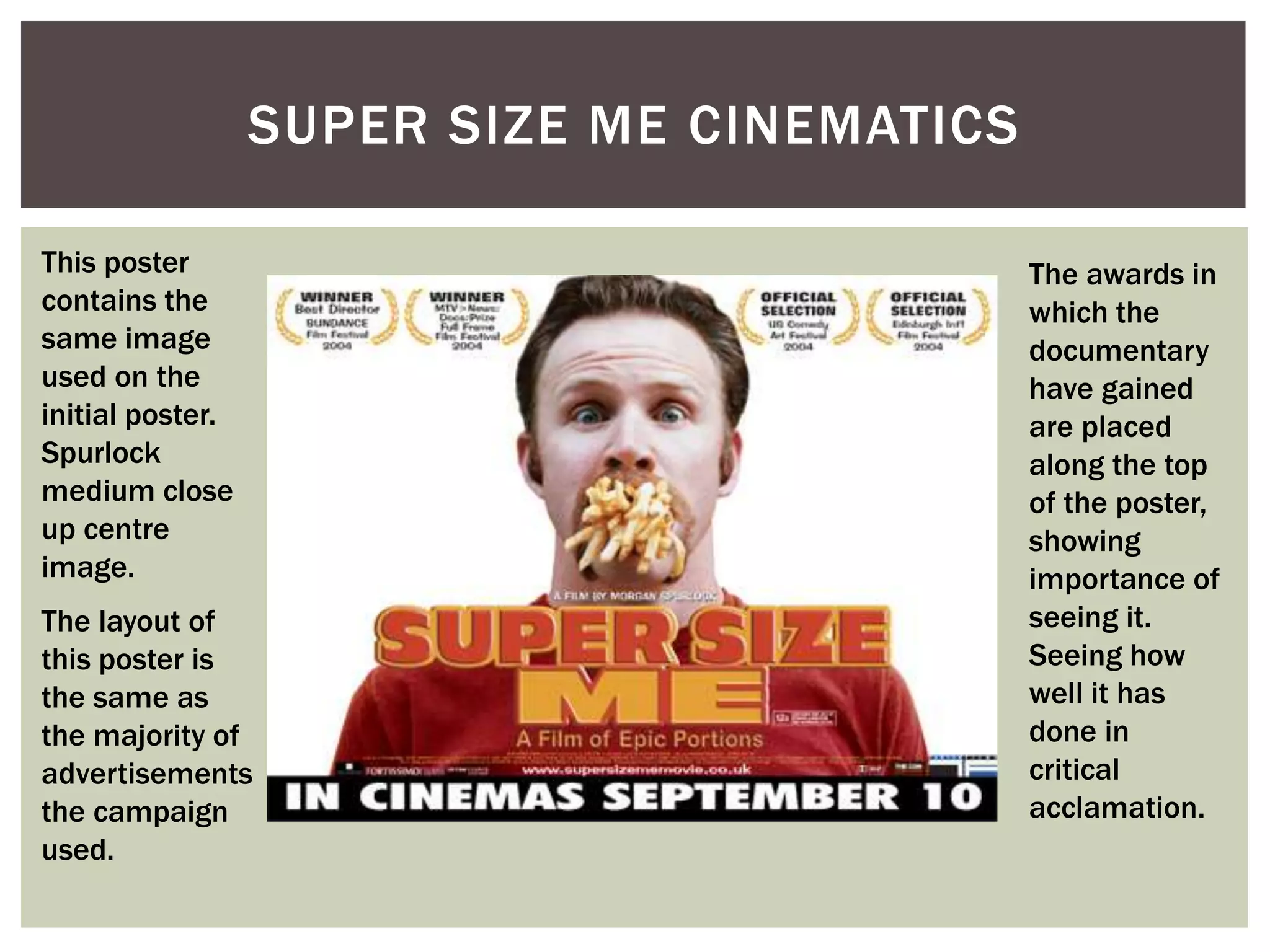
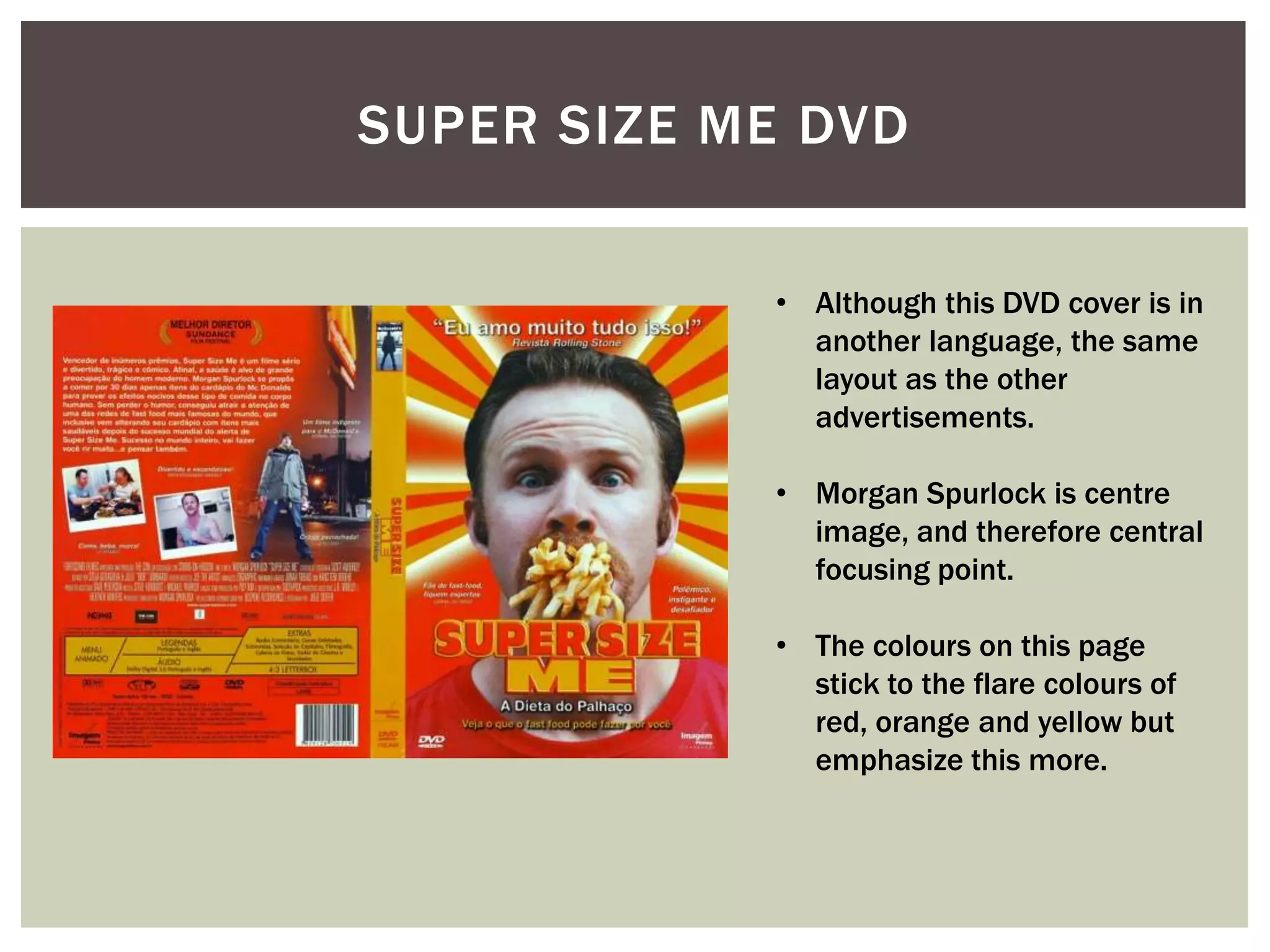
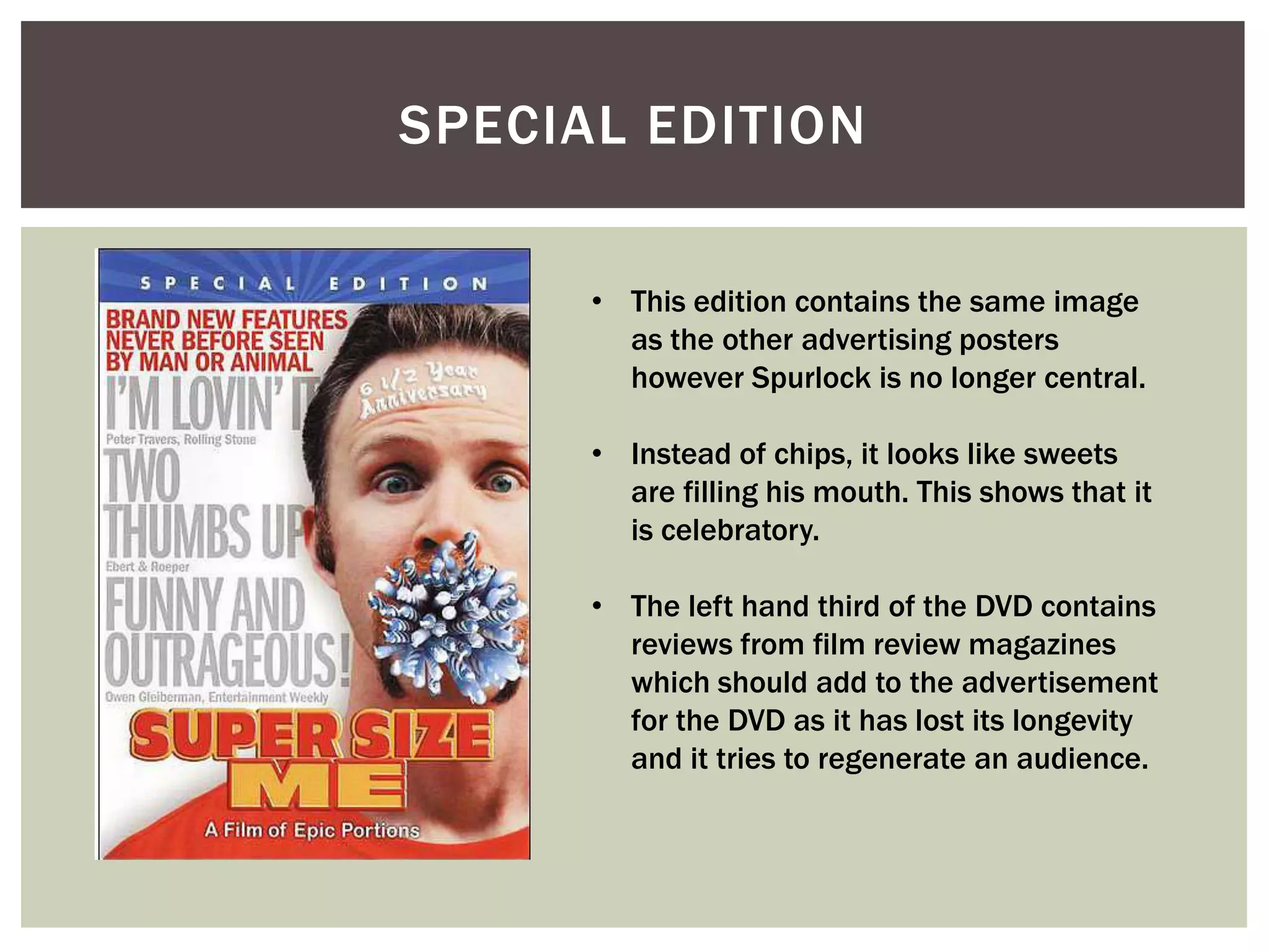
COHESIVE MARKETING   SUPER SIZE
                     ME
          CAMPAIGN
SUPER SIZE ME POSTER

       • The poster to the left is part of the Super Size
         Me campaign to gain an audience to the
         documentary.
       • As you can see Morgan Spurlock, is in
         Medium Close Up center of the page which
         immediately catches attention. He has a bulk
         of chips coming out of his mouth, this
         connotes that he cannot handle the amount
         of fast food he is putting into his body.
       • The colours within this poster link in with
         McDonalds Golden Arches with the Ronald
         McDonald red.
       • The title is in bold and also centre of the
         poster, the ‘me’ is in a larger font and
         emphasizes the importance of Morgan
         Spurlock within the documentary.
SUPER SIZE ME CINEMATICS

This poster                                  The awards in
contains the                                 which the
same image                                   documentary
used on the                                  have gained
initial poster.                              are placed
Spurlock                                     along the top
medium close                                 of the poster,
up centre                                    showing
image.                                       importance of
The layout of                                seeing it.
this poster is                               Seeing how
the same as                                  well it has
the majority of                              done in
advertisements                               critical
the campaign                                 acclamation.
used.
SUPER SIZE ME DVD


            • Although this DVD cover is in
              another language, the same
              layout as the other
              advertisements.

            • Morgan Spurlock is centre
              image, and therefore central
              focusing point.

            • The colours on this page
              stick to the flare colours of
              red, orange and yellow but
              emphasize this more.
SPECIAL EDITION

      • This edition contains the same image
        as the other advertising posters
        however Spurlock is no longer central.

      • Instead of chips, it looks like sweets
        are filling his mouth. This shows that it
        is celebratory.

      • The left hand third of the DVD contains
        reviews from film review magazines
        which should add to the advertisement
        for the DVD as it has lost its longevity
        and it tries to regenerate an audience.

Demi CMC Super Size Me

  • 1.
    COHESIVE MARKETING SUPER SIZE ME CAMPAIGN
  • 2.
    SUPER SIZE MEPOSTER • The poster to the left is part of the Super Size Me campaign to gain an audience to the documentary. • As you can see Morgan Spurlock, is in Medium Close Up center of the page which immediately catches attention. He has a bulk of chips coming out of his mouth, this connotes that he cannot handle the amount of fast food he is putting into his body. • The colours within this poster link in with McDonalds Golden Arches with the Ronald McDonald red. • The title is in bold and also centre of the poster, the ‘me’ is in a larger font and emphasizes the importance of Morgan Spurlock within the documentary.
  • 3.
    SUPER SIZE MECINEMATICS This poster The awards in contains the which the same image documentary used on the have gained initial poster. are placed Spurlock along the top medium close of the poster, up centre showing image. importance of The layout of seeing it. this poster is Seeing how the same as well it has the majority of done in advertisements critical the campaign acclamation. used.
  • 4.
    SUPER SIZE MEDVD • Although this DVD cover is in another language, the same layout as the other advertisements. • Morgan Spurlock is centre image, and therefore central focusing point. • The colours on this page stick to the flare colours of red, orange and yellow but emphasize this more.
  • 5.
    SPECIAL EDITION • This edition contains the same image as the other advertising posters however Spurlock is no longer central. • Instead of chips, it looks like sweets are filling his mouth. This shows that it is celebratory. • The left hand third of the DVD contains reviews from film review magazines which should add to the advertisement for the DVD as it has lost its longevity and it tries to regenerate an audience.