
Recommended
More Related Content
What's hot
What's hot (18)
Similar to Summer work
Similar to Summer work (20)
Recently uploaded
Recently uploaded (20)
Summer work
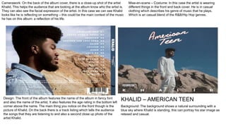
- 1. Camerawork: On the back of the album cover, there is a close-up shot of the artist Khalid. This helps the audience that are looking at the album know who the artist is. They can also see the facial expression of the artist. In this case we can see Khalid looks like he is reflecting on something – this could be the main context of the music he has on this album: a reflection of his life. Mise-en-scene – Costume: In this case the artist is wearing different things in the front and back cover. He is in casual clothing which describes his genre of music that he plays. Which is an casual blend of the R&B/Hip Hop genres. Design: The front of the album features the name of the album in fancy font and also the name of the artist. It also features the age rating in the bottom left corner above the name. The main thing you notice on the front though is the picture of Khalid. On the back there is a track listing which tells the audience the songs that they are listening to and also a second close up photo of the artist Khalid. Background: The background shows a natural surrounding with a blue sky where Khalid is standing, this can portray his star image as relaxed and casual. KHALID – AMERICAN TEEN
- 2. Camerawork: A master shot of the room showing a homemade sheep and a starry background. We also see the full band members on the backside of the CD which is conventional of any album covers. The target audience of Fall out Boy is usually teenagers so this album cover somewhat relates as it’s wacky, eccentric and creative. Fall Out Boy – Infinity on High This cover is typical of bands. It is common to use an image on the cover that is symbolic of the album rather than an image of the band. This adds authenticity to their image – it makes them look more like ‘artists’ Mise en Scene: The mise en scene of this album cover is quite dark with the starry night, which relates to the title of ‘infinity’, as space is infinite. In some areas however, the lighting is slightly brighter, the creativity of this cover relates to the style of music they produce. Design: The design for this album is also pushed as being eccentric and different. The writing of ‘fall out boy’ and the tracklisting is in a wacky font, almost like it has been handwritten by a teenager – which is the target audience for the band. The band are doing this to appeal to their target audience and catch their eye.
- 3. CONVENTIONS: Title of Band Title of Album Reviews Songs from Album Record Company ANALYSIS: This poster for Mumford & Son’s new ‘Sigh No More’ album features four different pictures of the four band members. This suggests that every band member is special and bring something to the band. They are seen individually as artists. MISE EN SCENE: In the background of all of the little images, a picturesque horizon of wheat and trees can be seen. This conveys the type of music they play. As they are in the countryside, the target can audience can tell that the band plays country music. Also the costumes and the band member in the bottom right corner holding an acoustic guitar also emphasises the type of music they play. CAMERAWORK: All of the shots of the band members are mid-shots. These shots give them a sense of entitlement and make them look powerful; as the camera is placed at a slight low angle and the way most the members are looking away from it. DESIGN: The font of the album name and also the name of the band looks aged and classic. The old writing connotates the genre of old country music which the band most identify with in terms of genre.
- 4. CONVENTIONS: Artist Name Title of Album Image of Artist Record Company ANALYSIS: This album picture is simple yet effective. It features the artist – Kendrick Lamar, and the title of the album above his head. The simplicity of it makes the artist stand out and catches the attention of the audience. He is also advertising his merchandise on the cover, with the ‘DAMN.’ MISE-EN-SCENE: The lighting of the cover is both dark and light. The sun is shining on his face yet the bottom half of him is in the shade. This is done to emphasise the face of the artist. Make him more recognisable to the audience. DESIGN: The lettering for the album name and Kendrick’s name is capitalised. This is used to make it stand out among the rest and send a message to the target audience. CAMERAWORK: The picture is a mid shot of Kendrick. He is placed in the centre of the shot which makes him the main focus for this image.