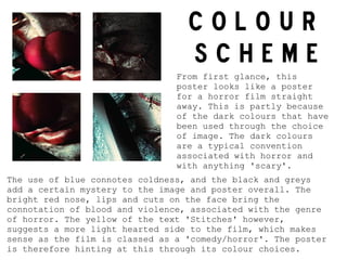
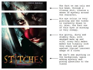
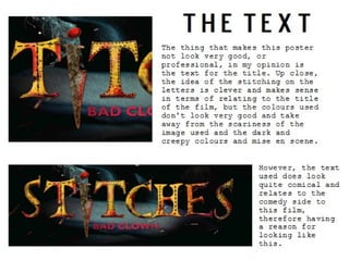
COLOUR
                                  SCHEME
                                From first glance, this
                                poster looks like a poster
                                for a horror film straight
                                away. This is partly because
                                of the dark colours that have
                                been used through the choice
                                of image. The dark colours
                                are a typical convention
                                associated with horror and
                                with anything 'scary'.
The use of blue connotes coldness, and the black and greys
add a certain mystery to the image and poster overall. The
bright red nose, lips and cuts on the face bring the
connotation of blood and violence, associated with the genre
of horror. The yellow of the text 'Stitches' however,
suggests a more light hearted side to the film, which makes
sense as the film is classed as a 'comedy/horror'. The poster
is therefore hinting at this through its colour choices.
Stitches poster analysis print screens

Stitches poster analysis print screens

  • 3.
    COLOUR SCHEME From first glance, this poster looks like a poster for a horror film straight away. This is partly because of the dark colours that have been used through the choice of image. The dark colours are a typical convention associated with horror and with anything 'scary'. The use of blue connotes coldness, and the black and greys add a certain mystery to the image and poster overall. The bright red nose, lips and cuts on the face bring the connotation of blood and violence, associated with the genre of horror. The yellow of the text 'Stitches' however, suggests a more light hearted side to the film, which makes sense as the film is classed as a 'comedy/horror'. The poster is therefore hinting at this through its colour choices.