80 ĐỀ THI THỬ TUYỂN SINH TIẾNG ANH VÀO 10 SỞ GD – ĐT THÀNH PHỐ HỒ CHÍ MINH NĂ...
Shelter advert analysing
1. Logo – sans-serif fontmayhave beenselectedaspeople whoare
homelessmayhave difficultyreadingwordswithcurlsandflicks.
The typeface alsomeansthatit isclear andbold,whichconnotes
urgency,encouraginghomelessindividualsorthose ina housing
crisisto gethelp.The softcurvesalsoconnotesa kindand caring
approach,if the type face wasboldand sharp itmay come across as
unapproachable orevendaunting.
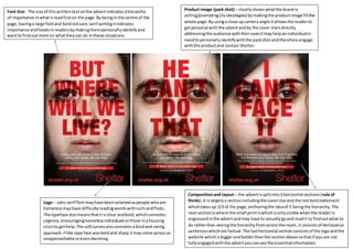
Product image (pack shot) – clearlyshowswhatthe brandis
selling/promoting(itsideologies) bymakingthe productimage fillthe
whole page.Byusinga close upcamera angle itallowsthe readerto
getpersonal withthe advertandby the cover starsdirectly
addressingthe audience withtheireyesitmayhelpanindividualin
needtopersonallyidentifywiththe packshotandtherefore engage
withthe productand contact Shelter.
Font Size - The size of thiswrittentext onthe advertindicatesahierarchy
of importance inwhatisreadfirston the page. By beinginthe centre of the
page,havinga large fontand boldredsans-serif writingitindicates
importance andhooksinreadersbymakingthempersonallyidentifyand
wantto findout more on whattheycan do inthese situations.
Compositionand layout – the advertissplitinto3 horizontal sections(rule of
thirds).It islargelya sectionincludingthe coverstarand the red boldstatement
whichtakesup 2/3 of the page,anchoringthe ideaof it beingthe hierarchy.The
nextsectioniswhere the small printiswhichisonlyvisible whenthe readeris
engrossedinthe advertandmay have to actuallygoand readit to findoutwhat to
do ratherthan seeingthe hierarchyfromacrossthe room,it consistsof declarative
sentenceswhichare factual.The lasthorizontal sectionconsistsof the logoandthe
website whichisbiggerandbolderthanthe sectionabove sothatif youare not
fullyengagedwiththe advertyoucansee the essentialinformation.