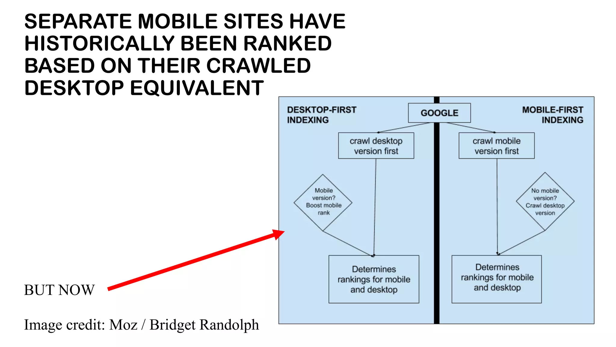
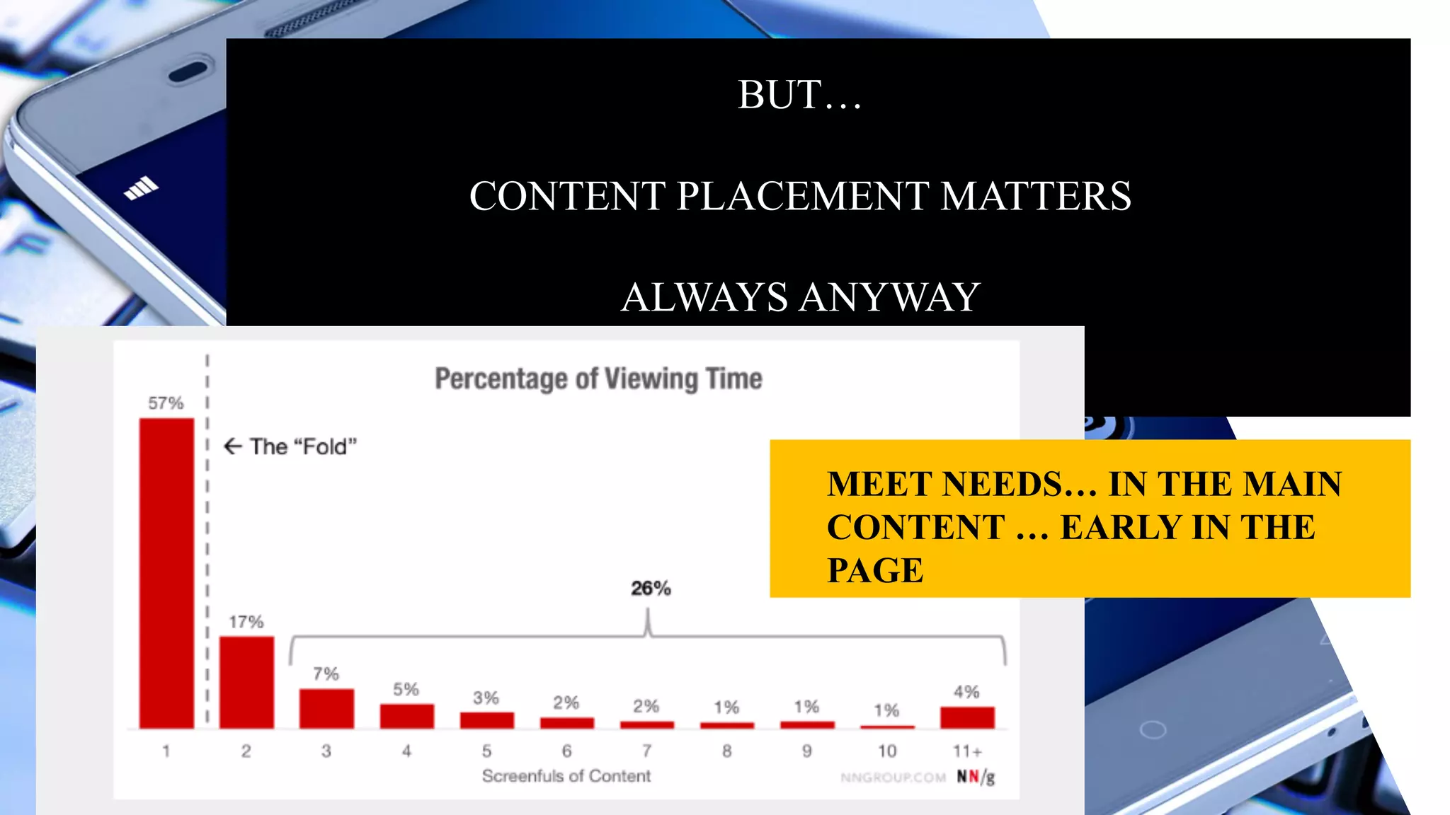
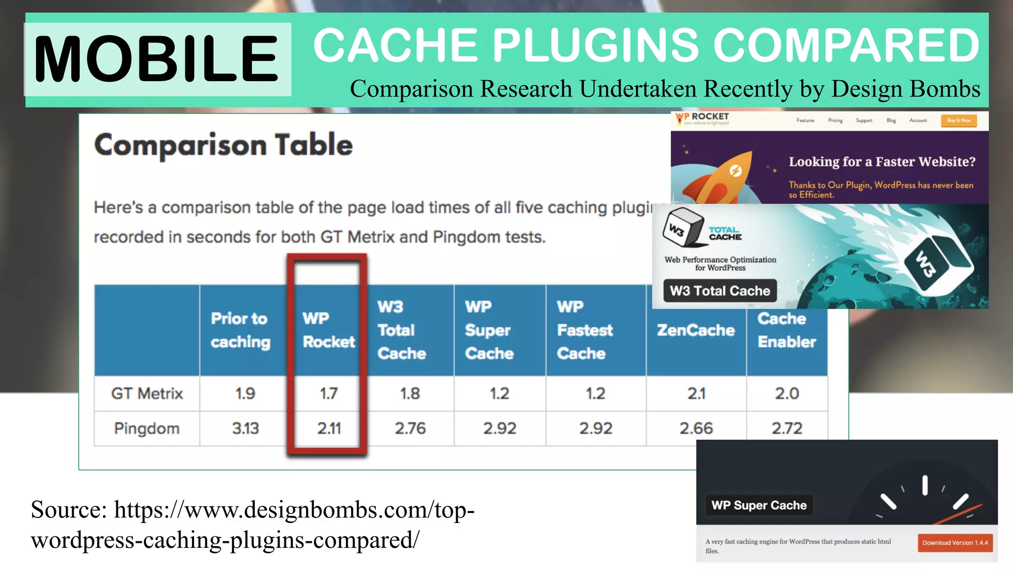
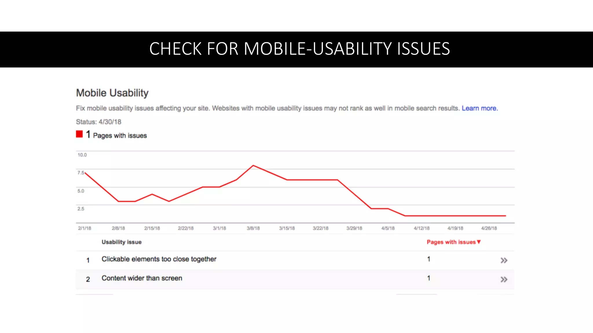
SEO FOR THE MOBILE-
FIRST PARADIGM
Dawn Anderson
• Director	
  -­‐ Move	
  It	
  Marketing
• University	
  Lecturer	
  – Digital	
  marketing	
  &	
  Search
• From	
  Manchester,	
  UK	
  
• International	
  SEO	
  Consultant	
  – 12+	
  Yrs in	
  SEO
• Pomeranian	
  Pooch	
  Lover	
  – Meet	
  Bert	
  &	
  Tedward
• Googebot Hunter	
  (Practice	
  &	
  Academia)
• Search	
  Awards	
  Judge
• Contributor
• Twitter	
  Chatterer	
  @dawnieando
THE MOBILE GLOBAL
MAJORITY HAS ARRIVED
MOBILE VIEW TIMES &
SESSIONS
MOBILE	
  GOES	
  
BEYOND	
  THE	
  PHONE
THESE INCLUDE:
• Mobile-first as a user group %
• Mobile-first as a web design
discipline
• Mobile-first as a user choice &
behaviour
• Mobile-first as a means of indexing
documents in a search engine
What does
mobile-
first web
design
look like?
Source: https://www.seroundtable.com/google-mobile-first-index-2017-
23663.html
The ‘Mobile First
Index’ is on its
way.
IT WILL COME
SOON
MOBILE
THIS TIME LAST YEAR WE WERE
DISCUSSING THE FUTURE MOBILE-
FIRST INDEX
BUT NOW… IT IS HERE
MOBILEGEDDON
APRIL 21ST
2015
REMEMBER
CHICKEN
LICKEN?
Don’t  Jump  The  Gun
IT  IS  BETTER  TO  BUILD  A  ‘THOUGHTFUL’  MOBILE-­FIRST  
RESPONSIVE  WEBSITE  THAN  RUSH  INTO  HASHING  SOMETHING  
TOGETHER
SO	
  WHAT’S	
  MOBILE-­‐
FIRST	
  INDEXING	
  ALL	
  
ABOUT	
  THEN?
SEPARATE MOBILE SITES HAVE
HISTORICALLY BEEN RANKED
BASED ON THEIR CRAWLED
DESKTOP EQUIVALENT
BUT NOW
Image credit: Moz / Bridget Randolph
Indexing and ranking
are two very separate
things
MOBILE-FIRST
INDEXING
DOES NOT
MEAN MOBILE-
FRIENDLY
CONTENT	
  PARITY	
  ON	
  
MOBILE	
  &	
  DESKTOP	
  SITES
CONTENT BEHIND
Tabs, Concertinas &
Hamburger Menus
designed for UX on
mobile is…
OK
ENSURE SEARCH
ENGINE ‘CRAWLERS’
CAN ACCESS
CONTENT HIDDEN
FOR UX
<div class="tab">
<button class="tablinks" onclick="openCity(event, 'London')">London</button>
<button class="tablinks" onclick="openCity(event, 'Paris')">Paris</button>
<button class="tablinks" onclick="openCity(event, 'Tokyo')">Tokyo</button>
</div>
Search engine crawlers
’mostly’ won’t be able to
access these tabs
BUT…
CONTENT PLACEMENT MATTERS
ALWAYS ANYWAY
MEET NEEDS… IN THE MAIN
CONTENT … EARLY IN THE
PAGE
Desktop versus responsive versus dynamic-
serving versus AMP versus M dot
CONTENT  MOVES  AROUND  ON  THE  PAGE  AS  DEVICE  
CHANGES
Recommended
“Dynamic  
serving. Dynamic  
serving is  a  setup  
where  the  server  
responds  with  different  
HTML  (and  CSS)  on  the  
same URL depending  
on  the  user  agent  
requesting  the  page”  
(Google  Developers).
“When a mobile user or desktop
user is detected different content
for each is delivered from the
same web page URL”
DO	
  YOU	
  HAVE	
  
SEPARATE	
  
DESKTOP	
  AND	
  
MOBILE	
  SITES
YOU  MAY  HAVE  SOME  
WORK  TO  DO  FOR  
‘MOBILE-­FIRST  
INDEXING
• Ensure  both  the  mobile  and  desktop  sites  serve  
structured  data
• Ensure  Google’s  crawlers  can  access  the  mobile  
version  of  the  site  (and  desktop  too  of  course)
• No  change  is  needed  for  canonical  links  on  mobile  
sites  at  this  point.
• Ensure  the  mobile  site  is  verified  as  a  separate  
property  in  Google  Search  Console.
DESKTOP
ONLY?
IT WILL STILL
BE INDEXED
X
X
Don’t  Jump  The  Gun
IT  IS  BETTER  TO  BUILD  A  ‘THOUGHTFUL’  MOBILE-­FIRST  
RESPONSIVE  WEBSITE  THAN  RUSH  INTO  HASHING  SOMETHING  
TOGETHER
DESKTOP ONLY & CANONICAL
AMP PAGES
COULD BE AN INTERIM SOLUTION
(OR EVEN LONGER TERM)
BUT… BE CAREFUL WITH THIS. ‘CANONICAL’ MEANS YOU
ARE TELLING GOOGLE TO INDEX YOUR AMP PAGE INSTEAD
OF YOUR DESKTOP PAGE
AMP  PAGES  CAN  LOOK  ‘VERY’  
DIFFERENT  TO  YOUR  OTHER  PAGES
NON AMP
AMP
AMP  PAGES  CAN  LOOK  ‘VERY’  
DIFFERENT  TO  YOUR  OTHER  PAGES
YOU SHOULD SPEND SOME TIME
ON:
• Content parity
• Internal link parity
• Navigation configuration
• Call to action parity
Check everything
twice… at least
Even without mobile-
first when you add
AMP a lot of traffic
becomes ‘AMP’
AVOID  AMP  ERRORS
SPEED	
  ON	
  MOBILE	
  IS	
  ‘OF	
  
THE	
  ESSENCE’
YOU	
  WILL	
  LIKELY	
  INCREASE	
  CONVERSION	
  TOO
TEST	
  YOUR	
  
MOBILE	
  
SPEED
USE  A  RANGE  OF  
TOOLS  TO  
IDENTIFY  ISSUES  
&  MEASURE  
SPEED
IDENTIFY	
  MOBILE	
  FETCH	
  TIMES
GTMetrix & Pingdom Speed Test
Combine Page Speed Tests
MOBILE
WORK  THROUGH  THE  
RECOMMENDATIONS
WORK  TOWARD  ACHIEVING  
BETTER  SCORES…  ACROSS  
MULTIPLE  TOOLS
MAKING IMAGES SMALLER IS OFTEN THE
QUICKEST WIN TO SPEED UP A SITE
Source: https://www.designbombs.com/top-
wordpress-caching-plugins-compared/
CACHE PLUGINS COMPARED
Comparison Research Undertaken Recently by Design Bombs
MOBILE
Enable	
  gzip compression	
  via	
  caching	
  
plugins,	
  .htaccess or	
  via	
  
compression	
  plugins
MOBILE
NO
INTERSTITIALS
ON MOBILE
THANK YOU
BUT… YOU SHOULD
CERTAINLY RAISE ITS
PRIORITY
CHECK	
  FOR	
  MOBILE-­‐USABILITY	
  ISSUES
TAKE	
  THE	
  MOBILE-­‐FRIENDLY	
  TEST
ASK	
  GOOGLE	
  DIRECTLY	
  IN	
  SERPs
TAKE	
  THE	
  MOBILE	
  FRIENDLY	
  TEST
Connecting	
  ‘things’
HELPS  SEARCH  ENGINES  (MACHINES)  DISAMBIGUATE  
THE  MEANINGS  OF  TEXT  AND  LINK  TOGETHER  THE  
RELATIONSHIPS  BETWEEN  ‘THINGS’  MENTIONED  IN  WEB  
PAGES
2014
Structured	
  Data
Mark	
  up	
  all	
  manner	
  of	
  
‘things’	
  with	
  special	
  
code	
  for	
  ‘machines’	
  to	
  
understand
Structured	
  Data
It’s	
  becoming	
  quite	
  
popular
2017
STRUCTURED DATA HELPS
SEARCH ENGINES DISAMBIGUATE
BETWEEN CONTENT WHICH IS
ABOUT E.G.
‘JAGUAR’ (CAR) AND ‘JAGUAR’
(CAT)
NB: IMAGES WORK
DIFFERENTLY – FOR
ILLUSTRATION OF
CONCEPT ONLY
STRUCTURED  DATA  HELPS  PROVIDE  A  BETTER  USER  
EXPERIENCE
USE  THE  STRUCTURED  DATA  TESTING  TOOL  TO  CHECK  
FOR  ERRORS  AND  ‘STRUCTURED-­DATA  PARITY’  
BETWEEN  DESKTOP  AND  MOBILE  WEBSITES
VOICE &
ASSISTIVE
SEARCH
• Keep sentences short
• Understand ‘actions’
• Put answers at the
beginning to sentences
and paragraphs
• Most results from
structured data
• Tables are a problem
WORK	
  ON	
  ‘GOOGLE	
  MY	
  
BUSINESS’
LOCAL
‘INTENT’
MEASURE MOBILE
TO PRIORITIZE
DEVICE	
  
PRIORITY
QUERY	
  
TYPES
PAGE	
  SPEED
HEAT	
  MAPS	
  
&	
  EVENT	
  
TRACKING
RIGHT
HELP
RIGHT
AUDIENCE
RIGHT
TIME
RIGHT
FORMAT
RIGHT
PLACE
RIGHT
DEVICE
BE  
THERE
‘CONTEXTUAL SEARCH’
THANK
YOU
TWITTER - @dawnieando
LINKEDIN – msdawnanderson
www.move-it-marketing.co.uk

SEO and The Mobile-First Paradigm Shift