Download to read offline

![www.1stepgrow.com
Axisgrid Objects
Plot
>>> g.despine(left=True)
>>> plt.title("A Title")
>>> g.set_ylabels("Survived")
>>> plt.ylabel("Survived")
>>> plt.xlabel("Sex")
>>> plt.ylim(0,100)
>>> plt.xlim(0,10)
>>> plt.setp(ax,yticks=[0,5])
>>> plt.tight_layout()
>>> g.set_xticklabels
(rotation=45)
>>> g.set_axis_labels
("Survived", "Sex")
>>> h.set(xlim=(0,5),
ylim=(0,5), xticks=[0,2.5,5],
yticks=[0,2.5,5])
Remove left spine
Add plot title
Set the labels of the y-axis
Adjust the label of the y-axis
Adjust the label of the x-axis
Adjust the limits of the y-axis
Adjust the limits of the x-axis
Adjust a plot property
Adjust subplot params
Set the tick labels for x
Set the axis labels
Set the limit and ticks of the
x-and y-axis
Further Customizations](https://image.slidesharecdn.com/monday-250210110317-ba4fa08f/75/Seaborn-Cheat-Sheet-Quick-Guide-to-Regression-Distplot-Matrix-Plots-3-2048.jpg)


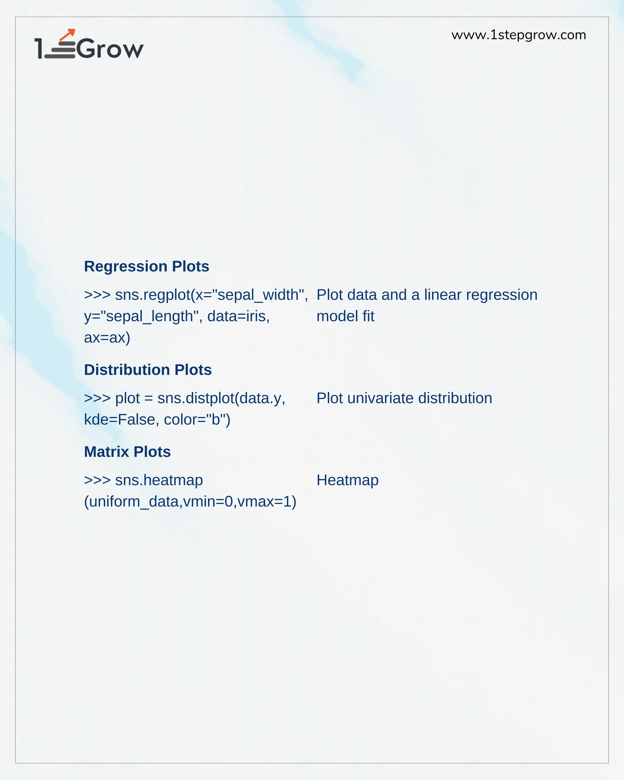
The document provides a cheat sheet for using Seaborn in Python for data science, focusing on various types of plots including regression plots, distribution plots, and heatmaps. It includes code snippets for customizing axes, titles, and limits, as well as instructions for saving and displaying plots. The content is geared towards enhancing data visualization skills for users of Seaborn.