Unit3
Customizing Plots:
• Introduction to Matplotlib,
• Plots, making subplots,
• controlling axes, Ticks, Labels & legends,
• annotations and Drawing on subplots,
• saving plots to files,
• matplotlib configuration using different plot styles, Seaborn library.
Making sense of data through advanced visualization :
Controlling line properties of chart, creating multiple plots, Scatter
plot, Line plot, bar plot, Histogram, Box plot, Pair plot, playing with text,
styling your plot, 3d plot of surface
Introduction to Matplotlib
Plotting and Visualization
Making informative visualizations (sometimes called plots) is one of
the most important tasks in data analysis.
It may be a part of the exploratory process—for example, to help
identify outliers or needed data transformations, or as a way of
generating ideas for models.
There are two primary uses for data visualization:
To explore data To communicate data
matplotlib API Primer:
Matplotlib is a low level graph plotting library in python that serves
as a visualization utility.
Installation of Matplotlib
• If you have Python and PIP already installed on a system, then
installation of Matplotlib is very easy.
• Install it using this command:
>pip install matplotlib
• Most of the Matplotlib utilities lies under the pyplot submodule,
and are usually imported under the plt alias:
• With matplotlib, we use the following import convention:
• import matplotlib.pyplot as plt
• Plotting x and y points
The plot() function is used to draw points (markers) in a diagram.
By default, the plot() function draws a line from point to point.
The function takes parameters for specifying points in the
diagram.
Parameter 1 is an array containing the points on the x-axis.
Parameter 2 is an array containing the points on the y-axis.
If we need to plot a line from (1, 3) to (8, 10), we have to pass
two arrays [1, 8] and [3, 10] to the plot function.
The x-axis is the horizontal axis.
The y-axis is the vertical axis.
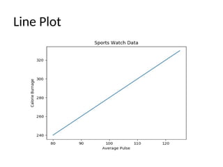
Ex1: Creating a simple plot:
import numpy as np
import matplotlib.pyplot as plt
x = np.array([80, 85, 90, 95, 100, 105, 110, 115, 120, 125])
y = np.array([240, 250, 260, 270, 280, 290, 300, 310, 320, 330])
plt.plot(x, y)
plt.title("Sports Watch Data")
plt.xlabel("Average Pulse")
plt.ylabel("Calorie Burnage")
plt.show()
Line Plot
Figures and Subplots
Plots in matplotlib reside within a Figure object. You can create a new figure
with
• plt.figure:
• fig = plt.figure()
In IPython, an empty plot window will appear, but in Jupyter nothing will be
shown until we use a few more commands. plt.figure has a number of
options; notably, figsize will guarantee the figure has a certain size and aspect
ratio if saved to disk.
You can’t make a plot with a blank figure. You have to create one or more
subplots
using add_subplot:
• ax1 = fig.add_subplot(2, 2, 1)
This means that the figure should be 2 × 2 (so up to four plots in total), and
we’re selecting the first of four subplots (numbered from 1).
If you create the next two sub plots, you’ll end up with a
visualization that looks like Figure 9-2:
In [18]: ax2 = fig.add_subplot(2, 2, 2)
In [19]: ax3 = fig.add_subplot(2, 2, 3)
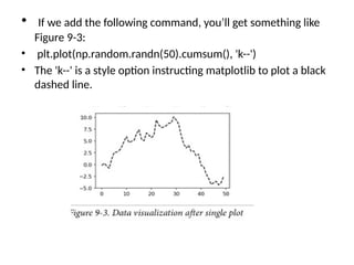
• If we add the following command, you’ll get something like
Figure 9-3:
• plt.plot(np.random.randn(50).cumsum(), 'k--')
• The 'k--' is a style option instructing matplotlib to plot a black
dashed line.
Adjusting the spacing around subplots
• By default matplotlib leaves a certain amount of padding around
the outside of the subplots and spacing between subplots.
• You can change the spacing using the subplots_adjust method on
Figure objects, also avail able as a top-level function:
subplots_adjust(left=None, bottom=None, right=None,
top=None, wspace=None, hspace=None)
• wspace and hspace controls the percent of the figure width and
figure height, respectively, to use as spacing between subplots.
• plt.subplots_adjust(wspace=0, hspace=0)
Colors, Markers, and Line Styles
• Matplotlib’s main plot function accepts arrays of x and y
coordinates and optionally a string abbreviation indicating
color and line style. For example, to plot x versus y with green
dashes, you would execute:
• ax.plot(x, y, 'g--')
• ax.plot(x, y, linestyle='--', color='g')
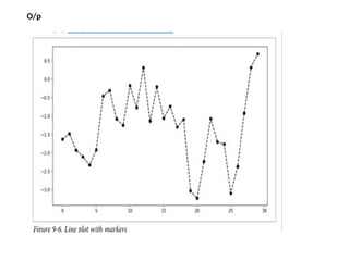
• Line plots can additionally have markers to highlight the
actual data points.
• The marker can be part of the style string, which must have
color followed by marker type and line style
• from numpy.random import randn
• plt.plot(randn(30).cumsum(), 'ko--')
O/p
Ticks, Labels, and Legends
• This could also have been written more explicitly as:
• plot(randn(30).cumsum(), color='k', linestyle='dashed',
marker='o')
• The pyplot interface, designed for interactive use, consists of
methods like xlim, xticks, and xticklabels. These control the
plot range, tick locations, and tick labels, respectively. They
can be used in two ways.
• Called with no arguments returns the current parameter value
(e.g., plt.xlim() returns the current x-axis plotting range)
• Called with parameters sets the parameter value (e.g.,
plt.xlim([0, 10]), sets the x-axis range to 0 to 10)
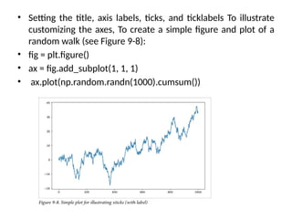
• Setting the title, axis labels, ticks, and ticklabels To illustrate
customizing the axes, To create a simple figure and plot of a
random walk (see Figure 9-8):
• fig = plt.figure()
• ax = fig.add_subplot(1, 1, 1)
• ax.plot(np.random.randn(1000).cumsum())
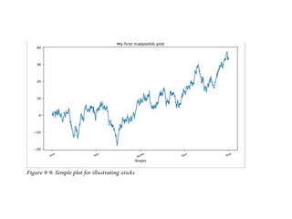
• To change the x-axis ticks, it’s easiest to use set_xticks and set_xticklabels.
The former instructs matplotlib where to place the ticks along the data
range; by default these locations will also be the labels. But we can set any
other values as the labels using set_xticklabels:
• In [40]: ticks = ax.set_xticks([0, 250, 500, 750, 1000])
• In [41]: labels = ax.set_xticklabels(['one', 'two', 'three', 'four', 'five'],
rotation=30, fontsize='small')
The rotation option sets the x tick labels at a 30-degree rotation. Lastly, set_xlabel gives
a name to the x-axis and set_title the subplot title (see Figure 9-9 for the resulting
figure):
ax.set_title('My first matplotlib plot')
ax.set_xlabel('Stages')
Adding legends
• In [44]: from numpy.random import randn
• In [45]: fig = plt.figure(); ax = fig.add_subplot(1, 1, 1)
• In [46]: ax.plot(randn(1000).cumsum(), 'k', label='one')
• Out[46]: [<matplotlib.lines.Line2D at 0x7fb624bdf860>]
• In [47]: ax.plot(randn(1000).cumsum(), 'k--', label='two')
• Out[47]: [<matplotlib.lines.Line2D at 0x7fb624be90f0>]
• In [48]: ax.plot(randn(1000).cumsum(), 'k.', label='three')
• Out[48]: [<matplotlib.lines.Line2D at 0x7fb624be9160>]
• Once you’ve done this, you can either call ax.legend() or
plt.legend() to automatically create a legend. The resulting
plot is in Figure 9-10:
• In [49]: ax.legend(loc='best‘)
Annotations and Drawing on a Subplot
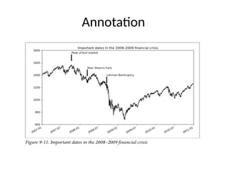
• you may wish to draw your own plot annotations, which could consist of
text, arrows, or other shapes. You can add annotations and text using the
text, arrow, and annotate functions. text draws text at given coordinates
(x, y) on the plot with optional custom styling.
• ax.text(x, y, 'Hello world!', family='monospace',
fontsize=10)
• Annotations can draw both text and arrows arranged
appropriately.
from datetime import datetime
fig = plt.figure()
ax = fig.add_subplot(1, 1, 1)
data = pd.read_csv('examples/spx.csv', index_col=0, parse_dates=True)
spx = data['SPX']
spx.plot(ax=ax, style='k-')
crisis_data = [
(datetime(2007, 10, 11), 'Peak of bull market'),
(datetime(2008, 3, 12), 'Bear Stearns Fails'),
(datetime(2008, 9, 15), 'Lehman Bankruptcy')
]
for date, label in crisis_data:
ax.annotate(label, xy=(date, spx.asof(date) + 75),
xytext=(date, spx.asof(date) + 225),
arrowprops=dict(facecolor='black', headwidth=4, width=2,
headlength=4),
horizontalalignment='left', verticalalignment='top')
# Zoom in on 2007-2010
ax.set_xlim(['1/1/2007', '1/1/2011'])
ax.set_ylim([600, 1800])
ax.set_title('Important dates in the 2008-2009 financial crisis')
Annotation
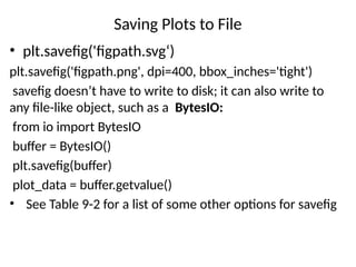
Saving Plots to File
• plt.savefig('figpath.svg‘)
plt.savefig('figpath.png', dpi=400, bbox_inches='tight')
savefig doesn’t have to write to disk; it can also write to
any file-like object, such as a BytesIO:
from io import BytesIO
buffer = BytesIO()
plt.savefig(buffer)
plot_data = buffer.getvalue()
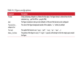
• See Table 9-2 for a list of some other options for savefig
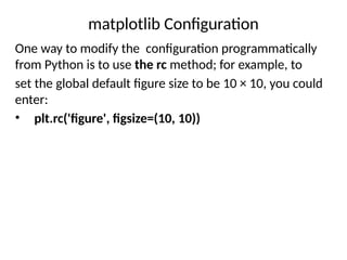
matplotlib Configuration
One way to modify the configuration programmatically
from Python is to use the rc method; for example, to
set the global default figure size to be 10 × 10, you could
enter:
• plt.rc('figure', figsize=(10, 10))
Plotting with pandas and seaborn
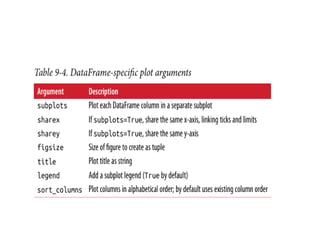
• In pandas we may have multiple columns of data,
along with row and column labels. pandas itself has
built-in methods that simplify creating visualizations
from Data Frame and Series objects.
• Another library is seaborn, a statistical graphics
library created by Michael Waskom. Seaborn
simplifies creating many common visualization types
Line Plots
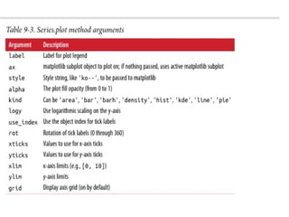
• Series and DataFrame each have a plot attribute for making
some basic plot types. By
• default, plot() makes line plots (see Figure 9-13):
• In [60]: s = pd.Series(np.random.randn(10).cumsum(),
index=np.arange(0, 100, 10))
• In [61]: s.plot()
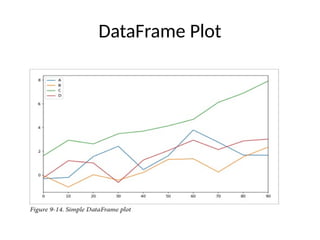
• DataFrame’s plot method plots each of its columns as a
different line on the same subplot, creating a legend
automatically (see Figure 9-14):
• df = pd.DataFrame(np.random.randn(10, 4).cumsum(0),
columns=['A', 'B', 'C', 'D'],index=np.arange(0, 100, 10))
> df.plot()
DataFrame Plot
Bar Plots
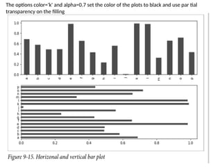
• The plot.bar() and plot.barh() make vertical and horizontal bar
plots, respectively. In this case, the Series or DataFrame index will
be used as the x (bar) or y (barh) ticks (see Figure 9-15):
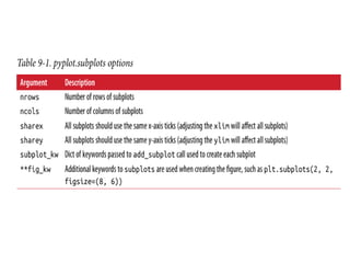
• fig, axes = plt.subplots(2, 1)
• data = pd.Series(np.random.rand(16),
index=list('abcdefghijklmnop'))
• data.plot.bar(ax=axes[0], color='k', alpha=0.7)
• data.plot.barh(ax=axes[1], color='k', alpha=0.7) (h-horizontal)
The options color='k' and alpha=0.7 set the color of the plots to black and use par tial
transparency on the filling
• Refer –Textbook 286
• Python for Data Analysis Data Wrangling with
Pandas, NumPy, and IPython Wes McKinney
Practise :
from matplotlib
import pyplot as plt
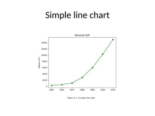
years = [1950, 1960, 1970, 1980, 1990, 2000, 2010]
gdp = [300.2, 543.3, 1075.9, 2862.5, 5979.6, 10289.7, 14958.3]
# create a line chart, years on x-axis, gdp on y-axis
plt.plot(years, gdp, color='green', marker='o', linestyle='solid')
# add a title
plt.title("Nominal GDP")
# add a label to the y-axis
plt.ylabel("Billions of $")
plt.show()
bar chart
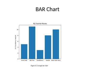
• A bar chart is a good choice when you want to show how some quantity
varies among some discrete set of items. For instance, Figure 3-2 shows
how many Academy Awards were won by each of a variety of movies:
movies = ["Annie Hall", "Ben-Hur", "Casablanca", "Gandhi", "West Side Story"]
num_oscars = [5, 11, 3, 8, 10]
# plot bars with left x-coordinates [0, 1, 2, 3, 4], heights [num_oscars]
plt.bar(range(len(movies)), num_oscars)
plt.title("My Favorite Movies")
# add a title
plt.ylabel("# of Academy Awards") # label the y-axis
# label x-axis with movie names at bar centers
plt.xticks(range(len(movies)), movies)
plt.show()
BAR Chart
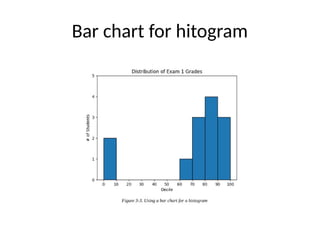
• A bar chart can also be a good choice for plotting histograms of
bucketed numeric values, as in Figure 3-3, in order to visually explore
how the values are distributed:
from collections import Counter
grades = [83, 95, 91, 87, 70, 0, 85, 82, 100, 67, 73, 77, 0]
# Bucket grades by decile, but put 100 in with the 90s
histogram = Counter(min(grade // 10 * 10, 90) for grade in grades)
plt.bar([x + 5 for x in histogram.keys()], # Shift bars right by 5
histogram.values(), 10 # Give each bar its correct height
# Give each bar a width of 10
edgecolor=(0, 0, 0)) # Black edges for each bar
plt.axis([-5, 105, 0, 5]) # x-axis from -5 to 105, # y-axis from 0 to 5
plt.xticks([10 * i for i in range(11)]) # x-axis labels at 0, 10, ..., 100
plt.xlabel("Decile")
plt.ylabel("# of Students")
plt.title("Distribution of Exam 1 Grades")
plt.show()
For example, making simple plots (like Figure
3-1) is pretty simple:
from matplotlib
import pyplot as plt
years = [1950, 1960, 1970, 1980, 1990, 2000, 2010]
gdp = [300.2, 543.3, 1075.9, 2862.5, 5979.6, 10289.7, 14958.3]
# create a line chart, years on x-axis, gdp on y-axis
plt.plot(years, gdp, color='green', marker='o', linestyle='solid')
# add a title
plt.title("Nominal GDP")
# add a label to the y-axis
plt.ylabel("Billions of $")
plt.show()
Simple line chart
Bar Charts
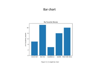
A bar chart is a good choice when you want to show how some quantity
varies among some discrete set of items. For instance, Figure 3-2 shows
how many Academy Awards were won by each of a variety of movies:
movies = ["Annie Hall", "Ben-Hur", "Casablanca", "Gandhi", "West Side Story"]
num_oscars = [5, 11, 3, 8, 10]
# plot bars with left x-coordinates [0, 1, 2, 3, 4], heights [num_oscars]
plt.bar(range(len(movies)), num_oscars)
plt.title("My Favorite Movies")
# add a title
plt.ylabel("# of Academy Awards") # label the y-axis
# label x-axis with movie names at bar centers
plt.xticks(range(len(movies)), movies)
plt.show()
Bar chart
A bar chart can also be a good choice for plotting histograms of
bucketed numeric values, as in Figure 3-3, in order to visually
explore how the values are distributed
from collections import Counter
grades = [83, 95, 91, 87, 70, 0, 85, 82, 100, 67, 73, 77, 0]
# Bucket grades by decile, but put 100 in with the 90s
histogram = Counter(min(grade // 10 * 10, 90) for grade in grades)
plt.bar([x + 5 for x in histogram.keys()], # Shift bars right by 5
histogram.values(), # Give each bar its correct height
10, # Give each bar a width of 10
edgecolor=(0, 0, 0)) # Black edges for each bar
plt.axis([-5, 105, 0, 5]) # x-axis from -5 to 105,
# y-axis from 0 to 5
plt.xticks([10 * i for i in range(11)]) # x-axis labels at 0, 10, ..., 100
plt.xlabel("Decile")
plt.ylabel("# of Students")
plt.title("Distribution of Exam 1 Grades")
plt.show()
Bar chart for hitogram
Line chart
Line Charts - As we saw already, we can make line charts using plt.plot
These are a good choice for showing trends, as illustrated in Figure 3-6:
variance == [1, 2, 4, 8, 16, 32, 64, 128, 256]
bias_squared = [256, 128, 64, 32, 16, 8, 4, 2, 1]
total_error = [x + y
for x, y in zip(variance, bias_squared)]
xs = [i for i, _ in enumerate(variance)]
# We can make multiple calls to plt.plot
# to show multiple series on the same chart
plt.plot(xs, variance, 'g-', label='variance')
plt.plot(xs, bias_squared, 'r-.', label='bias^2')
# green solid line
# red dot-dashed line
plt.plot(xs, total_error, 'b:', label='total error') # blue dotted line
Bias variance tradoff
• # Because we've assigned labels to each series,
• # we can get a legend for free (loc=9 means "top center")
• plt.legend(loc=9)
• plt.xlabel("model complexity")
• plt.xticks([])
• plt.title("The Bias-Variance Tradeoff")
• plt.show()
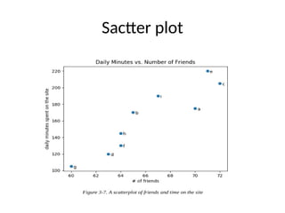
Scatterplots
A scatterplot is the right choice for visualizing the relationship between two
paired sets of data.
For example, Figure 3-7 illustrates the relationship between the number of
friends your users have and the number of minutes they spend on the site
every day.
Sactter plot
Additional Materials –
refer : https://www.geeksforgeeks.org/overlapping-histograms-with-
matplotlib-in-python/?ref=lbp
Practise Programs:
# import the library
import matplotlib.pyplot as plt
# Creation of Data
x1 = ['math', 'english', 'science', 'Hindi', 'social studies']
y1 = [92, 54, 63, 75, 53]
y2 = [86, 44, 65, 98, 85]
# Plotting the Data
plt.plot(x1, y1, label='Semester1')
plt.plot(x1, y2, label='semester2')
plt.xlabel('subjects')
plt.ylabel('marks')
plt.title("marks obtained in 2010")
plt.plot(y1, 'o:g', linestyle='--', linewidth='8')
plt.plot(y2, 'o:g', linestyle=':', linewidth='8')
plt.legend()
O/p:-
Histograms and Density Plots
• A histogram is a kind of bar plot that gives a discretized display of value
frequency. The data points are split into discrete, evenly spaced bins, and
the number of data points in each bin is plotted.
• A histogram is a graph showing frequency distributions.
• It is a graph showing the number of observations within each given
interval.
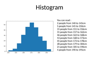
• Example: Say you ask for the height of 250 people, you might end up with
a histogram like this:
Histogram
You can read :
2 people from 140 to 145cm
5 people from 145 to 150cm
15 people from 151 to 156cm
31 people from 157 to 162cm
46 people from 163 to 168cm
53 people from 168 to 173cm
45 people from 173 to 178cm
28 people from 179 to 184cm
21 people from 185 to 190cm
4 people from 190 to 195cm
• The hist() function takes in an array-like dataset and plots a histogram,
which is a graphical representation of the distribution of the data.
• Here’s how you can use the hist() function to create a basic histogram:
import matplotlib.pyplot as plt
data = [1, 2, 2, 3, 3, 3, 4, 4, 4, 4]
plt.hist(data)
plt.show()
• # Output:
• # A histogram plot with x-axis representing the data and y-axis
representing the frequency.
The ‘bins’ parameter in the hist() function determines the number of equal-
width bins in the range. Let’s see how changing the ‘bins’ parameter affects
the histogram.
import matplotlib.pyplot as plt
data = [1, 2, 2, 3, 3, 3, 4, 4, 4, 4]
plt.hist(data, bins=20)
plt.show()
# Output:
# A histogram plot with x-axis representing the data and y-axis representing
the frequency. The number of bars is increased due to the increased number
of bins.
Working with ‘range’
The ‘range’ parameter specifies the lower and upper range of the bins.
Anything outside the range is ignored.
import matplotlib.pyplot as plt
data = [1, 2, 2, 3, 3, 3, 4, 4, 4, 4]
plt.hist(data, range=[2, 3])
plt.show()
• # Output:
• # A histogram plot with x-axis representing the data and y-axis representing the frequency. The plot
only includes data within the specified range.
• In this example, we’ve set the ‘range’ to [2, 3]. As a result, the histogram only
includes the data points between 2 and 3.
Exploring ‘density’
The ‘density’ parameter, when set to True, normalizes the histogram such that
the total area (or integral) under the histogram will sum to 1. This is useful
when you want to visualize the probability distribution.
import matplotlib.pyplot as plt
data = [1, 2, 2, 3, 3, 3, 4, 4, 4, 4]
plt.hist(data, density=True)
plt.show()
# Output:
# A histogram plot with x-axis representing the data and y-axis representing the probability
density. The total area under the histogram sums to 1.
Histograms with Seaborn and Pandas
• Seaborn: An Enhanced Visualization Library
• Seaborn is a statistical plotting library built on top of Matplotlib. It
provides a high-level interface for creating attractive graphics, including
histograms.
• import seaborn as sns
• data = [1, 2, 2, 3, 3, 3, 4, 4, 4, 4]
• sns.histplot(data)
• # Output:
• # A histogram plot similar to Matplotlib but with a different
style.
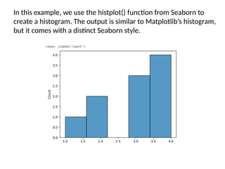
In this example, we use the histplot() function from Seaborn to
create a histogram. The output is similar to Matplotlib’s histogram,
but it comes with a distinct Seaborn style.
import pandas as pd
data = pd.DataFrame([1, 2, 2, 3, 3, 3, 4, 4, 4, 4], columns=['Values'])
data['Values'].plot(kind='hist')
• # Output:
• # A histogram plot similar to Matplotlib but created from a DataFrame.
Scatter or Point Plots
Point plots or scatter plots can be a useful way of examining the
relationship between two one-dimensional data series.
For example, here we load the macrodata dataset from the
statsmodels project, select a few variables, then compute log
differences:
macro = pd.read_csv('examples/macrodata.csv')
data = macro[['cpi', 'm1', 'tbilrate', 'unemp']]
trans_data = np.log(data).diff().dropna()
trans_data[-5:]
Out[103]:
cpi m1 tbilrate unemp
198 -0.007904 0.045361 -0.396881 0.105361
199 - 0.021979 0.066753 - 2.277267 0.139762
200 0.002340 0.010286 0.606136 0.160343
201 0.008419 0.037461 -0.200671 0.127339
202 0.008894 0.012202 -0.405465 0.042560
• We can then use seaborn’s regplot method, which makes a
scatter plot and fits a linear regression line (see Figure 9-24):
sns.regplot('m1', 'unemp', data=trans_data)
Out[105]:
plt.title('Changes in log %s versus log %s' % ('m1', 'unemp')
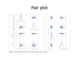
• In exploratory data analysis it’s helpful to be able to look at
all the scatter plots among a group of variables; this is known
as a pairs plot or scatter plot matrix. Making such a plot from
scratch is a bit of work, so seaborn has a convenient pairplot
function,
• which supports placing histograms or density estimates of
each variable along the diagonal (see Figure 9-25 for the
resulting plot):
sns.pairplot(trans_data, diag_kind='kde', plot_kws={'alpha':
0.2})
Pair plot
Three-dimensional Plotting in Python using Matplotlib
• 3D plots are very important tools for visualizing data that have three
dimensions such as data that have two dependent and one independent
variable. By plotting data in 3d plots we can get a deeper understanding of
data that have three variables. We can use various matplotlib library
functions to plot 3D plots.
• We will first start with plotting the 3D axis using the Matplotlib library. For
plotting the 3D axis we just have to change the projection parameter of
plt.axes() from None to 3D.
import numpy as np
import matplotlib.pyplot as plt
fig = plt.figure()
ax = plt.axes(projection='3d')
3d plot
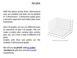
With the above syntax three -dimensional
axes are enabled and data can be plotted
in 3 dimensions. 3 dimension graph gives
a dynamic approach and makes data more
interactive.
Like 2-D graphs, we can use different ways
to represent to plot 3-D graphs. We can
make a scatter plot, contour plot, surface
plot, etc. Let’s have a look at different 3-D
plots.
Graphs with lines and points are the
simplest 3-dimensional graph.
We will use ax.plot3d and ax.scatter
functions to plot line and point graph
respectively.
Creating 3D surface Plot
• The axes3d present in Matplotlib’s mpl_toolkits.mplot3d
toolkit provides the necessary functions used to create 3D
surface plots.
• Surface plots are created by using ax.plot_surface() function.
• Syntax:
• ax.plot_surface(X, Y, Z)where X and Y are 2D array of points of
x and y while Z is 2D array of heights.
Pie chart
• A Pie Chart is a circular statistical plot that can display only
one series of data. The area of the chart is the total
percentage of the given data. Pie charts are commonly used
in business presentations like sales, operations, survey results,
resources, etc. as they provide a quick summary. In this
article, let’s understand how to create pie chart in python
with pie diagram.
• Matplotlib API has pie() function in its pyplot module which
create a pie chart representing the data in an array. let’s
create pie chart in python.
• Syntax: matplotlib.pyplot.pie(data, explode=None,
labels=None, colors=None, autopct=None, shadow=False)
Pie chart
# Import libraries
from matplotlib import pyplot as plt
import numpy as np
# Creating dataset
cars = ['AUDI', 'BMW', 'FORD', 'TESLA', 'JAGUAR', 'MERCEDES']
data = [23, 17, 35, 29, 12, 41]
# Creating plot
fig = plt.figure(figsize=(10, 7))
plt.pie(data, labels=cars)
# show plot
plt.show()
Box Plot
• A Box Plot is also known as Whisker plot is created to display the
summary of the set of data values having properties like minimum, first
quartile, median, third quartile and maximum. In the box plot, a box is
created from the first quartile to the third quartile, a vertical line is also
there which goes through the box at the median.
• Here x-axis denotes the data to be plotted while the y-axis shows the
frequency distribution.
• The matplotlib.pyplot module of matplotlib library provides boxplot()
function with the help of which we can create box plots.
• Syntax:
• matplotlib.pyplot.boxplot(data, notch=None, vert=None,
patch_artist=None, widths=None)
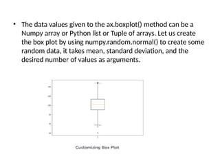
• The data values given to the ax.boxplot() method can be a
Numpy array or Python list or Tuple of arrays. Let us create
the box plot by using numpy.random.normal() to create some
random data, it takes mean, standard deviation, and the
desired number of values as arguments.
Add Text Inside the Plot in Matplotlib
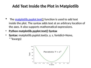
• The matplotlib.pyplot.text() function is used to add text
inside the plot. The syntax adds text at an arbitrary location of
the axes. It also supports mathematical expressions.
• Python matplotlib.pyplot.text() Syntax
• Syntax: matplotlib.pyplot.text(x, y, s, fontdict=None,
**kwargs)
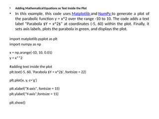
• Adding Mathematical Equations as Text Inside the Plot
• In this example, this code uses Matplotlib and NumPy to generate a plot of
the parabolic function y = x^2 over the range -10 to 10. The code adds a text
label “Parabola $Y = x^2$” at coordinates (-5, 60) within the plot. Finally, it
sets axis labels, plots the parabola in green, and displays the plot.
import matplotlib.pyplot as plt
import numpy as np
x = np.arange(-10, 10, 0.01)
y = x**2
#adding text inside the plot
plt.text(-5, 60, 'Parabola $Y = x^2$', fontsize = 22)
plt.plot(x, y, c='g')
plt.xlabel("X-axis", fontsize = 15)
plt.ylabel("Y-axis",fontsize = 15)
plt.show()
Text book
• Python for Data Analysis Data Wrangling with
Pandas, NumPy, and Ipython, Wes McKinney ,
SECOND EDITION .

Unit3-v1-Plotting and Visualization.pptx

  • 1.
    Unit3 Customizing Plots: • Introductionto Matplotlib, • Plots, making subplots, • controlling axes, Ticks, Labels & legends, • annotations and Drawing on subplots, • saving plots to files, • matplotlib configuration using different plot styles, Seaborn library. Making sense of data through advanced visualization : Controlling line properties of chart, creating multiple plots, Scatter plot, Line plot, bar plot, Histogram, Box plot, Pair plot, playing with text, styling your plot, 3d plot of surface
  • 2.
    Introduction to Matplotlib Plottingand Visualization Making informative visualizations (sometimes called plots) is one of the most important tasks in data analysis. It may be a part of the exploratory process—for example, to help identify outliers or needed data transformations, or as a way of generating ideas for models. There are two primary uses for data visualization: To explore data To communicate data matplotlib API Primer: Matplotlib is a low level graph plotting library in python that serves as a visualization utility.
  • 3.
    Installation of Matplotlib •If you have Python and PIP already installed on a system, then installation of Matplotlib is very easy. • Install it using this command: >pip install matplotlib • Most of the Matplotlib utilities lies under the pyplot submodule, and are usually imported under the plt alias: • With matplotlib, we use the following import convention: • import matplotlib.pyplot as plt
  • 4.
    • Plotting xand y points The plot() function is used to draw points (markers) in a diagram. By default, the plot() function draws a line from point to point. The function takes parameters for specifying points in the diagram. Parameter 1 is an array containing the points on the x-axis. Parameter 2 is an array containing the points on the y-axis. If we need to plot a line from (1, 3) to (8, 10), we have to pass two arrays [1, 8] and [3, 10] to the plot function. The x-axis is the horizontal axis. The y-axis is the vertical axis.
  • 5.
    Ex1: Creating asimple plot: import numpy as np import matplotlib.pyplot as plt x = np.array([80, 85, 90, 95, 100, 105, 110, 115, 120, 125]) y = np.array([240, 250, 260, 270, 280, 290, 300, 310, 320, 330]) plt.plot(x, y) plt.title("Sports Watch Data") plt.xlabel("Average Pulse") plt.ylabel("Calorie Burnage") plt.show()
  • 6.
  • 7.
    Figures and Subplots Plotsin matplotlib reside within a Figure object. You can create a new figure with • plt.figure: • fig = plt.figure() In IPython, an empty plot window will appear, but in Jupyter nothing will be shown until we use a few more commands. plt.figure has a number of options; notably, figsize will guarantee the figure has a certain size and aspect ratio if saved to disk. You can’t make a plot with a blank figure. You have to create one or more subplots using add_subplot: • ax1 = fig.add_subplot(2, 2, 1) This means that the figure should be 2 × 2 (so up to four plots in total), and we’re selecting the first of four subplots (numbered from 1).
  • 8.
    If you createthe next two sub plots, you’ll end up with a visualization that looks like Figure 9-2: In [18]: ax2 = fig.add_subplot(2, 2, 2) In [19]: ax3 = fig.add_subplot(2, 2, 3)
  • 9.
    • If weadd the following command, you’ll get something like Figure 9-3: • plt.plot(np.random.randn(50).cumsum(), 'k--') • The 'k--' is a style option instructing matplotlib to plot a black dashed line.
  • 11.
    Adjusting the spacingaround subplots • By default matplotlib leaves a certain amount of padding around the outside of the subplots and spacing between subplots. • You can change the spacing using the subplots_adjust method on Figure objects, also avail able as a top-level function: subplots_adjust(left=None, bottom=None, right=None, top=None, wspace=None, hspace=None) • wspace and hspace controls the percent of the figure width and figure height, respectively, to use as spacing between subplots. • plt.subplots_adjust(wspace=0, hspace=0)
  • 12.
    Colors, Markers, andLine Styles • Matplotlib’s main plot function accepts arrays of x and y coordinates and optionally a string abbreviation indicating color and line style. For example, to plot x versus y with green dashes, you would execute: • ax.plot(x, y, 'g--') • ax.plot(x, y, linestyle='--', color='g') • Line plots can additionally have markers to highlight the actual data points. • The marker can be part of the style string, which must have color followed by marker type and line style • from numpy.random import randn • plt.plot(randn(30).cumsum(), 'ko--')
  • 13.
  • 14.
    Ticks, Labels, andLegends • This could also have been written more explicitly as: • plot(randn(30).cumsum(), color='k', linestyle='dashed', marker='o') • The pyplot interface, designed for interactive use, consists of methods like xlim, xticks, and xticklabels. These control the plot range, tick locations, and tick labels, respectively. They can be used in two ways. • Called with no arguments returns the current parameter value (e.g., plt.xlim() returns the current x-axis plotting range) • Called with parameters sets the parameter value (e.g., plt.xlim([0, 10]), sets the x-axis range to 0 to 10)
  • 15.
    • Setting thetitle, axis labels, ticks, and ticklabels To illustrate customizing the axes, To create a simple figure and plot of a random walk (see Figure 9-8): • fig = plt.figure() • ax = fig.add_subplot(1, 1, 1) • ax.plot(np.random.randn(1000).cumsum())
  • 16.
    • To changethe x-axis ticks, it’s easiest to use set_xticks and set_xticklabels. The former instructs matplotlib where to place the ticks along the data range; by default these locations will also be the labels. But we can set any other values as the labels using set_xticklabels: • In [40]: ticks = ax.set_xticks([0, 250, 500, 750, 1000]) • In [41]: labels = ax.set_xticklabels(['one', 'two', 'three', 'four', 'five'], rotation=30, fontsize='small') The rotation option sets the x tick labels at a 30-degree rotation. Lastly, set_xlabel gives a name to the x-axis and set_title the subplot title (see Figure 9-9 for the resulting figure): ax.set_title('My first matplotlib plot') ax.set_xlabel('Stages')
  • 18.
    Adding legends • In[44]: from numpy.random import randn • In [45]: fig = plt.figure(); ax = fig.add_subplot(1, 1, 1) • In [46]: ax.plot(randn(1000).cumsum(), 'k', label='one') • Out[46]: [<matplotlib.lines.Line2D at 0x7fb624bdf860>] • In [47]: ax.plot(randn(1000).cumsum(), 'k--', label='two') • Out[47]: [<matplotlib.lines.Line2D at 0x7fb624be90f0>] • In [48]: ax.plot(randn(1000).cumsum(), 'k.', label='three') • Out[48]: [<matplotlib.lines.Line2D at 0x7fb624be9160>]
  • 19.
    • Once you’vedone this, you can either call ax.legend() or plt.legend() to automatically create a legend. The resulting plot is in Figure 9-10: • In [49]: ax.legend(loc='best‘)
  • 20.
    Annotations and Drawingon a Subplot • you may wish to draw your own plot annotations, which could consist of text, arrows, or other shapes. You can add annotations and text using the text, arrow, and annotate functions. text draws text at given coordinates (x, y) on the plot with optional custom styling. • ax.text(x, y, 'Hello world!', family='monospace', fontsize=10) • Annotations can draw both text and arrows arranged appropriately.
  • 21.
    from datetime importdatetime fig = plt.figure() ax = fig.add_subplot(1, 1, 1) data = pd.read_csv('examples/spx.csv', index_col=0, parse_dates=True) spx = data['SPX'] spx.plot(ax=ax, style='k-') crisis_data = [ (datetime(2007, 10, 11), 'Peak of bull market'), (datetime(2008, 3, 12), 'Bear Stearns Fails'), (datetime(2008, 9, 15), 'Lehman Bankruptcy') ] for date, label in crisis_data: ax.annotate(label, xy=(date, spx.asof(date) + 75), xytext=(date, spx.asof(date) + 225), arrowprops=dict(facecolor='black', headwidth=4, width=2, headlength=4), horizontalalignment='left', verticalalignment='top') # Zoom in on 2007-2010 ax.set_xlim(['1/1/2007', '1/1/2011']) ax.set_ylim([600, 1800]) ax.set_title('Important dates in the 2008-2009 financial crisis')
  • 22.
  • 23.
    Saving Plots toFile • plt.savefig('figpath.svg‘) plt.savefig('figpath.png', dpi=400, bbox_inches='tight') savefig doesn’t have to write to disk; it can also write to any file-like object, such as a BytesIO: from io import BytesIO buffer = BytesIO() plt.savefig(buffer) plot_data = buffer.getvalue() • See Table 9-2 for a list of some other options for savefig
  • 25.
    matplotlib Configuration One wayto modify the configuration programmatically from Python is to use the rc method; for example, to set the global default figure size to be 10 × 10, you could enter: • plt.rc('figure', figsize=(10, 10))
  • 26.
    Plotting with pandasand seaborn • In pandas we may have multiple columns of data, along with row and column labels. pandas itself has built-in methods that simplify creating visualizations from Data Frame and Series objects. • Another library is seaborn, a statistical graphics library created by Michael Waskom. Seaborn simplifies creating many common visualization types
  • 27.
    Line Plots • Seriesand DataFrame each have a plot attribute for making some basic plot types. By • default, plot() makes line plots (see Figure 9-13): • In [60]: s = pd.Series(np.random.randn(10).cumsum(), index=np.arange(0, 100, 10)) • In [61]: s.plot()
  • 28.
    • DataFrame’s plotmethod plots each of its columns as a different line on the same subplot, creating a legend automatically (see Figure 9-14): • df = pd.DataFrame(np.random.randn(10, 4).cumsum(0), columns=['A', 'B', 'C', 'D'],index=np.arange(0, 100, 10)) > df.plot()
  • 29.
  • 32.
    Bar Plots • Theplot.bar() and plot.barh() make vertical and horizontal bar plots, respectively. In this case, the Series or DataFrame index will be used as the x (bar) or y (barh) ticks (see Figure 9-15): • fig, axes = plt.subplots(2, 1) • data = pd.Series(np.random.rand(16), index=list('abcdefghijklmnop')) • data.plot.bar(ax=axes[0], color='k', alpha=0.7) • data.plot.barh(ax=axes[1], color='k', alpha=0.7) (h-horizontal)
  • 33.
    The options color='k'and alpha=0.7 set the color of the plots to black and use par tial transparency on the filling
  • 34.
    • Refer –Textbook286 • Python for Data Analysis Data Wrangling with Pandas, NumPy, and IPython Wes McKinney
  • 35.
    Practise : from matplotlib importpyplot as plt years = [1950, 1960, 1970, 1980, 1990, 2000, 2010] gdp = [300.2, 543.3, 1075.9, 2862.5, 5979.6, 10289.7, 14958.3] # create a line chart, years on x-axis, gdp on y-axis plt.plot(years, gdp, color='green', marker='o', linestyle='solid') # add a title plt.title("Nominal GDP") # add a label to the y-axis plt.ylabel("Billions of $") plt.show()
  • 36.
    bar chart • Abar chart is a good choice when you want to show how some quantity varies among some discrete set of items. For instance, Figure 3-2 shows how many Academy Awards were won by each of a variety of movies: movies = ["Annie Hall", "Ben-Hur", "Casablanca", "Gandhi", "West Side Story"] num_oscars = [5, 11, 3, 8, 10] # plot bars with left x-coordinates [0, 1, 2, 3, 4], heights [num_oscars] plt.bar(range(len(movies)), num_oscars) plt.title("My Favorite Movies") # add a title plt.ylabel("# of Academy Awards") # label the y-axis # label x-axis with movie names at bar centers plt.xticks(range(len(movies)), movies) plt.show()
  • 37.
  • 38.
    • A barchart can also be a good choice for plotting histograms of bucketed numeric values, as in Figure 3-3, in order to visually explore how the values are distributed: from collections import Counter grades = [83, 95, 91, 87, 70, 0, 85, 82, 100, 67, 73, 77, 0] # Bucket grades by decile, but put 100 in with the 90s histogram = Counter(min(grade // 10 * 10, 90) for grade in grades) plt.bar([x + 5 for x in histogram.keys()], # Shift bars right by 5 histogram.values(), 10 # Give each bar its correct height # Give each bar a width of 10 edgecolor=(0, 0, 0)) # Black edges for each bar plt.axis([-5, 105, 0, 5]) # x-axis from -5 to 105, # y-axis from 0 to 5 plt.xticks([10 * i for i in range(11)]) # x-axis labels at 0, 10, ..., 100 plt.xlabel("Decile") plt.ylabel("# of Students") plt.title("Distribution of Exam 1 Grades") plt.show()
  • 39.
    For example, makingsimple plots (like Figure 3-1) is pretty simple: from matplotlib import pyplot as plt years = [1950, 1960, 1970, 1980, 1990, 2000, 2010] gdp = [300.2, 543.3, 1075.9, 2862.5, 5979.6, 10289.7, 14958.3] # create a line chart, years on x-axis, gdp on y-axis plt.plot(years, gdp, color='green', marker='o', linestyle='solid') # add a title plt.title("Nominal GDP") # add a label to the y-axis plt.ylabel("Billions of $") plt.show()
  • 40.
  • 41.
    Bar Charts A barchart is a good choice when you want to show how some quantity varies among some discrete set of items. For instance, Figure 3-2 shows how many Academy Awards were won by each of a variety of movies: movies = ["Annie Hall", "Ben-Hur", "Casablanca", "Gandhi", "West Side Story"] num_oscars = [5, 11, 3, 8, 10] # plot bars with left x-coordinates [0, 1, 2, 3, 4], heights [num_oscars] plt.bar(range(len(movies)), num_oscars) plt.title("My Favorite Movies") # add a title plt.ylabel("# of Academy Awards") # label the y-axis # label x-axis with movie names at bar centers plt.xticks(range(len(movies)), movies) plt.show()
  • 42.
  • 43.
    A bar chartcan also be a good choice for plotting histograms of bucketed numeric values, as in Figure 3-3, in order to visually explore how the values are distributed from collections import Counter grades = [83, 95, 91, 87, 70, 0, 85, 82, 100, 67, 73, 77, 0] # Bucket grades by decile, but put 100 in with the 90s histogram = Counter(min(grade // 10 * 10, 90) for grade in grades) plt.bar([x + 5 for x in histogram.keys()], # Shift bars right by 5 histogram.values(), # Give each bar its correct height 10, # Give each bar a width of 10 edgecolor=(0, 0, 0)) # Black edges for each bar plt.axis([-5, 105, 0, 5]) # x-axis from -5 to 105, # y-axis from 0 to 5 plt.xticks([10 * i for i in range(11)]) # x-axis labels at 0, 10, ..., 100 plt.xlabel("Decile") plt.ylabel("# of Students") plt.title("Distribution of Exam 1 Grades") plt.show()
  • 44.
    Bar chart forhitogram
  • 45.
    Line chart Line Charts- As we saw already, we can make line charts using plt.plot These are a good choice for showing trends, as illustrated in Figure 3-6: variance == [1, 2, 4, 8, 16, 32, 64, 128, 256] bias_squared = [256, 128, 64, 32, 16, 8, 4, 2, 1] total_error = [x + y for x, y in zip(variance, bias_squared)] xs = [i for i, _ in enumerate(variance)] # We can make multiple calls to plt.plot # to show multiple series on the same chart plt.plot(xs, variance, 'g-', label='variance') plt.plot(xs, bias_squared, 'r-.', label='bias^2') # green solid line # red dot-dashed line plt.plot(xs, total_error, 'b:', label='total error') # blue dotted line
  • 46.
    Bias variance tradoff •# Because we've assigned labels to each series, • # we can get a legend for free (loc=9 means "top center") • plt.legend(loc=9) • plt.xlabel("model complexity") • plt.xticks([]) • plt.title("The Bias-Variance Tradeoff") • plt.show()
  • 47.
    Scatterplots A scatterplot isthe right choice for visualizing the relationship between two paired sets of data. For example, Figure 3-7 illustrates the relationship between the number of friends your users have and the number of minutes they spend on the site every day.
  • 48.
  • 49.
    Additional Materials – refer: https://www.geeksforgeeks.org/overlapping-histograms-with- matplotlib-in-python/?ref=lbp Practise Programs: # import the library import matplotlib.pyplot as plt # Creation of Data x1 = ['math', 'english', 'science', 'Hindi', 'social studies'] y1 = [92, 54, 63, 75, 53] y2 = [86, 44, 65, 98, 85] # Plotting the Data plt.plot(x1, y1, label='Semester1') plt.plot(x1, y2, label='semester2') plt.xlabel('subjects') plt.ylabel('marks') plt.title("marks obtained in 2010") plt.plot(y1, 'o:g', linestyle='--', linewidth='8') plt.plot(y2, 'o:g', linestyle=':', linewidth='8') plt.legend() O/p:-
  • 50.
    Histograms and DensityPlots • A histogram is a kind of bar plot that gives a discretized display of value frequency. The data points are split into discrete, evenly spaced bins, and the number of data points in each bin is plotted. • A histogram is a graph showing frequency distributions. • It is a graph showing the number of observations within each given interval. • Example: Say you ask for the height of 250 people, you might end up with a histogram like this:
  • 51.
    Histogram You can read: 2 people from 140 to 145cm 5 people from 145 to 150cm 15 people from 151 to 156cm 31 people from 157 to 162cm 46 people from 163 to 168cm 53 people from 168 to 173cm 45 people from 173 to 178cm 28 people from 179 to 184cm 21 people from 185 to 190cm 4 people from 190 to 195cm
  • 52.
    • The hist()function takes in an array-like dataset and plots a histogram, which is a graphical representation of the distribution of the data. • Here’s how you can use the hist() function to create a basic histogram: import matplotlib.pyplot as plt data = [1, 2, 2, 3, 3, 3, 4, 4, 4, 4] plt.hist(data) plt.show() • # Output: • # A histogram plot with x-axis representing the data and y-axis representing the frequency.
  • 53.
    The ‘bins’ parameterin the hist() function determines the number of equal- width bins in the range. Let’s see how changing the ‘bins’ parameter affects the histogram. import matplotlib.pyplot as plt data = [1, 2, 2, 3, 3, 3, 4, 4, 4, 4] plt.hist(data, bins=20) plt.show() # Output: # A histogram plot with x-axis representing the data and y-axis representing the frequency. The number of bars is increased due to the increased number of bins.
  • 54.
    Working with ‘range’ The‘range’ parameter specifies the lower and upper range of the bins. Anything outside the range is ignored. import matplotlib.pyplot as plt data = [1, 2, 2, 3, 3, 3, 4, 4, 4, 4] plt.hist(data, range=[2, 3]) plt.show() • # Output: • # A histogram plot with x-axis representing the data and y-axis representing the frequency. The plot only includes data within the specified range. • In this example, we’ve set the ‘range’ to [2, 3]. As a result, the histogram only includes the data points between 2 and 3.
  • 55.
    Exploring ‘density’ The ‘density’parameter, when set to True, normalizes the histogram such that the total area (or integral) under the histogram will sum to 1. This is useful when you want to visualize the probability distribution. import matplotlib.pyplot as plt data = [1, 2, 2, 3, 3, 3, 4, 4, 4, 4] plt.hist(data, density=True) plt.show() # Output: # A histogram plot with x-axis representing the data and y-axis representing the probability density. The total area under the histogram sums to 1.
  • 56.
    Histograms with Seabornand Pandas • Seaborn: An Enhanced Visualization Library • Seaborn is a statistical plotting library built on top of Matplotlib. It provides a high-level interface for creating attractive graphics, including histograms. • import seaborn as sns • data = [1, 2, 2, 3, 3, 3, 4, 4, 4, 4] • sns.histplot(data) • # Output: • # A histogram plot similar to Matplotlib but with a different style.
  • 57.
    In this example,we use the histplot() function from Seaborn to create a histogram. The output is similar to Matplotlib’s histogram, but it comes with a distinct Seaborn style.
  • 58.
    import pandas aspd data = pd.DataFrame([1, 2, 2, 3, 3, 3, 4, 4, 4, 4], columns=['Values']) data['Values'].plot(kind='hist') • # Output: • # A histogram plot similar to Matplotlib but created from a DataFrame.
  • 60.
    Scatter or PointPlots Point plots or scatter plots can be a useful way of examining the relationship between two one-dimensional data series. For example, here we load the macrodata dataset from the statsmodels project, select a few variables, then compute log differences: macro = pd.read_csv('examples/macrodata.csv') data = macro[['cpi', 'm1', 'tbilrate', 'unemp']] trans_data = np.log(data).diff().dropna() trans_data[-5:] Out[103]: cpi m1 tbilrate unemp 198 -0.007904 0.045361 -0.396881 0.105361 199 - 0.021979 0.066753 - 2.277267 0.139762 200 0.002340 0.010286 0.606136 0.160343 201 0.008419 0.037461 -0.200671 0.127339 202 0.008894 0.012202 -0.405465 0.042560
  • 61.
    • We canthen use seaborn’s regplot method, which makes a scatter plot and fits a linear regression line (see Figure 9-24): sns.regplot('m1', 'unemp', data=trans_data) Out[105]: plt.title('Changes in log %s versus log %s' % ('m1', 'unemp')
  • 62.
    • In exploratorydata analysis it’s helpful to be able to look at all the scatter plots among a group of variables; this is known as a pairs plot or scatter plot matrix. Making such a plot from scratch is a bit of work, so seaborn has a convenient pairplot function, • which supports placing histograms or density estimates of each variable along the diagonal (see Figure 9-25 for the resulting plot): sns.pairplot(trans_data, diag_kind='kde', plot_kws={'alpha': 0.2})
  • 63.
  • 64.
    Three-dimensional Plotting inPython using Matplotlib • 3D plots are very important tools for visualizing data that have three dimensions such as data that have two dependent and one independent variable. By plotting data in 3d plots we can get a deeper understanding of data that have three variables. We can use various matplotlib library functions to plot 3D plots. • We will first start with plotting the 3D axis using the Matplotlib library. For plotting the 3D axis we just have to change the projection parameter of plt.axes() from None to 3D. import numpy as np import matplotlib.pyplot as plt fig = plt.figure() ax = plt.axes(projection='3d')
  • 65.
    3d plot With theabove syntax three -dimensional axes are enabled and data can be plotted in 3 dimensions. 3 dimension graph gives a dynamic approach and makes data more interactive. Like 2-D graphs, we can use different ways to represent to plot 3-D graphs. We can make a scatter plot, contour plot, surface plot, etc. Let’s have a look at different 3-D plots. Graphs with lines and points are the simplest 3-dimensional graph. We will use ax.plot3d and ax.scatter functions to plot line and point graph respectively.
  • 66.
    Creating 3D surfacePlot • The axes3d present in Matplotlib’s mpl_toolkits.mplot3d toolkit provides the necessary functions used to create 3D surface plots. • Surface plots are created by using ax.plot_surface() function. • Syntax: • ax.plot_surface(X, Y, Z)where X and Y are 2D array of points of x and y while Z is 2D array of heights.
  • 67.
    Pie chart • APie Chart is a circular statistical plot that can display only one series of data. The area of the chart is the total percentage of the given data. Pie charts are commonly used in business presentations like sales, operations, survey results, resources, etc. as they provide a quick summary. In this article, let’s understand how to create pie chart in python with pie diagram. • Matplotlib API has pie() function in its pyplot module which create a pie chart representing the data in an array. let’s create pie chart in python. • Syntax: matplotlib.pyplot.pie(data, explode=None, labels=None, colors=None, autopct=None, shadow=False)
  • 68.
    Pie chart # Importlibraries from matplotlib import pyplot as plt import numpy as np # Creating dataset cars = ['AUDI', 'BMW', 'FORD', 'TESLA', 'JAGUAR', 'MERCEDES'] data = [23, 17, 35, 29, 12, 41] # Creating plot fig = plt.figure(figsize=(10, 7)) plt.pie(data, labels=cars) # show plot plt.show()
  • 69.
    Box Plot • ABox Plot is also known as Whisker plot is created to display the summary of the set of data values having properties like minimum, first quartile, median, third quartile and maximum. In the box plot, a box is created from the first quartile to the third quartile, a vertical line is also there which goes through the box at the median. • Here x-axis denotes the data to be plotted while the y-axis shows the frequency distribution. • The matplotlib.pyplot module of matplotlib library provides boxplot() function with the help of which we can create box plots. • Syntax: • matplotlib.pyplot.boxplot(data, notch=None, vert=None, patch_artist=None, widths=None)
  • 70.
    • The datavalues given to the ax.boxplot() method can be a Numpy array or Python list or Tuple of arrays. Let us create the box plot by using numpy.random.normal() to create some random data, it takes mean, standard deviation, and the desired number of values as arguments.
  • 71.
    Add Text Insidethe Plot in Matplotlib • The matplotlib.pyplot.text() function is used to add text inside the plot. The syntax adds text at an arbitrary location of the axes. It also supports mathematical expressions. • Python matplotlib.pyplot.text() Syntax • Syntax: matplotlib.pyplot.text(x, y, s, fontdict=None, **kwargs)
  • 72.
    • Adding MathematicalEquations as Text Inside the Plot • In this example, this code uses Matplotlib and NumPy to generate a plot of the parabolic function y = x^2 over the range -10 to 10. The code adds a text label “Parabola $Y = x^2$” at coordinates (-5, 60) within the plot. Finally, it sets axis labels, plots the parabola in green, and displays the plot. import matplotlib.pyplot as plt import numpy as np x = np.arange(-10, 10, 0.01) y = x**2 #adding text inside the plot plt.text(-5, 60, 'Parabola $Y = x^2$', fontsize = 22) plt.plot(x, y, c='g') plt.xlabel("X-axis", fontsize = 15) plt.ylabel("Y-axis",fontsize = 15) plt.show()
  • 73.
    Text book • Pythonfor Data Analysis Data Wrangling with Pandas, NumPy, and Ipython, Wes McKinney , SECOND EDITION .