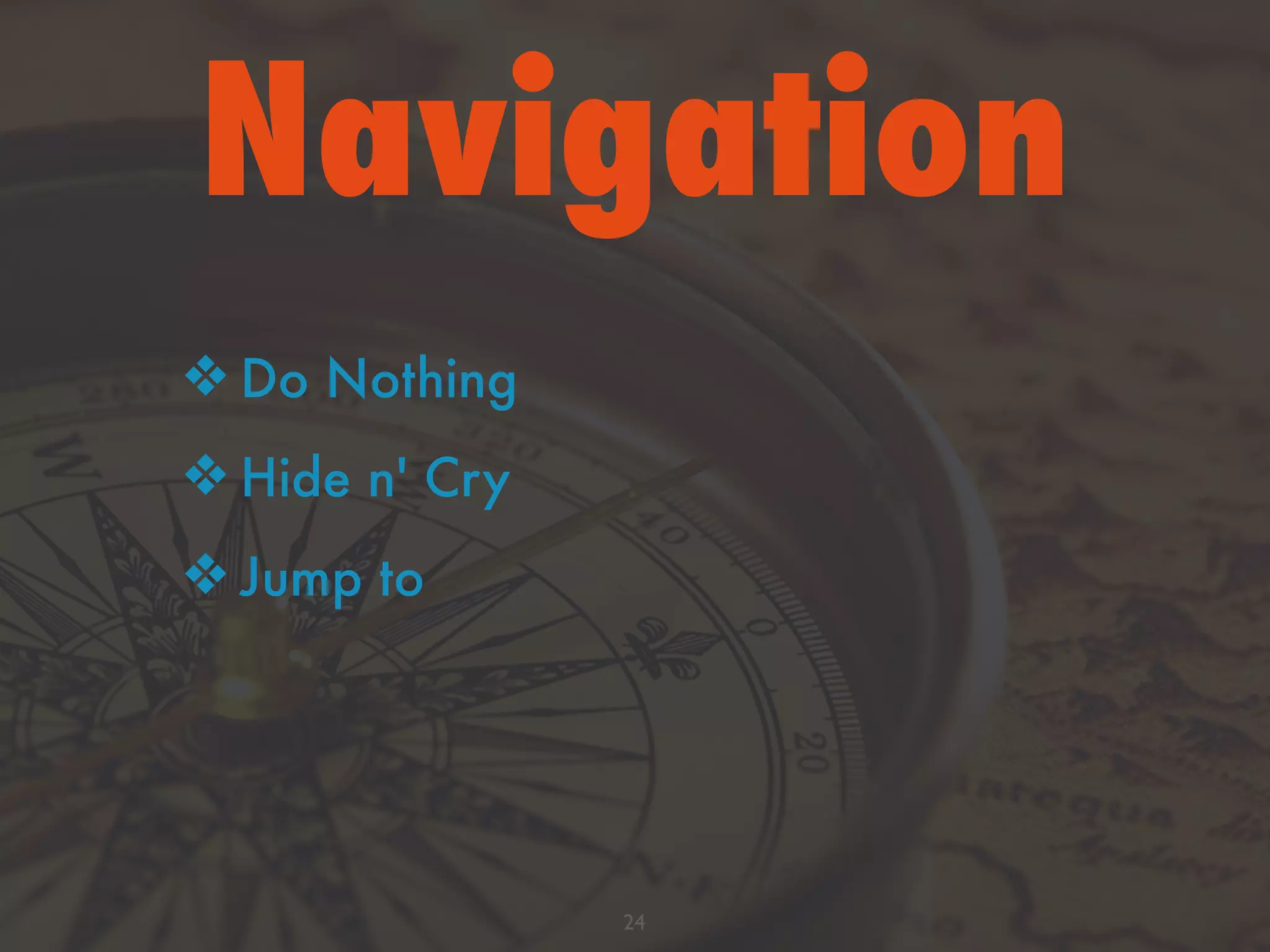
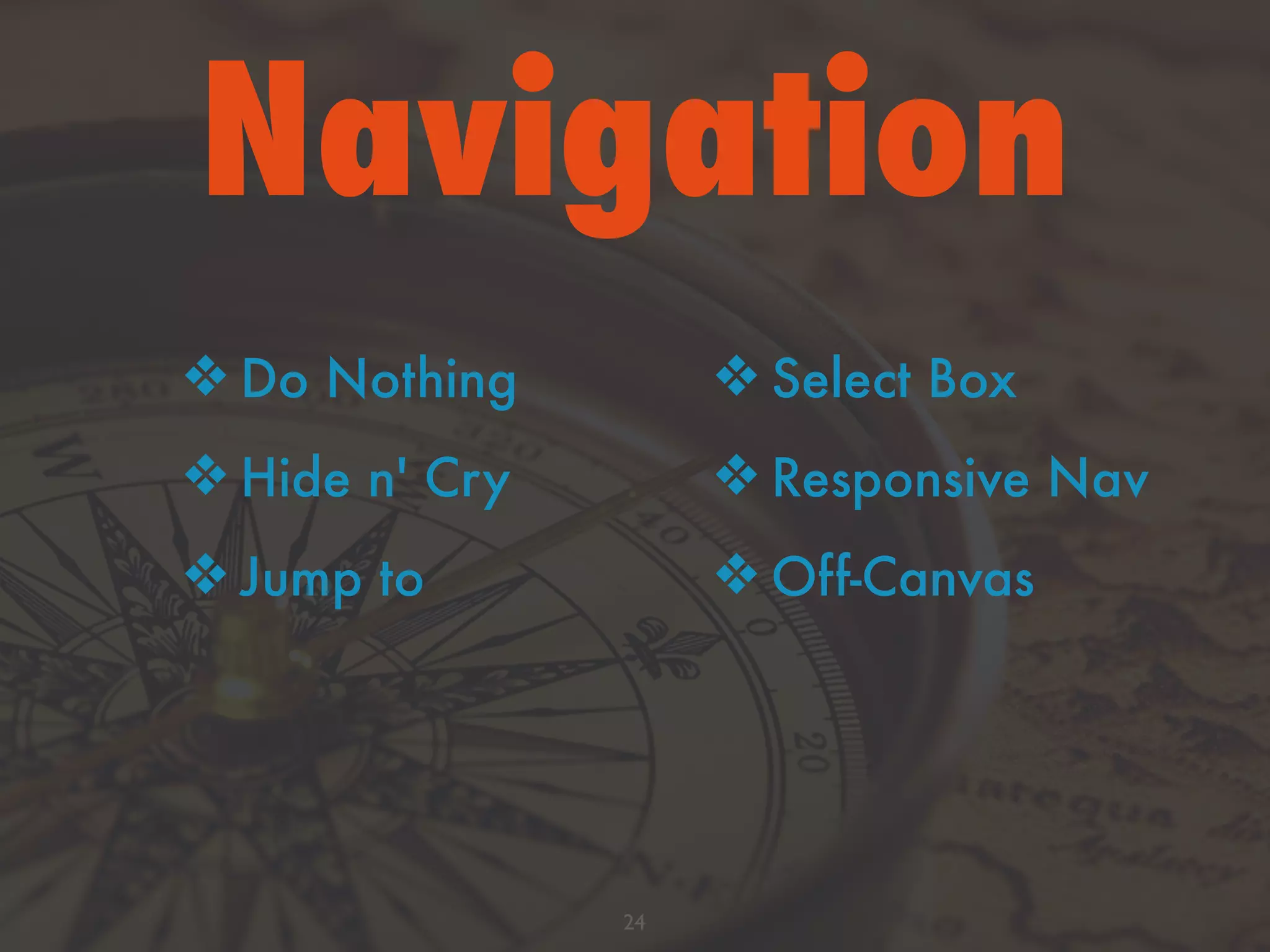
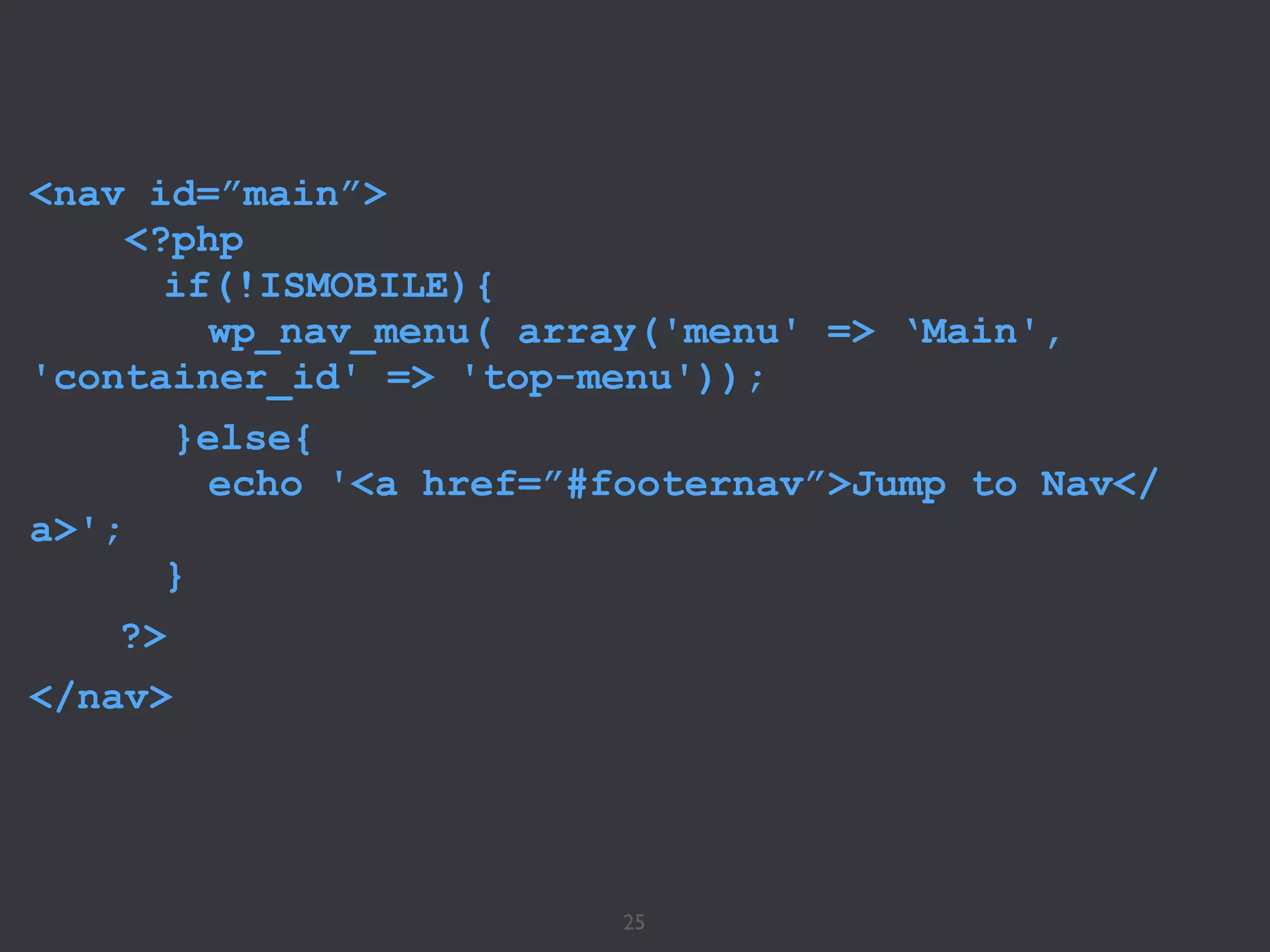
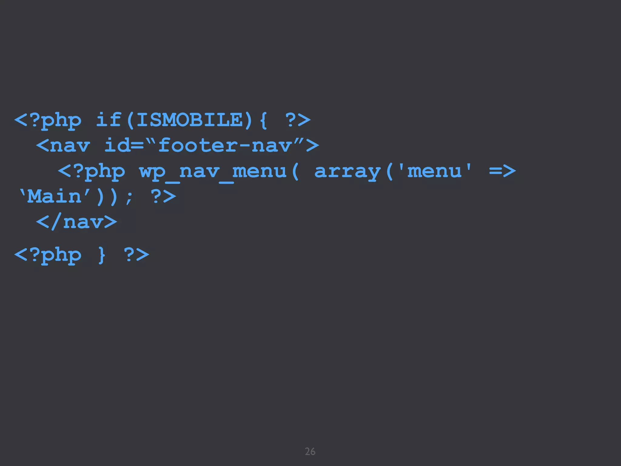
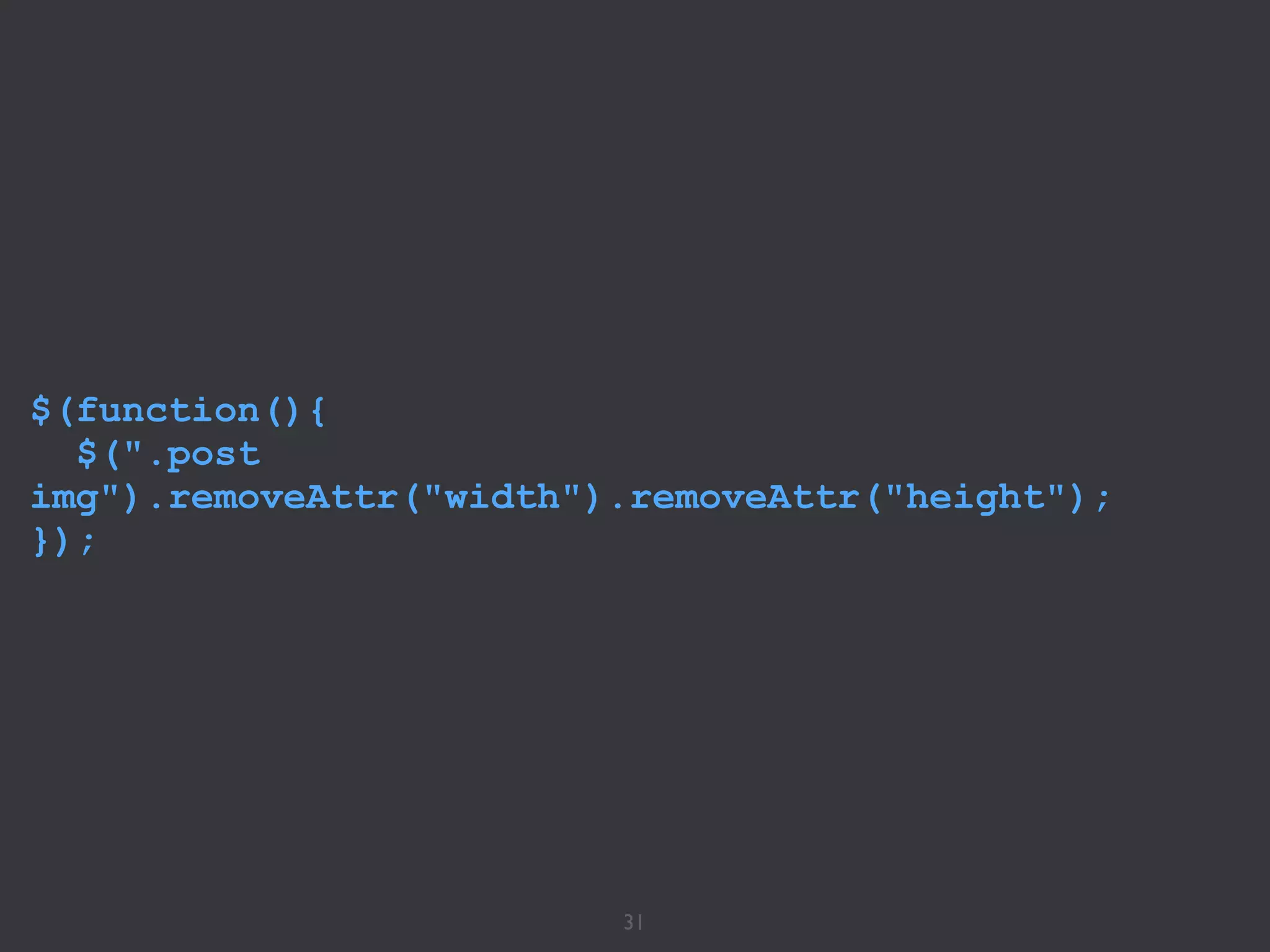
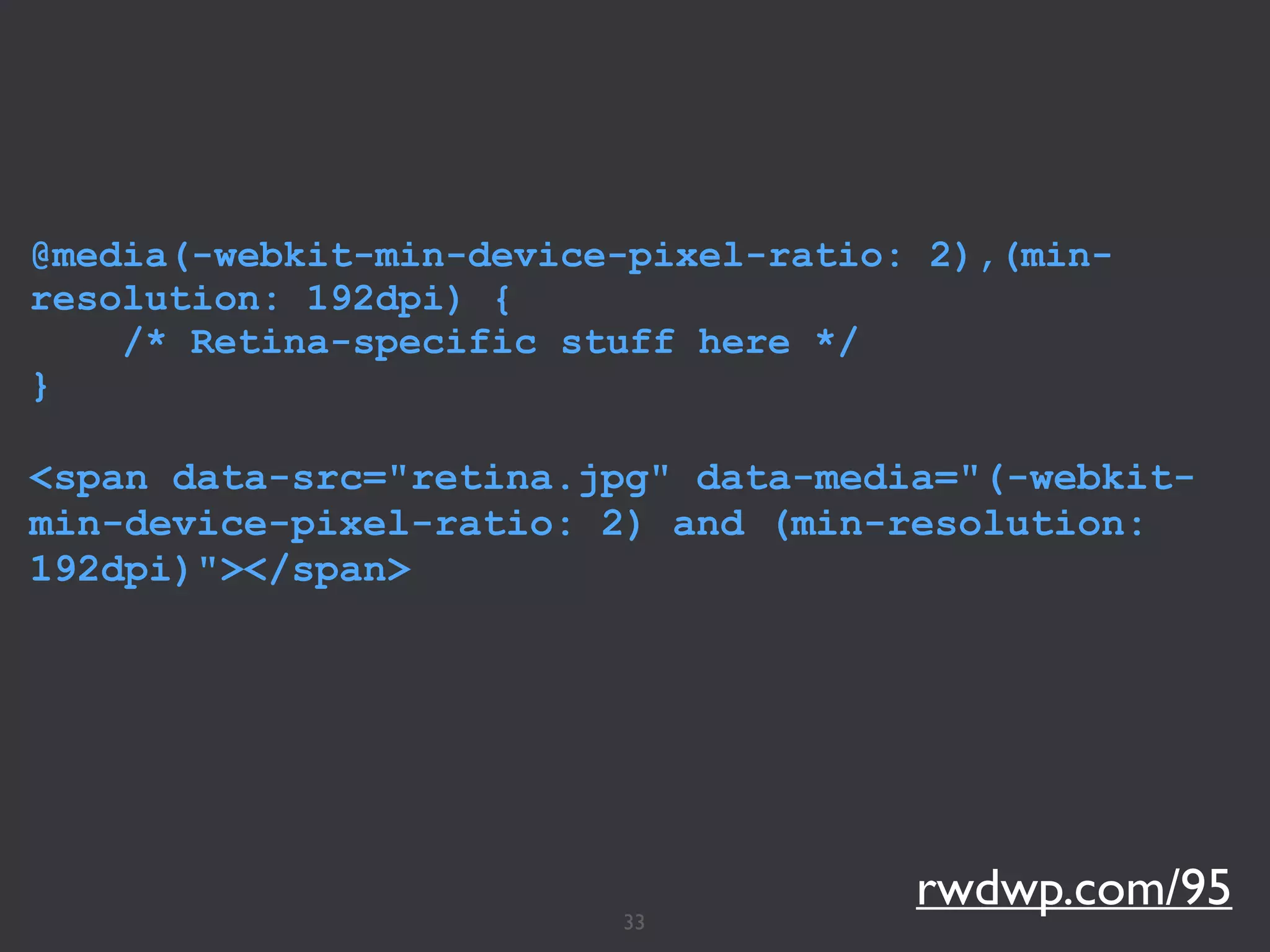
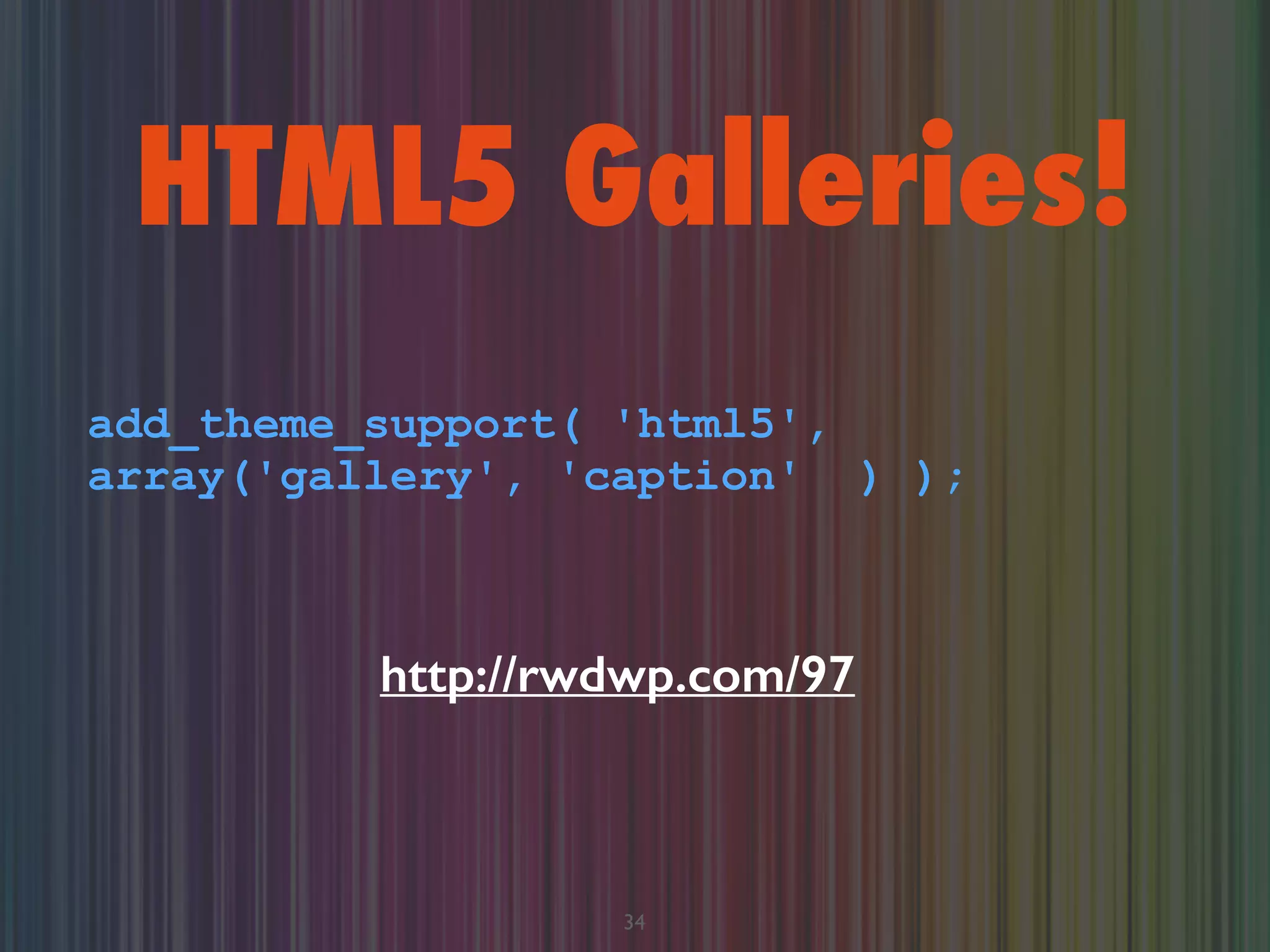
Download as PDF, PPTX


![30
<picture>
<!--[if IE 9]><video style="display:
none;"><![endif]-->
<source srcset="extralarge.jpg" media="(min-
width: 1000px)">
<source srcset="large.jpg" media="(min-width:
800px)">
<source srcset="medium.jpg">
<!--[if IE 9]></video><![endif]-->
<img srcset="medium.jpg" alt="A giant stone
face at The Bayon temple in Angkor Thom,
Cambodia">
</picture>](https://image.slidesharecdn.com/rwdwp-140517121254-phpapp02/75/WCCHS-Responsive-Design-with-WordPress-50-2048.jpg)


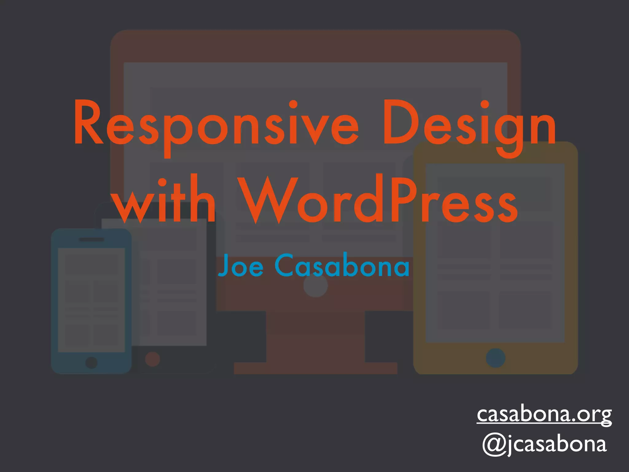
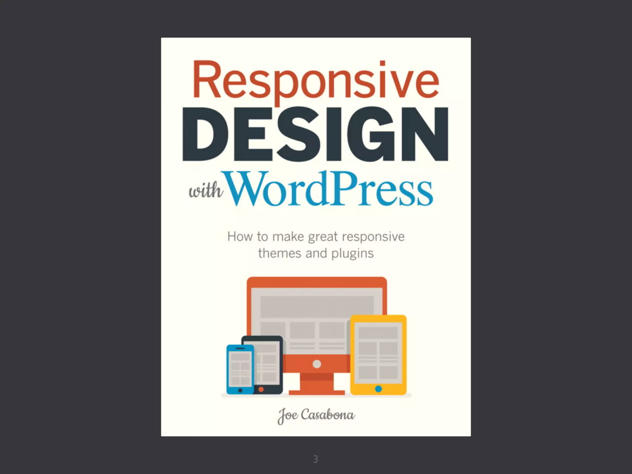
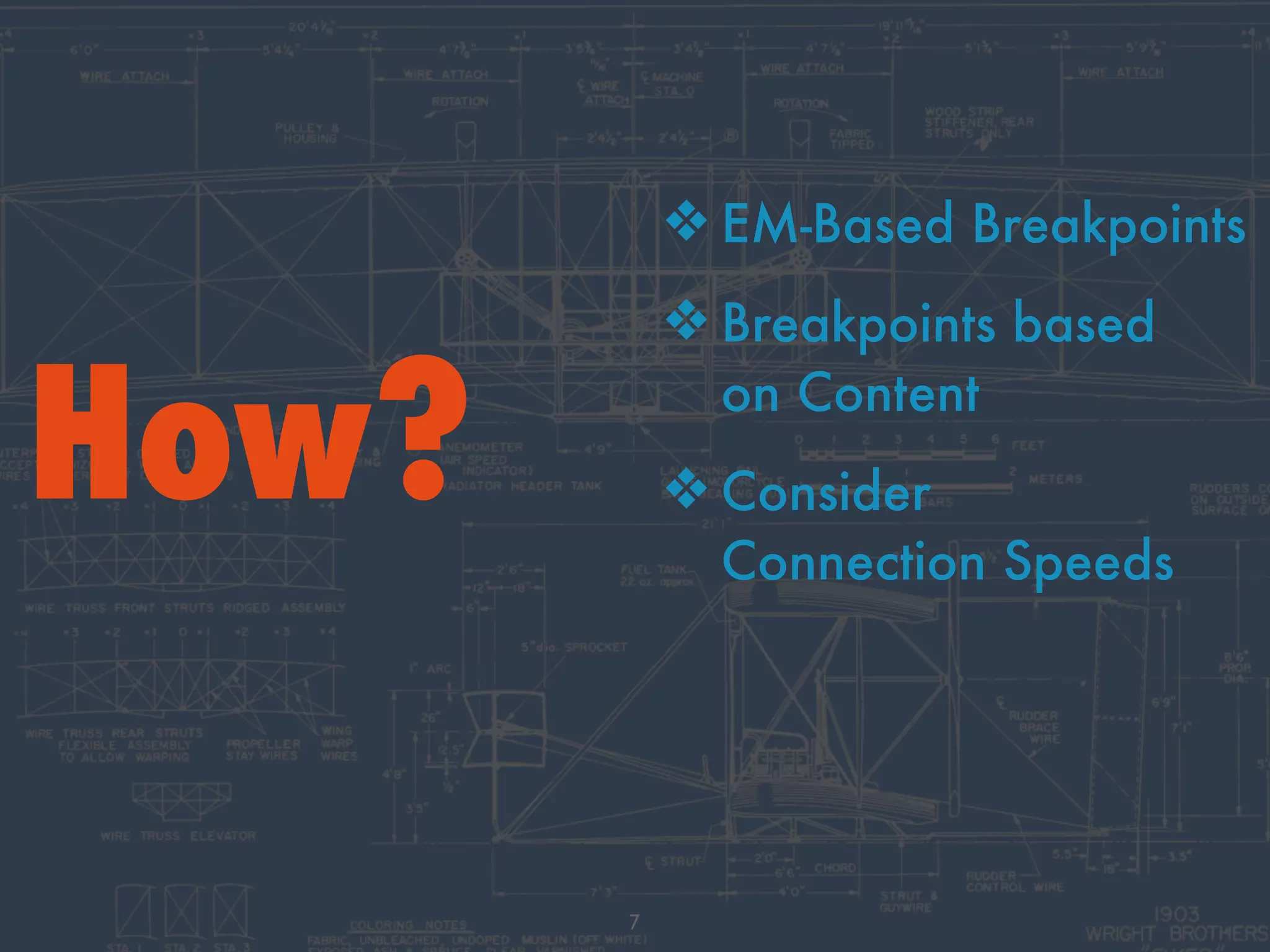
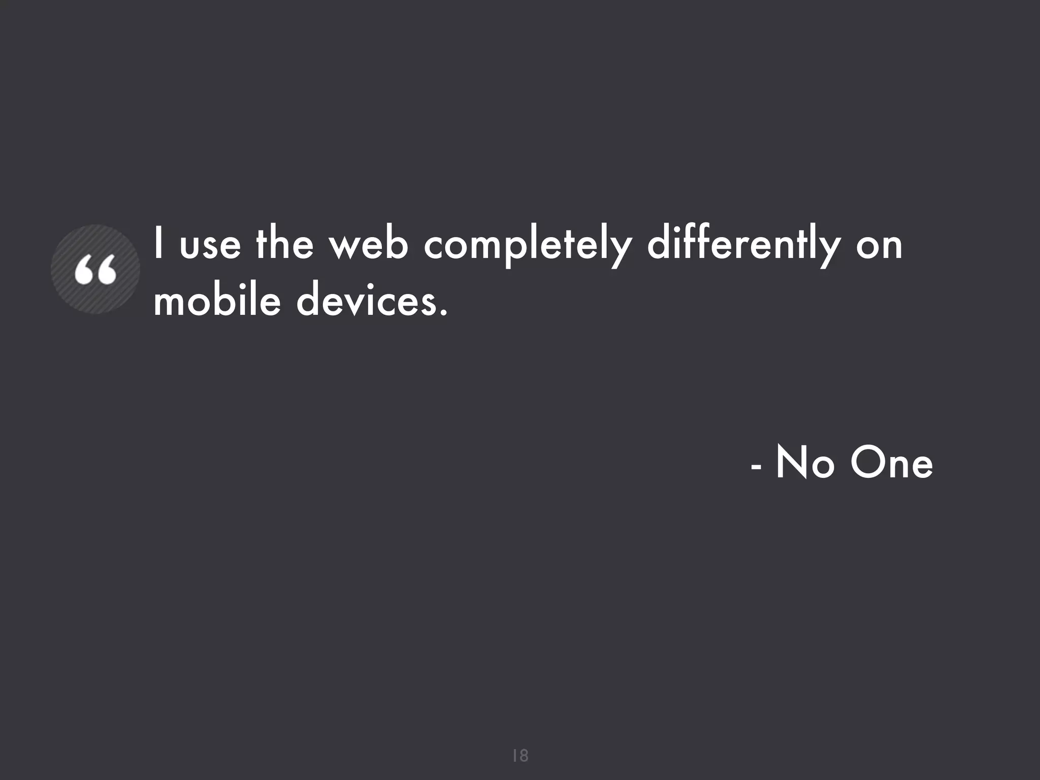
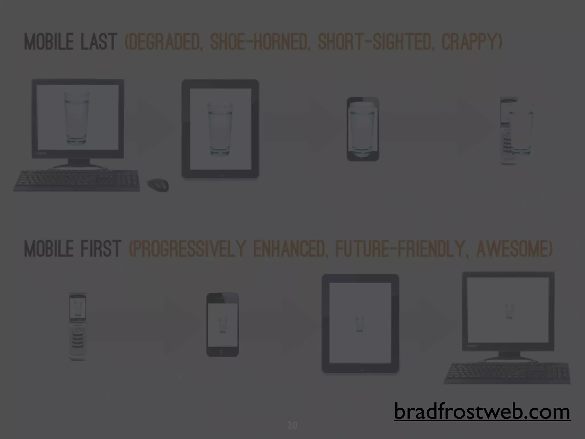
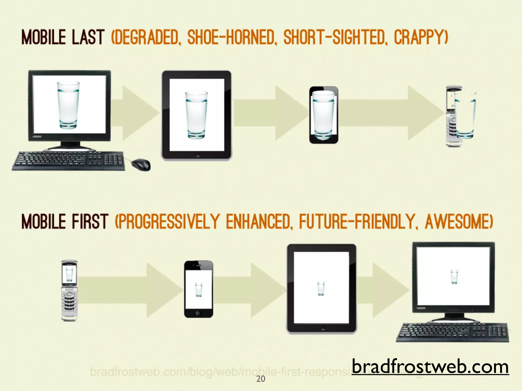
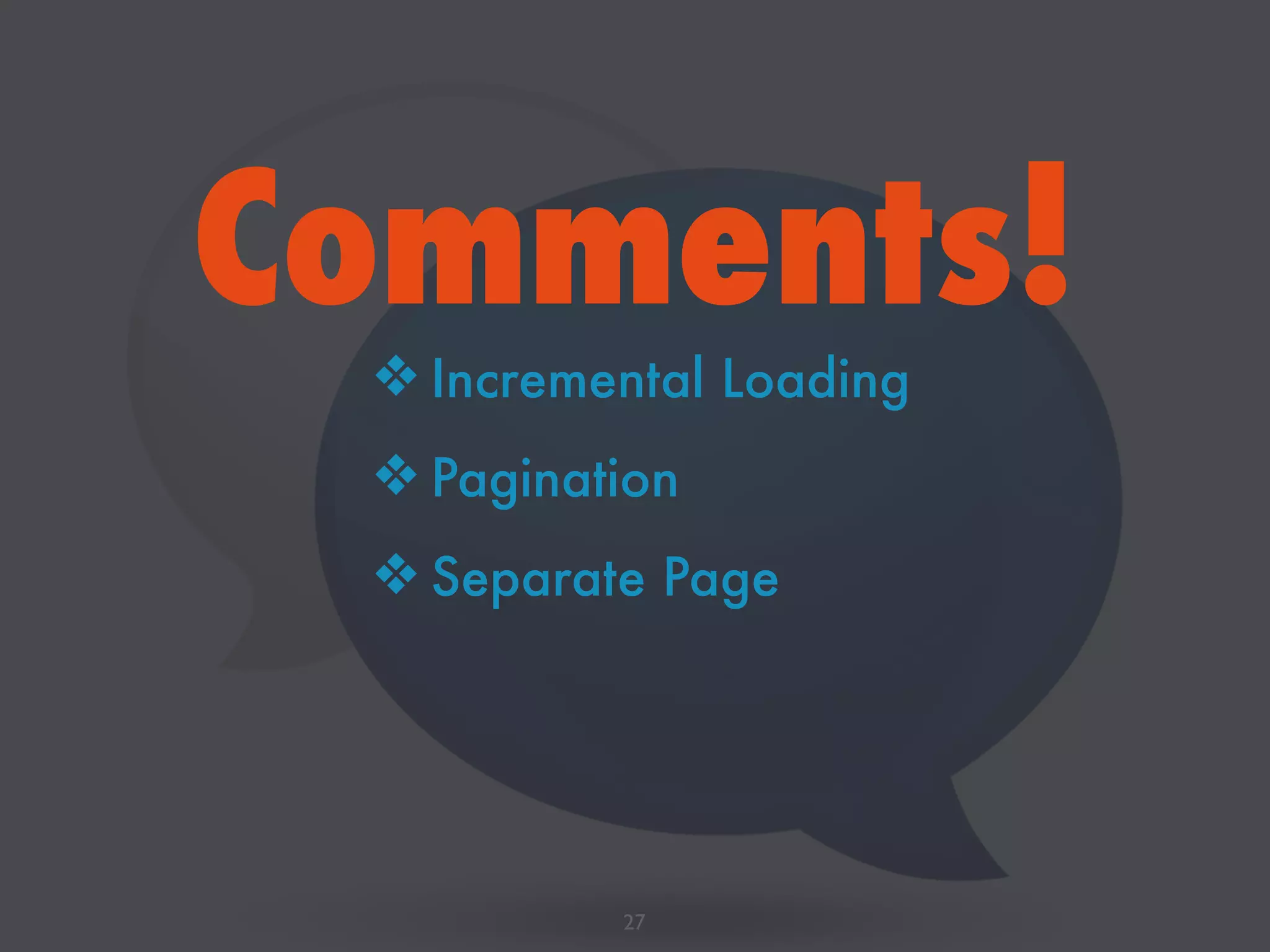
This document discusses responsive design for WordPress sites. It covers topics like responsive images, navigation patterns for mobile, testing on different devices and browsers, and using breakpoints and media queries. The overall message is that websites need to automatically adapt to different screens through responsive design principles in order to provide the best experience for users on any device.


![Coded Agents – with UiPath SDK + LangGraph [Virtual Hands-on Workshop]](https://cdn.slidesharecdn.com/ss_thumbnails/codedagentsdeck-251215155422-5497c599-thumbnail.jpg?width=640&height=640&fit=bounds)


