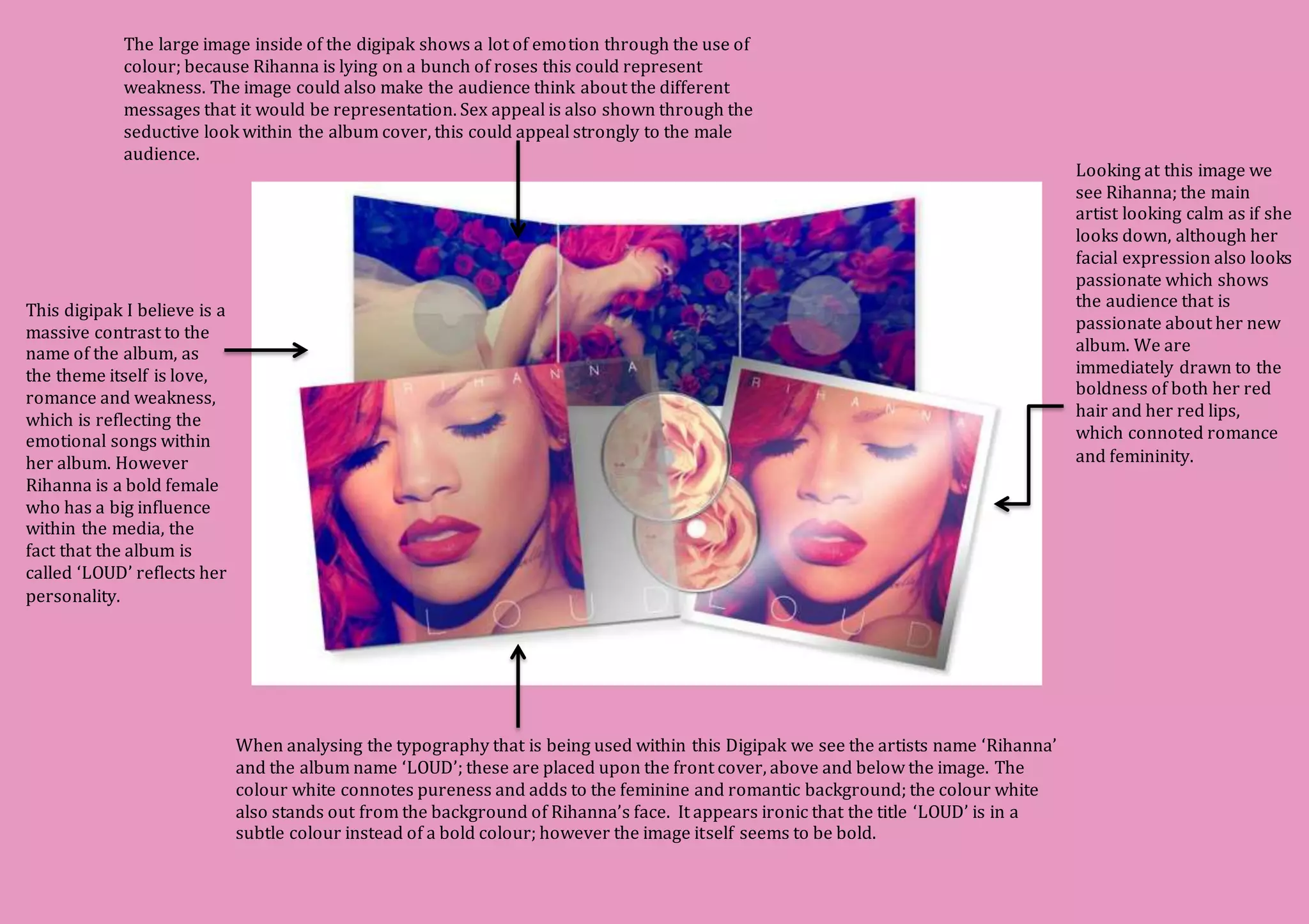
Looking at this image we
see Rihanna; the main
artist looking calm as if she
looks down, although her
facial expression also looks
passionate which shows
the audience that is
passionate about her new
album. We are
immediately drawn to the
boldness of both her red
hair and her red lips,
which connoted romance
and femininity.
When analysing the typography that is being used within this Digipak we see the artists name ‘Rihanna’
and the album name ‘LOUD’; these are placed upon the front cover, above and below the image. The
colour white connotes pureness and adds to the feminine and romantic background; the colour white
also stands out from the background of Rihanna’s face. It appears ironic that the title ‘LOUD’ is in a
subtle colour instead of a bold colour; however the image itself seems to be bold.
The large image inside of the digipak shows a lot of emotion through the use of
colour; because Rihanna is lying on a bunch of roses this could represent
weakness. The image could also make the audience think about the different
messages that it would be representation. Sex appeal is also shown through the
seductive look within the album cover, this could appeal strongly to the male
audience.
This digipak I believe is a
massive contrast to the
name of the album, as
the theme itself is love,
romance and weakness,
which is reflecting the
emotional songs within
her album. However
Rihanna is a bold female
who has a big influence
within the media, the
fact that the album is
called ‘LOUD’ reflects her
personality.

Rihanna digipak

  • 1.
    Looking at thisimage we see Rihanna; the main artist looking calm as if she looks down, although her facial expression also looks passionate which shows the audience that is passionate about her new album. We are immediately drawn to the boldness of both her red hair and her red lips, which connoted romance and femininity. When analysing the typography that is being used within this Digipak we see the artists name ‘Rihanna’ and the album name ‘LOUD’; these are placed upon the front cover, above and below the image. The colour white connotes pureness and adds to the feminine and romantic background; the colour white also stands out from the background of Rihanna’s face. It appears ironic that the title ‘LOUD’ is in a subtle colour instead of a bold colour; however the image itself seems to be bold. The large image inside of the digipak shows a lot of emotion through the use of colour; because Rihanna is lying on a bunch of roses this could represent weakness. The image could also make the audience think about the different messages that it would be representation. Sex appeal is also shown through the seductive look within the album cover, this could appeal strongly to the male audience. This digipak I believe is a massive contrast to the name of the album, as the theme itself is love, romance and weakness, which is reflecting the emotional songs within her album. However Rihanna is a bold female who has a big influence within the media, the fact that the album is called ‘LOUD’ reflects her personality.