Responsive web design tools and technique
•Download as PPTX, PDF•
1 like•2,671 views

This document discusses responsive web design tools and techniques. It begins by defining block and inline HTML elements, and listing common examples of each. It then explains basic CSS elements, pseudo-classes, and properties like background, border, padding etc. Media queries and media types like screen and print are introduced, with examples given for associating styles with viewport widths. Responsive meta tags and JavaScript libraries for supporting media queries in older browsers are also covered. The document concludes by outlining topics for creating responsive menus, tables, forms and using frameworks like Bootstrap and Foundation.

Recommended
More Related Content
Similar to Responsive web design tools and technique
Similar to Responsive web design tools and technique (20)
More from Nascenia IT
More from Nascenia IT (20)
Recently uploaded
Recently uploaded (20)
Responsive web design tools and technique
- 1. Responsive web design tools and technique Md Nazrul Islam Software Engineer Nascenia IT
- 2. Basic html structure Html element In general, HTML elements can be divided into two categories : block level and inline elements. ◦ 1. HTML block level elements can appear in the body of an HTML page. ◦ 2. It can contain other block level as well as inline elements. ◦ 3. By default, block-level elements begin on new lines. ◦ 4. block level elements create larger structures (than inline elements). List of block element p,h1, h2, h3, h4, h5, h6, ol, ul, pre, address, blockquote, dl, div, fieldset, form , hr, noscript, table List of inline element b, big, i, small, tt abbr, acronym, cite, code, dfn, em, kbd, strong, samp, var a, bdo, br, img, map, object, q, script, span, sub, sup button, input, label, select, textarea
- 3. Basic css Total css element Animation, appearance, backface-visibility, background, border, bottom, box, captionside, clear, clip, color, column, content, counter-increment, counterreset, cursor, direction, display, empty-cells, float, font, grid-columns, grid-rows, hangingpunctuation, height, icon, left, letter-spacing, line-height, list-style, margin, max-height, max-width, min-height, minwidth, nav, opacity, outline, overflow, overflow-x, overflow-y, padding, pagebreak, perspective, perspective-origin, position, punctuationtrim, quotes, resize, right, rotation, rotation-point, tablelayout, target, text, top, transform, transition, vertical-align, visibility, width, whitespace, word-spacing, word-break, word-wrap, z-index. Known css element background, border, clear, content, cursor, display, float, height, margin, max-height , minwidth min-width, overflow, padding, position, vertical-align, visibility, word-break. CSS pseudo element (A CSS pseudo-class is a keyword added to selectors that specifies a special state of the element to be selected) :link, :visited, :active, :hover, :focus, :first-child, :nth-child, :nth-last-child, :nth-oftype, :first-of-type, :last-of-type, :empty, :target, :checked, :enabled, :disabled
- 4. Understanding media query What id media The @media CSS at-rule associates a set of nested statements, in a CSS block, that is delimited by curly braces, with a condition defined by a media query. Syntax @media <media types> { /* media-specific rules */ } Media type screen => Intended primarily for color computer screens. tv => Intended for television-type devices. all => Suitable for all devices. Example @media print { body { font-size: 10pt } } @media screen { body { font-size: 13px } } @media screen, print { body { line-height: 1.2 } }
- 5. Media query example <!-- CSS media query on a link element --> <link rel="stylesheet" media="(max-width: 800px)" href="example.css" /> <!-- CSS media query within a style sheet --> <style> @media (max-width: 600px) { .facet_sidebar { display: none; } } </style>
- 6. Responsive meta element <meta name="viewport" content="width=device-width, initial-scale=1.0"> Internet Explorer 8 or older doesn't support media query. You can use media-queries.js Internet Explorer 8 or older doesn't support media query. You can use media-queries.js or respond.js to add media query support in IE. <!--[if lt IE 9]> <script src="http://css3-mediaqueries-js.googlecode.com/svn/trunk/css3mediaqueries.js"></script> <![endif]-->
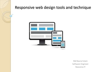
- 7. Design simple responsive site
- 9. Next topics Responsive table Responsive form with input field CSS border magic Responsive framework Twitter bootstrap and Foundation.