Download as PDF, PPTX


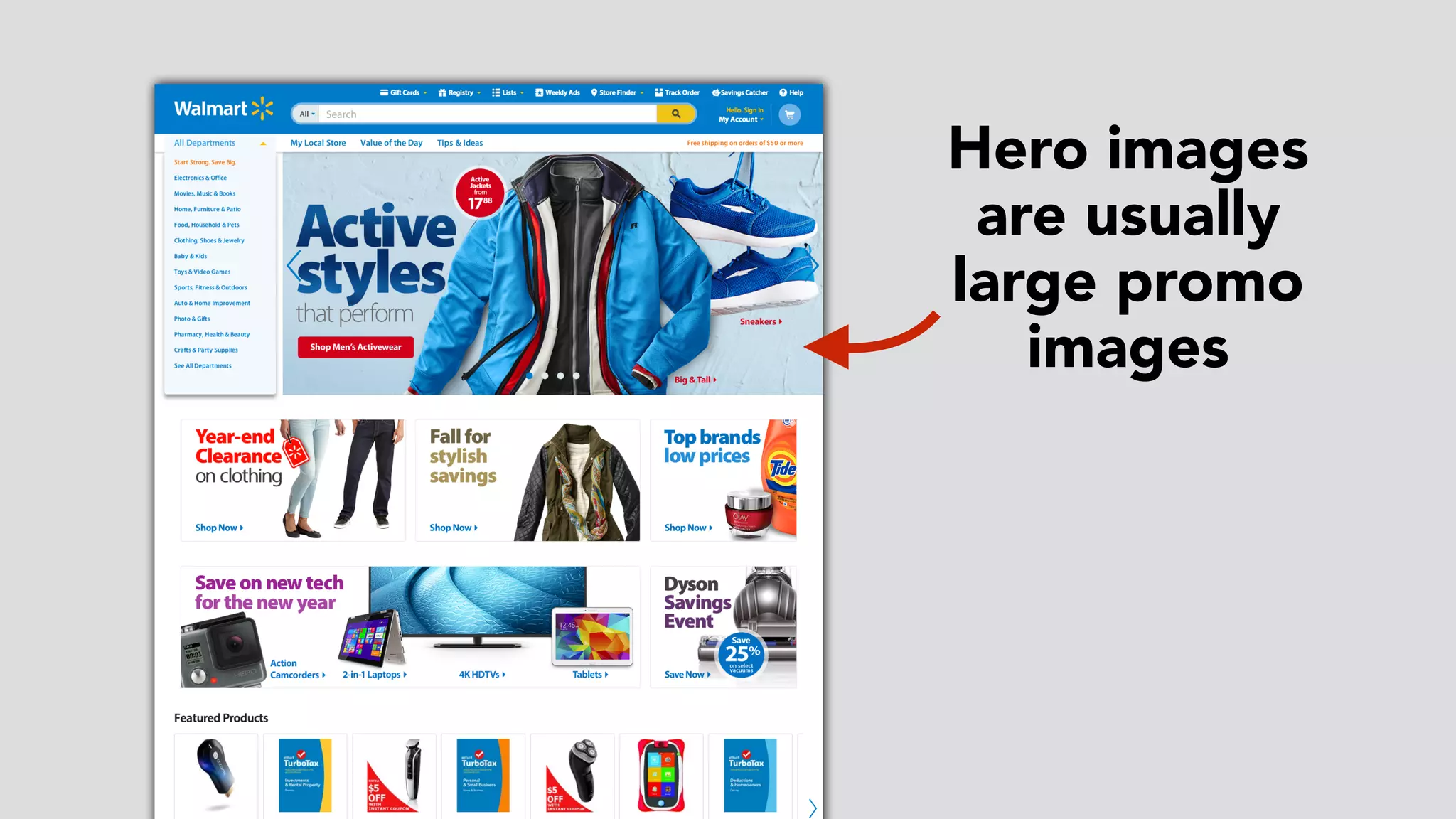


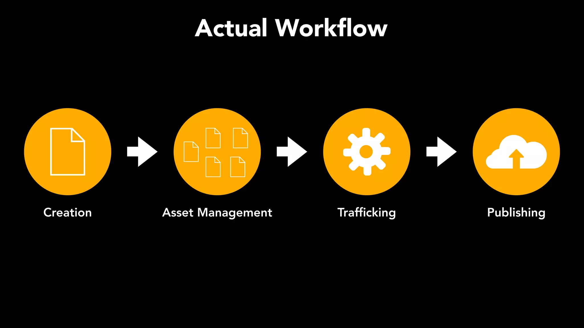


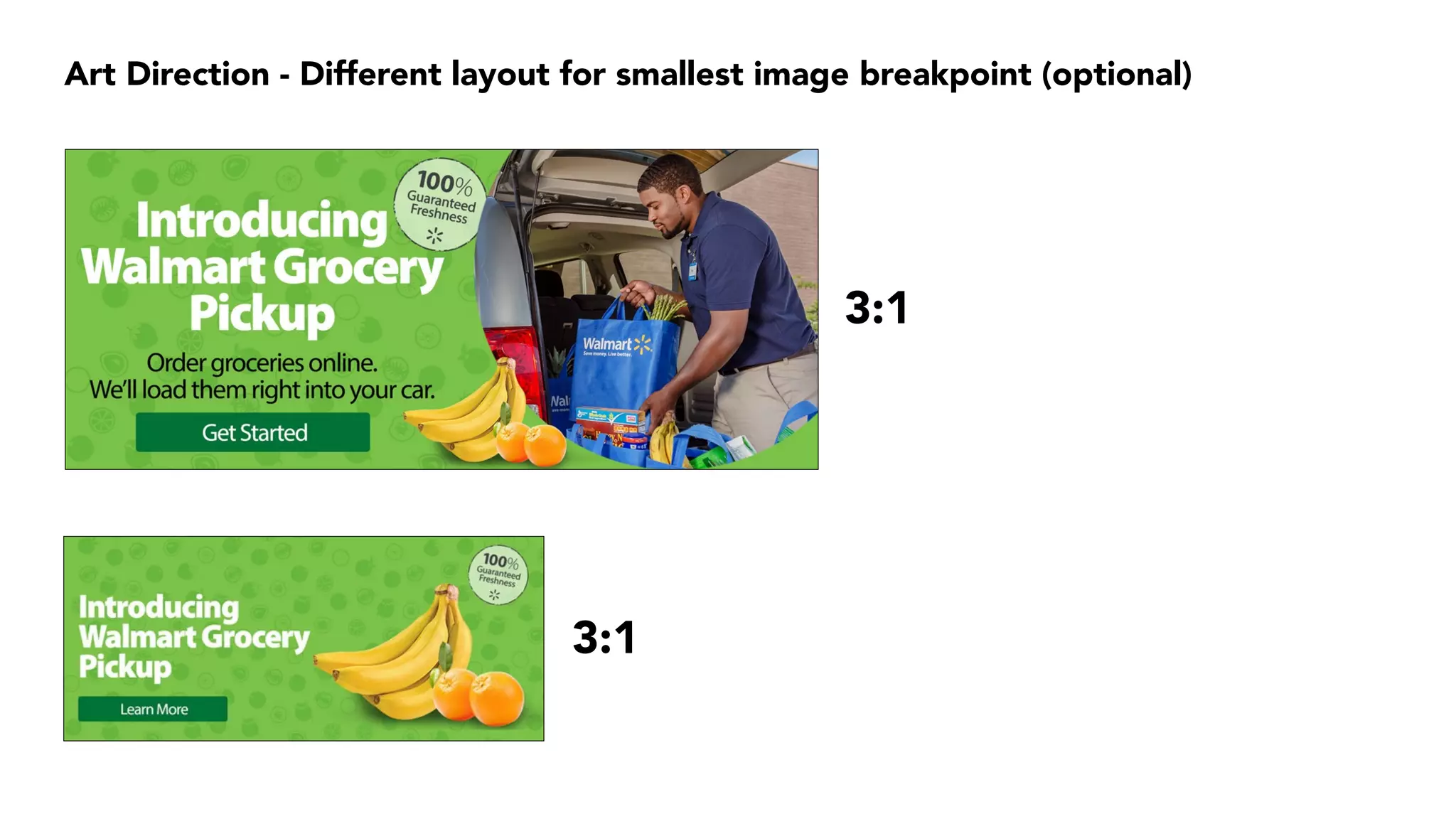


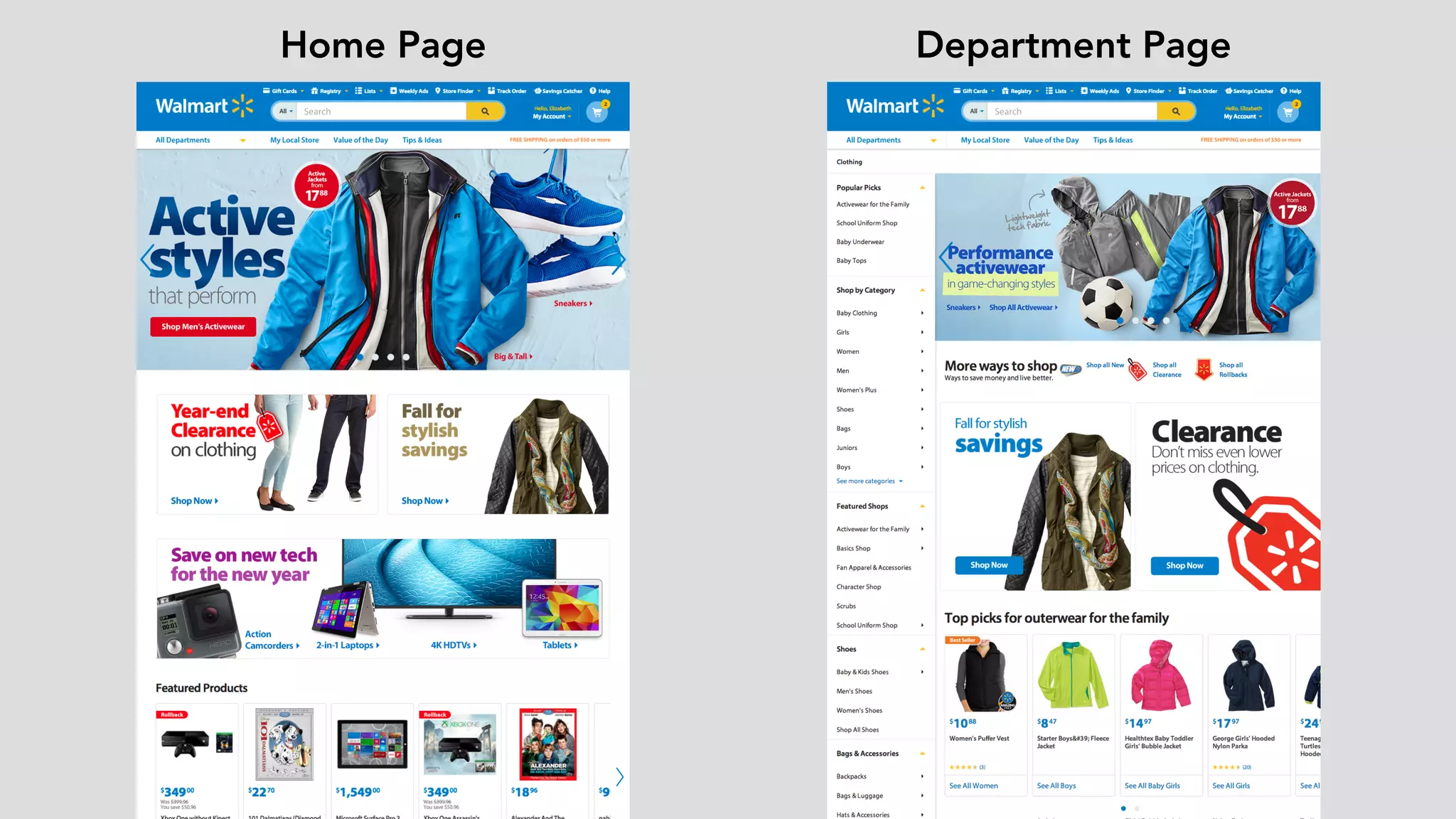


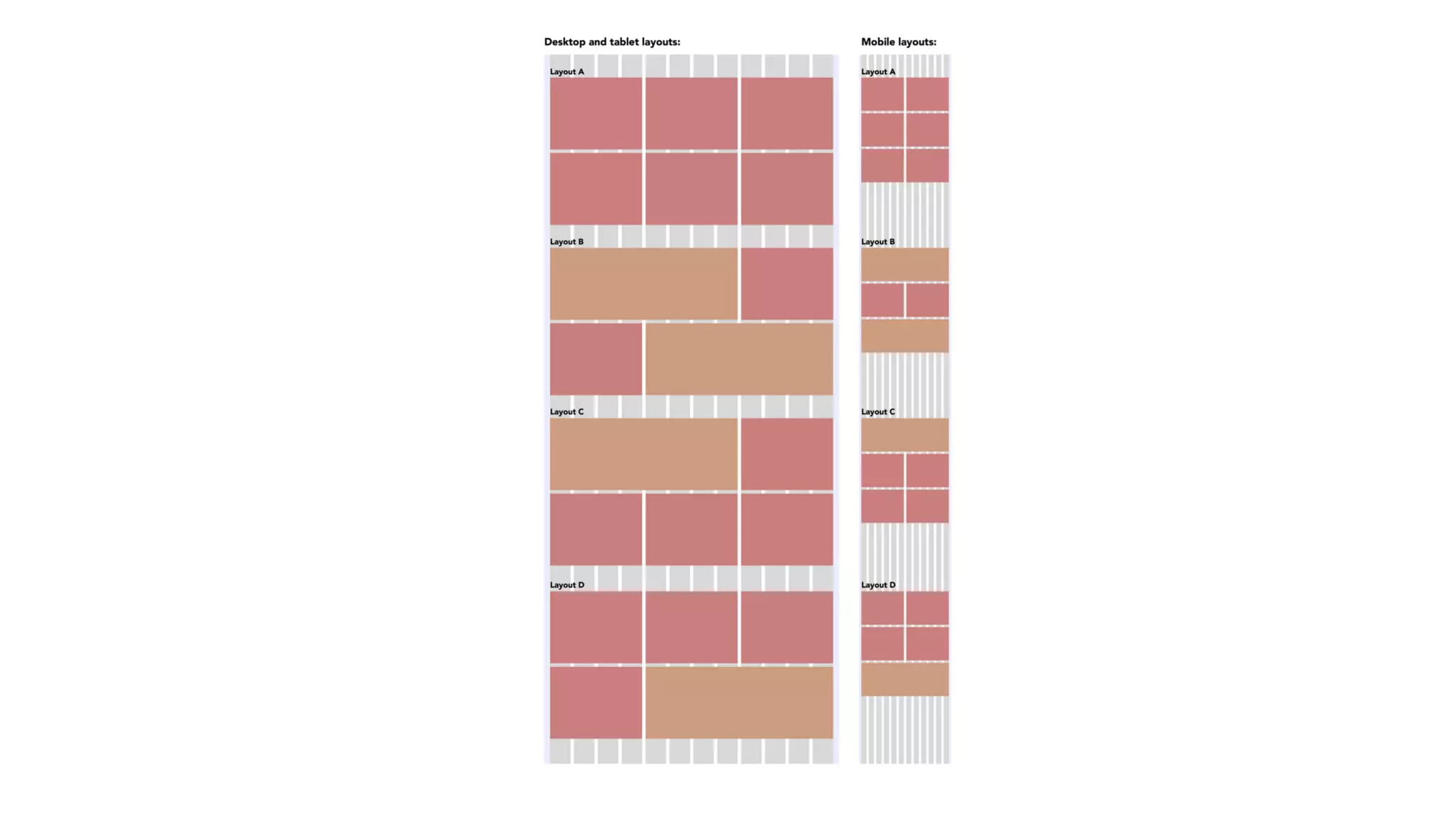


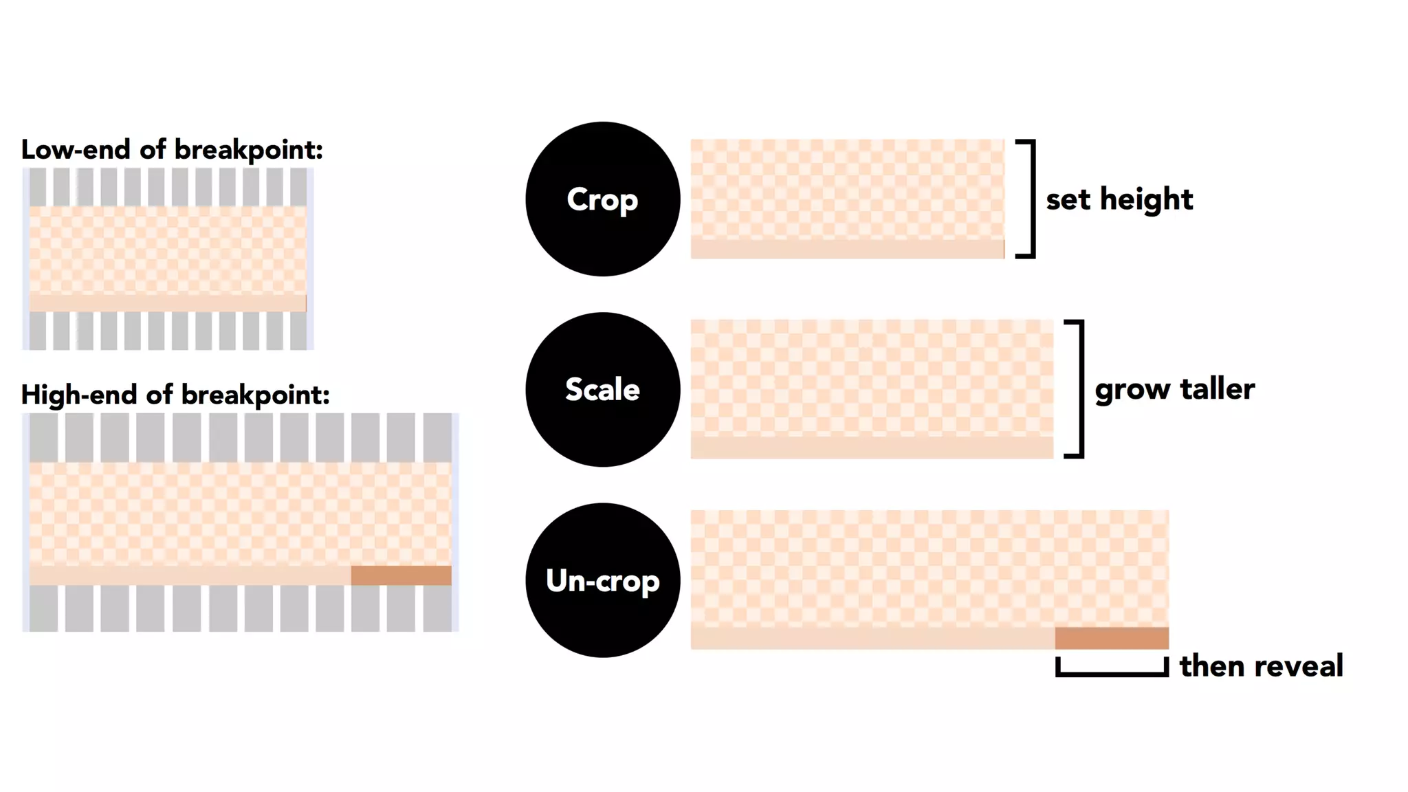


Walmart's shift to responsive web design began in 2014, emphasizing the importance of hero images and optimizing image use across various device widths. The team aimed to minimize the number of high-quality images needed while maintaining performance, ultimately reducing from 5,500 to 4,200 images through standardization and strategic asset management. Key takeaways included the collaborative nature of responsive design and the necessity of scaling solutions effectively.


