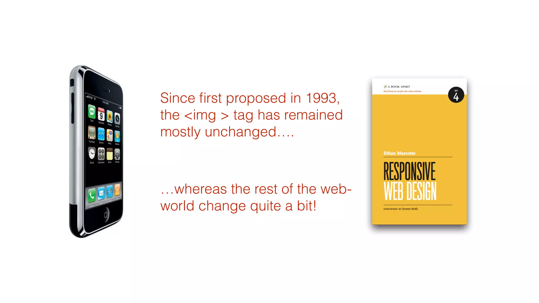

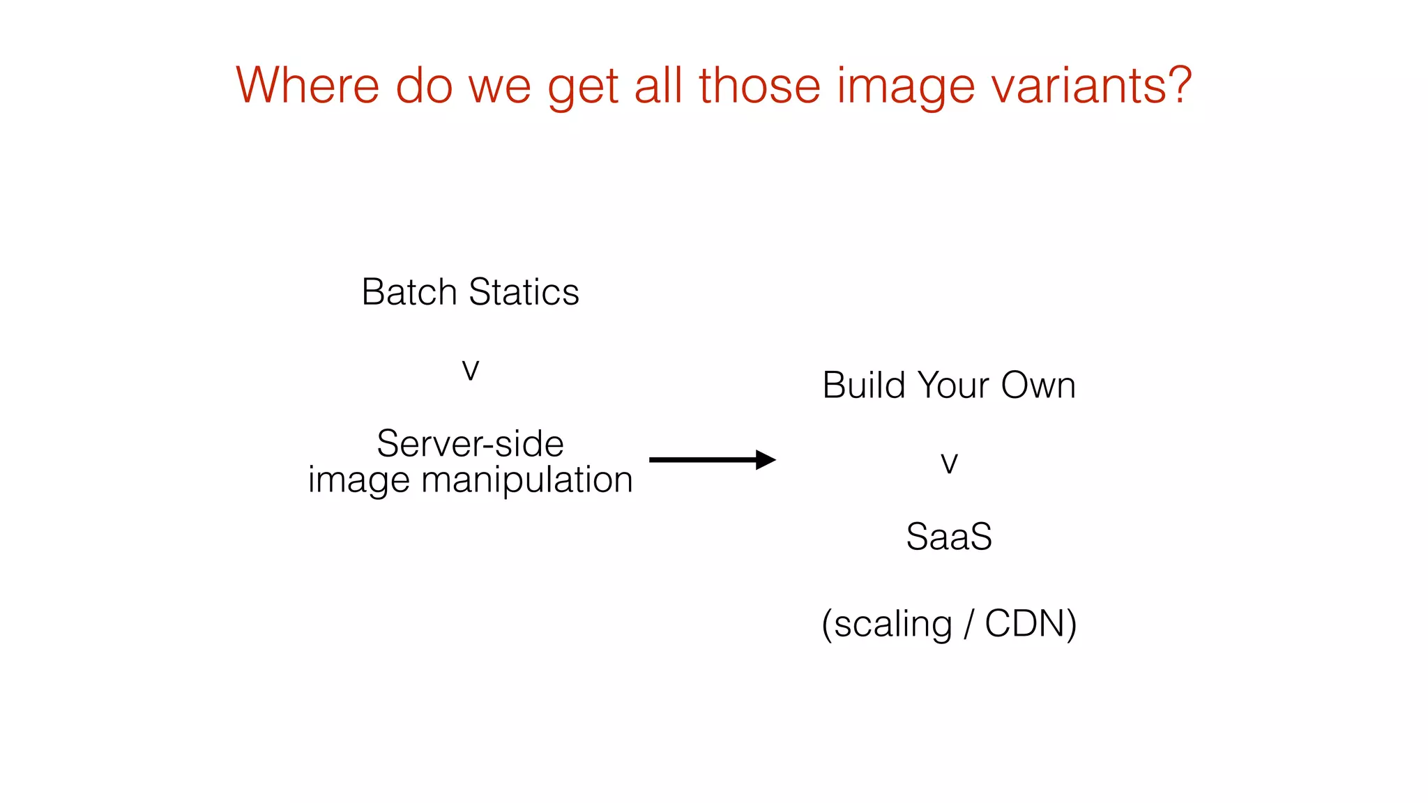
![Javascript Image Replacement
using <noscript>, custom data- attributes and .insertAfter($(this))
<noscript data-imageid=‘bag.jpg’ data-small-imageid=‘bag_small.jpg’ data-large-imageid=‘bag_large.jpg’>
<img src=‘bag_small.jpg’ alt='Bag' />
http://allbs.co.uk/2012/05/11/responsive-images-intro/
!
</noscript>
<script>
!
var areawidth = $(window).width();
var widthDownTosmall = 600;
var widthUpToLarge = 1100;
!
$('noscript[data-imageid]').each(function(){
var imageBase=“image/path";
var imageid = $(this).attr("data-imageid");
var imageSmall = $(this).attr("data-small-imageid");
var imageLarge = $(this).attr("data-large-imageid");
if (areawidth <= widthDownTosmall) {imageid = imageSmall; }
if (areawidth >= widthUpToLarge) {imageid = imageLarge; }
$('<img src="' + imageBase + imageid + '"/>').insertAfter($(this));
});
</script>](https://image.slidesharecdn.com/responsiveimages2bb169finalforsharing-140820111639-phpapp02/75/Practical-Responsive-Images-from-Breaking-Borders-14-2048.jpg)

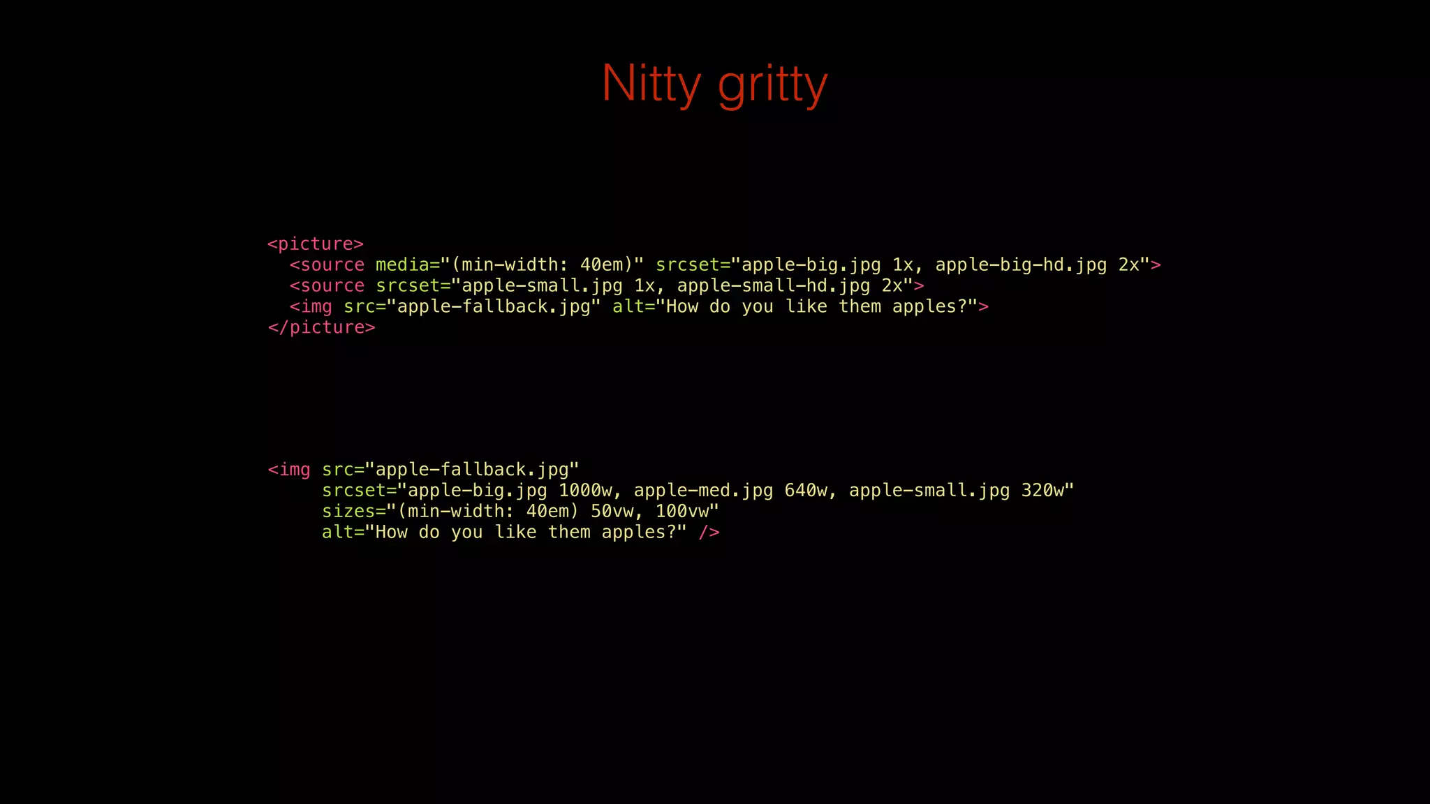
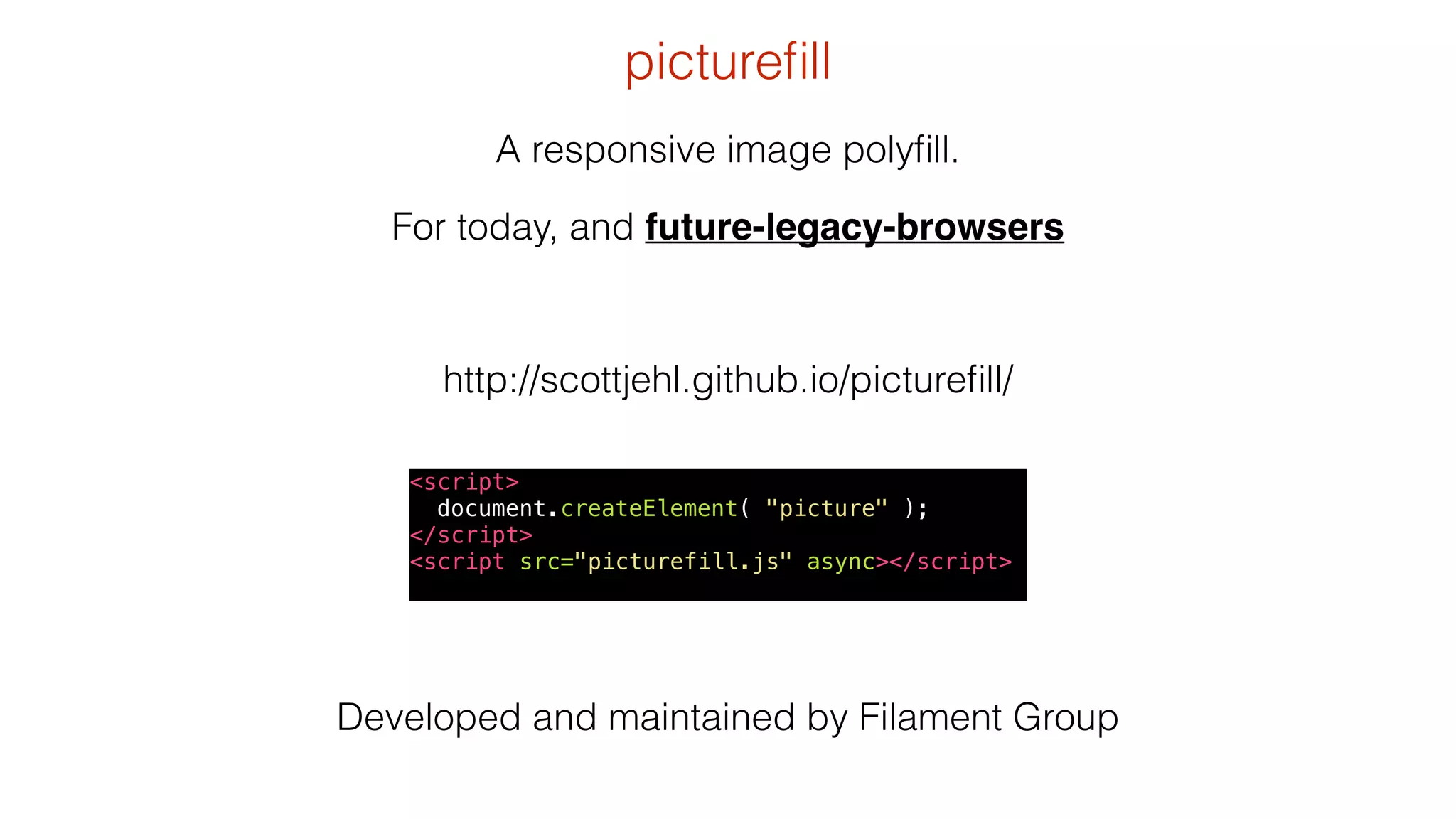
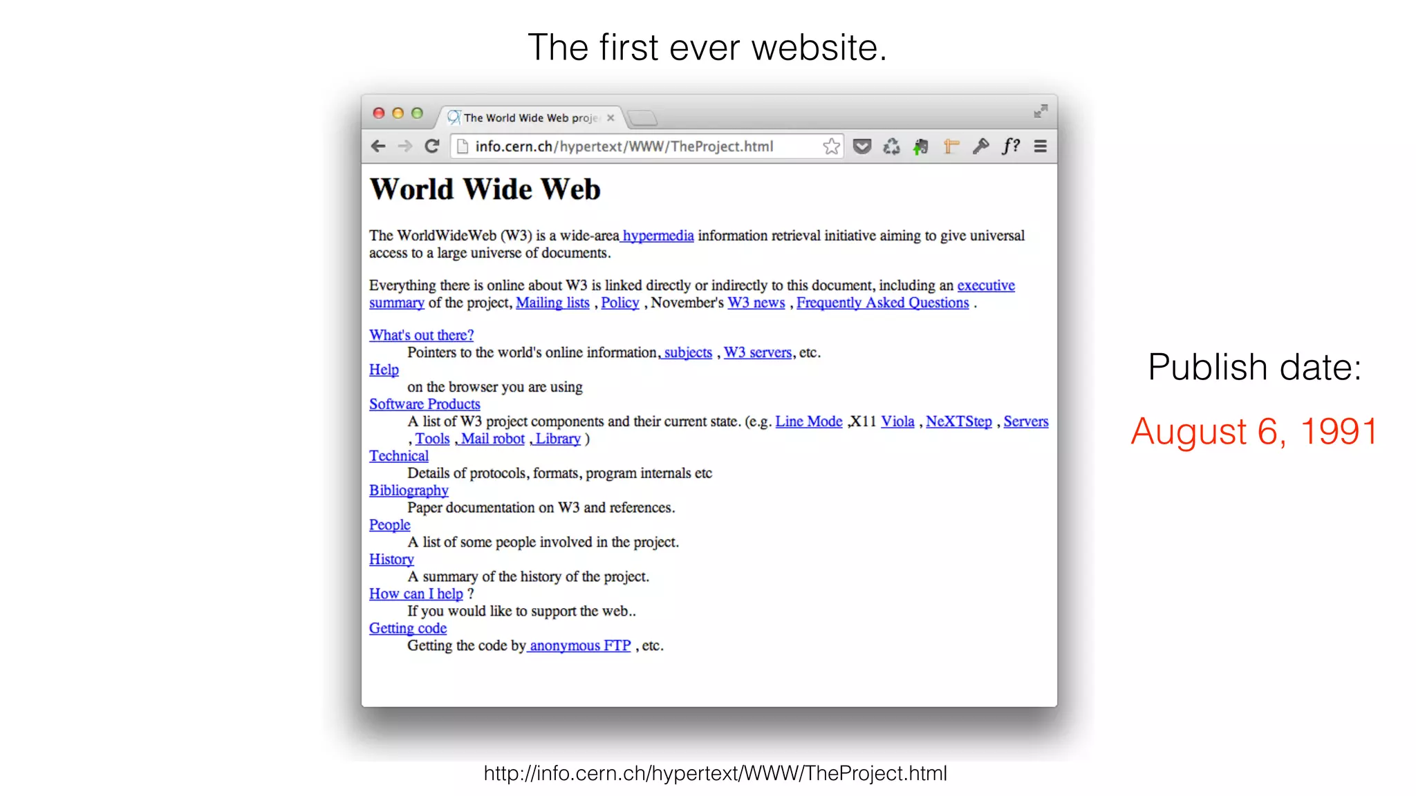
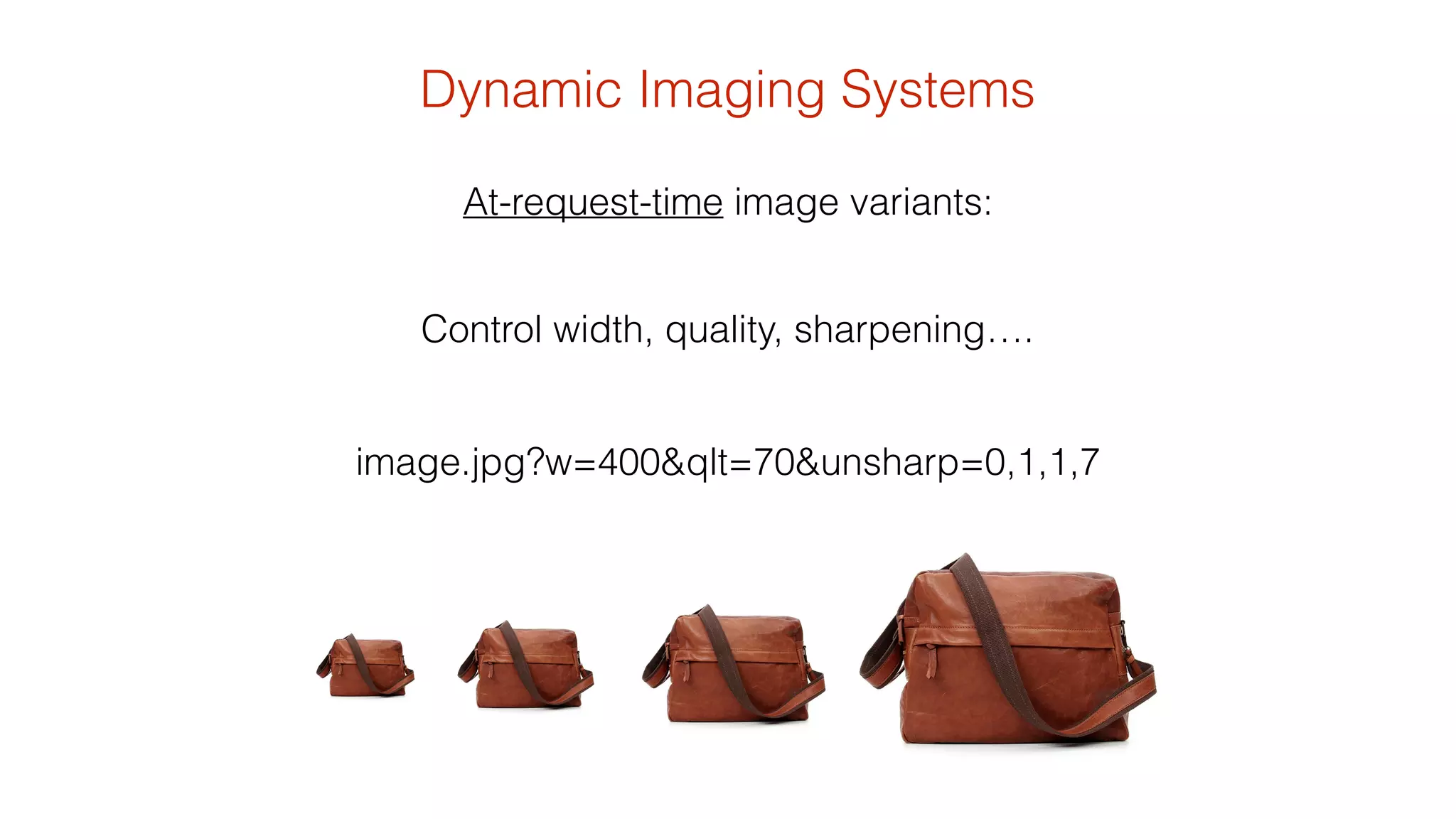
![• grab a copy of picturefill.js
• Use the <picture> element
(never go back)
<picture>
<!--[if IE 9]><video style="display: none;”><![endif]-->
<source srcset="/image1_big.jpg" media="(min-width: 1000px)">
<source srcset="/image1_medium.jpg" media="(min-width: 800px)">
<source srcset="/image_small.jpg">
<!--[if IE 9]></video><![endif]-->
<img srcset="/image_fallback.jpg alt="context">
</picture>
Try it today](https://image.slidesharecdn.com/responsiveimages2bb169finalforsharing-140820111639-phpapp02/75/Practical-Responsive-Images-from-Breaking-Borders-22-2048.jpg)
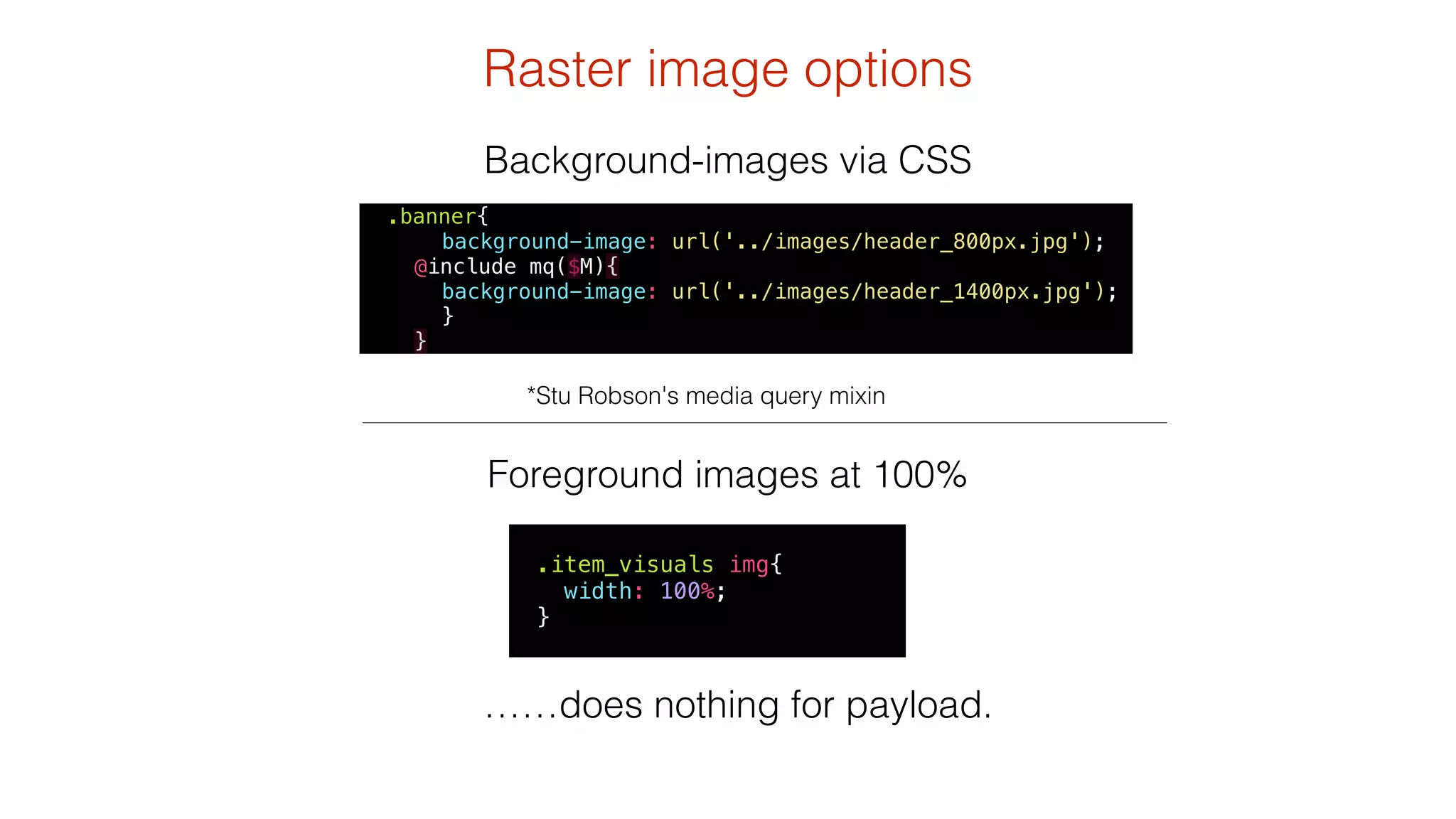
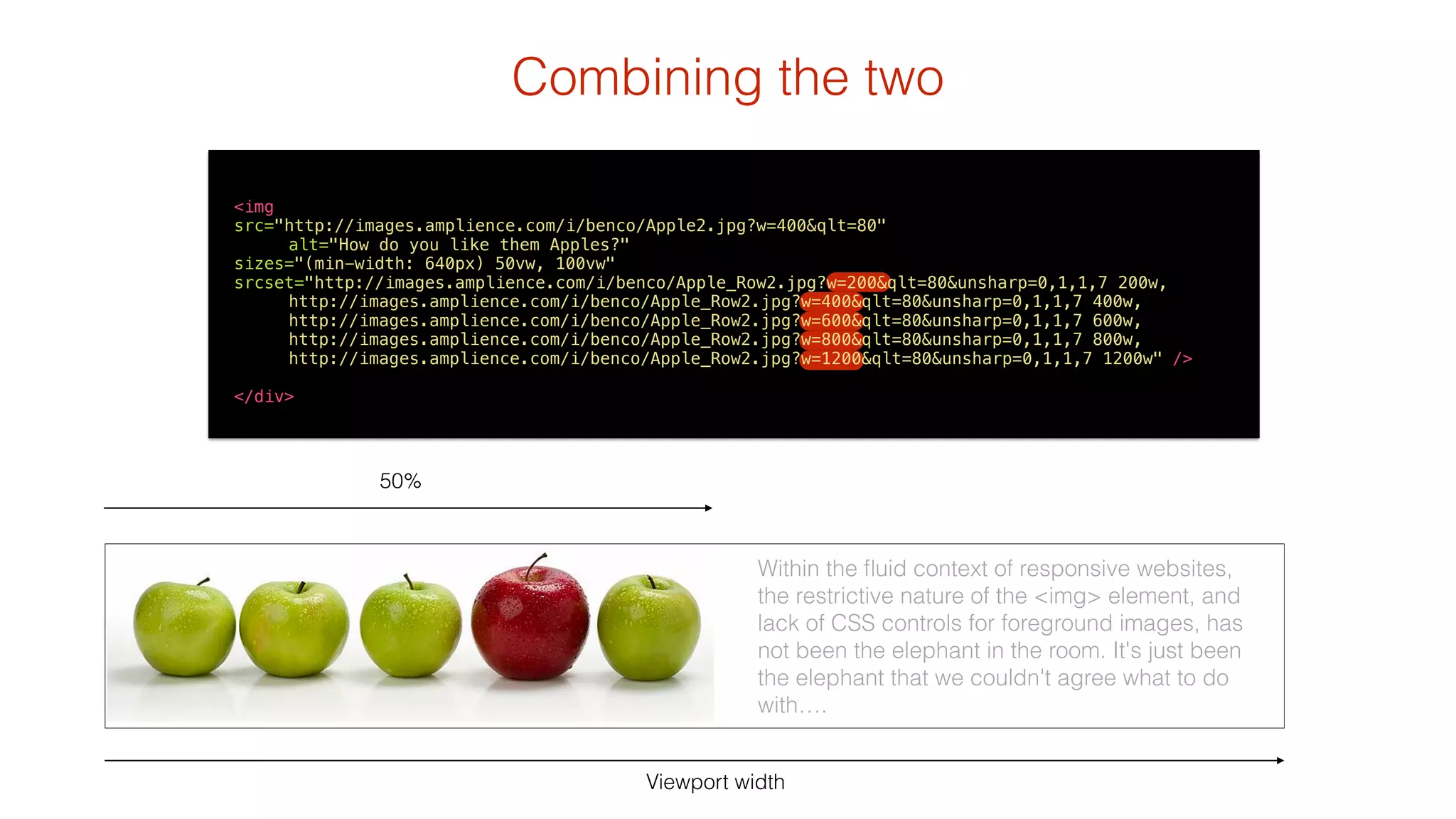
![Combining the two
<picture>
<!--[if IE 9]><video style="display: none;"><![endif]-->
<source srcset="http://images.amplience.com/i/benco/Apple_Row2.jpg?
w=1400&qlt=80&unsharp=0,1,1,7" media="(min-width: 1200px)">
<source srcset=“http://images.amplience.com/i/benco/Apple_Row2.jpg?
w=1200&qlt=80&unsharp=0,1,1,7" media="(min-width: 1050px)">
<source srcset=“http://images.amplience.com/i/benco/Apple_Row2.jpg?
pcrop=700,0,2500,800&w=950&qlt=80&unsharp=0,1,1,7" media="(min-width: 850px)">
<source srcset=“http://images.amplience.com/i/benco/Apple_Row2.jpg?
pcrop=1300,0,1900,800&w=850&qlt=80&unsharp=0,1,1,7" media="(min-width: 600px)">
<source srcset=“http://images.amplience.com/i/benco/Red_And_Green_Apples2.jpg?
w=600&qlt=80&unsharp=0,1,1,7">
<!--[if IE 9]></video><![endif]-->
<img srcset="http://images.amplience.com/i/benco/Apple2.jpg?w=600&qlt=80"
alt="How do you like them Apples?">
</picture>](https://image.slidesharecdn.com/responsiveimages2bb169finalforsharing-140820111639-phpapp02/75/Practical-Responsive-Images-from-Breaking-Borders-31-2048.jpg)

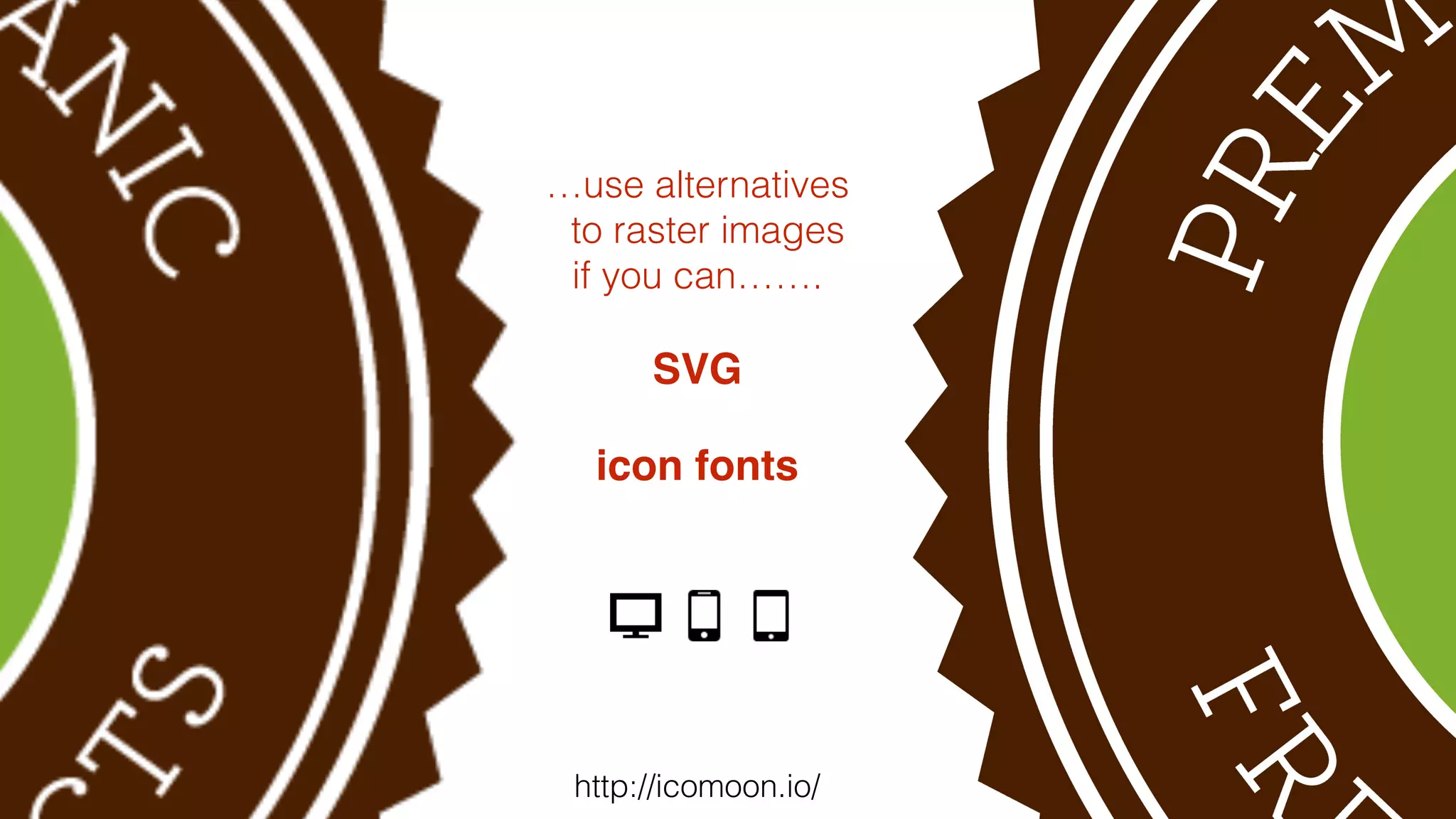
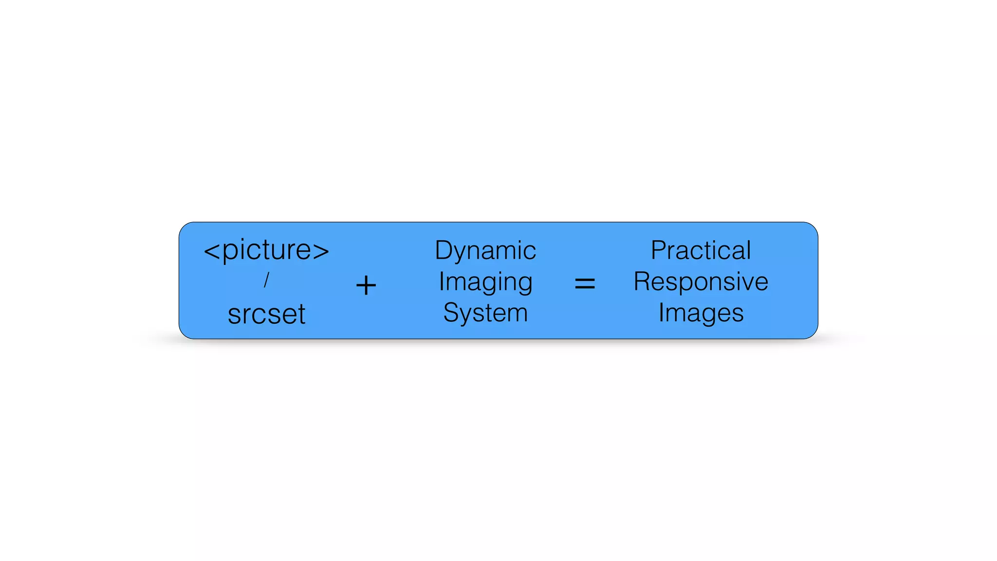
![AngularJS
<body>
<img src=“Apple.jpg" picture-assetid="Apple_Row2"
alt="How do you like them apples?"/>
</body>
angular.module('components', [])
.directive('pictureAssetid', function(){
return {
restrict: 'A',
replace:true,
transclude: true,
scope : {
caption: '@',
pictureAssetid: '@'
},
templateUrl: 'partials/image-picture.html'
}
})
!
angular.module('HelloApp', ['components'])
<picture>
<!--[if IE 9]><video style="display: none;"><![endif]-->
<source srcset="http://images.amplience.com/i/benco/{{pictureAssetid}}.jpg?w=1400&qlt=80&unsharp=0,1,1,7" media="(min-width: 1000px)">
<source srcset="http://images.amplience.com/i/benco/{{pictureAssetid}}.jpg?w=800&qlt=80&unsharp=0,1,1,7" media="(min-width: 800px)">
<source srcset="http://images.amplience.com/i/benco/{{pictureAssetid}}.jpg?w=600&qlt=80&unsharp=0,1,1,7">
<!--[if IE 9]></video><![endif]-->
<img srcset="http://images.amplience.com/i/benco/{{pictureAssetid}}.jpg?w=400&qlt=80" >
</picture>](https://image.slidesharecdn.com/responsiveimages2bb169finalforsharing-140820111639-phpapp02/75/Practical-Responsive-Images-from-Breaking-Borders-34-2048.jpg)

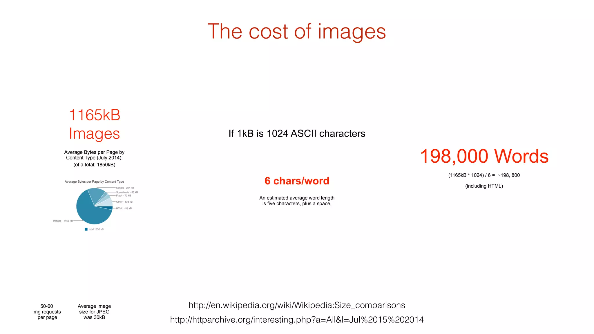
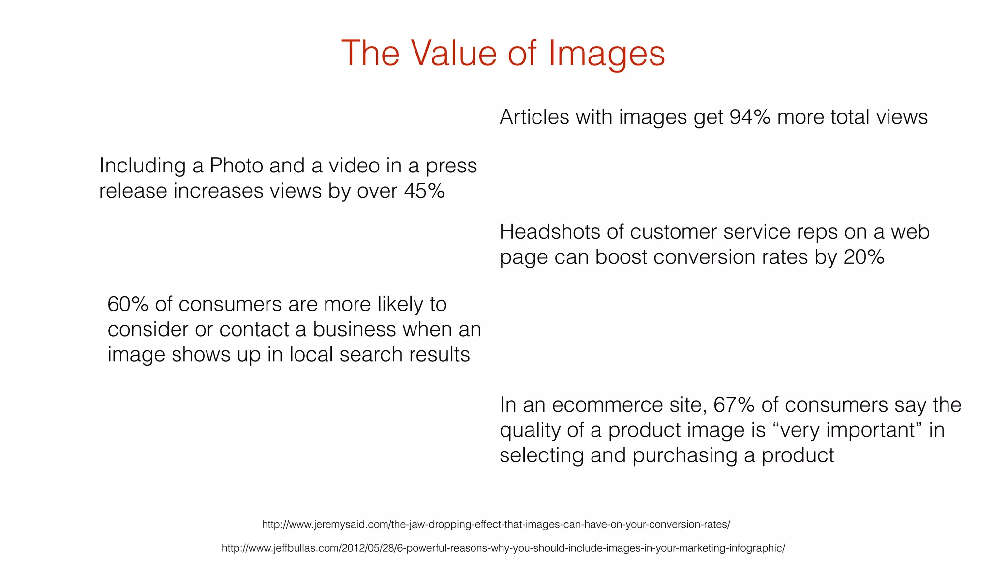
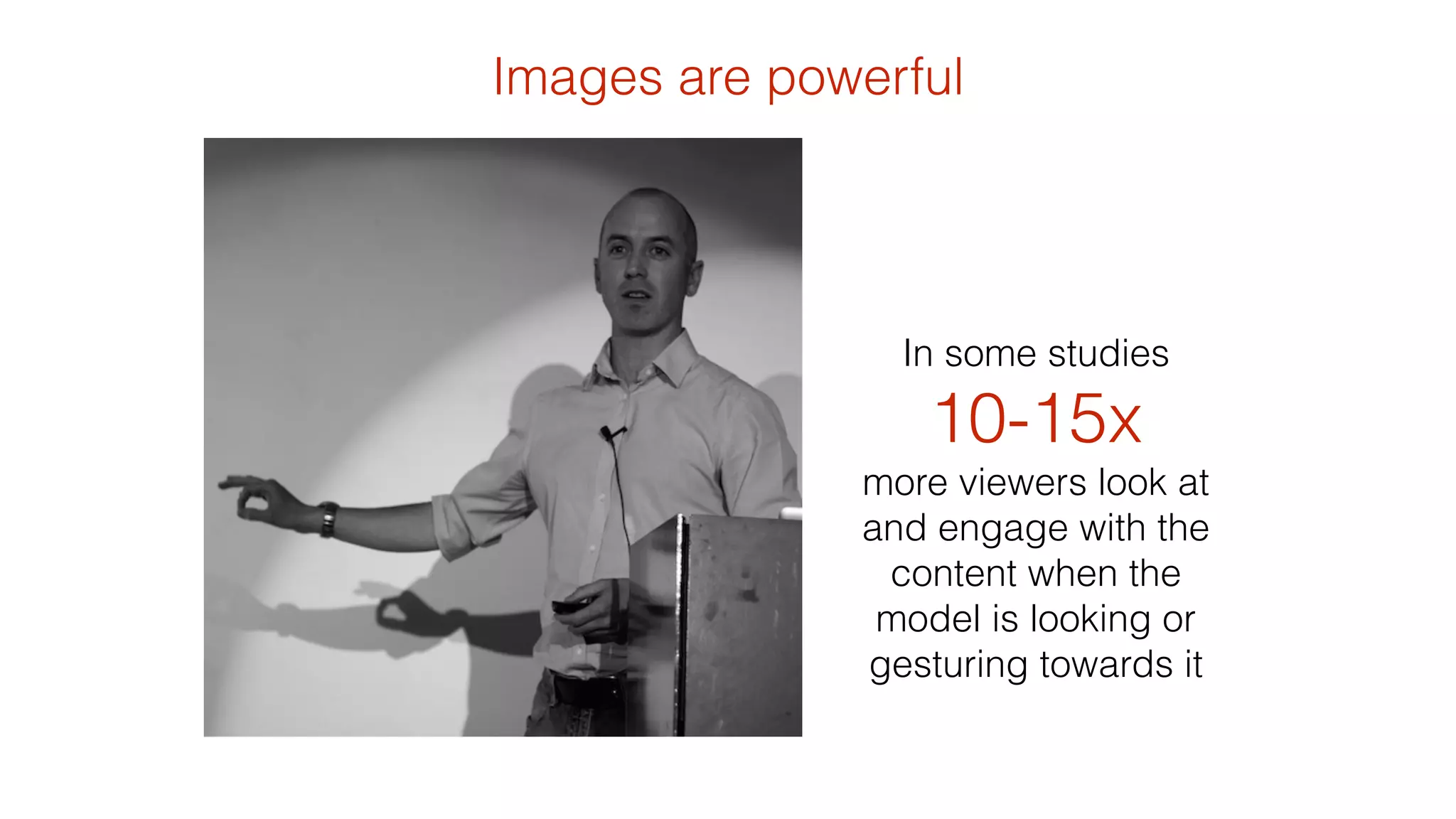
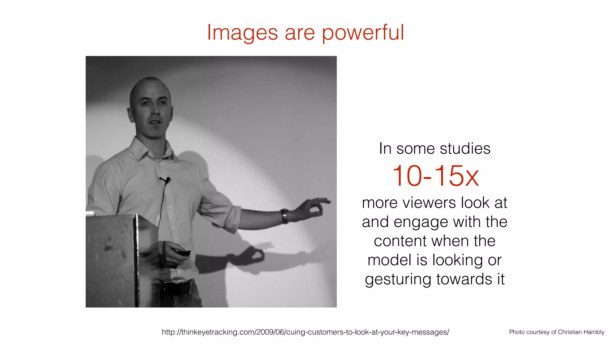
The document discusses the significance and techniques of responsive images in web design, emphasizing their emotional impact and effectiveness in engagement and conversion rates. It highlights the use of the <picture> element and various coding practices to optimize image display across different devices and screen sizes. Additionally, it presents data showing that articles with images receive significantly more views and details the importance of image quality in consumer decision-making.


![[cssdevconf] Adaptive Images in Responsive Web Design](https://cdn.slidesharecdn.com/ss_thumbnails/adaptive-imagesv16-131021133151-phpapp01-thumbnail.jpg?width=640&height=640&fit=bounds)


![[cssdevconf] Adaptive Images in RWD](https://cdn.slidesharecdn.com/ss_thumbnails/adaptive-imagesv6-121210084537-phpapp02-thumbnail.jpg?width=640&height=640&fit=bounds)

![[rwdsummit2012] Adaptive Images in Responsive Web Design](https://cdn.slidesharecdn.com/ss_thumbnails/schmitt-adaptive-imagesv2-120829225201-phpapp02-thumbnail.jpg?width=640&height=640&fit=bounds)
![[refreshaustin] Adaptive Images in Responsive Web Design](https://cdn.slidesharecdn.com/ss_thumbnails/adaptive-imagesv7-130410122323-phpapp02-thumbnail.jpg?width=640&height=640&fit=bounds)
![[html5tx] Adaptive Images in Responsive Web Design](https://cdn.slidesharecdn.com/ss_thumbnails/adaptive-images-html5tx-130202100125-phpapp01-thumbnail.jpg?width=640&height=640&fit=bounds)


![[convergese] Adaptive Images in Responsive Web Design](https://cdn.slidesharecdn.com/ss_thumbnails/2012-adaptive-images-convergese-120509135732-phpapp01-thumbnail.jpg?width=640&height=640&fit=bounds)
![[CSSDevConf] Adaptive Images in Responsive Web Design 2014](https://cdn.slidesharecdn.com/ss_thumbnails/adaptive-images-cssdevconf-141013185313-conversion-gate02-thumbnail.jpg?width=640&height=640&fit=bounds)


![Number_Guessing_Game_Dsbsbssbzboc[1].pptx](https://cdn.slidesharecdn.com/ss_thumbnails/numberguessinggamedoc1-251206215042-a076fc05-thumbnail.jpg?width=640&height=640&fit=bounds)


