Download as PDF, PPTX
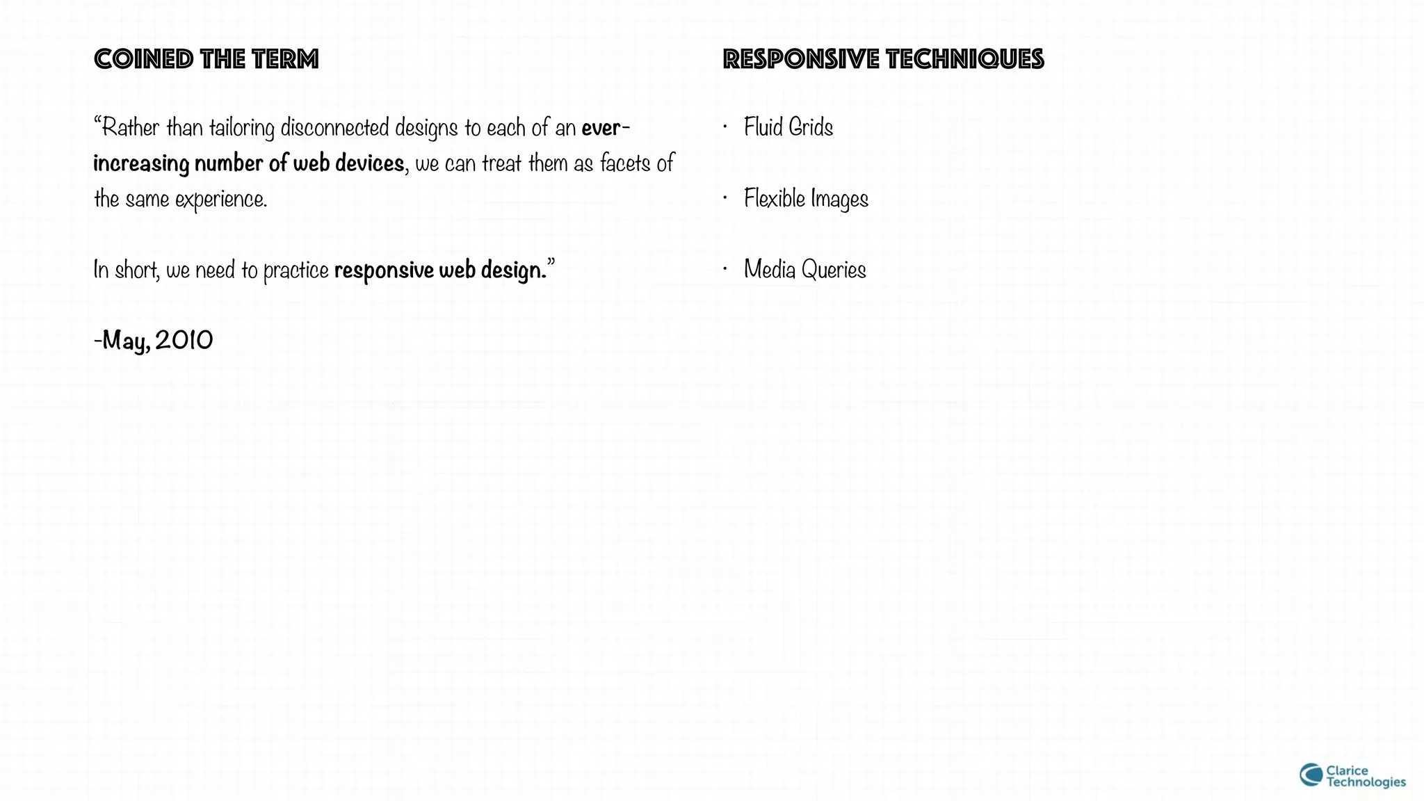
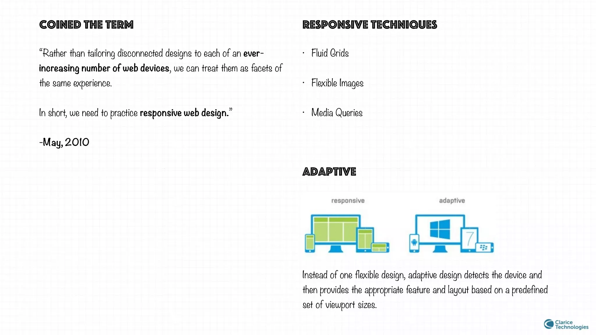

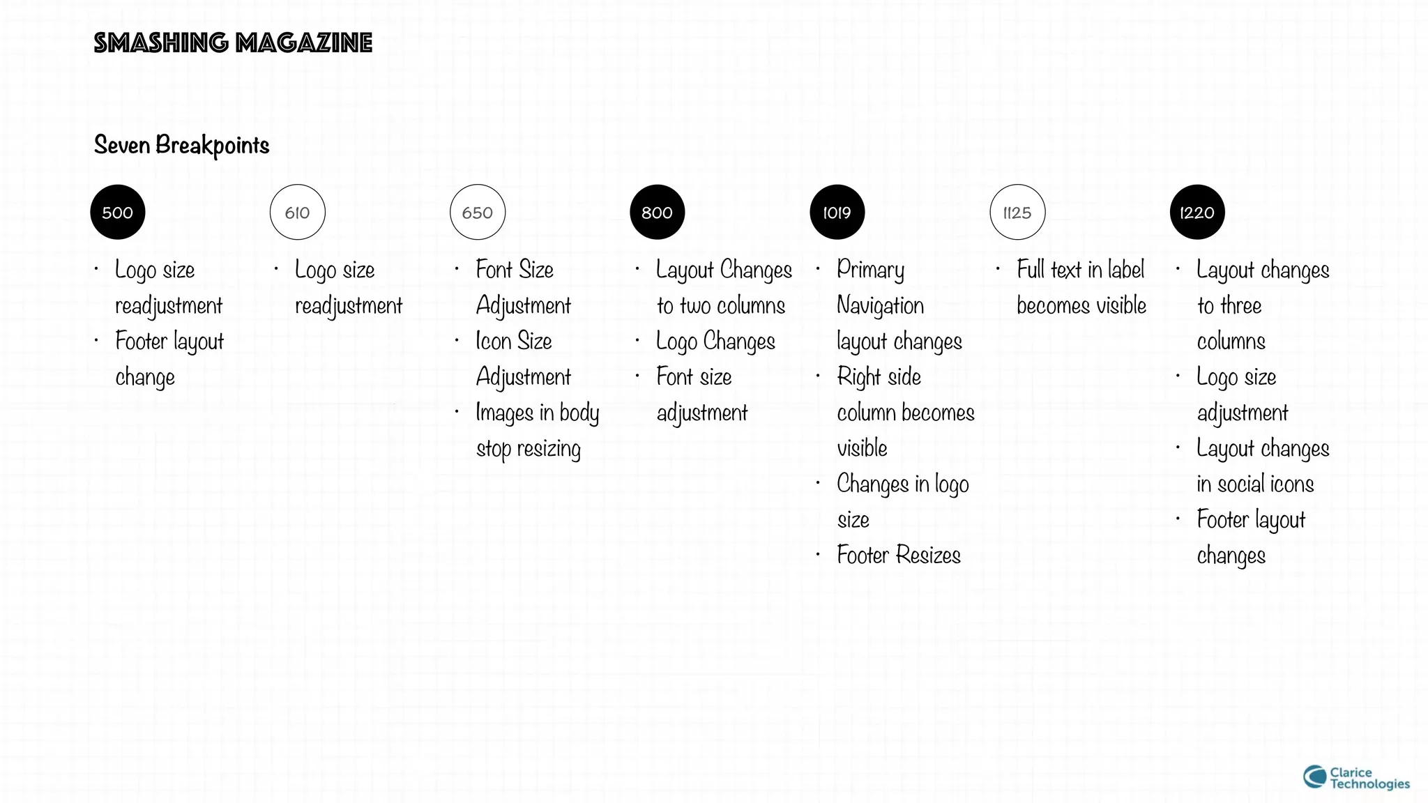
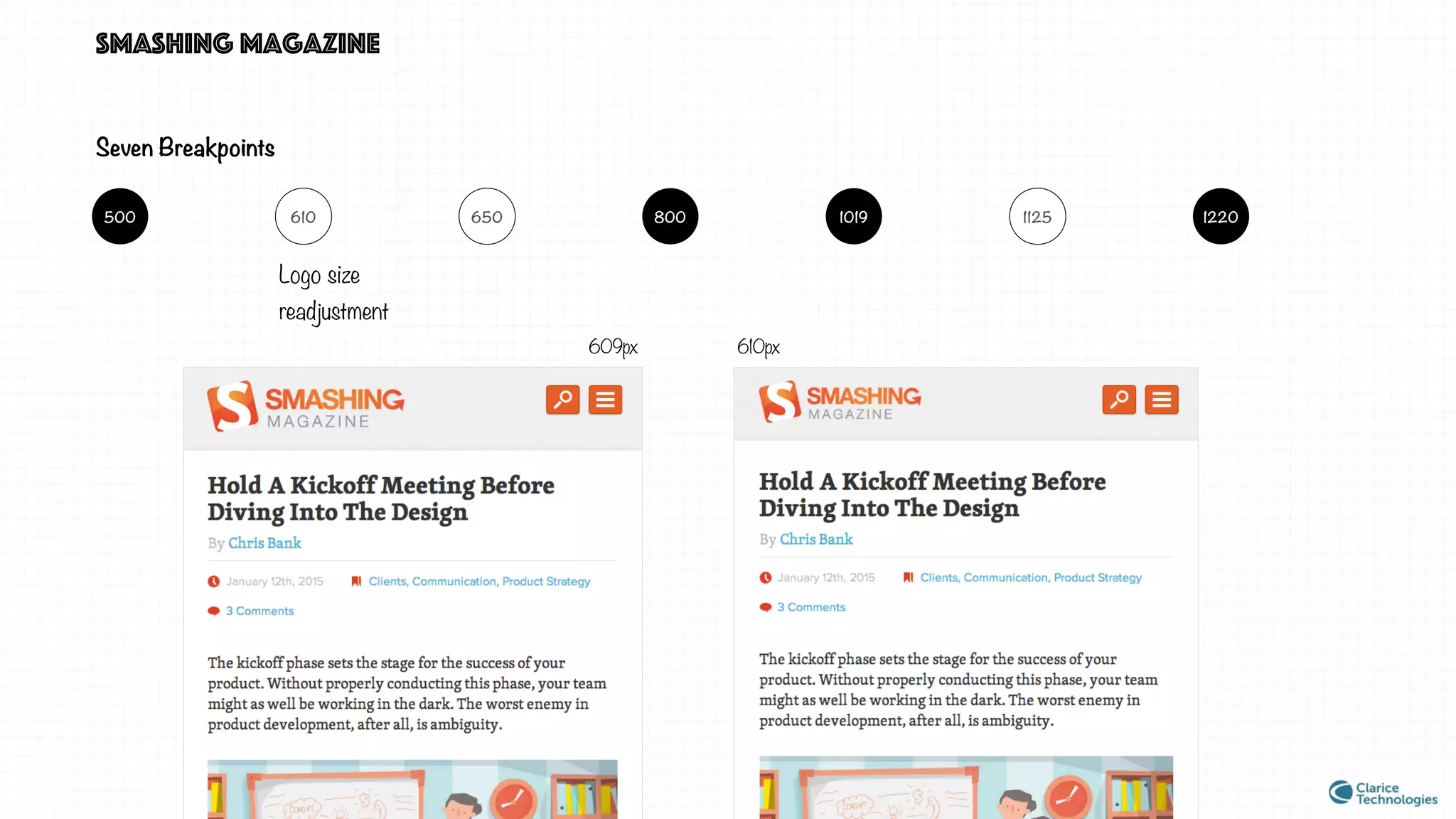
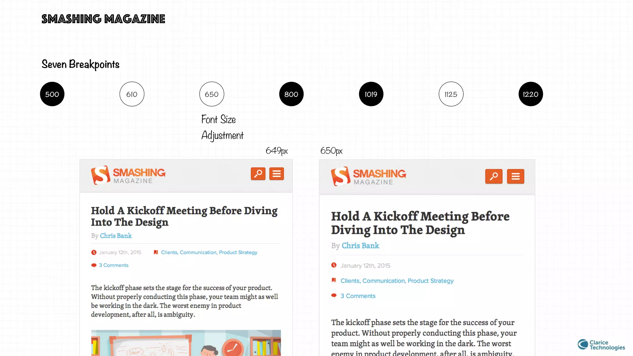
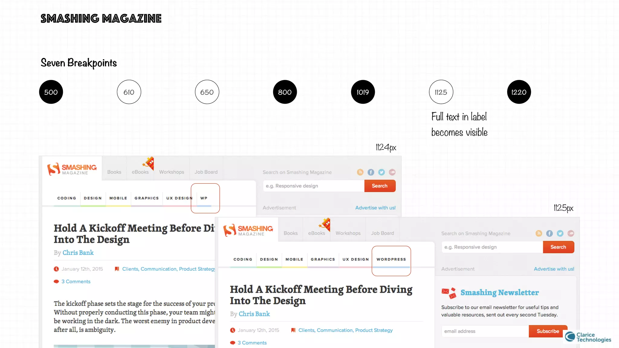

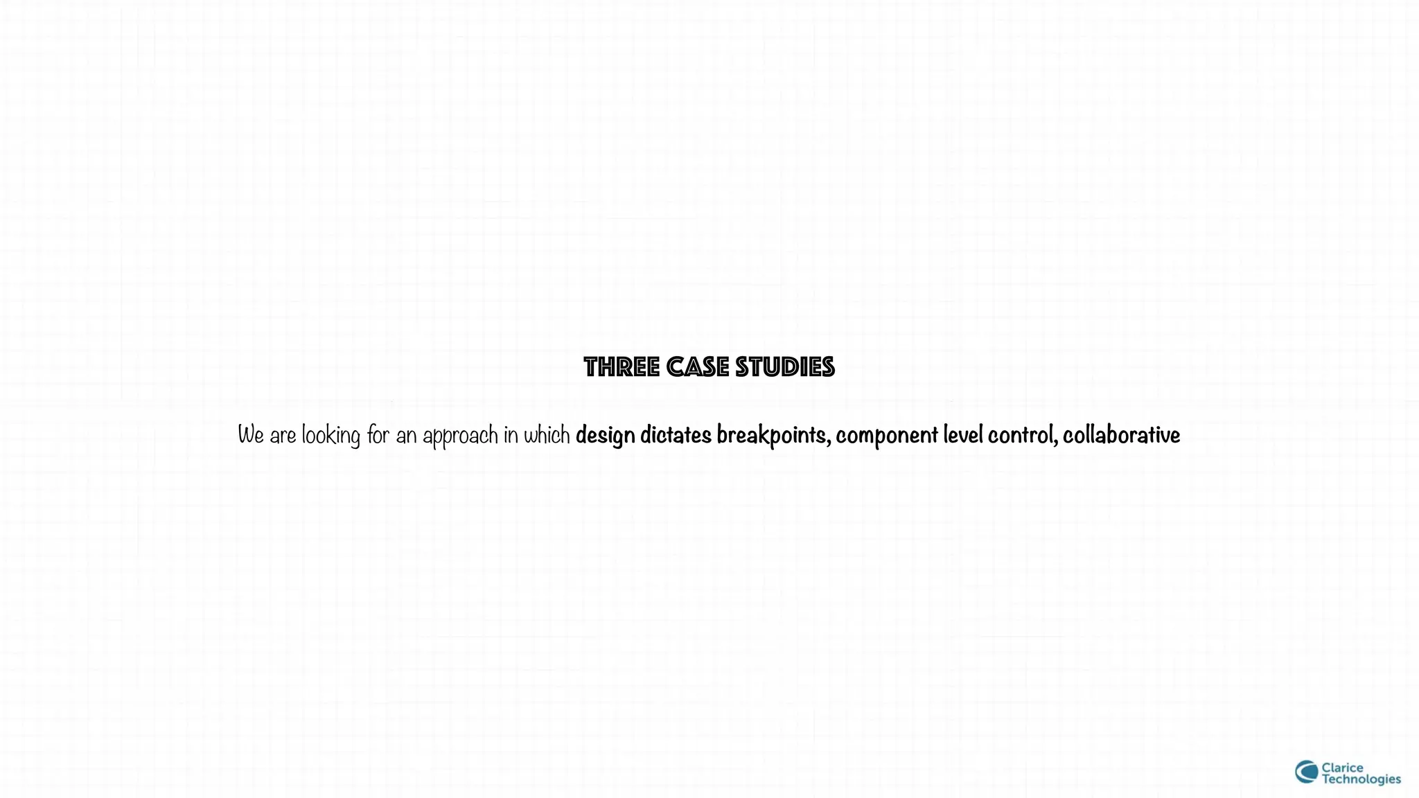
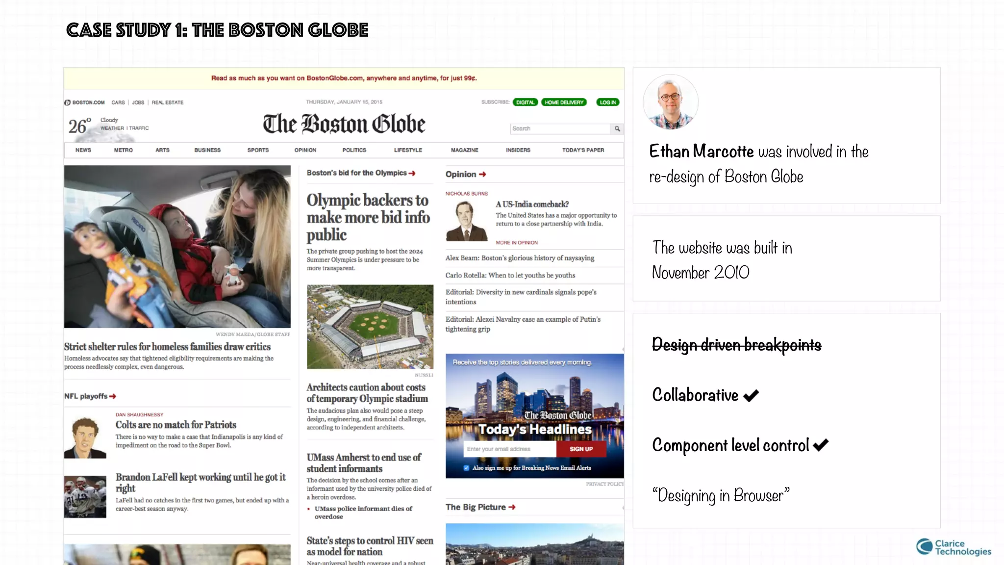
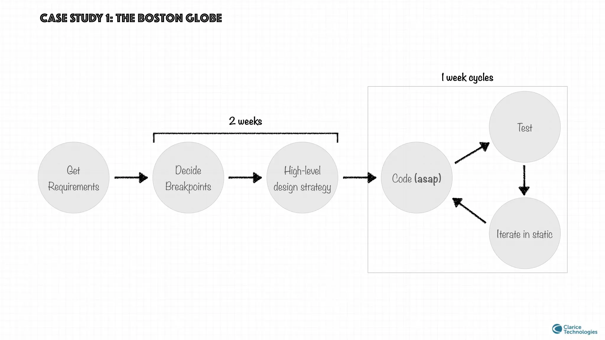
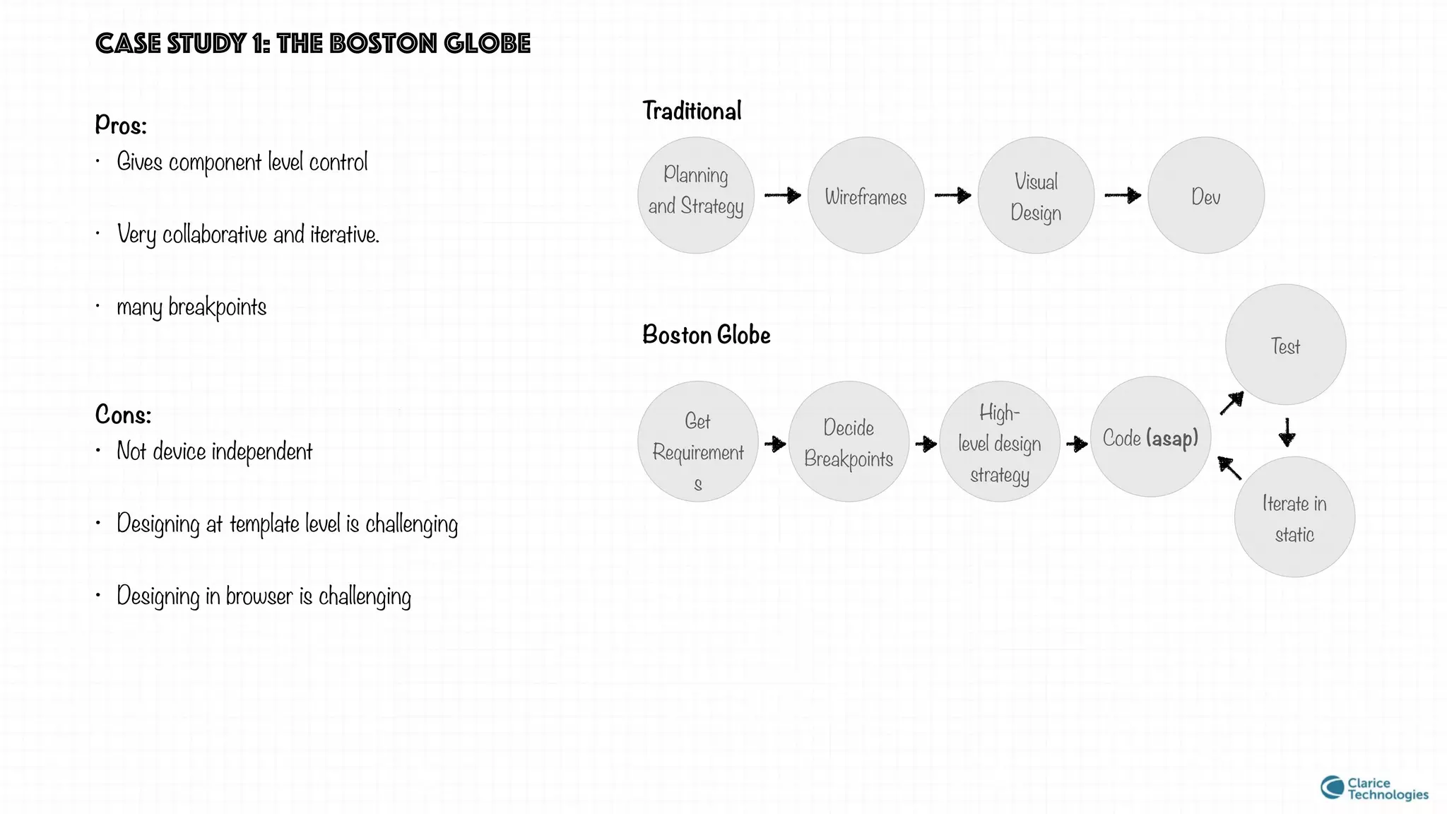
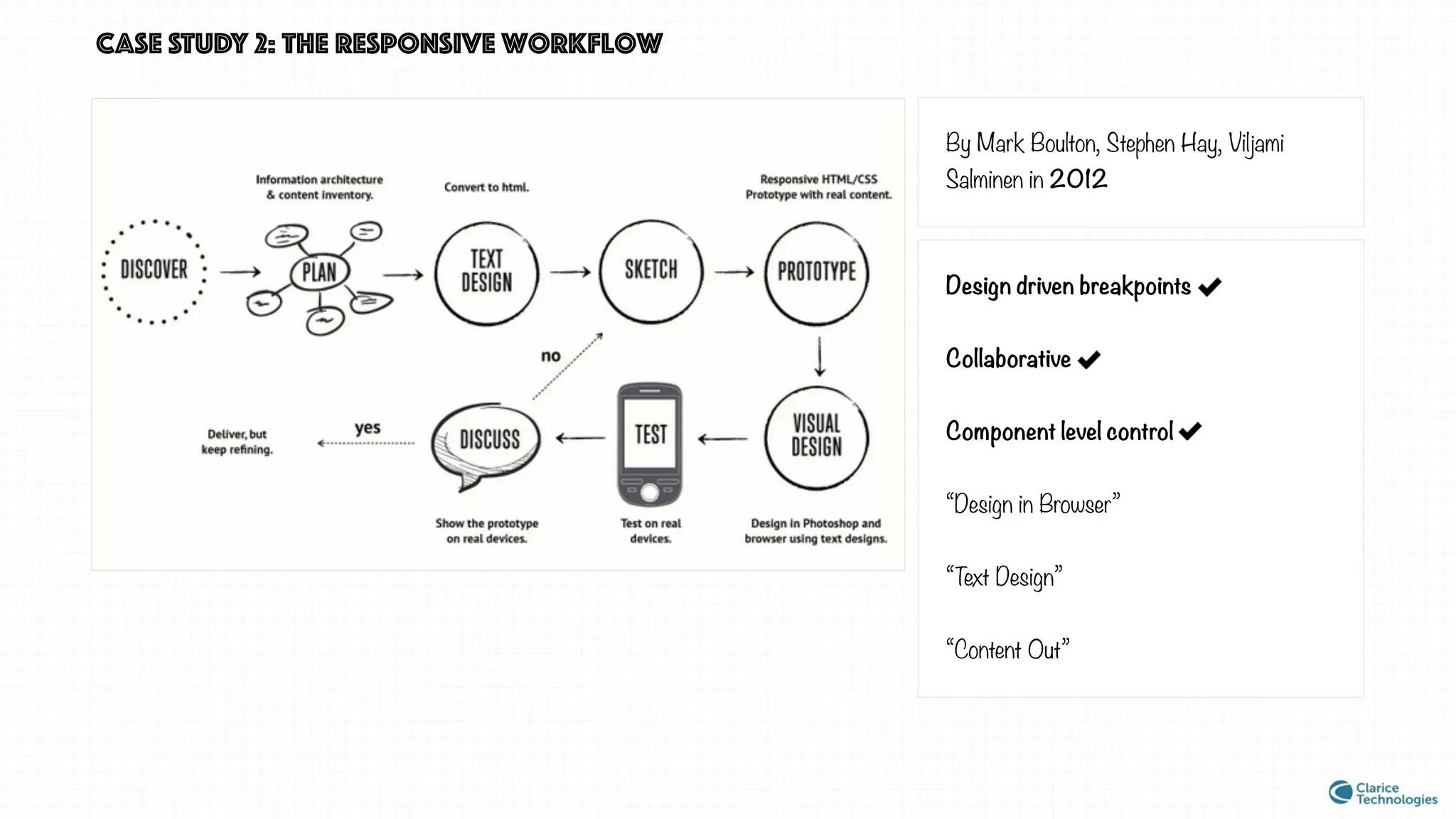
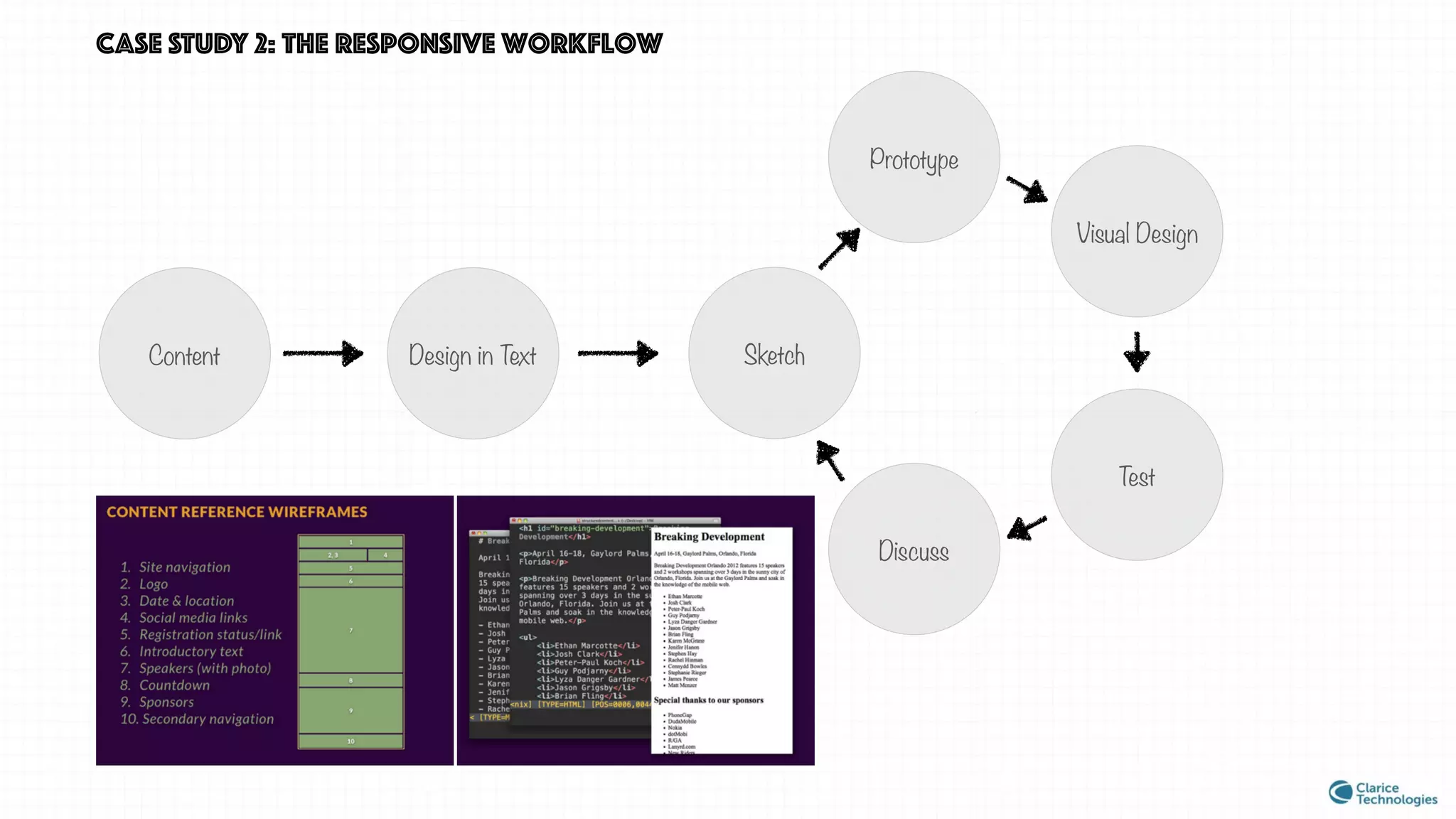
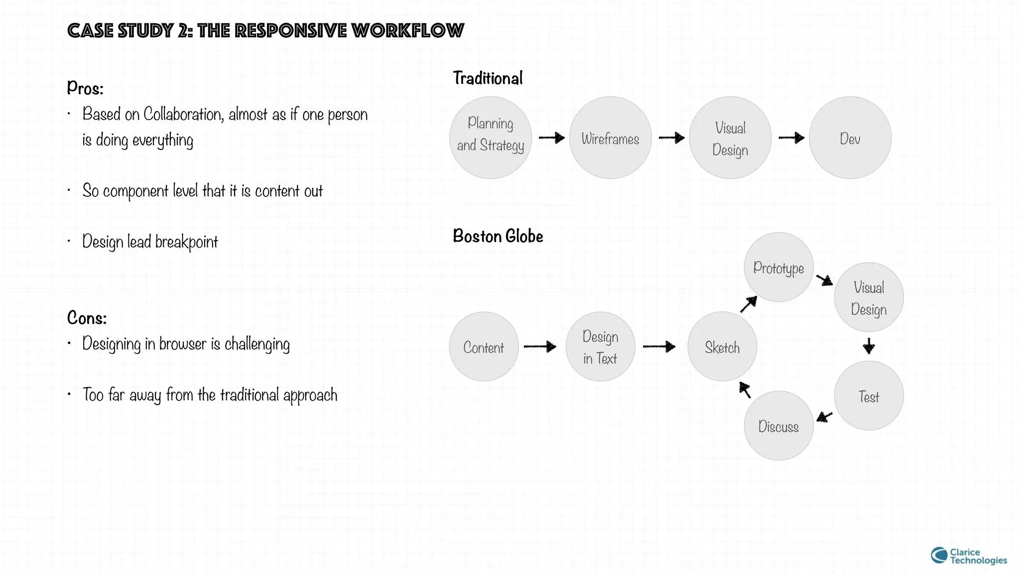
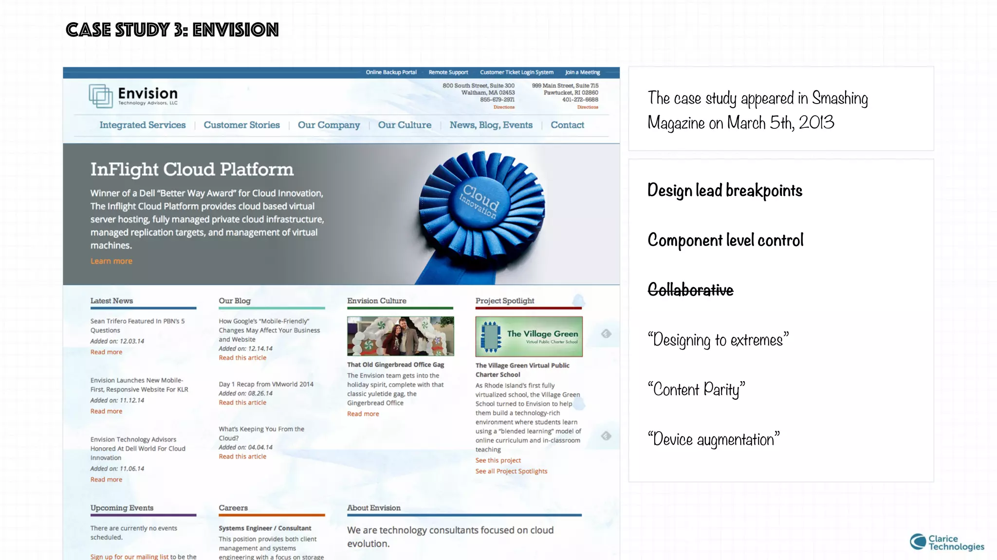
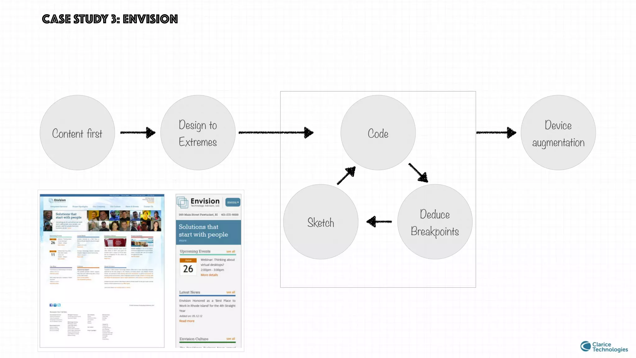
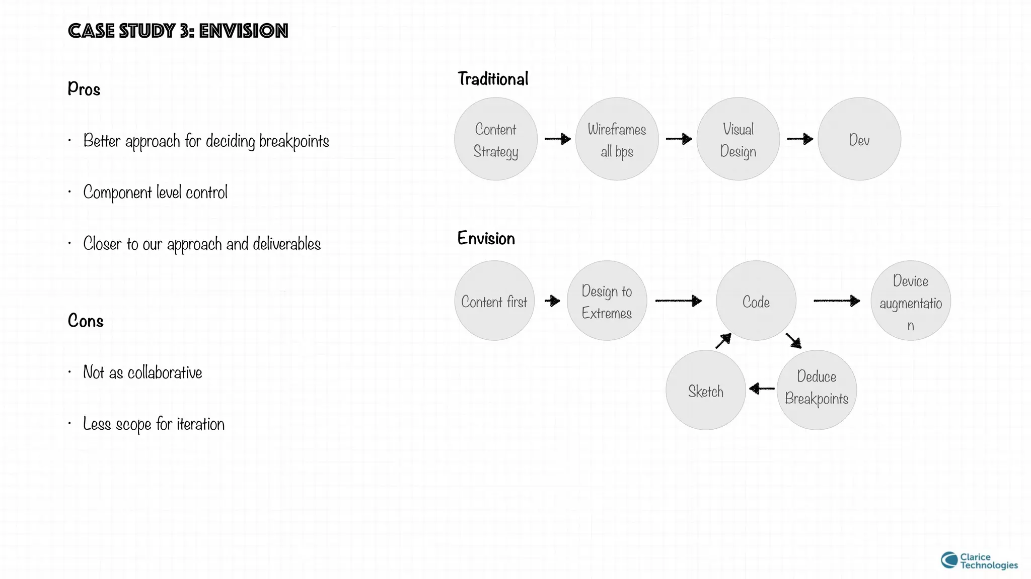
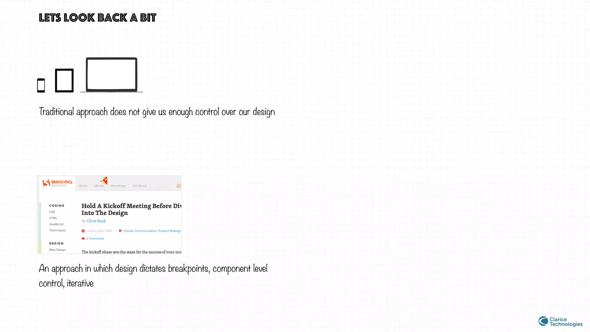
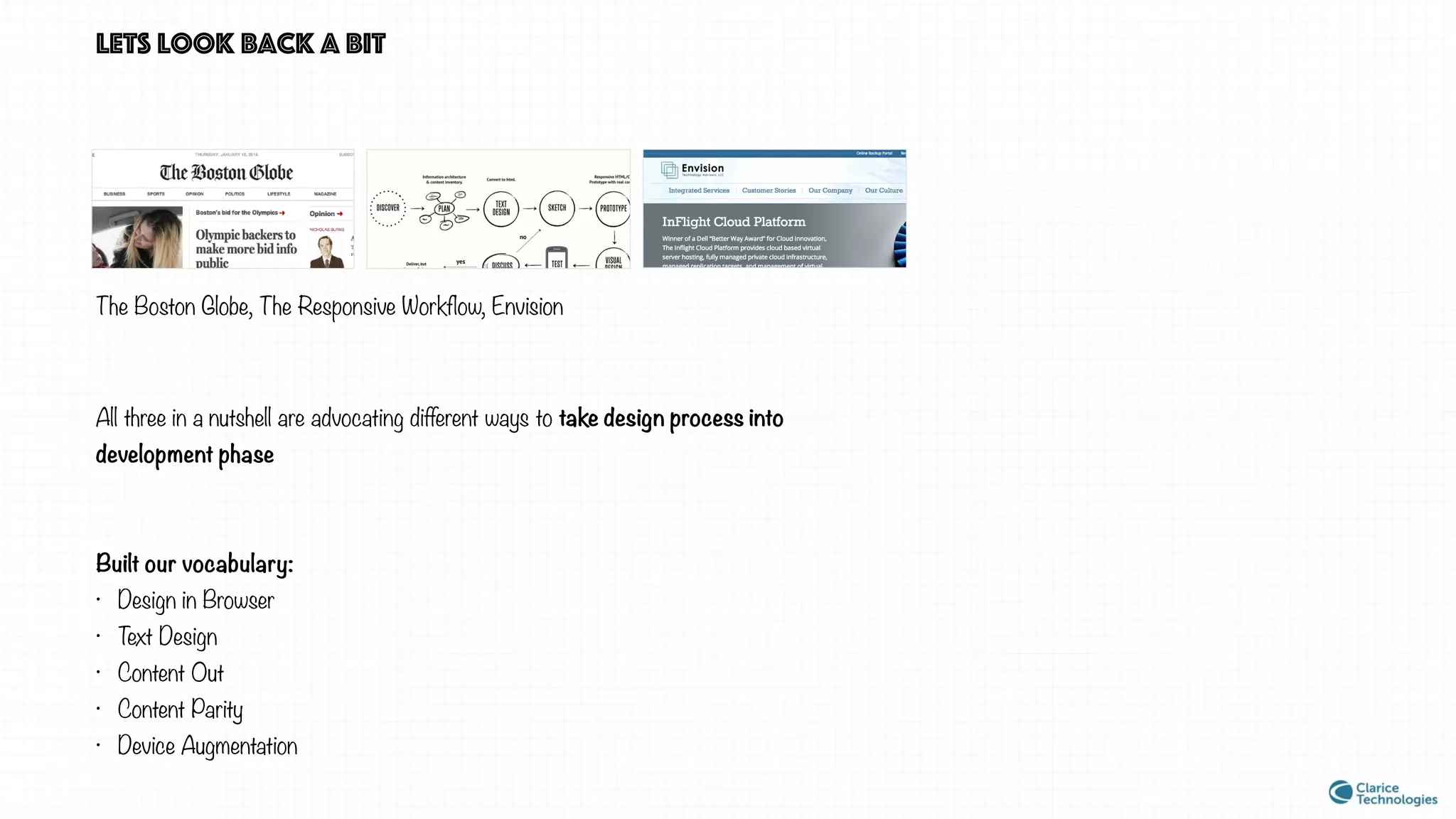

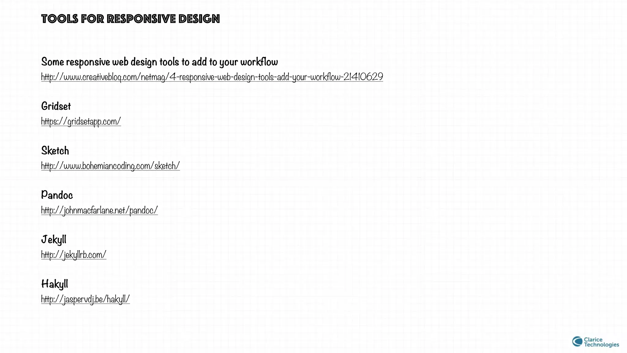


The document discusses responsive web design, emphasizing the need for a unified approach to accommodate various devices through techniques like fluid grids, flexible images, and media queries. It critiques traditional design methods and highlights case studies like 'The Boston Globe' and 'The Responsive Workflow' to demonstrate collaborative, component-driven strategies. The piece concludes with suggestions for tools to enhance responsive design workflows while recognizing that ongoing discussions about design approaches continue within the field.