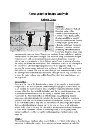
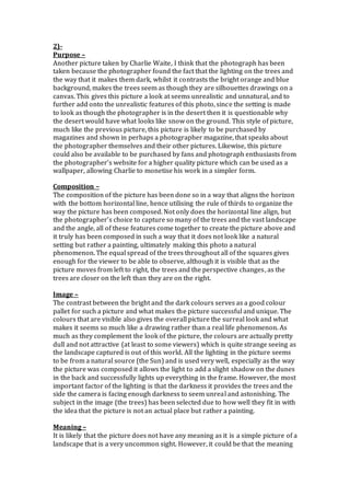
1. The photograph shows an American soldier capturing a German soldier in 1944 Belgium, showing that mercy can be shown to enemies. It was likely taken to show victory over the other side or could have been altered for propaganda.
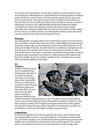
2. Another photo by Robert Capa shows an American medical officer treating a German POW, suggesting enemies can still help each other in war. It was likely published to argue against war by showing humanity.
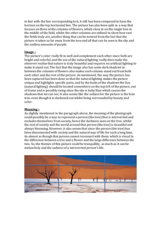
3. A photo by Charlie Waite shows a lone tree in a field of purple flowers under a blue sky, capturing natural beauty. It could represent loneliness or disconnect from society. The photographer aims to showcase nature's tranquility.
This photograph shows an American soldier smiling and walking hand in hand with three British orphans who were adopted by his unit. The focal points are the soldier and three children. It could represent the soldier telling the children stories from the war or returning them after the war, though they are orphans. The lighting is bright but the black and white photo represents the age of the image, from 60-90 years ago. Their clothing represents their war experiences, with the soldier's uniform and orphans' dark clothes signifying loss of parents.
The document provides a 4-step process for critiquing photographs:
1. Examine the value or tonal range of lights and darks.
2. Assess the clarity and focus, including whether a point of interest stands out.
3. Consider the composition, presentation, cropping, and lines.
4. Two sample photos are critiqued using this process, noting values, focus, composition elements.
Photography and photographic practice task 2Craig Cassidy
Phillip Jones Griffiths was a Welsh photojournalist known for his coverage of the Vietnam War in the 1960s and 1970s. He studied pharmacy but began working as a part-time photographer for the Manchester Guardian. His first full-time job in photography was freelancing for The Observer in Algeria in 1962. In 1966, Griffiths was sent to Vietnam by Magnum Photos to document the suffering of the Vietnamese people under American forces, though his photos were initially difficult to publish. After publishing his influential book "Vietnam Inc." in 1977, he went on to cover other conflicts and become President of Magnum Photos, focusing his career on bearing witness to human suffering in war and its impact on civilians.
This document provides analysis of 9 pictures based on their angle, focus, lighting, positioning, adherence to the rule of thirds, category, purpose, and meaning. For each picture, these visual elements are described in 1-2 sentences to assess the intended message and use of the picture. Overall, the analyses aim to understand how photographic techniques are used to tell stories or convey specific information through visual media.
The document discusses a photo being considered for the front cover of a magazine. It notes that the photo stands out due to the large contrast in colors between the man's clothing and the background. Bright lighting enhances this contrast and eliminates shadows. However, there is one shadow under the man's right arm due to lack of lighting from all angles, which is atypical for magazine covers. The man's relaxed body language fits the magazine's laidback theme. The shadow would need to be removed through photo editing if this photo is selected.
The document provides analysis of four celebrity portrait photographs taken by Annie Leibovitz.
The first image depicts Sir Patrick Stewart and Sir Ian McKellen posing with crossed arms. The second shows Johnny Depp relaxed in a chair with a cigarette. The third is of Miley Cyrus as a teenager posed with a satin sheet. The fourth portraits Adele laying down with her face illuminated.
The analysis examines the composition, lighting, framing, and technical details of each image. Strengths highlighted include the warm tones, natural poses, and focus on the subjects' facial expressions. Suggested weaknesses include cropped framing that removes context and unnatural skin tones. The document considers how the photographer used lighting,
Robert Capa was a Hungarian war photographer who documented five major wars of the 20th century, including the Spanish Civil War, World War II, and the First Indochina War. He is best known for his photos from the D-Day Normandy landings, where he captured images of soldiers hiding behind obstacles on Omaha Beach under fire. Capa took these photos to show the true brutality and suffering of war, countering propaganda that portrayed war as glorious. He composed his photos to depict both the foreground subjects and background setting to fully capture the scenes of war.
This document analyzes 4 images taken by different photographers. It discusses the purpose, composition, and meaning of each image. The purposes included showing the effects of war, generating revenue through sales and promotions, and portraying cities in unique ways. Composition techniques like rule of thirds and lighting were examined. The meanings explored how war can corrupt innocence, how civilians are affected by conflict, appreciating architecture, and seeing cities from different perspectives. Revenue could be generated through sales, advertising, and adding images to portfolios.
This document analyzes 4 images taken by different photographers. The first image by Robert Capa shows a child soldier surrounded by dead bodies, meant to expose the brutality of war and corruption of innocence. The second image shows displaced civilians huddled together for warmth and protection, intended to showcase the human impact of war. The third image by Alisdair Miller shows Big Ben and the London skyline in fog, possibly used for portfolio development or commercial purposes. The fourth surreal image by an unnamed photographer shows two cities separated by a canyon, meant to portray urban environments in an unusual way.
This document analyzes the design elements of a magazine cover featuring the band Muse. It discusses the masthead, main image of the band members, prominent display of the band name, unconventional placement of coverlines, connection of the main coverline to the space theme in the background, use of three contrasting colors, simple and readable typefaces with the band name standing out, use of high and low key lighting to create contrast and dimensionality, application of Guttenberg design principles to make optimal use of space, and consistency of house style elements like colors, logo placement, and barcode location across NME magazine covers.
My media product uses, develops, and challenges conventions of real magazines, posters, and trailers in the following ways:
1. For the magazine, I included a barcode and used different fonts/layout than the reference magazine, making it look more like a real product.
2. For the poster, I included more text/colors around the image compared to the reference poster, and chose a landscape orientation to better fit the picture.
3. For the trailer, I developed conventions like establishing shots and scenes of party preparation similarly to the reference trailer, but also challenged conventions with different cinematography.
This document discusses landscape photography and analyzes two landscape images. It describes landscape photography as depicting large outdoor areas like oceans, forests, and mountains. It notes that landscape photography includes the photographic techniques of rule of thirds and leading lines. The document then analyzes the first image in detail, noting its framing, lighting, narrative, and meaning in conveying a sense of journey along a path to an unknown destination. It similarly analyzes the second image of a lone tree, discussing its framing, narrative, and meaning in conveying loneliness.
The document analyzes the design elements of a film magazine cover, including the banner, masthead, main image, and main cover line. The masthead uses a memorable red font and features the actors to draw attention. The main image depicts the actors in an intimidating pose to reference the horror theme in a humorous way. Different expressions are used to anchor the audience in different ways. The costumes in the medium shot image help convey meanings of power, evil, and danger through the use of red and black. The main cover line clearly states the story title in high contrast white font placed effectively on the black clothing.
In this photograph by Tom Barnes, a single man stands in front of a background of speakers of varying sizes and shapes, drawing the eye to his overexposed face. The central, eye-level camera angle and high definition allow details of the speakers to be seen. Repetition of the speakers adds dynamism, while a lack of depth of field keeps everything in focus, making the man's colorful t-shirt stand out against the dark backdrop and clothing.
The magazine cover uses bold colors, fonts, and images to attract its target audience. The masthead catches viewers' eyes first with its unique design. High contrast colors like black, white, and red are used throughout. Photographs show the band from different angles and lighting to make one member appear dominant. Larger fonts draw attention to the band's name at the center of the cover. Cover lines are placed above and below the images rather than around them. Consistent use of design elements like color and logo placement maintain the magazine's house style.
Understanding different applications of photographyCiara Lowney
Eve Arnold was a pioneering 20th century photographer known for her portraits of celebrities like Marilyn Monroe. She was the first female photographer at Magnum Photos. Arnold's black and white photos captured intimate moments that revealed deeper aspects of her subjects' personalities beyond their public personas. Her curious nature drove her to explore various genres including fashion, photojournalism and portraits.
Anne Leibovitz is an American portrait photographer known for her work with Rolling Stone magazine and Vanity Fair. She was born in 1949 in Connecticut to a family of Romanian Jewish heritage. In the 1970s, she began working for Rolling Stone, creating iconic celebrity portraits. She later worked for Vanity Fair for 13 years. Leibovitz's portraits are recognizable for their unique style and ability to capture her subjects in a compelling way.
Photography plans are described for a music magazine, including a close-up shot of an artist on the cover to draw attention, shots of bands for the contents page, and images of solo artists featured in articles that portray them as genuine
Annie Leibovitz was born in 1949 in Connecticut. She got a job at Rolling Stone magazine in 1970 and helped define their visual style as chief photographer. In 1983, she began working for Vanity Fair magazine, where she produced iconic and provocative images. She has since worked on advertising campaigns and published several books of her work, which has been exhibited worldwide.
Analysis of film posters and the progressionhamsterlife
The poster contrasts a red dress against other colors to draw the viewer's eye and highlight the character. The two characters are depicted as close and expressing happiness, indicating a love story. Dark colors, an image of wrestling, and intimacy between the characters create intrigue and confusion for the viewer about the plot.
The document compares two magazine covers to highlight their similarities in representing similar social groups. Both covers feature famous celebrities with direct eye contact that captures the audience's attention. They also show the celebrities looking serious and confident in a way that creates a connection with the audience. While the photos differ in angles, lighting, and backgrounds, they both feature the celebrities wearing jewelry and tracksuits, clothing common among the target audiences. This direct eye contact and portrayal of assertive body language and familiar behaviors make the audiences able to relate to the magazines.
This document provides information about two photographers - Henri Cartier-Bresson and Adrian Dennis. It discusses Cartier-Bresson's background and style, noting he was a pioneering photojournalist known for candid shots in black and white. It then analyzes one of Cartier-Bresson's landscape photographs that differs from his typical documentary work. The document also provides biographical information about Adrian Dennis and analyzes one of his photographs of Andy Murray celebrating a Wimbledon victory, discussing the photographic techniques used.
The document provides details for photography planning for magazine covers and articles. It includes descriptions of camerawork, mise-en-scene elements, and concepts for different types of images including cover photos, contents pages, and double page spreads. Medium close-ups and shots that establish intimacy are prioritized. Styling aims to portray artists' authenticity and connect with target audiences. Locations include urban settings and studios, while props involve glow sticks, wristbands, and notebooks.
This document analyzes and compares two photos by Tanya M Ross that depict Native American themes. The first photo features a model with an elaborate headdress in a sterile background, accentuating her lines and expression. Though beautiful, the headdress does not overshadow the model. The second photo also features a strong-posed model making eye contact, with harmonious neutral colors giving it a sensual feel. Both photos effectively keep the models as the focal point despite striking headdresses. The photos similarly use color and texture contrasts to accentuate the models and outfits within a Native American theme.
1) The document analyzes 9 shots from a film trailer through the lens of mise en scene and camerawork techniques. The shots establish elements of mystery, crime, and thriller genres.
2) Early shots introduce characters searching with flashlights at night and finding a photo of a woman. Composition and lighting draw attention to her importance. A turned over table at a crime scene introduces violence.
3) Later shots show clues being found, a character's distress, tilted angles signifying unease, crime scene tape establishing danger, and intimidating interactions between a male and female character suggesting a power dynamic. The last shot uses a dolly zoom to show a character's frustration after witnessing something shocking.
The document discusses settings, narrative structures, and iconography used in thriller and romance genres as they relate to developing a film trailer that blends these genres. It notes that thriller settings often use nighttime, confined spaces, and abandoned locations to create fear and suspense, while romance settings employ beaches, parks, and daytime lighting to portray happiness. The narrative may incorporate flashbacks and non-chronological storytelling like thrillers or focus on character perspectives meeting like romances. Iconography of weapons, blood, and shadows signify thrillers, while gifts, candles, and affection signal romance genres.
The photographer chose one photo for a double page spread because it seemed the most natural and had better quality and definition than others. The brick wall and color scheme are prominent aspects of My Chemical Romance, and the subject is wearing an MCR jacket, making the photo relevant. The photographer will edit the photo by changing colors to fit the theme of the article and enhance aspects as needed. A second photo was chosen for the front cover because the colors fit the magazine's scheme. The photographer will also crop, resize and enhance this photo. Their friend is portrayed as Brendon Urie from Panic! At the Disco due to their similar style of plaid shirts, ripped jeans and pop-punk vibe.
Robert Capa was a Hungarian war photographer who documented five major wars of the 20th century, including the Spanish Civil War, World War II, and the First Indochina War. He is best known for his photos from the D-Day Normandy landings, where he captured images of soldiers hiding behind obstacles on Omaha Beach under fire. Capa took these photos to show the true brutality and suffering of war, countering propaganda that portrayed war as glorious. He composed his photos to depict both the foreground subjects and background setting to fully capture the scenes of war.
This document provides information on several photographs and photographers:
- Oliver Grunewald took a photo of blue lava at a volcano in Ethiopia to showcase this rare natural phenomenon.
- Nick Ut photographed a young girl fleeing a napalm attack in Vietnam, capturing the human cost of war.
- A soldier in Vietnam had "War is Hell" written on his helmet, as photographed by Horst Faas, reflecting soldiers' experiences of the horrors of war.
- Teshawn Davis photographed a model surrounded by smoke to depict graceful movement like flowing smoke.
- Amelia Groundlung photographed two subjects, one light and one dark, to depict how purity can be corrupted.
Robert Capa was a war photographer who covered five major conflicts - the Spanish Civil War, World War 2, and wars in the Middle East and Asia. His photos provided scenes from the environments and events of war that changed perceptions of what war and its human toll looked like. Don McCullin was another war photographer known for documenting the impacts of war on people, including taking the first photo of a soldier suffering from mental stress. Modern photographer Remy Oshlik also captures images from active war zones to depict the realities of conflict and the roles of individuals defending their nations or causes.
The photographer, Horst Faas, was a German-born war photojournalist best known for his photography of the Vietnam War. He won two Pulitzer Prizes for his landscape photographs capturing the real pain and suffering of war. This photograph shows a Vietnamese soldier looking despairingly down a dirt road lined with dead bodies, in order to expose the true horrors of the Vietnam War to the public.
The document analyzes three photographs by Robert Capa, Robert Capa, and Charlie Waite. For Robert Capa's first photo, the summary is that it depicts dead and hiding soldiers to show viewers the reality of war and generate income. The second photo by Robert Capa shows a dead American soldier to demonstrate to viewers how horrible war is and convince people to protest it. Charlie Waite's photo shows lavender fields and a lone tree, using leading lines of lavender to draw the eye to the tree, with the goal of selling prints for income due to its beauty.
This document provides analysis of four photographs by different photographers:
1. Oliver Grunewald's "Blue Lava" photo shows the rare blue lava from a volcano in Ethiopia. It was taken to showcase natural beauty.
2. Grunewald's "Aurora Borealis" photo captures the northern lights mixing with a sunset, showing two opposing forces in the night sky.
3. Nick Ut's "Napalm Girl" photo documents a young Vietnamese girl fleeing a napalm attack, highlighting the human cost of war.
4. A Vietnam War-era soldier's helmet photo reads "War is Hell," suggesting even soldiers oppose war's cruelty.
This image shows a blue lava eruption from the Erta Ale volcano in Ethiopia. It was taken to showcase the rare natural phenomenon of cerulean lava caused by high sulfur content. The photographer intends to display the image in natural landscape exhibitions and museums to educate viewers about this unique spectacle. The composition frames the blue lava in the foreground against the black landscape, drawing the eye with its unnatural hue.
Ao1 – understanding photography ryan banks ssbanksryan4
Robert Capa was a famous war photographer known for documenting World War II by going to the front lines and risking his life to capture images. The document discusses two of Capa's black-and-white photos from D-Day that show dead soldiers on a beach. The photos aimed to publicize the human costs of war and turn public opinion against it by graphically depicting its deadly consequences. They were also taken to be commercially sold to media outlets and personal buyers to earn the photographers a living.
This document contains summaries of multiple photographs by different photographers:
- The first summary describes an Ian Allen portrait of Patrick Peterson that uses lighting to portray him as powerful and important, with a black background making him the central focus.
- The second summarizes an Ed Thompson landscape photo from Pluckley, Kent, known as one of the most haunted places in England, where unusual colors are used to portray it as not normal.
- The third discusses a Neil Leifer black and white portrait of Kobe Bryant announcing his retirement, using lighting and positioning to convey mixed emotions of sadness and motivation.
Robert Capa was a war photographer who covered five major conflicts - the Spanish Civil War, World War 2, and wars in Israel, Japan, and Indochina. His photos provided scenes of war and its human impact that changed perceptions of warfare. Don McCullin also photographed the human toll of war, including the first image of shell shock in a soldier. Both photographers documented the reality of war and its effects on those fighting.
The document discusses a student's analysis of photographs taken during war by photographer Robert Capa. It focuses on two of Capa's photographs - one showing dead soldiers on a beach after D-Day attacks, and another showing multiple dead bodies lined up on a beach. The student analyzes both photographs in terms of their narrative purpose, composition, focus, and meaning, which is to document the death and horrors of war in order to turn public opinion against it and encourage efforts to end wars.
Photojournalism tells stories through photographs alone. It began as war photography in the mid-19th century and has shaped news reporting. Advancing camera technology allowed photographers to capture more realistic scenes from conflicts. During World War I, portable cameras let photographers document the front lines. A photojournalism image's meaning depends on viewer interpretation, just as with Georgia O'Keeffe's flower paintings that also represented vaginas. Photojournalists must use symbolic elements to convey stories without words.
This document contains summaries of multiple photographs by different photographers. The first is a portrait of Patrick Peterson by Ian Allen, showing him relieved with arms outstretched against a black background to draw focus. The second is a landscape photo from Pluckley, Kent by Ed Thompson, showing the haunted village's church to stand out with unusual colors. The third is Kobe Bryant's retirement announcement portrait by Neil Leifer in black and white with the basketball touching his head to represent his career.
Portrait photography focuses on displaying the subject's expression, personality, and mood. It usually features the face as the main subject, but can also include the entire body and background context. Jimmy Nelsson takes portraits showing people's personalities and where they come from through subtle cues in their photos. Christopher J creates surreal portraits that appear realistic through extensive editing, often featuring men with enhanced abilities against gloomy backgrounds. Landscape photographer Adam Burton specializes in landscapes from five continents, particularly the UK, often capturing early morning light through natural illumination.
This document provides summaries of several photographs taken by artists Bruce Davidson and Boogie. It summarizes Bruce Davidson's 1986 photograph of the Statue of Liberty between two skyscrapers, emphasizing the statue. It also summarizes his 1963 photograph showing the arrest of a black demonstrator in Alabama during the Civil Rights movement. For Boogie's photographs, it summarizes images showing a man with blurred face holding guns pointed at the camera, emphasizing the weapons, and another of a man holding a sad-looking dog, focusing on the dog.
This document provides summaries of several photographs taken by artists Bruce Davidson and Boogie. It summarizes Bruce Davidson's 1986 photograph of the Statue of Liberty between two skyscrapers, showing the height of the statue. It also summarizes his 1963 photograph taken in Alabama showing the arrest of a black demonstrator during a time of major segregation and racism. Finally, it summarizes photographs by Boogie showing men holding guns and blurred faces in Brooklyn, emphasizing violence in the area through a focus on the weapons.
This document provides summaries of multiple photographs taken by Bruce Davidson and Boogie. It describes photographs such as Bruce Davidson's 1986 photo of the Statue of Liberty between two skyscrapers, his 1963 photo of a black woman being arrested in Alabama during the civil rights movement, and his Central Park photos from 1992 showing people in the snow with birds. It also summarizes photos by Boogie, including ones showing men holding guns with their faces blurred, a man holding a sad-looking dog, and a graphic photo of a man holding his eyeball after removing it from his eye socket.
This document provides summaries of several photographs taken by artists Bruce Davidson and Boogie. It summarizes Bruce Davidson's 1986 photograph of the Statue of Liberty between two skyscrapers, showing the height of the statue. It also summarizes his 1963 photograph taken in Alabama showing the arrest of a black demonstrator during a time of major segregation and racism. Finally, it summarizes photographs by Boogie showing men holding guns and blurred faces in Brooklyn, emphasizing violence in the area through a focus on the weapons.
This presentation includes basic of PCOS their pathology and treatment and also Ayurveda correlation of PCOS and Ayurvedic line of treatment mentioned in classics.
Chapter wise All Notes of First year Basic Civil Engineering.pptxDenish Jangid
Chapter wise All Notes of First year Basic Civil Engineering
Syllabus
Chapter-1
Introduction to objective, scope and outcome the subject
Chapter 2
Introduction: Scope and Specialization of Civil Engineering, Role of civil Engineer in Society, Impact of infrastructural development on economy of country.
Chapter 3
Surveying: Object Principles & Types of Surveying; Site Plans, Plans & Maps; Scales & Unit of different Measurements.
Linear Measurements: Instruments used. Linear Measurement by Tape, Ranging out Survey Lines and overcoming Obstructions; Measurements on sloping ground; Tape corrections, conventional symbols. Angular Measurements: Instruments used; Introduction to Compass Surveying, Bearings and Longitude & Latitude of a Line, Introduction to total station.
Levelling: Instrument used Object of levelling, Methods of levelling in brief, and Contour maps.
Chapter 4
Buildings: Selection of site for Buildings, Layout of Building Plan, Types of buildings, Plinth area, carpet area, floor space index, Introduction to building byelaws, concept of sun light & ventilation. Components of Buildings & their functions, Basic concept of R.C.C., Introduction to types of foundation
Chapter 5
Transportation: Introduction to Transportation Engineering; Traffic and Road Safety: Types and Characteristics of Various Modes of Transportation; Various Road Traffic Signs, Causes of Accidents and Road Safety Measures.
Chapter 6
Environmental Engineering: Environmental Pollution, Environmental Acts and Regulations, Functional Concepts of Ecology, Basics of Species, Biodiversity, Ecosystem, Hydrological Cycle; Chemical Cycles: Carbon, Nitrogen & Phosphorus; Energy Flow in Ecosystems.
Water Pollution: Water Quality standards, Introduction to Treatment & Disposal of Waste Water. Reuse and Saving of Water, Rain Water Harvesting. Solid Waste Management: Classification of Solid Waste, Collection, Transportation and Disposal of Solid. Recycling of Solid Waste: Energy Recovery, Sanitary Landfill, On-Site Sanitation. Air & Noise Pollution: Primary and Secondary air pollutants, Harmful effects of Air Pollution, Control of Air Pollution. . Noise Pollution Harmful Effects of noise pollution, control of noise pollution, Global warming & Climate Change, Ozone depletion, Greenhouse effect
Text Books:
1. Palancharmy, Basic Civil Engineering, McGraw Hill publishers.
2. Satheesh Gopi, Basic Civil Engineering, Pearson Publishers.
3. Ketki Rangwala Dalal, Essentials of Civil Engineering, Charotar Publishing House.
4. BCP, Surveying volume 1
it describes the bony anatomy including the femoral head , acetabulum, labrum . also discusses the capsule , ligaments . muscle that act on the hip joint and the range of motion are outlined. factors affecting hip joint stability and weight transmission through the joint are summarized.
Reimagining Your Library Space: How to Increase the Vibes in Your Library No ...Diana Rendina
Librarians are leading the way in creating future-ready citizens – now we need to update our spaces to match. In this session, attendees will get inspiration for transforming their library spaces. You’ll learn how to survey students and patrons, create a focus group, and use design thinking to brainstorm ideas for your space. We’ll discuss budget friendly ways to change your space as well as how to find funding. No matter where you’re at, you’ll find ideas for reimagining your space in this session.
Walmart Business+ and Spark Good for Nonprofits.pdfTechSoup
"Learn about all the ways Walmart supports nonprofit organizations.
You will hear from Liz Willett, the Head of Nonprofits, and hear about what Walmart is doing to help nonprofits, including Walmart Business and Spark Good. Walmart Business+ is a new offer for nonprofits that offers discounts and also streamlines nonprofits order and expense tracking, saving time and money.
The webinar may also give some examples on how nonprofits can best leverage Walmart Business+.
The event will cover the following::
Walmart Business + (https://business.walmart.com/plus) is a new shopping experience for nonprofits, schools, and local business customers that connects an exclusive online shopping experience to stores. Benefits include free delivery and shipping, a 'Spend Analytics” feature, special discounts, deals and tax-exempt shopping.
Special TechSoup offer for a free 180 days membership, and up to $150 in discounts on eligible orders.
Spark Good (walmart.com/sparkgood) is a charitable platform that enables nonprofits to receive donations directly from customers and associates.
Answers about how you can do more with Walmart!"
ISO/IEC 27001, ISO/IEC 42001, and GDPR: Best Practices for Implementation and...PECB
Denis is a dynamic and results-driven Chief Information Officer (CIO) with a distinguished career spanning information systems analysis and technical project management. With a proven track record of spearheading the design and delivery of cutting-edge Information Management solutions, he has consistently elevated business operations, streamlined reporting functions, and maximized process efficiency.
Certified as an ISO/IEC 27001: Information Security Management Systems (ISMS) Lead Implementer, Data Protection Officer, and Cyber Risks Analyst, Denis brings a heightened focus on data security, privacy, and cyber resilience to every endeavor.
His expertise extends across a diverse spectrum of reporting, database, and web development applications, underpinned by an exceptional grasp of data storage and virtualization technologies. His proficiency in application testing, database administration, and data cleansing ensures seamless execution of complex projects.
What sets Denis apart is his comprehensive understanding of Business and Systems Analysis technologies, honed through involvement in all phases of the Software Development Lifecycle (SDLC). From meticulous requirements gathering to precise analysis, innovative design, rigorous development, thorough testing, and successful implementation, he has consistently delivered exceptional results.
Throughout his career, he has taken on multifaceted roles, from leading technical project management teams to owning solutions that drive operational excellence. His conscientious and proactive approach is unwavering, whether he is working independently or collaboratively within a team. His ability to connect with colleagues on a personal level underscores his commitment to fostering a harmonious and productive workplace environment.
Date: May 29, 2024
Tags: Information Security, ISO/IEC 27001, ISO/IEC 42001, Artificial Intelligence, GDPR
-------------------------------------------------------------------------------
Find out more about ISO training and certification services
Training: ISO/IEC 27001 Information Security Management System - EN | PECB
ISO/IEC 42001 Artificial Intelligence Management System - EN | PECB
General Data Protection Regulation (GDPR) - Training Courses - EN | PECB
Webinars: https://pecb.com/webinars
Article: https://pecb.com/article
-------------------------------------------------------------------------------
For more information about PECB:
Website: https://pecb.com/
LinkedIn: https://www.linkedin.com/company/pecb/
Facebook: https://www.facebook.com/PECBInternational/
Slideshare: http://www.slideshare.net/PECBCERTIFICATION
Leveraging Generative AI to Drive Nonprofit InnovationTechSoup
In this webinar, participants learned how to utilize Generative AI to streamline operations and elevate member engagement. Amazon Web Service experts provided a customer specific use cases and dived into low/no-code tools that are quick and easy to deploy through Amazon Web Service (AWS.)
हिंदी वर्णमाला पीपीटी, hindi alphabet PPT presentation, hindi varnamala PPT, Hindi Varnamala pdf, हिंदी स्वर, हिंदी व्यंजन, sikhiye hindi varnmala, dr. mulla adam ali, hindi language and literature, hindi alphabet with drawing, hindi alphabet pdf, hindi varnamala for childrens, hindi language, hindi varnamala practice for kids, https://www.drmullaadamali.com
1. Photographer Image Analysis
Robert Capa:
1) –
Purpose –
This picture, taken by Robert
Capa, is a picture of an
American soldier capturing a
German soldier during 1944,
Belgium, could have possibly
been taken to show that despite
having fought against each
other, the victor can choose to
show mercy to their enemies,
something which takes much
honor and discipline to do since
any man with a gun can shoot. This picture has been shown on Robert’s website
and much like the picture on the right, this picture is likely to have been bought
by newspapers with stories concerning war, except this picture could be
interpreted as propaganda to show that one nation’s side is winning, show that
the enemy’s soldiers are actually merciless killers with a caption exclaiming how
the soldier was later killed (propaganda towards the opposite side), or to
portray the same message as the picture on the next slide and how they can put
their differences aside. The true purpose of the picture however is unclear since
the photographer did not share his reasons, although we can only assume it was
to show the victory of one side and the loss of the other in a way that does not
portray death.
Composition –
The use of the rule of thirds in the above picture is very useful in analyzing the
composure of the overall picture, and how the photographer planned it out. So,
as we can see, the main subject is obviously the young German soldier, mainly
because of the fear that is visible in his face and the surrendering pose, serving
as a way to show the masses that the enemy is just like them, innocent.
Meanwhile, the American soldier is off to the right side, attracting minimal
amounts of attention from the viewer since he is doing nothing but pointing a
gun at an unarmed man in a way that shows he really does not want to do it due
to the fact that his arm is limp and has no enthusiasm, providing further proof
that not all soldiers that are taking part in the war are there to kill and make
others suffer.- Due to the way the picture has been composed allows the viewer
to focus more on the two soldiers in the foreground, as the majority of the
background has been blurred out for not being as important as what is truly
going on.
Image –
The way the image has been taken shows that it is very likely to be taken at the
moment it is taking place rather than being staged since it definitely looks like
2. the two men are wearing their normal attire and have not been affected in any
way whatsoever, although there is a possibility that the photographer could have
instructed the two men to pose in a certain way that allows him to capture the
picture a certain way. Once again, it bears close resemblance to the picture on
the next slide, as it too is black and white to represent the seriousness of what is
taking place. However, the bright beautiful setting and background highly
contradicts the whole dark situation and what the picture is portraying,
especially since a landscape filled with snow isn’t necessarily the darkest setting
for war since its so white and clear, even though the cold that comes with snow
can represent the cold and harsh environment of war.
Meaning –
The photograph’s meaning is likely to be to show that people can be merciful in a
time of conflict no matter their previous actions, whilst slightly showing the type
of people and their ages, to show that they too have been affected by the war by
being sent to fight. From this, its visible that the overall theme is forgiveness and
how enemies are truly able to show mercy on those that have fallen to them.
Overall, the picture truly makes a statement about the fact that people can still be
friendly towards each other even if there is conflict between their nations and
they have to fight against one another, and that it does not always have to end
with one side being killed by the other.
2) –
Purpose –
Another of Robert Capa’s
more recognizable war
photographs, this picture
was taken to perhaps
show that even during a
time of war and conflict,
enemies can still share a
moment in which they put
behind everything and
help each other out, as is
the case in the photo
above, showing an
American Medical Corps
member treating a German prisoner of war. The picture has been uploaded to
Capa’s very own site, Magnum Photos, along with his collection of pictures. This
type of picture is likely to be bought by newspapers that write stories against
war and all it brings, showing civilians that there is absolutely no need for it as
an attempt to reach out to the higher members of government.
Composition –
As shown through the rule of thirds applied to the picture above, Robert Capa
has composed the it in such a way that it splits the overall picture between the
two men almost equally as we see both the German and American man share the
middle square and take up a small amount of the outside squares. The way the
picture was taken has been done in a way that it blurs out the background,
3. making it almost disappear in into the back whilst the two subjects stand out
greatly from everything else, dragging the attention of the viewer towards the
two men.
Image –
Just like majority of war photography and possibly due to the time it was taken
and the cameras not being powerful, this picture’s black and white color pallet is
great at showing how serious the picture is and how its depressing in some
ways, despite the actions being good. The fact that they are both wearing their
war fatigues also shows that no changes have been made and how they have not
been altered to behave/look a certain way, although it could very well be a
staged picture.
Meaning –
As already mentioned the meaning behind the picture could be to show that
although both soldiers are enemies, they can put their differences behind them
and help each other, so in a way the theme of this picture is humanity and how
everyone can truly unite as one in the end.
Charlie Waite:
1) -
Purpose –
This photograph taken by Charlie Waite
is likely to have been taken to capture
the beauty of the flower fields
portrayed in the picture, whilst also
capturing the lone tree in the middle of
nowhere. The peace and tranquility
captured in the photo makes it a nice
picture to look at, making this style of
photo perfect for the type of magazine
that dedicates an entire page to one
image. Likewise, this image could very
well be used for religious pamphlets
and flyers, since it fits well with
religious book quotes and makes the
person reading feel spiritual and
peaceful with themselves. Apart from
being shown on magazines and leaflets, the photographer could monetize this
picture on the internet by allowing his pictures to be purchased online for a
higher quality than viewers can download on an external website.
Composition –
The picture above is structured in a way that purposely places the tree in the
middle of the photo, although it does not seem like it since the shot has been
taken whilst the photographer was standing up. Although the lines laying out the
rules of third make it seems as though the horizon is not perfectly on the actually
4. in line with the line corresponding to it, it still has been composed to have the
horizon on the top horizontal line. The picture has also been split in a way that
focuses on three of the columns of flowers, which close in on the single tree in
the middle of the field, whilst the other columns are utilized to show how vast
the fields truly are, another thing that can be noticed from the fact that the
picture is taken so far away from the tree and all that can be seen is the sky and
the endless amounts of purple.
Image –
The picture’s color really fit in well and complement each other since both are
bright and colorful, and the use of the natural lighting really does make the
observer realize that nature is truly beautiful and requires no artificial lighting to
make it stand out. The fact that the image also has some dark shadows in
between the columns of flowers also makes each column stand out from both
each other and the rest of the picture. As mentioned, the way the picture has
been captured has been done so that the natural lighting makes the picture
unique and highlights specific parts, and by the looks of the shadows the Sun
(natural lighting) should be located somewhere on the top left of the picture, out
of frame and is possibly rising since the sky is baby blue which causes the
shadows that we can see. It also seems like the subject for the picture is the lone
tree, even though it is darkened out whilst being surrounded by beauty and
color.
Meaning –
As slightly mentioned in the paragraph above, the meaning of the photograph
could possibly be a way to represent a person (the tree) that is introverted and
excludes themselves from society, hence the darkness seen on the tree, whilst
the rest of society and the world around that person (the tree) is beautiful and
always blooming. However, it also seems that since the person (the tree) has
been disconnected with society and the natural way of life for such a long time,
its almost as though that person cannot reconnect with them, which is visual in
the difference between a tree and a flower and the large difference between the
two. So, the themes of this picture could be tranquillity, as much as it can be
melancholy and the sadness of a introverted person’s life.
5. 2)-
Purpose –
Another picture taken by Charlie Waite, I think that the photograph has been
taken because the photographer found the fact that the lighting on the trees and
the way that it makes them dark, whilst it contrasts the bright orange and blue
background, makes the trees seem as though they are silhouettes drawings on a
canvas. This gives this picture a look at seems unrealistic and unnatural, and to
further add onto the unrealistic features of this photo, since the setting is made
to look as though the photographer is in the desert then it is questionable why
the desert would have what looks like snow on the ground. This style of picture,
much like the previous picture, this picture is likely to be purchased by
magazines and shown in perhaps a photographer magazine, that speaks about
the photographer themselves and their other pictures. Likewise, this picture
could also be available to be purchased by fans and photograph enthusiasts from
the photographer’s website for a higher quality picture which can be used as a
wallpaper, allowing Charlie to monetise his work in a simpler form.
Composition –
The composition of the picture has been done so in a way that aligns the horizon
with the bottom horizontal line, hence utilising the rule of thirds to organize the
way the picture has been composed. Not only does the horizontal line align, but
the photographer’s choice to capture so many of the trees and the vast landscape
and the angle, all of these features come together to create the picture above and
it truly has been composed in such a way that it does not look like a natural
setting but rather a painting, ultimately making this photo a natural
phenomenon. The equal spread of the trees throughout all of the squares gives
enough for the viewer to be able to observe, although it is visible that as the
picture moves from left to right, the trees and the perspective changes, as the
trees are closer on the left than they are on the right.
Image –
The contrast between the bright and the dark colours serves as a good colour
pallet for such a picture and what makes the picture successful and unique. The
colours that are visible also gives the overall picture the surreal look and what
makes it seems so much like a drawing rather than a real life phenomenon. As
much as they complement the look of the picture, the colours are actually pretty
dull and not attractive (at least to some viewers) which is quite strange seeing as
the landscape captured is out of this world. All the lighting in the picture seems
to be from a natural source (the Sun) and is used very well, especially as the way
the picture was composed it allows the light to add a slight shadow on the dunes
in the back and successfully lights up everything in the frame. However, the most
important factor of the lighting is that the darkness it provides the trees and the
side the camera is facing enough darkness to seem unreal and astonishing. The
subject in the image (the trees) has been selected due to how well they fit in with
the idea that the picture is not an actual place but rather a painting.
Meaning –
It is likely that the picture does not have any meaning as it is a simple picture of a
landscape that is a very uncommon sight. However, it could be that the meaning
6. behind the picture is all about how beautiful and unnatural nature can truly be,
which an oxymoron is because nature is supposedly the most natural aspect of
Earth.
Steve McCurry:
1) -
Purpose –
Known for his large
variety of photos ranging
in themes, from
landscapes to war
photography, it is no
surprise that Steve
McCurry has taken some
spectacular and beautiful
portrait photos such as
the picture of this Indian
man on the right side.
Much like the rest of
Steve’s portrait pictures
they tend to portray the
person in the picture in their natural state, without having to be told which way
to look at the camera or pose which creates this type of picture in which the
person can truly show what they truly are like. This type of picture is like to be
shown off in various art conventions and expos alongside other portrait pictures
as a collection. Likewise, it is plausible that this type of picture is bought by and
shown off in various photography magazines for its composition and hidden
meanings that observers are able to come up with.
Composition –
The composition of this picture of the Indian man has a very simplistic style due
to the subject obviously sitting still in front of a plain background, so it does not
take much to make the subject the main focus of the photo. Although, since the
background is quite dark in comparison to the man, it really does bring out some
of the finer details and features in the man, ensuring that the viewer does not get
distracted by any figures or objects in the background. Further establishing on
the fact that the picture only consists of one subject, the fact that there isn’t much
empty space in the picture confines the picture to the man. Likewise, the
headspace is minimal, clearly demonstrating that the photographer really is
familiar with taking quality pictures of people making it an added bonus. As can
be visible in the picture, the man’s posture makes his positioning be slightly to
the right (left of the man) and not quite in the centre of the picture frame,
something is quite strange when it comes to portraits. However, the structure of
the picture and the use of the rule of thirds allows us to analyse that there is a
clear layout as both the man’s eyes and the man’s shoulders both are aligned on
the line, making it organised and well structured. As mentioned the man is not
quite in the middle of the framing, but when we look at the rule of thirds we can
visibly see that the entirety of man’s head is within the middle squares since they
7. are the more important squares in a picture due to viewers looking straight to
the middle of the picture.
Image –
Since majority of the colour within this picture is already introduced by the man
through his colourful beard and hair and all the shading within said beard and
hair that the main source of the light causes. Like already mentioned, since the
background is very plain and boring, it allows the man to stand out and catch the
viewer’s eye, especially since there seems to be an outline around the man that
separates his figure from the background. The fact that the subject is standing
out from the background is due to the aperture being low enough that blurs
away all the unwanted space in the back whilst maintaining the focus on the
subject, which allows for a crisp photo as the final product. From the picture it
seems likely that both photographer and the subject were inside a structure,
which could cause it to become dark for the camera to produce such a bright
photo, hence the ISO would have perhaps been adjusted to light up the subject.
Although the shutter speed is just as important, it is unlikely that Steve would
have had to change the settings for this option since the subject and he are
standing/sitting still. The man in the picture is seen to be wearing his normal
attire; shirtless, decorated with all of his chains with perhaps some religious
items, and his normal style of hair. This not only makes the subject more
comfortable because he is in his natural state but it is actually what the
photographer wants resulting in such a successful and beautiful picture.
Meaning –
The meaning of this picture is likely that Steve wants to show the man in his
natural state with no interference, capturing his essence and a slight glimpse of
the type of person he is; religious and seemingly wise as can be identified
through the look in his face, age and perhaps his beard (long beards can often
represent wisdom in some cultures). Apart from the things stated above, it is
unlikely the picture has much more of a meaning due to it being part of Steve’s
collection of portrait photos.
2) –
Purpose –
Another picture taken by Steve McCurry, this
picture is part of his collection of portrait
photographs. The picture of the woman on the left
side portrays her as almost posing for the camera
as she shows off her fashion sense and exotic style
of clothing, something which she probably would
not be able to do but perhaps her dream is to
become a model. Her carefree expression also
shows that she does not worry about what others
may think of what she is wearing due to it not being
so common to see people with this type of style in
the location she is in (South Africa). However,
within Steve’s gallery of portraits, another person,
this time a black male, is wearing the same exact
8. clothing minus the hat, but instead of having it around his upper body he has the
cloth over his back whilst still wearing the same sun glasses and the same chain
as the woman is. From this, it could be presumed that Steve either stumbled
across a couple with very similar tastes in clothing or perhaps he is asking
people to put on some props and wear it whichever way they want as a form of
expressing their sense of style. This picture along with many others is likely to be
shown off during expos and perhaps purchased by photography magazines that
praise the photographer, and might also be featured/shown off in some fashion
focused magazines.
Composition –
This portray photograph of a stylish woman has been composed in a form, just
like many of Steve’s photos, that places the subject right in the middle of the
frame with a minimal amount of empty space around the subject. The picture has
also been taken in a portrait layout so as to capture more of the subject due to
how much space the hat takes up, but in a way it aids in the composition of the
picture when it comes to applying the rule of thirds. As can be noted within the
picture and the rule of thirds layout placed over the original shot, rather than the
eyes and shoulders resting on the horizontal lines like the previous photo, this
time the photographer placed the top of the woman’s head and the shoulders on
the lines. However, once again this picture’s composition shows the woman
slightly off centre in the middle square but instead slightly to the right (her left),
as a result of her natural pose so it’s much more believable than if she was right
in the middle of the picture.
Image –
Once again we can observe that the way the subject looks is due to the tweaking
of the ISO and Aperture settings, allowing a slight brightness to be added to the
subject to bring the main focus of the picture out from the background, as well as
blurring out the background to draw viewer’s attention to the person. The colour
in the picture is a very interesting choice, as majority of the colours visible are all
quite bright and complement each other pretty well, although the vibrant blue on
the sun glasses stand out much more than the rest of her clothing making it a
great point to centre due to the attention it grabs. The natural lighting provided
by the Sun makes it so the photographer does not really need to change many of
the settings of the ISO due to the highlights on the person already being provided
by the shadows. The costume used in the picture, like already mentioned, could
perhaps be some props given to the woman since it was also seen on a different
man person, and it could represent what type of person she is due to the way she
has dressed up and her plausible taste for fashion.
Meaning –
Although not stated, it can be assumed that the meaning of this picture is to show
what type of person the woman in the picture truly is, through the use of
inanimate objects.