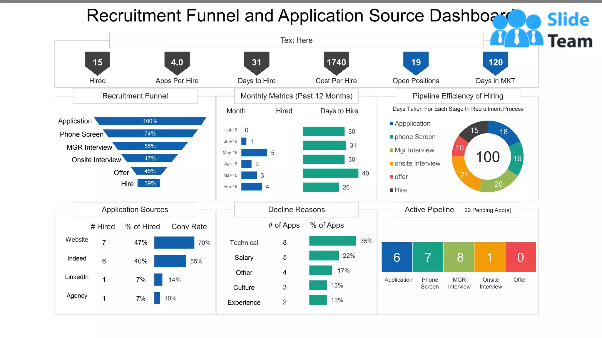
Recruitment Funnel Monthly Metrics (Past 12 Months) Pipeline Efficiency of Hiring
Application Sources Decline Reasons Active Pipeline 22 Pending App(s)
Text Here
Recruitment Funnel and Application Source Dashboard
This graph/chart is linked to excel, and changes automatically based on data. Just left click on it and select “Edit Data”.
15
Hired
4.0
Apps Per Hire
31
Days to Hire
1740
Cost Per Hire
19
Open Positions
120
Days in MKT
39%
45%
47%
55%
74%
100%
Application
Phone Screen
MGR Interview
Onsite Interview
Offer
Hire 4
3
2
5
1
0
Feb-16
Mar-16
Apr-16
May-16
Jun-16
Jul-16
26
40
30
31
30
Month Hired Days to Hire Days Taken For Each Stage In Recruitment Process
18
16
20
21
10
15
Appplication
phone Screen
Mgr Interview
onsite Interview
offer
Hire
100
# Hired % of Hired Conv Rate
10%
14%
55%
70%
47%
40%
7%
7%
7
6
1
1
Website
Indeed
LinkedIn
Agency
# of Apps % of Apps
13%
13%
17%
22%
35%
8
5
4
3
2
Technical
Salary
Other
Culture
Experience
6 7 8 1 0
Application Phone
Screen
MGR
Interview
Onsite
Interview
Offer
Instructions To Edit This Slide
This slide has been made in PowerPoint using basic PowerPoint shapes, and all graphics are 100%
editable in PowerPoint.
You can change color, size and orientation of any element to your liking, and add/edit any piece of text
anywhere.
All images are 100% editable in PowerPoint
Change color, size and orientation of any icon to your liking”
1. Select the Graph and right click -> Select "Edit Data"
2. An excel matrix will automatically show up
3. Enter the values based on your requirements and hit enter
4. The Graph/Chart shape will automatically adjust according to your data, and anytime you can go and change the value
again
Edit Excel-linked Chart
This is a Data Driven Chart/Graph and the shape automatically adjusts according to your data
1 2 3
Edit Color
1. Select the shape to change the color and Right click the object( click any object which you want to change color)
2. Choose Format Data Series in the dialog box.
3. Choose “Fill” in the Format Shape box then “Solid” or “Gradient” depending on the appearance of the object. Change
colour as shown in the picture.
1 2 3
Select From Thousands Of Editable Icons On Every Topic
These icons are available at the Icons section on www.slideteam.net

Recruitment Funnel And Application Source Dashboard

  • 1.
    Recruitment Funnel MonthlyMetrics (Past 12 Months) Pipeline Efficiency of Hiring Application Sources Decline Reasons Active Pipeline 22 Pending App(s) Text Here Recruitment Funnel and Application Source Dashboard This graph/chart is linked to excel, and changes automatically based on data. Just left click on it and select “Edit Data”. 15 Hired 4.0 Apps Per Hire 31 Days to Hire 1740 Cost Per Hire 19 Open Positions 120 Days in MKT 39% 45% 47% 55% 74% 100% Application Phone Screen MGR Interview Onsite Interview Offer Hire 4 3 2 5 1 0 Feb-16 Mar-16 Apr-16 May-16 Jun-16 Jul-16 26 40 30 31 30 Month Hired Days to Hire Days Taken For Each Stage In Recruitment Process 18 16 20 21 10 15 Appplication phone Screen Mgr Interview onsite Interview offer Hire 100 # Hired % of Hired Conv Rate 10% 14% 55% 70% 47% 40% 7% 7% 7 6 1 1 Website Indeed LinkedIn Agency # of Apps % of Apps 13% 13% 17% 22% 35% 8 5 4 3 2 Technical Salary Other Culture Experience 6 7 8 1 0 Application Phone Screen MGR Interview Onsite Interview Offer
  • 2.
    Instructions To EditThis Slide This slide has been made in PowerPoint using basic PowerPoint shapes, and all graphics are 100% editable in PowerPoint. You can change color, size and orientation of any element to your liking, and add/edit any piece of text anywhere.
  • 3.
    All images are100% editable in PowerPoint Change color, size and orientation of any icon to your liking”
  • 4.
    1. Select theGraph and right click -> Select "Edit Data" 2. An excel matrix will automatically show up 3. Enter the values based on your requirements and hit enter 4. The Graph/Chart shape will automatically adjust according to your data, and anytime you can go and change the value again Edit Excel-linked Chart This is a Data Driven Chart/Graph and the shape automatically adjusts according to your data 1 2 3
  • 5.
    Edit Color 1. Selectthe shape to change the color and Right click the object( click any object which you want to change color) 2. Choose Format Data Series in the dialog box. 3. Choose “Fill” in the Format Shape box then “Solid” or “Gradient” depending on the appearance of the object. Change colour as shown in the picture. 1 2 3
  • 6.
    Select From ThousandsOf Editable Icons On Every Topic These icons are available at the Icons section on www.slideteam.net