Download as PDF, PPTX
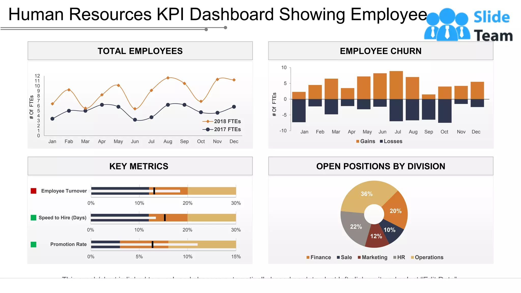
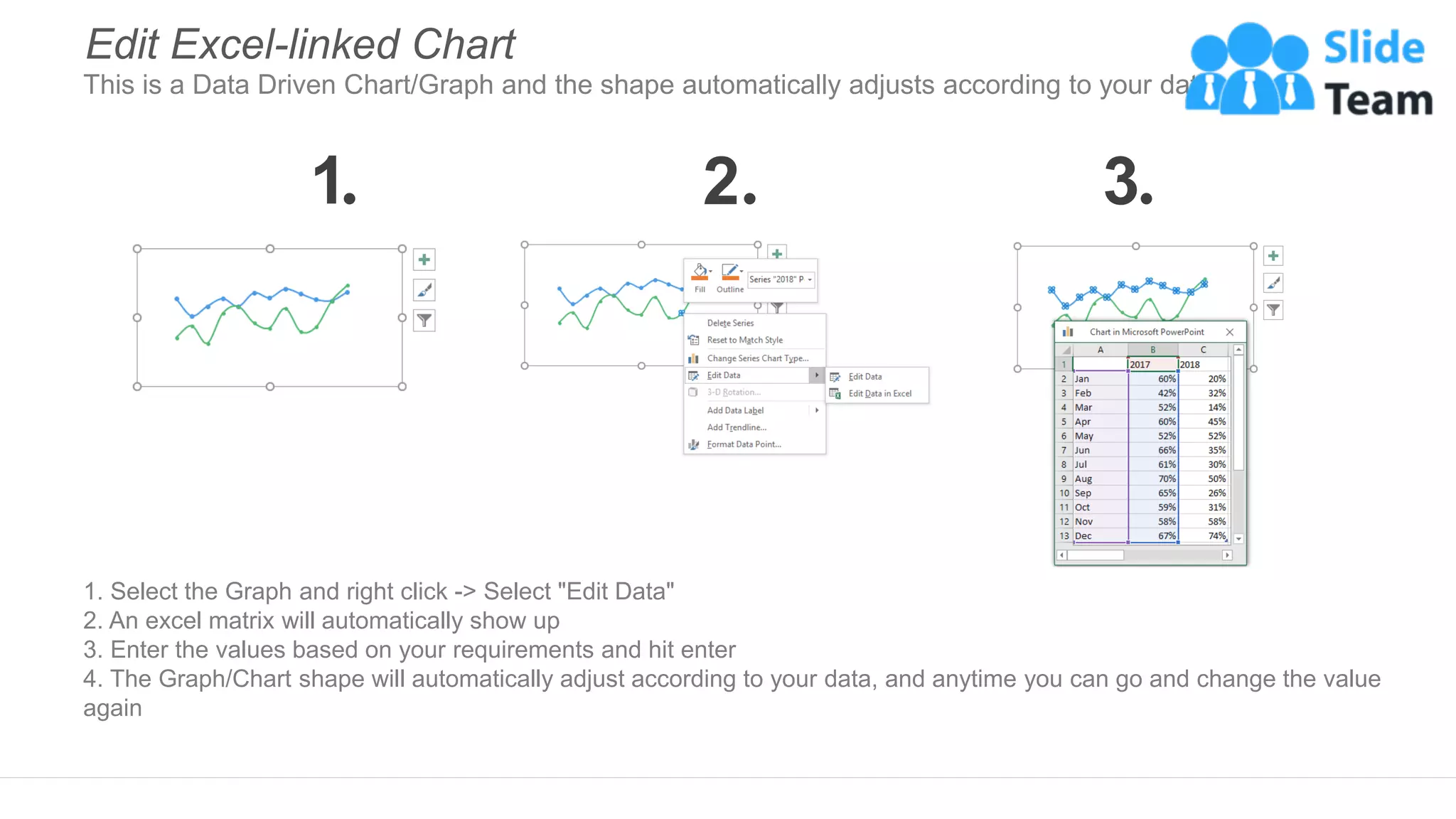
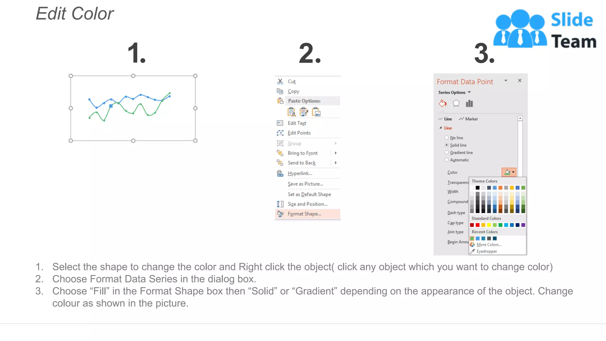

The document describes a human resources KPI dashboard that displays various metrics related to employee positions, turnover, and promotion rates, which is linked to Excel for automatic updates. Instructions for editing the dashboard in PowerPoint are provided, including how to change colors and shapes, as well as how to update the data in the linked chart. Additionally, it mentions the availability of editable icons for customization.


