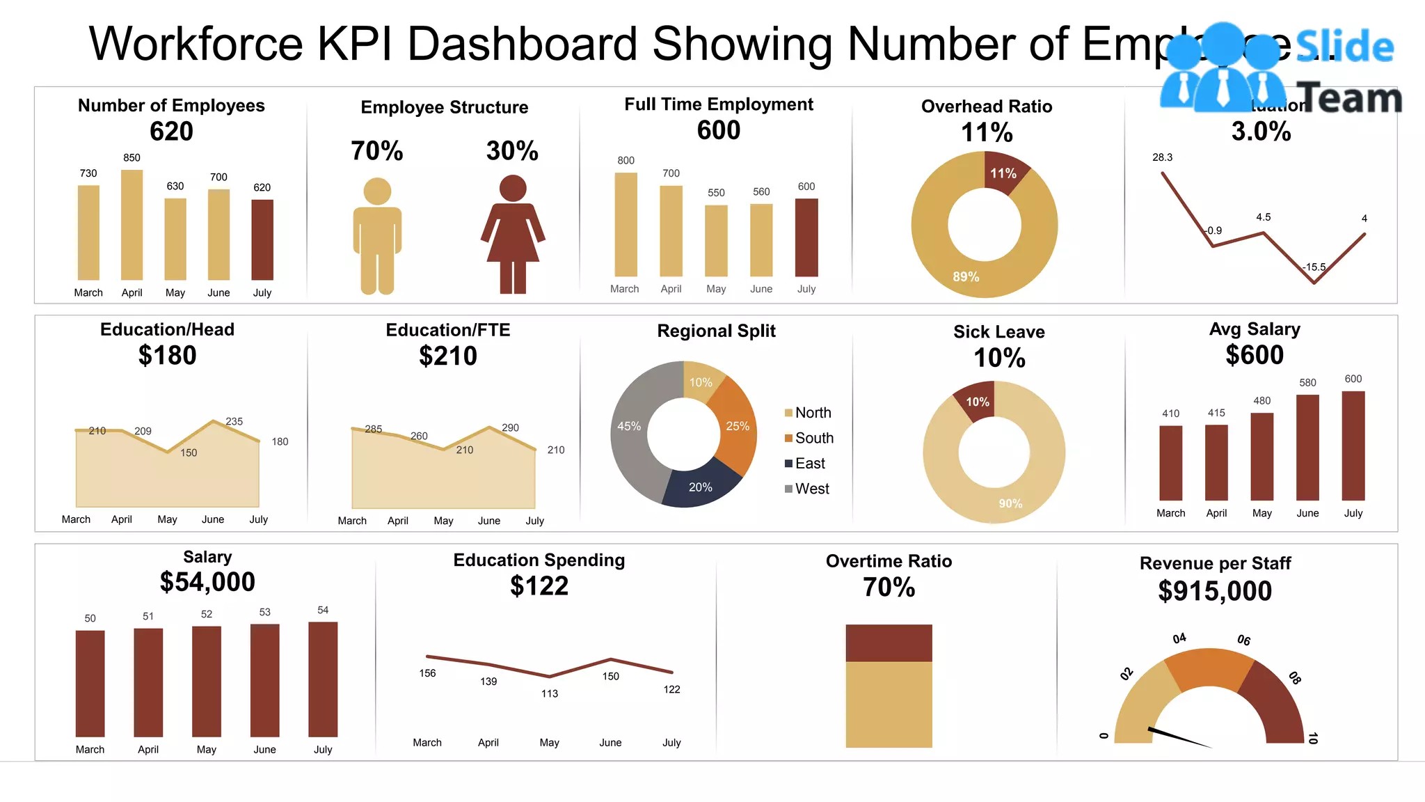
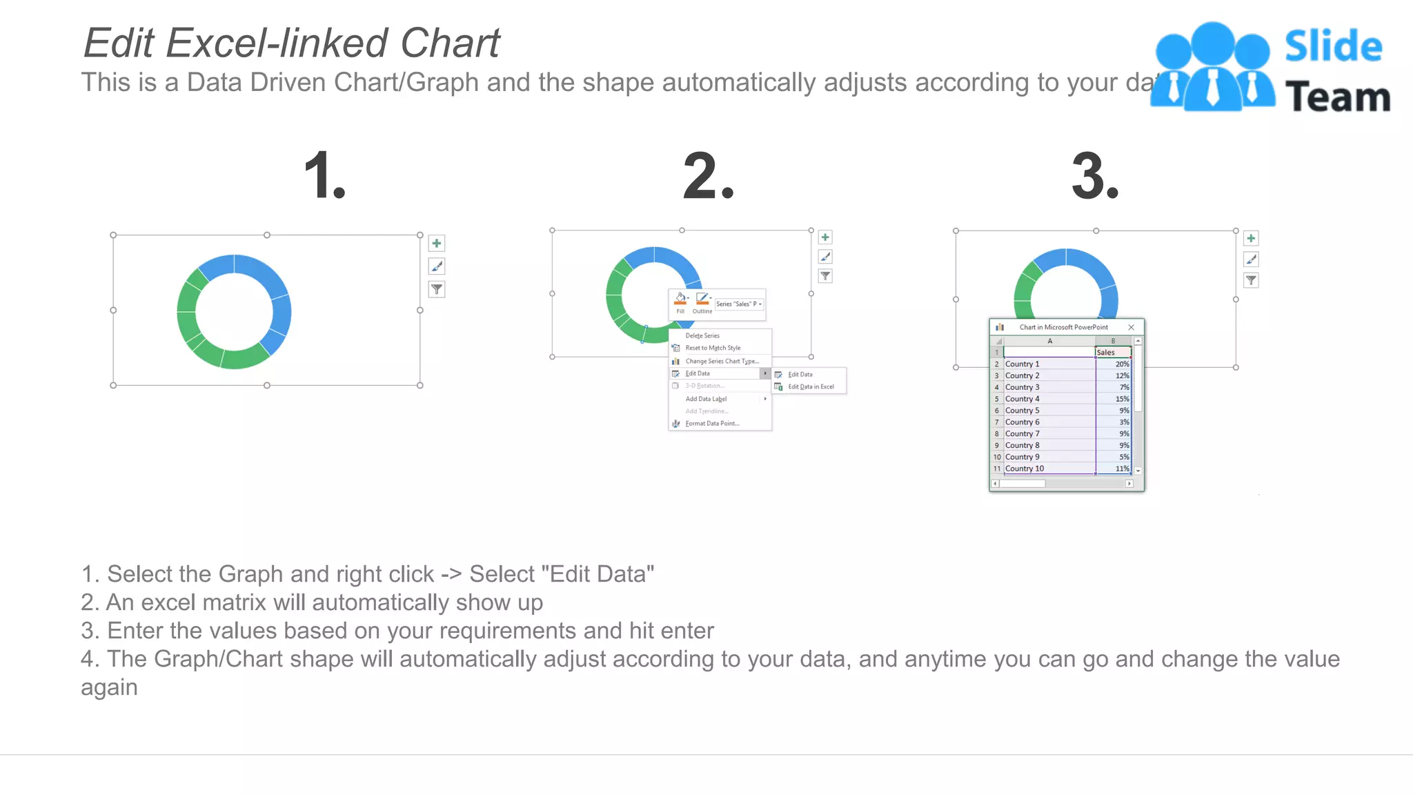
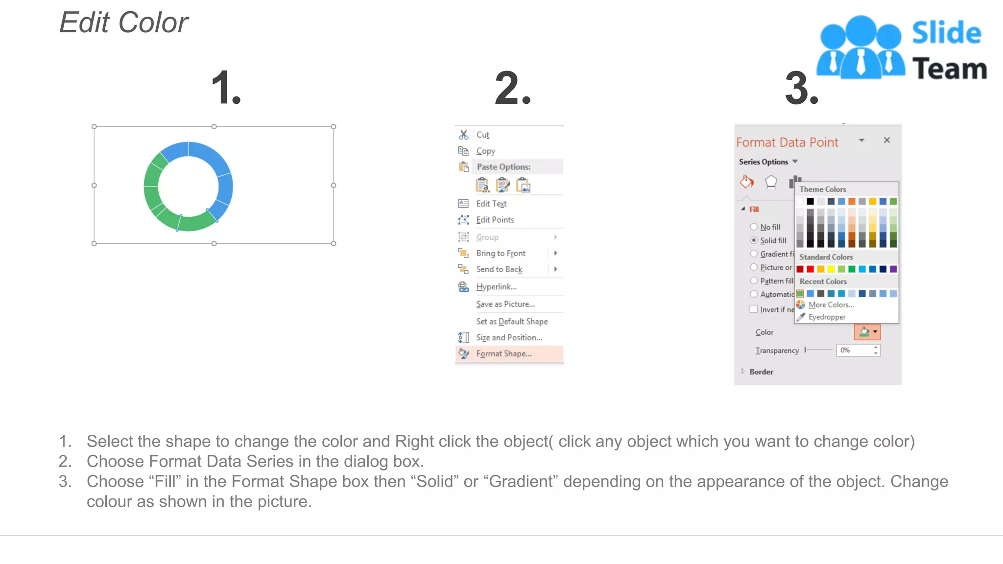
Workforce KPI Dashboard Showing Number of Employee…
This graph/chart is linked to excel, and changes automatically based on data. Just left click on it and select “Edit Data”.
730
850
630
700
620
March April May June July
Number of Employees
620
70% 30%
Employee Structure
210 209
150
235
180
March April May June July
Education/Head
$180
285
260
210
290
210
March April May June July
Education/FTE
$210
800
700
550 560
600
March April May June July
Full Time Employment
600
11%
89%
Overhead Ratio
11%
28.3
-0.9
4.5
-15.5
4
Fluctuation
3.0%
10%
25%
20%
45%
Regional Split
North
South
East
West
90%
10%
Sick Leave
10%
410 415
480
580 600
March April May June July
Avg Salary
$600
50 51 52 53 54
March April May June July
Salary
$54,000
156
139
113
150
122
March April May June July
Education Spending
$122
Overtime Ratio
70%
Revenue per Staff
$915,000
Instructions To Edit This Slide
This slide has been made in PowerPoint using basic PowerPoint shapes, and all graphics are 100%
editable in PowerPoint.
You can change color, size and orientation of any element to your liking, and add/edit any piece of text
anywhere.
All images are 100% editable in PowerPoint
Change color, size and orientation of any icon to your liking”
1. Select the Graph and right click -> Select "Edit Data"
2. An excel matrix will automatically show up
3. Enter the values based on your requirements and hit enter
4. The Graph/Chart shape will automatically adjust according to your data, and anytime you can go and change the value
again
Edit Excel-linked Chart
This is a Data Driven Chart/Graph and the shape automatically adjusts according to your data
1 2 3
Edit Color
1. Select the shape to change the color and Right click the object( click any object which you want to change color)
2. Choose Format Data Series in the dialog box.
3. Choose “Fill” in the Format Shape box then “Solid” or “Gradient” depending on the appearance of the object. Change
colour as shown in the picture.
1 2 3
Select From Thousands Of Editable Icons On Every Topic
These icons are available at the Icons section on www.slideteam.net

Workforce KPI Dashboard Showing Number Of Employee Overhead Ratio And Salary

  • 1.
    Workforce KPI DashboardShowing Number of Employee… This graph/chart is linked to excel, and changes automatically based on data. Just left click on it and select “Edit Data”. 730 850 630 700 620 March April May June July Number of Employees 620 70% 30% Employee Structure 210 209 150 235 180 March April May June July Education/Head $180 285 260 210 290 210 March April May June July Education/FTE $210 800 700 550 560 600 March April May June July Full Time Employment 600 11% 89% Overhead Ratio 11% 28.3 -0.9 4.5 -15.5 4 Fluctuation 3.0% 10% 25% 20% 45% Regional Split North South East West 90% 10% Sick Leave 10% 410 415 480 580 600 March April May June July Avg Salary $600 50 51 52 53 54 March April May June July Salary $54,000 156 139 113 150 122 March April May June July Education Spending $122 Overtime Ratio 70% Revenue per Staff $915,000
  • 2.
    Instructions To EditThis Slide This slide has been made in PowerPoint using basic PowerPoint shapes, and all graphics are 100% editable in PowerPoint. You can change color, size and orientation of any element to your liking, and add/edit any piece of text anywhere.
  • 3.
    All images are100% editable in PowerPoint Change color, size and orientation of any icon to your liking”
  • 4.
    1. Select theGraph and right click -> Select "Edit Data" 2. An excel matrix will automatically show up 3. Enter the values based on your requirements and hit enter 4. The Graph/Chart shape will automatically adjust according to your data, and anytime you can go and change the value again Edit Excel-linked Chart This is a Data Driven Chart/Graph and the shape automatically adjusts according to your data 1 2 3
  • 5.
    Edit Color 1. Selectthe shape to change the color and Right click the object( click any object which you want to change color) 2. Choose Format Data Series in the dialog box. 3. Choose “Fill” in the Format Shape box then “Solid” or “Gradient” depending on the appearance of the object. Change colour as shown in the picture. 1 2 3
  • 6.
    Select From ThousandsOf Editable Icons On Every Topic These icons are available at the Icons section on www.slideteam.net