Information Technology KPI Dashboard Showing Incident…
This graph/chart is linked to excel, and changes automatically based on data. Just left click on it and select “Edit Data”.
Vendor Payments
0
10
20
30
40
50
60
70
80
90
100
Jan-18 Feb-18 Mar-18
Payments
Product 1 Product 2 Product 3
Service Impact and Performance
0
50
100
0
50
100
Business Exchange
50%
0
50
100
Expense Reporting
60%
0
50
100
Help Desk
70%
0
50
100
HR Systems
80%
0
50
100
Manufacturing
90%
0
50
100
Microsoft Commerce
100%
0
50
100
Order Fulfillment
20%
0
50
100
Order Management
30%
0
50
100
Supply Chain
50%
0
50
100
Time Tracking
60%
Problem Summary : Number and Time Elapsed Trend
0
10
20
30
40
50
60
70
80
90
100
Number
of
Problems
Medium High Critical
0
20
40
60
80
100
Time
Elapsed
(Minutes)
Incident Target Summary Trend
0%
10%
20%
30%
40%
50%
60%
70%
80%
90%
100%
05-15-2018 6-21-2018 7-19-2018 8-28-2018 04-22-2018
Percentage
Incidents
No Target Within Target Breached
22%
15%
63%
Breakdown By Service Type
User Services
Requests 63%
Billing
40%
Instructions To Edit This Slide
This slide has been made in PowerPoint using basic PowerPoint shapes, and all graphics are 100%
editable in PowerPoint.
You can change color, size and orientation of any element to your liking, and add/edit any piece of text
anywhere.
All images are 100% editable in PowerPoint
Change color, size and orientation of any icon to your liking”
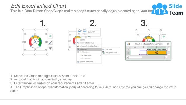
1. Select the Graph and right click -> Select "Edit Data"
2. An excel matrix will automatically show up
3. Enter the values based on your requirements and hit enter
4. The Graph/Chart shape will automatically adjust according to your data, and anytime you can go and change the value
again
Edit Excel-linked Chart
This is a Data Driven Chart/Graph and the shape automatically adjusts according to your data
1 2 3
Edit Color
1. Select the shape to change the color and Right click the object( click any object which you want to change color)
2. Choose Format Data Series in the dialog box.
3. Choose “Fill” in the Format Shape box then “Solid” or “Gradient” depending on the appearance of the object. Change
colour as shown in the picture.
1 2 3
Select From Thousands Of Editable Icons On Every Topic
These icons are available at the Icons section on www.slideteam.net

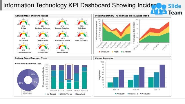
Information Technology KPI Dashboard Showing Incident Target Summary Trend

  • 1.
    Information Technology KPIDashboard Showing Incident… This graph/chart is linked to excel, and changes automatically based on data. Just left click on it and select “Edit Data”. Vendor Payments 0 10 20 30 40 50 60 70 80 90 100 Jan-18 Feb-18 Mar-18 Payments Product 1 Product 2 Product 3 Service Impact and Performance 0 50 100 0 50 100 Business Exchange 50% 0 50 100 Expense Reporting 60% 0 50 100 Help Desk 70% 0 50 100 HR Systems 80% 0 50 100 Manufacturing 90% 0 50 100 Microsoft Commerce 100% 0 50 100 Order Fulfillment 20% 0 50 100 Order Management 30% 0 50 100 Supply Chain 50% 0 50 100 Time Tracking 60% Problem Summary : Number and Time Elapsed Trend 0 10 20 30 40 50 60 70 80 90 100 Number of Problems Medium High Critical 0 20 40 60 80 100 Time Elapsed (Minutes) Incident Target Summary Trend 0% 10% 20% 30% 40% 50% 60% 70% 80% 90% 100% 05-15-2018 6-21-2018 7-19-2018 8-28-2018 04-22-2018 Percentage Incidents No Target Within Target Breached 22% 15% 63% Breakdown By Service Type User Services Requests 63% Billing 40%
  • 2.
    Instructions To EditThis Slide This slide has been made in PowerPoint using basic PowerPoint shapes, and all graphics are 100% editable in PowerPoint. You can change color, size and orientation of any element to your liking, and add/edit any piece of text anywhere.
  • 3.
    All images are100% editable in PowerPoint Change color, size and orientation of any icon to your liking”
  • 4.
    1. Select theGraph and right click -> Select "Edit Data" 2. An excel matrix will automatically show up 3. Enter the values based on your requirements and hit enter 4. The Graph/Chart shape will automatically adjust according to your data, and anytime you can go and change the value again Edit Excel-linked Chart This is a Data Driven Chart/Graph and the shape automatically adjusts according to your data 1 2 3
  • 5.
    Edit Color 1. Selectthe shape to change the color and Right click the object( click any object which you want to change color) 2. Choose Format Data Series in the dialog box. 3. Choose “Fill” in the Format Shape box then “Solid” or “Gradient” depending on the appearance of the object. Change colour as shown in the picture. 1 2 3
  • 6.
    Select From ThousandsOf Editable Icons On Every Topic These icons are available at the Icons section on www.slideteam.net