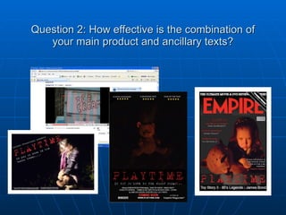
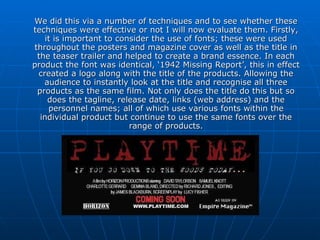
Question 2: How effective is the combination of your main product and ancillary texts?
I will now go onto analysis our branding techniques and how we have used these to create a definitive house style. A brand is important as it allows an audience to instantly recognise a product and the image associated with that brand, for example, Cadbury’s is a brand of chocolate with an image of quality at an affordable price. It is also important that the brand makes the products stand out from the crowd, as Naomi Klein states ‘within a manufactured sameness, image-based difference had to be manufactured along with the product’. This is why brands are so important and our products are no different; we simply had to target a different audience. To define our house style we had to include several of the same styles, designs, colours, lighting effects etc. in each product. For example, we used the same font for the title ‘Playtime’, colours revolved around reds, black and white etc. In the end we produced a series of products that reflected our specific brand of physiological horror thriller.
We did this via a number of techniques and to see whether these techniques were effective or not I will now evaluate them. Firstly, it is important to consider the use of fonts; these were used throughout the posters and magazine cover as well as the title in the teaser trailer and helped to create a brand essence. In each product the font was identical, ‘1942 Missing Report’, this in effect created a logo along with the title of the products. Allowing the audience to instantly look at the title and recognise all three products as the same film. Not only does the title do this but so does the tagline, release date, links (web address) and the personnel names; all of which use various fonts within the individual product but continue to use the same fonts over the range of products.
A second important factor is the use of colour. Colours define a products brand appearance, for example bright bold colours would suggest a product targeted at a young child. Juxtaposed to this we used a range of dark colours targeting an older audience. This is effective as it targets a specific age range. A brand slogan is also included within the ancillary products but is excluded visually from the teaser trailer. This is perhaps a mistake because the teaser trailer may, to some people, not be linked with the ancillary task due to the lack of this visual component. On the other hand the tagline is included within the soundtrack to the teaser, with the sound of the little girl singing ‘If you go down to the woods today, your sure of a big surprise.’ This does in essence link the products together but maybe not quite so much as a visual object might have.
Audiences also look for a brand that they can trust – if they trust a brand they will ultimately invest in it. The technique we have used to do this included the star rating at the top of the posters - this suggests that the product actually exists and that it is worth watching.  The inclusion of ‘Coming Soon’ is the only ineffective piece of branding in my view because audiences rely on trust to invest; as I have previously stated. ‘Coming Soon’ suggests to an audience that the film is coming out sometime in the near future but this could be months or years – it is simply to vague. As an alternative next time it would be more useful to include, at the very least, a month for release.
Conclusion Overall the branding we have used is very effective in the sense that the audience has a clear image of what the products are about and what they stand for. As mudvalley.com states ‘Brands need to provide customers with a consistent compelling experience in order not to confuse them, as confusion leads to doubt’ I agree that our products provide consistent fonts, themes and imagery and do not confuse the audience. As a result we have created a brand with a sense of purpose and tone that reflects the genre and audience views.

Question 2

  • 1.
    Question 2: Howeffective is the combination of your main product and ancillary texts?
  • 2.
    I will nowgo onto analysis our branding techniques and how we have used these to create a definitive house style. A brand is important as it allows an audience to instantly recognise a product and the image associated with that brand, for example, Cadbury’s is a brand of chocolate with an image of quality at an affordable price. It is also important that the brand makes the products stand out from the crowd, as Naomi Klein states ‘within a manufactured sameness, image-based difference had to be manufactured along with the product’. This is why brands are so important and our products are no different; we simply had to target a different audience. To define our house style we had to include several of the same styles, designs, colours, lighting effects etc. in each product. For example, we used the same font for the title ‘Playtime’, colours revolved around reds, black and white etc. In the end we produced a series of products that reflected our specific brand of physiological horror thriller.
  • 3.
    We did thisvia a number of techniques and to see whether these techniques were effective or not I will now evaluate them. Firstly, it is important to consider the use of fonts; these were used throughout the posters and magazine cover as well as the title in the teaser trailer and helped to create a brand essence. In each product the font was identical, ‘1942 Missing Report’, this in effect created a logo along with the title of the products. Allowing the audience to instantly look at the title and recognise all three products as the same film. Not only does the title do this but so does the tagline, release date, links (web address) and the personnel names; all of which use various fonts within the individual product but continue to use the same fonts over the range of products.
  • 4.
    A second importantfactor is the use of colour. Colours define a products brand appearance, for example bright bold colours would suggest a product targeted at a young child. Juxtaposed to this we used a range of dark colours targeting an older audience. This is effective as it targets a specific age range. A brand slogan is also included within the ancillary products but is excluded visually from the teaser trailer. This is perhaps a mistake because the teaser trailer may, to some people, not be linked with the ancillary task due to the lack of this visual component. On the other hand the tagline is included within the soundtrack to the teaser, with the sound of the little girl singing ‘If you go down to the woods today, your sure of a big surprise.’ This does in essence link the products together but maybe not quite so much as a visual object might have.
  • 5.
    Audiences also lookfor a brand that they can trust – if they trust a brand they will ultimately invest in it. The technique we have used to do this included the star rating at the top of the posters - this suggests that the product actually exists and that it is worth watching. The inclusion of ‘Coming Soon’ is the only ineffective piece of branding in my view because audiences rely on trust to invest; as I have previously stated. ‘Coming Soon’ suggests to an audience that the film is coming out sometime in the near future but this could be months or years – it is simply to vague. As an alternative next time it would be more useful to include, at the very least, a month for release.
  • 6.
    Conclusion Overall thebranding we have used is very effective in the sense that the audience has a clear image of what the products are about and what they stand for. As mudvalley.com states ‘Brands need to provide customers with a consistent compelling experience in order not to confuse them, as confusion leads to doubt’ I agree that our products provide consistent fonts, themes and imagery and do not confuse the audience. As a result we have created a brand with a sense of purpose and tone that reflects the genre and audience views.