How Does Your Media
   Product Represent
Particular Social Groups?


                        S
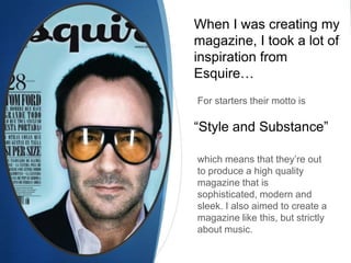
When I was creating my
magazine, I took a lot of
inspiration from
Esquire…
For starters their motto is

“Style and Substance”

which means that they’re out
to produce a high quality
magazine that is
sophisticated, modern and
sleek. I also aimed to create a
magazine like this, but strictly
about music.
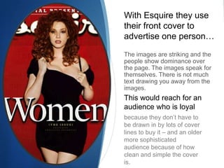
With Esquire they use
their front cover to
advertise one person…

The images are striking and the
people show dominance over
the page. The images speak for
themselves. There is not much
text drawing you away from the
images.
This would reach for an
audience who is loyal
because they don’t have to
be drawn in by lots of cover
lines to buy it – and an older
more sophisticated
audience because of how
clean and simple the cover
is.
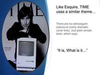
Like Esquire, TIME
uses a similar theme…


There are no extravagant
colours or overly dramatic
cover lines. Just plain simple
texts, which says,


“It is, What is it…”
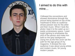
I aimed to do this with
mine…

I followed the conventions and
showed dominance through the
picture being layered on top of the
masthead to draw an audience
whose passion was for the artist
and their music. When I took the
photo I kept it to the waist up so I
waste unnecessary space. I used
bright lighting to emphasise the
shot of the person and make him
bold on the grey background.
Using him as the first cover set the
path for the age group of my
magazine. It showed the new
audience it was about young artists
and modern music, for young
modern people.

Question 2

  • 1.
    How Does YourMedia Product Represent Particular Social Groups? S
  • 2.
    When I wascreating my magazine, I took a lot of inspiration from Esquire… For starters their motto is “Style and Substance” which means that they’re out to produce a high quality magazine that is sophisticated, modern and sleek. I also aimed to create a magazine like this, but strictly about music.
  • 3.
    With Esquire theyuse their front cover to advertise one person… The images are striking and the people show dominance over the page. The images speak for themselves. There is not much text drawing you away from the images. This would reach for an audience who is loyal because they don’t have to be drawn in by lots of cover lines to buy it – and an older more sophisticated audience because of how clean and simple the cover is.
  • 4.
    Like Esquire, TIME usesa similar theme… There are no extravagant colours or overly dramatic cover lines. Just plain simple texts, which says, “It is, What is it…”
  • 5.
    I aimed todo this with mine… I followed the conventions and showed dominance through the picture being layered on top of the masthead to draw an audience whose passion was for the artist and their music. When I took the photo I kept it to the waist up so I waste unnecessary space. I used bright lighting to emphasise the shot of the person and make him bold on the grey background. Using him as the first cover set the path for the age group of my magazine. It showed the new audience it was about young artists and modern music, for young modern people.