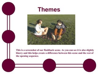
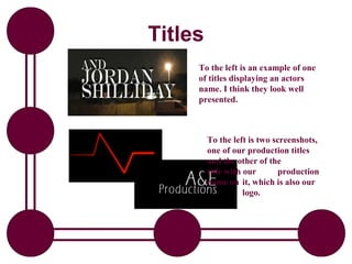
ENGLISH5 QUARTER4 MODULE1 WEEK1-3 How Visual and Multimedia Elements.pptx
Evaluation - Question 1
1. Evaluation
In what ways does your
media product use, develop
or challenge forms and
conventions of real media
products?
2. Characters
In my opening sequence I stuck to the conventional
characters normally seen in a thriller film. This character
is normally a young male who is a police man or ex
detective. Although at first I wanted to challenge this
convention, but I thought it was best to stick with a male
young lead because this would help my film appeal to
males and as well as this we wanted a vulnerable
character, and this is stereotypically a female. This
Worked out well in our opening sequence because our
male needs to be strong and powerful enough to stick up
for himself, plus the relationship between the male and
the vulnerable female creates an interesting storyline.
3. Characters
On the left is our main character, and on the right is the vulnerable girl.
You can also see the change in colour here. How we used brighter colour
on the vulnerable girl, and the darkness to portray the mysterious male.
4. Themes
In my research, I found out that a key theme that runs in a thriller
Film is romance because this gives the audience something else to
follow and relate to. I kept this convention in because it added
another situation to the opening sequence. We used this in our
opening sequence by including a flashback of our main character
on a date with his girlfriend. In our audience feedback we had
some people getting confused between our main storyline in the
present, to the flashback. So from this feedback we felt we needed
to make the flashback stand out more from the rest of the
sequence. We achieved this by changing the lighting to something
brighter, and brightness connotes happiness, so this helped to
make a distinct difference. In our final draft of the opening
sequence our flashback looks well edited, and fits into the
sequence well and hopefully Our audience will be less confused by
its position in the sequence now.
5. Themes
This is a screenshot of our flashback scene. As you can see it is also slightly
blurry and this helps create a difference between this scene and the rest of
the opening sequence.
6. Music
Another convention of a thriller film which I found out in my
research was that the sound in a thriller film is non-diegetic music.
This helps to create tension. In our opening sequence we kept to
this convention, by using a piece of parallel music, so that it
was relevant to the scene. The music definitely helps our opening
sequence because without it, it doesn’t look very professional and
the sequence is boring. I got the idea of using music over the top
of our sequence from the film ‘James Bond’. This is because each
of the films has a different soundtrack which helps had tension to
the opening sequence and I thought our opening sequence could
have done with its own soundtrack to.
Click on the speaker to listen to a
preview of the music we used.
7. Introduction of Characters
The conventions of an opening sequence include titles and an
introduction to the characters. Our opening sequence follows both
of these conventions by including titles throughout the opening
sequence, and introducing the majority of the characters which
will be in the rest of the film. The narrative in our opening
sequence follows our main character through a calm action of
making a cup of tea, which people do everyday, to then hearing
the news report and his world turning upside down. We also
introduced his girlfriend in the opening sequence because she is a
key character in the rest of the film and then the family as well
because they add setting.
Continued…
8. Titles
… The titles we used were the production company logo, which
we created ourselves, and the names of the director, producer
and actors in the film. These are conventional of an opening
sequence because similar titles were used in all the films I
looked at during my research. At first our titles did not look so
good, because we could not get a font which reflected the
thriller genre, however we managed to find one and now the
titles look acceptable. This font is bold and in capitals this
makes it stand out, but is not distracting from the story. Also,
they have shadow on them, because shadows connote mystery
which is a convention of a thriller. As well as this, we spent a
lot of time getting our production title and logo to look good
because we thought this was an important element of an
opening sequence. We also added a beeping sound to our
production titles because this was something that a lot of
production companies use for example 20th Century Fox have
music whilst their titles move.
9. Titles
To the left is an example of one
of titles displaying an actors
name. I think they look well
presented.
To the left is two screenshots,
one of our production titles
and the other of the
title with our production
name on it, which is also our
logo.
10. Titles
To the left is an example of one
of titles displaying an actors
name. I think they look well
presented.
To the left is two screenshots,
one of our production titles
and the other of the
title with our production
name on it, which is also our
logo.