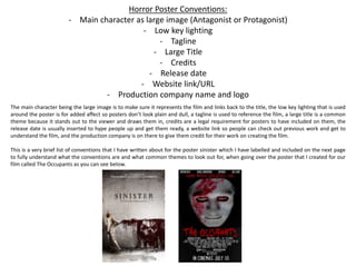
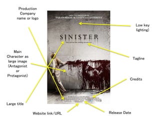
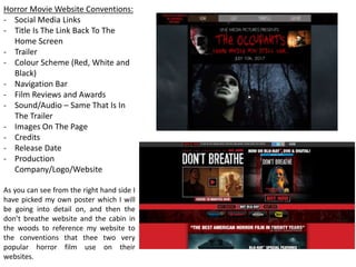
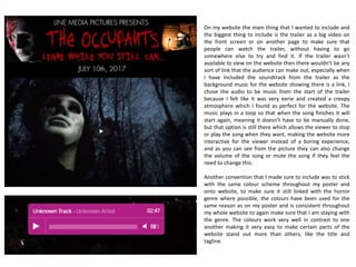
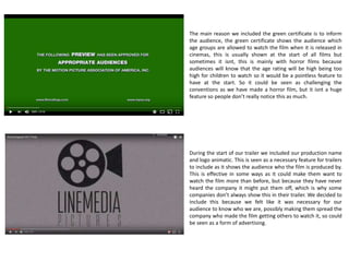
The document discusses conventions used in horror movie posters and websites. It provides examples of several key conventions including:
- Featuring the main character prominently on the poster
- Using low-key lighting and colors like black, red, and white for the poster
- Including taglines, titles, credits, and release dates on the poster
- Placing the production company name and logo on the poster
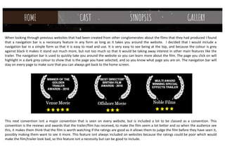
- Adding social media links, trailers, and background music from the trailer on the website
- Allowing the title to link back to the home page on the website
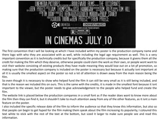
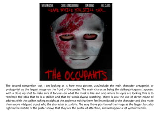
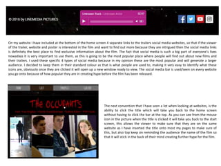
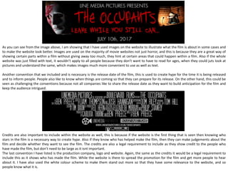
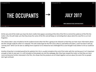
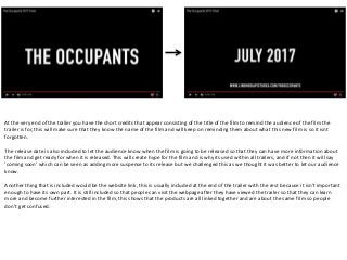
The document analyzes how these conventions were applied to a poster and website created for a horror film called "The Occupants" to